


Sidra 5 designs
in one theme
Each design is a complete store with its own look and sections. Pick the one closest to your business when you add the theme from the Shopify Theme Store.
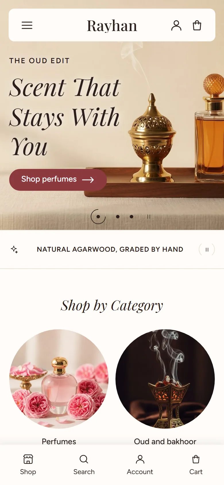
5 designs, ready to apply
Each has its own home page, header, footer, product cards and colors. Try its demo store before you buy.


Rayhan








Sada
All designs come in one theme at one price, with the same features and settings.
Designs install from the Shopify Theme Store
Each design here is one of Sidra's styles in the Shopify Theme Store, with its own demo store there.
-
1
Open Sidra in the Shopify Theme Store
Search for Sidra in the Shopify Theme Store.
-
2
Pick the style
On the theme's page there, pick the style of the design that fits your business. You can open its demo store first.
-
3
Add it to your store and publish
The theme lands in your store's theme library with the style you picked. Customize it, then publish when it is ready.
Want another design later? Add the theme again with the other style. A new copy lands in your theme library, and your published theme stays as it is.
Features in every design
5 designs in one theme
Fashion, beauty and fragrance, jewelry and watches, home and furniture, and electronics, each with a demo store.
Arabic and English
The storefront is translated into Arabic and turns right to left by itself.
Cart drawer
Products are added without leaving the page, and the drawer has discounts and express checkout.
Predictive search
Products show up as the customer types.
Quick view
Customers open a product in a window from the collection page, without leaving it.
Filters and sorting
On collection and search pages.
A complete product page
Colour and size buttons, express checkout, Shop Pay Installments, store pickup, subscriptions, video and 3D.
Theme user guide
One guide for every design: the settings are the same.
The theme's designs
Sidra comes with five designs, each made for a kind of store. A design sets two things: the theme settings (colors, fonts, buttons, product cards and spacing) and the home page sections in their order, with the header and footer. Every section and every look is available in every design, so you can bring a section from one design into another with Add section.
To change the design:
- In your Shopify admin, go to Online Store > Themes and click Customize next to the theme.
- In the editor, open Theme settings in the side bar.
- Open Theme style and choose the design.
- Check the preview on desktop and mobile, then click Save.
This replaces the theme settings with the chosen design's values; your home page sections, header and footer stay as they are. For the whole home page as in the demo, add its sections in the order listed under each design and pick the same looks, or add that design from the Theme Store as a new theme. Duplicate the theme before you change it, and afterwards check your logo, store contact and social links.
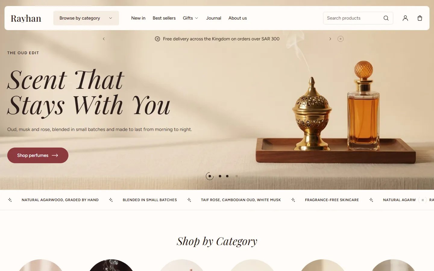
A warm design for perfume, oud, incense and skincare stores. An ivory page, burgundy buttons and links, italic headings, and product cards in boxes with size buttons and a stock line.

This is the theme's default design.
Its home page has 12 sections, in this order:
- Slideshow, Layout: “Text on the image”
- Scrolling text, Style: “Small text”
- Collection list, Layout: “Circles”
- Featured collections, Heading layout: “Tabs as the title”
- Banner grid, Layout: “Equal columns”
- Features around an image
- Featured product, Layout: “Gallery with thumbnails”
- Image banner, Layout: “Text on the image”
- Testimonials, Layout: “Cards with a photo”
- FAQ, Layout: “Questions in a box”
- Blog posts, Card style: “Plain”
- Benefits, Layout: “Centered icons”
Header and footer
- Header, Layout: “Floating bar with category menu”
- Footer, Layout: “Store details and menu columns”
From the theme settings
- Card style: “Boxed with add button”
- Button shape: “Pill”
- Heading font: “Playfair Display”
- Body font: “Figtree”
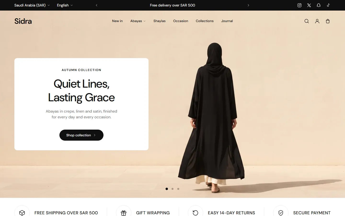
A calm black-and-white design for fashion and abayas. Buttons and links are black, product pictures are tall 3:4 so a whole outfit shows, and cards show star ratings when a reviews app provides them.

Its home page has 11 sections, in this order:
- Slideshow, Layout: “Text in a card”
- Benefits, Layout: “Strip with icon circles”
- Collection list, Layout: “Tiles with a button”
- Featured collections, Heading layout: “Title centered, tabs under it”
- Banner grid, Layout: “One tall and two stacked”
- Product slider with image
- Collection accordion
- Lookbook
- Image with product, Layout: “Image beside centered text”
- Testimonial slider, Layout: “With a picture”
- Blog posts, Card style: “Bordered”
Header and footer
- Header, Layout: “Logo at start, menu in the center”
- Footer, Layout: “Logo band on top and three columns”
From the theme settings
- Card style: “Quick add on the image”
- Button shape: “Pill”
- Heading font: “DM Sans”
- Body font: “DM Sans”
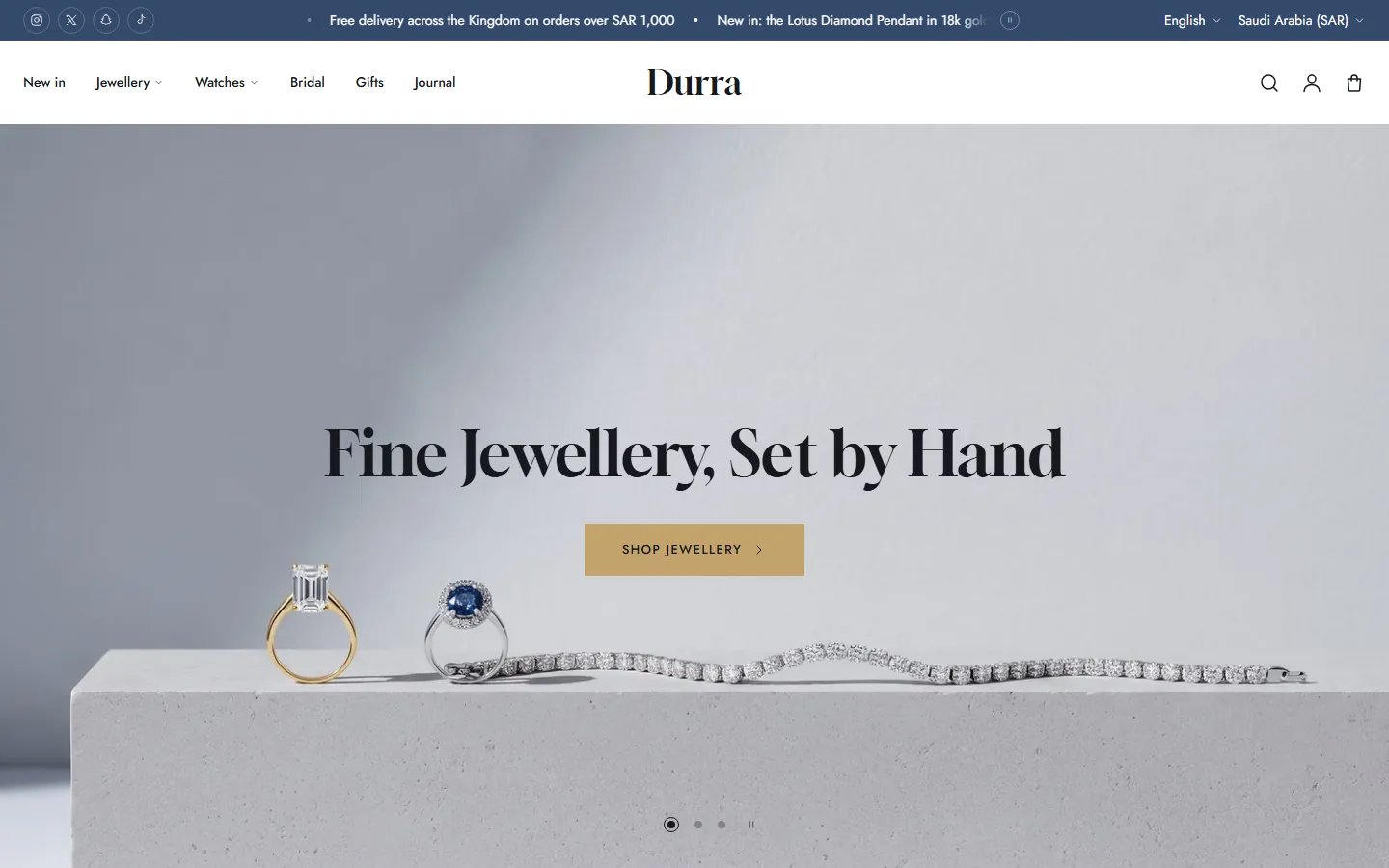
An elegant design for jewelry and watch stores. A light gray page, navy buttons and gold touches, square corners everywhere, square product pictures, and card swatches that show each variant's picture instead of a color dot.

Its home page has 11 sections, in this order:
- Slideshow, Layout: “Centered text”
- Scrolling text, Style: “Large words”
- Collection list, Layout: “Label box on the image”
- Featured collections, Heading layout: “Title at start, tabs or arrows at the end”
- Image cards, Layout: “Start-aligned with an underlined link”
- Featured product, Layout: “Details panel between images”
- Image with highlights
- Shop the look
- Testimonial slider, Layout: “Centered on a panel”
- Blog list, Layout: “Lead post with a list”
- Benefits, Layout: “Icon beside the text”
Header and footer
- Header, Layout: “Logo in the center, menu at start”
- Footer, Layout: “Store, links and newsletter panels”
From the theme settings
- Card style: “Icon buttons on the image”
- Button shape: “Square”
- Heading font: “Gloock”
- Body font: “Jost”
A warm design for furniture, decor and home stores. A cream page, terracotta buttons, uppercase widely spaced headings, square corners, and the widest space between sections of the five designs.

Its home page has 12 sections, in this order:
- Color panel slideshow
- Collection list, Layout: “Tiles with a link below”
- Featured collections, Heading layout: “Title at start, tabs or arrows at the end”
- Image mosaic
- Featured collections, Heading layout: “Title centered, tabs under it”
- Shop the room
- Image cards, Layout: “Centered with a button”
- Product list with images
- Image banner, Layout: “Text in a box”
- Testimonials, Layout: “White cards on a band”
- Blog list, Layout: “Two columns of rows”
- Benefits, Layout: “Bordered boxes”
Header and footer
- Header, Layout: “Two rows with centered logo”
- Footer, Layout: “Store, links and newsletter panels”
From the theme settings
- Card style: “Centered with outline button”
- Button shape: “Square”
- Heading font: “Manrope”
- Body font: “Poppins”
A modern design for electronics and accessories. A white page, black buttons with rounded corners and orange touches, a large search bar in the header, bordered product cards with a stock bar, and a sale badge that reads “15% off”.

Its home page has 12 sections, in this order:
- Hero grid
- Collection list, Layout: “Square boxes”
- Featured collections, Heading layout: “Title at start, tabs or arrows at the end”
- Banner grid, Layout: “Equal columns”
- Large word
- Featured collections, Heading layout: “Title centered, tabs under it”
- Image with product, Layout: “Image slides with thumbnails”
- Image banner, Layout: “Text on the image”
- Testimonials, Layout: “Bordered cards”
- Blog posts, Card style: “Plain”
- FAQ, Layout: “Numbered question tiles”
- Benefits, Layout: “Framed, title on the border”
Header and footer
- Header, Layout: “Search bar with menu row”
- Footer, Layout: “Store details and menu columns”
From the theme settings
- Card style: “Bordered with stock bar”
- Button shape: “Rounded”
- Heading font: “Red Hat Display”
- Body font: “Plus Jakarta Sans”
General settings and identity
These settings change the whole store at once. In the theme editor they are under Theme settings in the side bar, in ten groups, in the order below. The design you choose sets them for you, and you can change any of them afterwards.
Your logo in the header, in the footer layouts that show one, on the password page and the gift card page, plus the small icon in the browser tab. Find it under Theme settings > Logo and favicon.
- Logo: Upload your logo here. Left empty, the store name shows instead in the heading font, styled by the text logo settings below. A PNG with a transparent background looks cleanest on any color.
- Logo width: Applies in the header, the footer and on the password page. In the header the logo is never taller than 56px (45px in the “Floating bar with category menu” layout), so a square or tall logo stops growing as you widen it.
- Text logo size: The size of the store name in the header when there is no logo image. Phones show it a little smaller on their own. The footer's name size is set in the footer.
- Text logo weight: How bold the store name is in the header and footer. If the heading font lacks that weight, the name shows in the font's regular weight.
- Text logo case: Uppercase writes the store name in capital letters. No effect on Arabic pages.
- Text logo letter spacing: The space between the name's letters: Tight packs them, Wide spreads them and suits uppercase names. Not applied on Arabic pages.
- Favicon: The small icon next to your store name in the browser tab. It shows at 32 x 32px, so use a simple square image, such as the first letter of your logo.
Tips
- Upload the logo at least twice the width it shows at (240px wide for a width of 120) so it stays sharp on high-resolution screens.
All the store's colors in one place. Most live in Color schemes: each scheme holds a background, text and button colors, and every section picks one in its own color scheme setting, so editing a scheme repaints every section that uses it. Below the schemes are the badge and stock colors. Find them under Theme settings > Colors.
- Color schemes: The six schemes play the same role in every design: 1 page, 2 soft tinted band, 3 white box, 4 dark band, 5 accent band, 6 a special one per design (such as Rayhan's gradient band). Edit any of them or add a new one; scheme 1 also colors the page itself.
- Background: For every section that uses this scheme. Scheme 1's is the background of the whole page.
- Background gradient: An optional gradient drawn instead of the flat background. Arabic pages mirror its direction on their own. Leave it empty for a flat color.
- Text: Headings and text. Also the fill of contrast buttons, such as the add button on “Boxed with add button” cards.
- Secondary text: Less important text: the line under section titles, the struck-through old price, hint text inside fields and tabs that aren't selected. Keep it lighter than Text but readable.
- Image and chip background: Shows behind pictures while they load, around transparent pictures and behind the placeholder drawings of a section with no picture yet. Some small buttons and chips use it too.
- Box background: Fills “Boxed with add button” and “Bordered with stock bar” cards, the icon buttons on product pictures, and the cards inside some sections.
- Borders: Lines and frames: field and table borders, framed cards, and the empty part of star ratings.
- Accent: Links inside text, icons in sections, and the color product names and links turn on mouse-over.
- Button: The fill of primary buttons in sections that use this scheme. With Button style set to Outline it becomes their border and label color.
- Button label: The label color on primary buttons; pick one that reads clearly on the button color.
- Button on hover: Shows when the mouse rests on a primary button. Make it a little darker or lighter than Button so the change is felt.
- Button label on hover: The primary button's label at that moment; pick one that reads clearly on Button on hover.
- Secondary button: The fill of secondary buttons. On mouse-over it swaps with their label color.
- Secondary button label: The label and border of secondary buttons, and the color of hollow buttons such as the add button on “Centered with outline button” cards.
- Sale price and badge: The discounted price and the sale badge. Error messages and “Out of stock” use it too. The badge text is white, so pick a dark color.
- New badge: Shown on products carrying the tag set in Product cards. Its text is white, so pick a dark color.
- Trending badge: Shown on products carrying the tag set in Product cards. Its text is white, so pick a dark color.
- Rating stars: The filled stars of ratings: on product cards, in quick view, the Featured product section and customer reviews.
- In stock: The “In stock, ready to ship” line, and the stock bar while stock is healthy.
- Low stock: “Only a few left”, and the stock bar once stock reaches Low stock below or less.
Tips
- Editing a scheme changes every section that uses it. To change one section only, give it another scheme in that section's own settings.
Fonts and sizes for headings and text. Find them under Theme settings > Typography. Shopify's font library has Latin letters only, so the fonts you pick show on English text and numbers, while Arabic text uses the device's own Arabic font. Letter case, letter spacing and italics don't apply on Arabic pages.
- Heading font: For large headings: page, section and slide titles, and the store name when there is no logo image. Smaller headings use the body font.
- Italic display headings: Sets page, section and slide titles in the italic style of the heading font, when the font has one. Rayhan uses it.
- Heading case: Uppercase writes large headings in capital letters, as Liwan does.
- Heading letter spacing: The space between the letters of large headings: Tight suits bold fonts, Wide suits uppercase headings.
- Section heading size: For computers and tablets (768px wide and up); phones have their own size in the next setting.
- Section heading size on phones: For screens under 768px wide.
- Section heading line height: The space between lines when a section title runs to two lines or more: lower packs them, higher spreads them.
- Section heading letter spacing: Letter spacing for section titles only. Same as headings follows Heading letter spacing.
- Heading size scale: Scales the other headings at once: page titles (such as the product name on its page, collection and search titles) and smaller headings in content. Section titles have their own sizes above; slide titles are set in their section.
- Body font: For ordinary text: descriptions, prices, menus, product names on most card styles, and buttons when Button font is Body font.
- Body size scale: Scales ordinary text (paragraphs and descriptions) from its 15px base. Parts with a fixed size, such as product names on cards, stay the same.
- Small label letter spacing: Letter spacing for the small uppercase lines above titles, such as the short line above a slide title.
Tips
- After changing a font, check long headings and product names in both languages on a phone.
Page width, margins, the space between sections and corner rounding for the whole store. Find it under Theme settings > Layout.
- Page width: The widest the page content gets on large screens, margin included. Full-width sections ignore it.
- Page margin: The empty space at each side of the content on computers and tablets (768px and up).
- Page margin on phones: The same side space on screens under 768px wide.
- Space between sections: The space above and below each section whose “Top spacing” or “Bottom spacing” is “Theme spacing”; “Half” uses half of it. Tablets use up to 64px and phones up to 48px. Two touching sections on the same color scheme share one space, not two.
- Space under section headings: The space between a section title and its content on computers and tablets. Phones always use 28px.
- Corner radius: For pictures, cards, banners and boxes. 0 gives square corners, as in Durra and Liwan.
- Small corner radius: For small items: thumbnails, badges and small boxes, plus buttons and fields set to Rounded. At 0 badges are square; above 0 they are pills.
- Show back to top button: A small button in the bottom right corner (on Arabic pages too) that appears once the shopper scrolls down and takes them back to the top, with a ring that fills as they scroll. It is round when Corner radius is above 0, and square at 0 with a line under it that fills instead.
The shape of every button and input field in the store. Button colors are in Color schemes. Find it under Theme settings > Buttons.
- Button shape: Pill rounds the ends fully (Rayhan, Sidra), Rounded takes Small corner radius from Layout (Sada), and Square gives sharp corners (Durra, Liwan). Size buttons on cards follow it too.
- Button style: Solid fills primary buttons with their color. Outline makes them transparent with the button color as border and label, filling on mouse-over. Other buttons don't change.
- Button border: For every button. With Outline keep it at 1 or more so the border shows; 0 removes it.
- Button height: The minimum button height. Large buttons add 6px to it; small buttons stay at 38px.
- Button font: The font of button labels: the body font, or the heading font as in Liwan and Sada.
- Button text size: For every button; small buttons use 1px less.
- Button text weight: Medium or Semibold. If the font lacks that weight, its regular weight shows.
- Button text case: Uppercase writes button labels in capital letters, as Durra does. No effect on Arabic pages.
- Button letter spacing: Letter spacing for button labels, useful with uppercase. Not applied on Arabic pages.
- Field shape: For the corners of input fields: search, the newsletter email, form fields and the quantity selector. Rounded takes Small corner radius.
The product card and everything on it, wherever products show: home sections, collections, search and related products. Quick view's buttons are set here too. Find it under Theme settings > Product cards.
- Card style: The card used across the store. “Boxed with add button” (Rayhan): a box, centered text and a wide add button at the foot. “Quick add on the image” (Sidra): no box, text from the start and a Quick add button at the foot of the picture. “Icon buttons on the image” (Durra): a bag icon and a quick view icon at the bottom center of the picture. “Centered with outline button” (Liwan): centered text and a full-width hollow add button. “Bordered with stock bar” (Sada): a framed card with the picture inside, two icons on the picture's bottom edge, and the stock bar when Stock status is Bar.
- Card image ratio: The picture shape on cards: Adapt to image keeps each picture's own shape (cards may differ in height), or Portrait 3:4, Portrait 4:5, Square or Landscape 4:3. Pictures are cropped at the edges to fill the shape, so upload them in that shape. The Shop the look section uses its own shape.
- Show second image on hover: On mouse-over the product's second picture replaces the first. Off, or for a product with one picture, the picture zooms in slightly instead. Phones have no mouse-over, so they always show the first picture.
- Show vendor: The product's vendor (its Vendor field) above its name. Useful for stores that sell several brands.
- Show product rating: Star ratings and the review count under the product name, and in quick view. It needs a reviews app that saves product ratings to Shopify; a product with no rating shows nothing.
- Show color swatches: Color dots under the price from the product's color option; clicking one changes the card picture. Up to 5 show, then a +N link. The theme finds the color option from Shopify's swatch data, or by its name in Color option names.
- Swatch style: Color shows dots. Variant image shows each color's own product picture instead, when every color has a picture linked to it (as in Durra).Shown when “Show color swatches” is on
- Show size buttons: Small buttons for the first option that isn't a color (such as size, or 50ml and 100ml) when it has 2 to 5 values. A sold-out value shows struck through. Rayhan uses it.
- Show quick add: An add button on the card. A product with one variant, or one whose options the shopper picked on the card, goes straight to the cart. Any other product opens quick view to choose, or its product page when quick view is off.
- Show quick view: An eye button on the card that opens a window with the product's media, options and add to cart, without leaving the page.
- Add to cart button in quick view: Primary uses the scheme's Button color, Contrast its Text color, Secondary the secondary button colors, and Automatic is Secondary when the dynamic checkout buttons show and Primary when they don't. Match it to the product page's button so both look the same.Shown when “Show quick view” is on
- Buy it now button in quick view: Primary uses the Button color, Contrast the Text color. Branded buttons such as Shop Pay keep their own colors. Match it to the product page.Shown when “Show quick view” is on
- Stock status: Stock on the card, from Shopify's real inventory. Text writes “In stock, ready to ship”, “Only a few left” or “Out of stock” (Rayhan). Bar draws a bar that fills with the quantity, with “Available” and the count under it (Sada). It shows only for products with Track quantity on and Continue selling when out of stock off.
- Low stock below: At this quantity or below, cards say “Only a few left” and the bar takes the Low stock color. Quick view and the Featured product section use the same number.
- Full stock bar at: The quantity at which the bar is full. With 25 in stock and this at 50, the bar is half full.Shown when “Stock status” is “Bar”
- Sale badge: On discounted products it reads -15%, 15% off or Sale, or doesn't show with Hidden. The percentage is worked out from the Compare-at price, and the badge never shows on a sold-out product. The product page price shows the same badge when its badge is turned on.
- Tag for the New badge: Products with this tag show a New badge. Add the tag on the product in Shopify; capital letters don't matter. Leave it empty to turn the badge off.
- Tag for the Trending badge: Products with this tag show a Trending badge. Add the tag on the product in Shopify; capital letters don't matter. Leave it empty to turn the badge off.
- Color option names: The names the theme looks for to find the color option when a product has no Shopify swatch data. Separate them with commas, and add the name you use in your products if it's different.
Tips
- When a product earns more than one badge, Sale comes first, then Trending, then New. Most card styles show one badge; “Quick add on the image” and “Bordered with stock bar” show up to two.
Your store's phone, email, address and opening hours, written once here and shown in the footer, and in the header and phone menu when their settings show them. An empty line doesn't show. Find them under Theme settings > Store contact.
- Use store details from Settings > General: On: any empty phone, email or address field takes your store's own details from Settings > General in Shopify. Opening hours and the map link have no fallback.
- Phone: Shoppers can tap it to call. Write it with the country code, such as +966.
- Email: Clicking it opens the shopper's email app.
- Address: Your store or branch address. It becomes a link that opens a map.
- Opening hours: Shown as you write them, such as “Daily 10am to 10pm”.
- Map link: A link to your location on Google Maps or another map. Left empty, the address opens a Google Maps search for it.
Links to your social accounts. Each icon shows only once its link is filled, in a fixed order, in the footer and in the announcement bar above the header when their social icons setting is on. Find them under Theme settings > Social media.
- Instagram: Your full profile link, such as https://www.instagram.com/yourstore
- X (Twitter): Your full profile link, such as https://x.com/yourstore
- Snapchat: Your full profile link, such as https://www.snapchat.com/add/yourstore
- TikTok: Your full profile link, such as https://www.tiktok.com/@yourstore
- Facebook: Your full page link, such as https://www.facebook.com/yourstore
- YouTube: Your full channel link, such as https://www.youtube.com/@yourstore
- Pinterest: Your full profile link, such as https://www.pinterest.com/yourstore
- LinkedIn: Your full company page link, such as https://www.linkedin.com/company/yourstore
- WhatsApp: A wa.me link with your full number, country code first, with no + or leading zeros, such as https://wa.me/966500000000. It opens a chat with you.
Tips
- Write every link in full, starting with https://, or the icon leads to a wrong page inside your store.
What happens when a shopper adds a product or clicks the cart icon. Find it under Theme settings > Cart.
- Cart type: Drawer opens the cart in a side panel after every add and from the cart icon, so shoppers keep browsing. Page takes them to the cart page after every add. The drawer's own settings are in the Cart drawer section.
Search in the header. Find it under Theme settings > Search. How search looks (an icon or a field) is set in the header.
- Enable search suggestions: Suggestions under the search box as the shopper types: products, collections, pages and articles. Off, search still works and opens the results page. On Arabic pages Shopify returns no suggestions, so the list shows one “Search for” line with the typed words, which opens the results page.
Header
The top of every page in the store. One section with five layouts, one for each of the theme's designs.
The top of every page: logo, menu, search, the account and cart icons, and the announcement bar. In the editor it is “Header”, the first section in the sidebar on any page. Here you pick one of five layouts and set search, announcements, the country and language pickers and the phone toolbar. The logo image itself is in Theme settings > Logo and favicon, and announcements are blocks you add under the section.

Layout

A rounded bar floating over the first home picture, with a category button and the menu beside the logo, a search field on computers, and announcements under the bar. Rayhan's header; a good fit for stores with many categories, such as perfume and beauty.

The icons at the end of the bar, with the announcement bar above. Sidra's header; classic and right for most stores.

The icons at the end of the bar. Durra's header, with scrolling announcements above; calm and refined for jewelry and gifts.

The top row holds your small links, the phone number and the icons; the bottom row, the menu, centered. Liwan's header; for stores with a long menu, such as furniture.

The logo, a wide search field with suggestions, “Sign in” and the cart total, over a tinted row with the menu, the help link and the phone. Sada's header; for stores where shoppers look for a specific product, such as electronics.
Settings
- Layout: Rearranges the whole header. Your menus and announcements stay when you switch, and some settings below appear only with certain layouts.
- Bar color scheme: Colors of the header bar itself: background, store name, menu and icons. Edit the schemes in Theme settings > Colors.
- Menu row color scheme: Colors of the row under the logo and search that holds the menu and the help link. A scheme with a different background sets the row apart.Shown with “Search bar with menu row”
- Dropdown and drawer color scheme: Colors of everything that opens from the header: dropdown menus, the category list, the phone menu drawer, the search window and the products under the search field.
- Show over the first section on the home page: On the home page only, the header sits on the first section with a clear background instead of above it, so the picture reaches the top of the screen. It works when the first section is a “Slideshow”, or an “Image banner” with Width “Full width” and Top spacing “None”. Once the header sticks while scrolling, it gets its color back. Use pictures with a calm top so the words stay readable.Shown with “Floating bar with category menu” or “Logo at start, menu in the center”
- Sticky header: “Always” keeps the header in view while shoppers scroll. “When scrolling up” hides it on the way down and brings it back as soon as they scroll up. “None” lets it scroll away with the page.
- Menu: The main menu: in the bar on computers and in the menu drawer on phones. Up to three levels: an item with links under it opens a dropdown, and when those links have their own, it becomes a large menu with columns. Build menus in Online Store > Navigation.
- Customer account menu: The links a signed-in customer sees after pressing the account icon. The icon shows when customer accounts are turned on in your store settings.
- Category menu: A button beside the logo that opens a list of your categories on computers; on phones it becomes the first row of the menu drawer, named after the menu. Give it a menu of your collections. Hidden when the menu is empty.Shown with “Floating bar with category menu”
- Category button label: The words on the category button, such as “Browse by category” or “Departments”.Shown with “Floating bar with category menu”
- Utility links: Small links such as “Track order” and “FAQ”. In “Two rows with centered logo” they sit at the start of the top row; in “Search bar with menu row”, at the end of the menu row. Computers only.Shown with “Two rows with centered logo” or “Search bar with menu row”
- Show phone number: The phone number from Theme settings > Store contact; a tap starts a call. It sits with the small links on computers.Shown with “Two rows with centered logo” or “Search bar with menu row”
- Search: “Search field”: a field in the bar on computers in “Floating bar with category menu” and “Search bar with menu row”; in other layouts and on smaller screens the search icon opens the search window. “Icon with a panel”: a sheet under the top of the screen with the field only. “Icon with a full window”: a window with the field, popular searches and popular products.
- Search field placeholder: The hint inside every search field, such as “Search perfumes and gifts”. Blank shows “Search products”, and “What are you looking for?” in the phone drawer.
- Popular searches: A menu whose links show as small buttons under “Popular searches” in the search window, so shoppers reach your best sellers in one tap. Make a menu whose links are searches or collections.Shown when “Search” is not “Icon with a panel”
- Products shown before typing: The first four products of this collection show under “Popular products” in the search window, and under the bar's search field when a shopper clicks into it before typing. Not shown with “Icon with a panel”.
- Show cart total: On computers the cart icon shows the cart total instead of the item count, updated after every change.Shown with “Search bar with menu row”
- Announcement motion: “One at a time”: messages take turns, with arrows and a pause button. “Scrolling”: all messages move along one line, with a pause button. In “Floating bar with category menu” the announcement row shows under the bar, on computers only.
- Change every: How many seconds each message stays before the next. It pauses while the mouse pointer rests on it.Shown when “Announcement motion” is “One at a time”
- Scrolling speed: How fast the scrolling messages move, in pixels per second; a lower number is easier to read.Shown when “Announcement motion” is “Scrolling”
- Announcement color scheme: Colors of the announcement bar. In “Floating bar with category menu” that row has no background, so the scheme sets the text color only.
- Show social icons in the announcement bar: Icons for the accounts you entered in Theme settings > Social media, at one end of the announcement bar. Larger screens only; an account with no link does not show.
- Country and language pickers: “In the announcement bar”: at one end of that bar. “In the header bar”: beside the icons; the floating layout moves them to the announcement row under the bar. “In the menu drawer only”: not in the header on computers. In every case they also sit at the foot of the phone menu drawer.
- Show country/region selector: A list of countries, each with its currency, in the header and the menu drawer. It shows only when you sell in more than one country, set in Settings > Markets.
- Show language selector: A language list in the header and the menu drawer. It shows only when your store has more than one published language, in Settings > Languages.
- Show a toolbar at the bottom of phone screens: A bar fixed to the bottom of the screen on phones and tablets with Shop, Account and Cart, plus Home and Search when turned on. Shoppers reach the cart from anywhere on the page.
- Toolbar: home link: Adds a Home button at the start of the toolbar.Shown when “Show a toolbar at the bottom of phone screens” is on
- Toolbar: search: Adds a Search button that opens the search window.Shown when “Show a toolbar at the bottom of phone screens” is on
- Show contact details in the menu drawer: Your phone, email and address from Theme settings > Store contact at the bottom of the phone menu drawer, so shoppers can call or write in one tap.
- Help link label: A help line such as “Need help?” in the phone menu drawer, and in the menu row of “Search bar with menu row” too. Clear it to hide it.
- Help link: The page the help line opens, such as your Contact page. Blank shows the words without a link.
- AnnouncementUp to 6 items
- Text: One short line, such as “Free delivery on orders over SAR 300”. You can make words bold or italic.
- Link: Makes the whole message a link to this page, such as your offers page. With a link here, links inside the text are dropped.
- Icon: A small icon before the message that matches its subject, such as the truck for delivery.
Home page sections
The home page is made of sections you choose and arrange yourself. In the editor, open the home page, click Add section in the side bar and pick a section. Drag it up or down to move it, and click the eye icon to hide it without deleting it.
Every section here works in every design, and many come in more than one look, chosen in the section's own settings. The options most sections share (color scheme, heading and spacing) are explained once in the next row, Options every section shares. At the end are two sections the demo does not use that you can add: Custom Liquid for your own code and Custom section, built from blocks, followed by the blocks that go inside them.
These repeat across most sections of the page, so they are stated once here instead of under every one of them. Each section below says which of them it has.
- Color scheme: The whole section's colors (background, words and buttons), from the schemes in Theme settings > Colors. Change a scheme there and every section using it follows.
- Heading: The section's heading; it can hold a bold or italic word or a link. Leave it empty for no heading. The first home section's heading becomes the page's main heading for search engines.
- Heading display: “Hide (kept for screen readers)” takes the heading off the page while search engines still read it, and the line under it hides too. Useful when the section's pictures speak for themselves.
- Top spacing: The space above the section: “Theme spacing” takes “Space between sections” from Theme settings > Layout, “Half” takes half of it, and “None” sets the section flush against the one above. Two touching sections on the same color scheme share one space, not two.
- Bottom spacing: Like “Top spacing”, below the section.
The first thing visitors see: large full-width pictures that change by themselves, each slide with a heading, a few words and a button. Add it from “Add section” on the home page as “Slideshow”; each slide is its own block you can edit or drag into a new order. It opens the Rayhan, Sidra and Durra designs.

Layout

No backing behind the words, and a large button with a long arrow. Suits photos with empty space beside the product. On phones the slide's “Text” line is hidden. The Rayhan design uses it.

The card takes “Card color scheme”, so the words read on any photo. On phones the slide's “Text” line is hidden. The Sidra design uses it.

Suits calm photos or ones with the product toward the edges, since the heading and button sit in their middle. The Durra design uses it.
Settings
- Layout: Your slides and pictures stay as they are when you switch, so try all three.
- Card color scheme: The colors of the card holding the words: its background, text and button.Shown with “Text in a card”
- Text position: “Start” places the words on the side where reading begins (the left in English, the right in Arabic); “Center” puts them in the middle. Keep them on the empty part of your picture.Shown with any look but “Centered text”
- Heading size: The size of every slide's heading on large screens; tablets and phones scale it down on their own.
- Transition: “Slide” moves the next slide in from the side; “Fade” blends it in over the current one. Both take one second.
- Auto-rotate slides: Slides change by themselves when there are two or more. They pause while the mouse is over them, when the slideshow is off screen, and for visitors who turned motion off on their device.
- Change slides every: How long each slide stays before the next. Raise it if your slides carry a lot of words.Shown when “Auto-rotate slides” is on
- Show pause button: A small button beside the dots that stops and restarts the rotation, so visitors can read at their own pace.Shown when “Auto-rotate slides” is on
- Slide indicator: The dots under the slideshow, shown with two or more slides. “Dots” makes the current dot slightly larger; “Dots with a ring” circles it, and in “Text on the image” the ring turns while the slides play.
- Desktop height: The slideshow's height from 992px up; the two numbers in brackets are width to height. “Fill the screen” fills the first screen under the header from 1440px, never under 500px and never taller than 16:9, and acts as “Tall (1920:909)” below 1440px. If the words need more room, the slide grows on its own.
- Phone height: For phones and tablets (under 992px). With “Fixed (400px, tablets 500px)” those heights are the minimum and the picture is cropped to fit. “Adapt to image” takes the shape of the first slide's picture (its phone image on phones, if you added one), so give every slide pictures of the same size.
- Mirror images in right-to-left languages: On Arabic pages the pictures flip like a mirror, so a product on the right in English moves to the left, away from the words. Turn it off for pictures with lettering or a logo.
- SlideUp to 5 items
- Image: Fills the slide and is cropped to fit, so keep what matters away from the edges. If you set a focal point on the image in Shopify, the crop keeps it in view. With no picture, a Shopify sample drawing shows.
- Phone image: An upright picture shown instead of the main one under 768px. Without it, phones show the main picture cropped.
- Small label: A short line above the heading, such as “Winter collection” or “Limited-time offer”.
- Heading: The large words on the slide; Enter starts a new line. When this is the first section on the home page, the first slide's heading is the page's main heading (H1) for search engines, so name what you sell.
- Text: A line or two under the heading. Phones hide it in “Text on the image” and “Text in a card”, so keep the key point in the heading.
- Button label: The button shows only when this and “Button link” are both filled.
- Button link: Where the button goes: a collection, a product or an offer page.
- Button style: “Primary” uses the scheme's “Button” colors, “Secondary” its “Secondary button” colors, and “Contrast” its “Text” color, turning to “Accent” on hover.
Plus these options from "Options every section shares", in the Home page sections chapter: "Color scheme".
A line of words that keeps moving, for short messages such as free shipping or collection names. It runs in the reading direction, so it moves the other way on Arabic pages, and it pauses under the mouse. Add it from “Add section” on the home page as “Scrolling text”; each phrase is its own item.

Style

A slim strip, English in capitals, with a small icon before each phrase. Good for notes such as delivery and offers. The Rayhan design uses it.

Across the screen, each word followed by a large icon; “Outlined letters” makes a word hollow. Good for collection names or words that sum up your store. The Durra design uses it.
Settings
- Style: Your items stay as they are when you switch.
- Speed in pixels per second: How many pixels the line moves each second; lower is calmer and easier to read.
- Show pause button: A small button at the end of the line that stops it for good and starts it again, for visitors who want to read at their own pace.
- Show lines above and below: A thin line above and below the strip in the scheme's “Borders” color.
- Icon color: “Text” matches the words, “Accent” uses the scheme's “Accent”, and “Rating color” uses “Rating stars” in Theme settings > Colors. It colors the icons only, not the round images.
- Label for screen readers: The name a screen reader announces for the strip, such as “Store offers”. It never shows on screen; left empty, it is “Scrolling text”.
- ItemUp to 12 items
- Text: The phrase. Keep it short: two or three words read well on the move.
- Link: With a link, the phrase becomes clickable and opens that page.
- Icon: An icon beside the phrase: before it in “Small text”, after it in “Large words”. A “Round image”, when you add one, shows in its place.
- Round image: A small round picture in the icon's place, such as a product shot. It wins over “Icon” when both are set.
- Outlined letters: The word shows as an outline with no fill. Alternate solid and outlined words for rhythm.Shown with “Large words”
Plus these options from "Options every section shares", in the Home page sections chapter: "Color scheme".
Your collections in one row of pictures, which shoppers drag or page through when there are more than fit. Add it from “Add section” on the home page as “Collection list”; each collection is a block where you pick it. Each of the five designs uses a different look of it.

Layout

The name under each picture, taking the “Accent” color on hover. The Rayhan design uses it.

Tall tiles edge to edge with no gaps, each with a button carrying the collection's name and an arrow that grows in on hover. The Sidra design uses it.

Tall pictures with a box at the bottom holding the name, plus the product count with “Show product count” on. The Durra design uses it.

The boxes take the “Image and chip background” color, with the picture inside and the name centered under it. Suits product shots on a plain background. The Sada design uses it.

Square pictures, each with the name in the heading font and a link with an arrow under it, worded in “Link label”. The Liwan design uses it.
Settings
- Layout: Your collections stay as they are when you switch.
- Text: A line under the heading; hidden when the heading is hidden.
- Heading alignment: Where the heading and its line sit: centered or at the start.
- Collections per row on desktop: How many collections show at once from 1200px. Tablets show one fewer (up to 4); the rest scroll into view.
- Collections per row on phones: How many collections show at once on phones (under 576px).
- Full width: The row reaches both screen edges instead of the page width; the heading stays in place.
- Show product count: The collection's product count under its name, such as “12 products”, counted by Shopify.Shown with “Label box on the image”
- Link label: The words of the link under each name, such as “Shop now”. Left empty, the whole tile is still a link, with no words.Shown with “Tiles with a link below”
- Arrows: Arrows to page through the row: “On the sides” at its ends, “Next to the heading” beside the heading. With “None”, shoppers drag or swipe.
- Hover effect: When the mouse is over a picture: “Zoom” enlarges it slowly; “Zoom and shine” enlarges it more and sweeps a pale shine across.
- CollectionUp to 12 items
- Collection: The collection the tile opens; its name and picture come from it. Left empty, a sample tile shows and opens the all-collections page.
- Image (optional): A picture in place of the collection's own. Left empty, the collection image set in Shopify shows.
- Title (optional): A name shown instead of the collection's, such as a shorter one. Left empty, the collection's own name shows.
Plus every option in "Options every section shares", in the Home page sections chapter.
Products from one or more collections, shown in the theme's product cards. One collection shows on its own; two to five become tabs shoppers switch between. Add it from “Add section” on the home page; each collection is a block where you pick it. The card itself is set in Theme settings > Product cards.
In “Add section” it is called “Product tabs” or “Featured collection”.

Heading layout

The tabs get a row of their own, which suits many collections or long names. Used by Sidra, and by Liwan and Sada for their second product section.

Both share one row, saving space; on phones they stack, centered. Used by Durra, Liwan and Sada.

Arrows at the end of the row; the written “Heading” is hidden from view and kept for screen readers, and with one collection it shows as usual. The Rayhan design uses it.
Settings
- Heading layout: Your collections stay as they are when you switch.
- Text: A line under the heading. Hidden when the heading is hidden, and in “Tabs as the title” when there are tabs.
- Tab style: It shows once there are two or more collections. “Large heading font” makes the tabs read like a title, a good match for “Tabs as the title”.
- Desktop layout: “Slider” is one row to drag through. “Two rows” is a still grid of two rows from 1200px, and swipeable pages of two rows below that.
- Products per tab: The most products each tab shows, in the collection's order in Shopify.
- Products per row on desktop: Products in view at once from 1200px. Tablets show up to 3.
- Products per row on phones: Products in view on phones. “1” shows one card under 476px and two on wider phones.
- Arrows: Where the paging arrows sit from 1200px. Below that, or with “None”, dots show under the products.Shown when “Desktop layout” is “Slider”
- Gap between products on desktop: The space between cards from 1200px.
- Gap between products on tablets: The space between cards from 768 to 1199px.
- Gap between products on phones: The space between cards under 768px.
- Gap between rows: The space between the two rows; a little less on tablets and phones.Shown when “Desktop layout” is “Two rows”
- Color scheme: The section's colors: background, heading, tabs and arrows. The schemes are edited in Theme settings > Colors.
- CollectionUp to 5 items
- Tab label: A tab name in place of the collection's, such as “New in”. Left empty, the collection's name shows.
- Collection: The collection whose products the tab shows. An empty collection is left out of the store along with its tab; with none picked yet, sample cards show.
Plus the options in "Options every section shares", in the Home page sections chapter, except "Color scheme".
One to four banners side by side, each a picture with a heading, words and a link, for offers or collections. Add it from “Add section” on the home page as “Banner grid”. Each banner is a block with its own colors; a single banner becomes one wide banner across the page.

Layout

One to three in a single row; four sit two by two. The Rayhan and Sada designs use it.

The first banner is the tall one, and the next ones share its height. Suits one main offer with two smaller ones. The Sidra design uses it.
Settings
- Layout: Your banners stay as they are when you switch.
- Image shape: The shape of every picture in “Equal columns”, and of the tall banner in “One tall and two stacked”. A single banner is wide 21:9 from 576px whatever you pick (from 1200px with “Image strip on top, text below”).
- Space between banners: The space between banners; 0 makes them touch. Below 1200px it is never more than 24px.
- Text position: Where the words sit on the picture. Pick the bottom when the product is in the middle of your picture.
- Heading size: “Large” is 44px on desktop; “Medium” runs from 28 to 40px with the screen width.
- Overlay: A layer in the banner scheme's “Background” color over the picture so the words read. “Flat” covers it evenly and deepens on hover; “Gradient from the bottom” starts clear and thickens toward the words at the foot.
- Overlay strength: How strong the layer is: 0 is none, 100 the strongest.
- Link style: “Heading is the link”: the heading and picture open the link, with no button. “Button”: the same, plus a button. “Underlined text”: the whole banner is the link, with underlined words at its foot.
- Below 1200px: “Crop the image” keeps the picture's shape with the words on it, the banners stacking on phones. “Image strip on top, text below” turns the picture into a wide strip that fades into a color, with the words under it.Shown with “Equal columns”
- Mirror images in right-to-left languages: On Arabic pages the pictures flip like a mirror to follow the reading direction. Leave it off for pictures with lettering or a logo.
- BannerUp to 4 items
- Show image: Off, the banner has no picture and the words stand on its scheme's background, at least 300px tall. A banner with neither picture nor words is hidden from the store.
- Image: Cropped to the banner's shape; it zooms slightly under the mouse. With no picture, a Shopify sample drawing shows.Shown when “Show image” is on
- Heading: The banner's heading. A line break made with Enter shows only from 1200px.
- Text: A line under the heading.
- Button label: The button's words with “Button”, the underlined words with “Underlined text”. It needs “Link” to show.Shown when “Link style” is not “Heading is the link”
- Link: The page the banner opens.
- Button style: “Button color” uses the banner scheme's “Button” colors; “Text color” fills the button with the text color.Shown when “Link style” is “Button”
- Text and overlay color scheme: The words take this scheme's “Text” color and the layer over the picture its “Background”. A scheme with a dark background and light text reads on most photos.
- Overlay starts at: Where the gradient starts, measured from the top: 0 at the top of the picture, 90 near its foot. Under 992px it starts at 20% at most.Shown when “Overlay” is “Gradient from the bottom”
- Background below the image strip: The color the picture strip fades into and the words sit on, under 1200px. Left empty, the banner scheme's background is used.Shown with “Equal columns” and when “Below 1200px” is “Image strip on top, text below”
- Text offset below the image strip: How far down the words start, as a share of the banner's width: 0 puts them over the strip from its top, 40 just below it.Shown with “Equal columns” and when “Below 1200px” is “Image strip on top, text below”
Plus every option in "Options every section shares", in the Home page sections chapter.
A picture in the middle with your store's features around it: half of them in a column on one side, the rest on the other, each with an icon, a title and a line. On phones they stack. It is on Rayhan's home page.

- Show image: Shows the picture in the middle. Turned off, the features spread over two columns with no picture.
- Image: The picture in the middle, close to square (383 by 392). On phones it sits between the two halves of the features. Left empty, Shopify's sample drawing shows.Shown when “Show image” is on
- Icon size: The size of every icon in pixels, the theme's icons and your uploaded ones alike.
- Feature: One feature. The first half go to the start column and the rest to the end column; an odd one goes to the start. An empty feature is not shown.Up to 6 items
- Icon: One of the theme's icons, in the accent color. “None” for no icon.
- Custom icon: Your own picture in place of the icon; once uploaded it shows instead of the one chosen in “Icon”. A square picture with a transparent background works best.
- Title: The feature's name, such as “Free shipping”.
- Text: A line or two that explain the feature.
Plus the options in "Options every section shares", in the Home page sections chapter, except "Heading display".
One product with all its pictures, videos, options and buy buttons, so shoppers can buy from the home page without opening the product page. Add it from “Add section” on the home page. When a shopper picks a color or size, the price and stock follow.
In “Add section” it is called “Featured product” or “Featured product with panel”.

Layout

Thumbnails beside the main picture (under it below 1200px), the gallery staying in view beside the details as you scroll, with a zoom lens under the mouse. The Rayhan design uses it.

The details on a colored panel, the product's pictures in the middle, and a second picture of your choice at the far side from 1400px. The Durra design uses it.
Settings
- Layout: Your product and choices stay as they are when you switch.
- Product: The product shown. With none picked, a sample product shows with a disabled add button.
- Show product type: The product type from Shopify above the name, such as “Dresses”. Hidden when the product has no type.
- Show rating: Stars and review count from a reviews app. Hidden when the product has no rating.
- Show badge: One badge beside the price, such as sale, Trending or New, following the badge settings in Theme settings > Product cards.
- Show stock status: The stock line: in stock, only a few left at “Low stock below”, or sold out. Shown only for products whose inventory Shopify tracks and that stop selling at zero.
- Show SKU: The SKU of the selected variant, when it has one in Shopify.
- Short description: A short line under the price that you write yourself, such as the product's main selling point.
- Highlight line: A highlighted line with an icon, such as “Free shipping”.
- Highlight icon: The icon before the highlight line; “None” removes it.
- Large color swatches with names: Colors show as large swatches with the name on hover, and scrolling the gallery to a color's picture selects that color.Shown with “Gallery with thumbnails”
- Show quantity selector: The quantity box beside the add-to-cart button.
- Show dynamic checkout buttons: Express payment buttons such as Shop Pay or Apple Pay, depending on the payment methods your store offers.
- Show Shop Pay Installments banner: The Shop Pay Installments line under the buy buttons; Shopify shows it only when your store offers installments.
- Size guide page: Pick your size guide page to show a “Size guide” link under the buy buttons. With no page, the link is hidden.
- Ask a question page: Pick a page, such as your contact page, to show an “Ask a question” link under the buy buttons.
- Show share: A Share button that opens the shopper's device share menu, or copies the product link where there is none.
- Details link label: The words of a link to the full product page, such as “Full details”. Left empty, the link is hidden.
- Second image: The picture at the far side, shown from 1400px only. Use a shot of the product in use; without one a sample drawing shows.Shown with “Details panel between images”
- Zoom on hover: With the mouse on the picture a lens appears and that spot shows enlarged over the details. Mouse only, from 1200px.Shown with “Gallery with thumbnails”
- Loop videos: Videos in the product's media (Shopify, YouTube or Vimeo) start again when they end.
- Color scheme: The section's colors: background, text and buttons.
- Panel color scheme: The details panel's colors: its background, text and buttons.Shown with “Details panel between images”
Plus the options in "Options every section shares", in the Home page sections chapter, except "Color scheme".
One picture with centered words and a button over it, for an offer, a collection or a message. Add it from “Add section” anywhere on the home page, as many times as you like. With the picture off, the words stand on a plain color.

Layout

No backing behind the words. With “Heading size” under 30px it becomes a slim promo band, as in Sada; larger headings make a wide banner, as in Rayhan.

The box sits in the middle of the picture in “Box color scheme”, with a large button, so the words read on any photo. The Liwan design uses it.
Settings
- Layout: Your picture and words stay as they are when you switch.
- Show image: Off, the words stand on the scheme's “Image and chip background” color at the same height. With no words either, the section is hidden from the store.
- Image: Fills the banner and is cropped to fit. The words sit in the middle, so pick a picture that is calm there. With no picture, a Shopify sample drawing shows.Shown when “Show image” is on
- Phone image: A picture for phones, shown instead of the main one under 768px.Shown when “Show image” is on
- Width: “Page width” keeps it inside the page with corners rounded by “Corner radius”; “Full width” runs from edge to edge. As the first section at full width with “Top spacing” on “None”, the header can sit over it when the header's “Show over the first section on the home page” is on.
- Height as a share of the width: The banner's height as a share of its width: 38 makes it a little over a third as tall as it is wide. It never drops below “Minimum height” and grows if the words need more room.
- Minimum height: The banner's smallest height from 768px up, so it never gets too thin on narrower screens.
- Minimum height on phones: The banner's smallest height on phones (under 768px).
- Move the image on scroll: The picture moves slower than the page as you scroll, for a sense of depth. It stays still for visitors who turned motion off on their device.Shown when “Show image” is on
- Small label: A short line above the heading, such as “This week's offer”.
- Small label style: “Text” is a plain small line; “Badge” puts it in a small pill filled with the text color.
- Heading: The large heading; Enter starts a new line. When the banner is the first section on the home page, this is the page's main heading (H1) for search engines.
- Heading size: The heading size on large screens; it scales down on phones. In “Text on the image”, anything under 30px turns the banner into a slim band with tighter spacing.
- Text: A line or two under the heading.
- Button label: The button shows only when this and “Button link” are both filled.
- Button link: Where the button goes.
- Button style: “Primary” uses the scheme's “Button” colors, “Secondary” its “Secondary button” colors, and “Contrast” its “Text” color, turning to “Accent” on hover.
- Box color scheme: The colors of the box holding the words: its background, text and button.Shown with “Text in a box”
- Top spacing: Space above the banner: “Theme spacing” is “Space between sections” from Theme settings > Layout; “Half” is half of it; “None” puts the banner right against the section above.
- Bottom spacing: Like “Top spacing”, below the banner.
Plus these options from "Options every section shares", in the Home page sections chapter: "Color scheme".
Reviews from your customers that you type yourself, on cards side by side that slide: the name, city, stars and review, and the product bought with its picture and price from your store. Use real reviews only. It is on the Rayhan, Liwan and Sada home pages.

Layout

A tall photo beside the words, above them when the card is narrow. Rayhan's look; when you have real photos from customers.

The band spans the page in “Band color scheme”, setting the section apart from its neighbors. Liwan's look.

A thin border, the name before the stars, and the product below after its “Label before the product”. Sada's look.
Settings
- Layout: Changes the cards' look; your reviews stay as they are.
- Text: A short line under the heading. It hides along with the heading when “Heading display” is set to “Hide (kept for screen readers)”.
- Heading alignment: Where the heading and its line sit: centered, or on the start side (left in English).
- Reviews per row on desktop: How many cards stand side by side on a computer (from 1200px). Tablets show two at most, phones one.
- Arrows: “Next to the heading” puts two arrows beside the heading instead of the dots from 768px; phones keep the dots. The arrows hide when every card is in view.
- Show verified buyer label: Writes “Verified buyer” under each customer's name. Turn it on only when every review comes from a real buyer.
- Label before the product: “Item purchased” for customer reviews; “Featured product” or “None” when the section holds your store's promises, so no purchase is claimed.Shown with “Bordered cards”
- Band color scheme: The colors of the band behind the cards.Shown with “White cards on a band”
- Card color scheme: The cards' own colors. In “Cards with a photo”, a scheme other than the section's turns each card into a box with its own background.
- Review: One customer review. A review with no text is not shown in the store.Up to 8 items
- Name: The customer's name as they want it shown.
- City: The customer's city, shown after the name with a comma.
- Star rating: The stars with the review. “No stars” when the customer gave no rating; the theme never adds stars on its own.
- Review: The customer's words as they said them; a new line stays a new line.
- Product: The product the customer bought, shown under a thin line with its picture, name, price and a link to its page.
- Photo: A photo of the customer or of the product in use. Left empty, Shopify's sample drawing shows in the store, so add one to every review.Shown with “Cards with a photo”
Plus every option in "Options every section shares", in the Home page sections chapter.
The questions your shoppers ask most, in a list that opens one at a time, beside a heading, a line and up to two buttons. It cuts repeat questions to your support. It is on the Rayhan and Sada home pages.

Layout

Thin lines between the questions, the heading and buttons beside the box, above it on smaller screens. Rayhan's look.

Each question with its number before it (“Q1:”) and a plus that turns into a minus, the heading beside the tiles. Sada's look.
Settings
- Layout: The questions' look; your questions stay as they are.
- Heading: The section's heading beside the questions; a new line you type shows as a new line. Leave it empty for no heading.
- Heading size: The heading's size in pixels.
- Text: A line or two under the heading, such as “Can't find your answer? Talk to us”.
- Button label: The words on the first button. A button shows only when it has both words and a link.
- Button link: The page the first button opens, such as your contact page. A link to another site opens in a new tab.
- Second button label: The words on a second, lighter button, such as “Chat on WhatsApp”.
- Second button link: The page the second button opens.
- Open the first question: The first question shows open, so shoppers see that the questions open.
- Question color scheme: The questions' colors: the whole box in “Questions in a box”, each tile in “Numbered question tiles”.
- Question: A question and its answer. A question without an answer is not shown in the store.Up to 20 items
- Question: The question the way a shopper asks it.
- Answer: A short, clear answer; it can hold bold words and links.
Plus the options in "Options every section shares", in the Home page sections chapter, except "Heading", "Heading display".
The latest posts of one of your store's blogs in a row that slides: each post's picture, date, title and an excerpt. Choose the blog first; until you do, sample posts show, in the store too. It is on the Rayhan, Sidra and Sada home pages.

Card style

The picture with the date, title and excerpt under it. Rayhan's and Sada's look.

A border around the picture and words. Sidra's look, shown there with the tag on the picture, the author and “Read more”.
Settings
- Card style: The post card's look; the posts themselves do not change.
- Text: A short line under the heading. It hides along with the heading when “Heading display” is set to “Hide (kept for screen readers)”.
- Blog: The blog the section takes its latest posts from. With none chosen, sample posts show in the store; a blog with no posts hides the section.
- Number of posts: How many posts show, newest first.
- Posts per row on desktop: How many posts stand side by side on a computer (from 1200px). Phones show one, two from 576px.
- Image shape: The shape of each post's picture, which is cropped to fit. “Portrait” suits pictures of people.
- Show author: The post author's name beside the date.
- Show date: The date the post was published.
- Show tag: The post's first tag on its picture; clicking it opens every post with that tag.
- Show excerpt: The excerpt you wrote for the post, or its opening lines if you wrote none, under the title.
- Show read more link: A “Read more” link under the post's words.
- Slider indicator: The indicator under the posts when they do not all fit: “Dots” step one post at a time, “Lines” a full page.
- Arrows on desktop: “On the sides” puts two arrows at the row's ends on a computer (from 1200px, with a mouse); they show when the mouse is over the row and replace the indicator. Touch screens keep the indicator.
Plus every option in "Options every section shares", in the Home page sections chapter.
A strip of your store's benefits, such as shipping, returns and secure payment, each with an icon, a title and a line. When there are more than the width holds, they slide with an indicator below. All five designs have it on their home page, each in its own look.

Layout

The icon above each benefit, the words under it. Rayhan's look.

A hairline above the strip, each icon in a circle beside its title. Sidra's look; a light strip under the banner.

The benefits on a padded band. Durra's look.

Inside each box, the icon on top and the words centered. Liwan's look.

One frame around all the benefits, the “Heading” sitting on its top line when shown. Sada's look.
Settings
- Layout: Changes the whole strip's look; your benefits stay as they are.
- Show dividers: A thin line between the benefits when they stand in one row on a computer, that is with four or fewer.Shown with “Strip with icon circles”
- Icon size: The icons' size in pixels. In “Strip with icon circles” and “Framed, title on the border” the icon sits in a 64px circle, so a smaller number leaves room around it.
- Slider indicator: The indicator under the benefits when they do not all fit and slide.
- Benefit: One benefit. An empty one is not shown.Up to 6 items
- Icon: One of the theme's icons. “None” for no icon.
- Custom icon: Your own picture in place of the icon; once uploaded it shows instead of the one chosen in “Icon”. A square picture with a transparent background works best.
- Title: The benefit's name, such as “Free shipping”.
- Text: A short line that explains it, such as “Within 14 days”.
Plus every option in "Options every section shares", in the Home page sections chapter.
Picture cards, each with a heading, a line and a link under the picture, for collections, offers or pages. Side by side on desktop; stacked or in a swipe slider on phones. Add it from “Add section” on the home page as “Image cards”.

Layout

A click anywhere on the card opens the link. The Durra design uses it.

The heading in the heading font, a softer line under it and a button in the text color. The Liwan design uses it.
Settings
- Layout: Your cards stay as they are when you switch.
- Cards per row: Cards per row from 768px up; extra cards start a new row.
- Image shape: The shape every picture is cropped to.
- On phones: Under 768px: “Stacked” lists every card down the page; “Slider” shows one card at a time to swipe through, with dots below.
- Hover effect: When the mouse is over a picture: “Zoom” enlarges it slowly; “Zoom and shine” enlarges it more and sweeps a pale shine across.
- CardUp to 4 items
- Image: The card's picture, cropped to “Image shape”.
- Heading: The card's heading; it opens “Link”.
- Text: A short line under the heading.
- Link label: The link's words in “Start-aligned with an underlined link”, the button's in “Centered with a button”. It needs “Link” to show.
- Link: The page the card opens; the picture opens it too.
Plus every option in "Options every section shares", in the Home page sections chapter.
A wide picture with a row of see-through panes along its bottom edge, each holding a short statement about your store. Four show on a computer; on smaller screens they slide. It is on Durra's home page.

- Show image: Shows the picture behind the panes. Turned off, the panes sit on a plain color band.
- Image: The large picture behind the panes. On a computer the frame is very wide (about 2.5 to 1) and shows the top of the picture unless you set a focal point. Keep what matters away from the bottom, which the panes cover. Left empty, Shopify's sample drawing shows.Shown when “Show image” is on
- Phone image: A second picture for screens narrower than 768px. The frame there is at least 400px tall and crops a wide picture hard; a square or tall one fits better.Shown when “Show image” is on
- Pane tint: How much of the panes' color covers the picture. 0 is frosted glass only; a higher number makes the color more solid so the words read on a busy picture.
- Pane color scheme: The panes' colors: their background (at the tint above) and their words. A pane under the mouse takes the section's own colors.
- Highlight: One pane with its statement. An empty pane is not shown.Up to 6 items
- Title: The large statement, such as “Genuine materials”.
- Text: A small line under the statement.
Plus every option in "Options every section shares", in the Home page sections chapter.
A picture of a look with pins on it, beside a product card that slides: a pin brings its product into the card, and the card on show marks its pin. It sells every piece of the look from one picture. It is on Durra's home page.

- Image: The picture of the look; a tall one fits best. It is cropped to its frame and keeps the focal point you set in Shopify, and the pins stay in place. Left empty, Shopify's sample drawing shows.
- Image position: “Start” puts the picture on the side where reading begins (left in English), “End” on the other side. On phones, “Start” puts the picture above the card and “End” below it.
- Mirror image in right-to-left languages: Flips the picture left to right on the Arabic page, and the pins flip with it so they stay on the product. Leave it off when the picture has words or a logo in it.
- Product: A pin on the picture and its product in the card; the blocks' order is the cards' order.Up to 6 items
- Name in the block list: A name that tells the blocks apart in the editor's list only; shoppers never see it.
- Product: The product shown in the card, with its picture, name, price and an add button under the price. With no product, a sample card shows.
- Horizontal position: Where the pin sits from the picture's left edge: 0 is the left edge, 100 the right. Put it on the product itself; it stays there at every screen size.
- Vertical position: Where the pin sits from the top: 0 is the top of the picture, 100 the bottom.
Plus the options in "Options every section shares", in the Home page sections chapter, except "Heading display".
One review at a time in large type, with controls to move between them. Use real reviews only. It is on Sidra's home page (with a picture) and Durra's (on a panel).

Layout

The review on one side and a tall picture on the other that changes with it, arrows below. Sidra's look.

An icon and a small label above the review, dots below, and the panel in “Panel color scheme”. Durra's look.
Settings
- Layout: Changes the whole layout; your reviews stay as they are.
- Small label: A small label above the review, such as “Happy customers”, the same on every review.Shown with “Centered on a panel”
- Icon: A small icon above that label, repeated on every review. “None” for no icon.Shown with “Centered on a panel”
- Show quote mark: A large quote mark before the review.Shown with “With a picture”
- Show photos: A picture frame beside the review from 768px, and a small photo beside the name on phones. Turn it off for reviews without photos; each review then takes a centered column.Shown with “With a picture”
- Label before the product: “Item purchased” for customer reviews; “Featured product” or “None” when the section holds your store's promises, so no purchase is claimed.
- Panel color scheme: The colors of the panel behind the review.Shown with “Centered on a panel”
- Review: One customer review. A review with no text is not shown in the store.Up to 6 items
- Title: A short line from the review above its words, such as “Best buy”. In “Centered on a panel” it shows in quote marks.
- Review: The customer's words as they said them; a new line stays a new line.
- Name: The customer's name as they want it shown.
- City: The customer's city, shown after the name with a comma.
- Star rating: The stars with the review. “No stars” when the customer gave no rating; the theme never adds stars on its own.
- Product: The product the customer bought, a link to its page under the name. In “With a picture”, a review with no photo takes the product's picture.
- Photo (product picture when empty): The review's photo, in the tall frame and beside the name. With neither a photo nor a product, Shopify's sample drawing shows.Shown with “With a picture” and when “Show photos” is on
Plus every option in "Options every section shares", in the Home page sections chapter.
The latest posts of one blog in a still list, no sliding. Choose the blog first; until you do, sample posts show, in the store too. It is on the Durra and Liwan home pages.

Layout

The newest post large with its picture, the others beside it as small rows split by thin lines. Durra's look.

Each picture beside its words on a computer and above them on smaller screens. Liwan's look.
Settings
- Layout: The list's look; the posts themselves do not change.
- Text: A short line under the heading. It hides along with the heading when “Heading display” is set to “Hide (kept for screen readers)”.
- Blog: The blog the section takes its latest posts from. With none chosen, sample posts show in the store; a blog with no posts hides the section.
- Number of posts: How many posts, newest first. In “Lead post with a list” the first is the large one and the rest are rows beside it.
- Show tag: The post's first tag on its picture; clicking it opens every post with that tag.
- Show date: The date the post was published.
- Show excerpt: The excerpt you wrote for the post, or its opening lines, under the title. In “Lead post with a list” it shows in the rows only, not on the large post.
- Show read more link: A “Read more” link under the post's words.
Plus every option in "Options every section shares", in the Home page sections chapter.
Slides split in two: a solid color panel with the heading, words and a button, and a picture beside it. Slides change with a soft fade; on phones the picture sits on top and the panel under it. Add it from “Add section” on the home page as “Color panel slideshow”; it opens the Liwan design.

- Panel color scheme: The panel's colors: its background and text; the button takes this scheme's “Secondary button” colors.
- Heading size: The heading size on large screens; it scales down on its own under 1200px.
- Image height as a share of its width: The picture's height as a share of its width on desktop and tablet: 100 is square, lower is wider, higher is taller. The section's height changes with it.
- Phone image shape: The shape of the picture above the panel on phones (under 768px): “4:3” is a little wide, “Square” is taller.
- Auto-rotate slides: Slides change by themselves when there are two or more. They pause while the mouse is over them, when the section is off screen, and for visitors who turned motion off on their device.
- Change slides every: How long each slide stays before the next. Raise it if your slides carry a lot of words.Shown when “Auto-rotate slides” is on
- Show pause button: A small button beside the dots under the panel that stops and restarts the rotation, so visitors can read at their own pace.Shown when “Auto-rotate slides” is on
- SlideUp to 5 items
- Show image: Off, the panel fills the whole slide with no picture, good for a words-only announcement.
- Image: Fills its half of the slide and is cropped to fit, so keep what matters in the middle. With no picture, a Shopify sample drawing shows.Shown when “Show image” is on
- Phone image: A separate picture for phones, shown instead of the main one under 768px.Shown when “Show image” is on
- Heading: The large heading in the panel. On phones, lines you broke with Enter run together. When this is the first section on the home page, the first slide's heading is the page's main heading (H1) for search engines.
- Text: A line or two under the heading, shown on desktop and phones alike.
- Button label: The button shows only when this and “Button link” are both filled.
- Button link: Where the button goes, such as a collection or a product.
A full-width collage with no gaps: three pictures and a words panel with a heading, a line and a link. On desktop a tall picture stands at each side and a picture sits over the panel in the middle, each with a button on it. Add it from “Add section” on the home page as “Image mosaic”; the Liwan design uses it.

- Text: A line under the heading in the words panel.
- Link label: A link under the words in the panel; it shows only when filled.
- Link: Where the panel link goes. Left empty, it opens the all-products page.
- Panel color scheme: The words panel's colors: its background and the color of the heading, line and link.
- Image label color scheme: The colors of the buttons on the pictures; they take this scheme's “Secondary button” colors.
- ImageUp to 3 items
- Image: The first picture stands at the start side, the second in the middle above the panel, the third at the end side; each is cropped to its place. With no picture, a Shopify sample drawing shows.
- Phone image: A picture for phones, shown instead of the main one under 768px.
- Label: A square button on the picture, such as a collection's name. With “Link” it opens that page; without one it is only a label.
- Link: Where the picture leads. With no label, the whole picture is the link.
Plus these options from "Options every section shares", in the Home page sections chapter: "Heading".
A picture of a room with pins, beside a numbered list of its pieces: each with its picture, price and options, and one button that adds them all to the cart, showing how many and their total. There is no bundle discount. It is on Liwan's home page.

- Text: A short line under the heading. It hides along with the heading when “Heading display” is set to “Hide (kept for screen readers)”.
- Image: The room's picture. The frame is wider than tall (5:4), so a wide picture fits best, and the pins keep their place at every size. Left empty, Shopify's sample drawing shows.
- Mirror image in right-to-left languages: Flips the picture left to right on the Arabic page, and the pins flip with it so they stay on the product. Leave it off when the picture has words or a logo in it.
- Button label: The words on the add all button; the theme adds the number of pieces and their total after them.
- Product: One piece of the room: a pin on the picture and a row in the list with the same number. Pointing at one lights up the other.Up to 5 items
- Name in the block list: A name that tells the blocks apart in the editor's list only; shoppers never see it.
- Product: The product in the row and in the pin's card. Shoppers choose a size or color in the row, and the price and picture follow. A sold out product reads “Sold out” and is left out of the button. With no product, a sample row shows.
- Horizontal position: Where the pin sits from the picture's left edge: 0 is the left edge, 100 the right. Put it on the product itself; it stays there at every screen size.
- Vertical position: Where the pin sits from the top: 0 is the top of the picture, 100 the bottom.
Plus every option in "Options every section shares", in the Home page sections chapter.
Up to six products in compact cards with picture, name, price and an add-to-cart button, in two columns around one or two large pictures with words and a link. The large pictures show from 1200px only; on phones the products become a swipeable row. Add it from “Add section” on the home page as “Product list with images”; the Liwan design uses it.

- Text: A line under the heading; hidden when the heading is hidden.
- Products: The products shown, up to six, in this order: the first half fills the first column, the rest the second. With none picked, sample cards show.
- Mirror images in right-to-left languages: On Arabic pages the large pictures flip like a mirror to follow the reading direction. Leave it off for pictures with lettering or a logo.
- Color scheme: The colors of the whole section. The schemes are edited in Theme settings > Colors.
- ImageUp to 2 items
- Image: A large picture between the two product columns, shown from 1200px only. Two pictures stack.
- Heading: A heading under the picture in the heading font; it opens “Link” when one is set.
- Text: A line or two under the heading; Enter starts a new line.
- Link label: A link with an arrow under the words. It needs “Link” to show.
- Link: The page the heading and link open.
Plus the options in "Options every section shares", in the Home page sections chapter, except "Color scheme".
A still hero with no rotation: one large tile beside two small stacked ones, each a picture with a heading and a link, and a click anywhere on the picture opens the link. One tile spans the full width; two sit side by side. Add it from “Add section” on the home page as “Hero grid”; it opens the Sada design.

- Image style: “Across the top, fading into the background” puts a 2:1 picture at the top whose foot melts into the background color, so the product stays whole above the words. “Fill the tile” covers the whole tile, words on top.
- Shade at the bottom: A shade in the color scheme's background color rising from the foot of each tile so the words read. Raise it if the words are hard to read on your picture.
- Main heading size: The large tile's heading size on large screens. The small tiles' headings are smaller, and all of them scale down on phones.
- Mirror images in right-to-left languages: On Arabic pages the pictures flip like a mirror to follow the reading direction. Turn it off for pictures with lettering or a logo.
- TileUp to 3 items
- Image: The first tile is the large one, the second and third the small ones. The picture is cropped to the tile and zooms slightly under the mouse.
- Phone image: A picture for phones, shown instead of the main one under 768px.
- Heading: The tile's heading. When this is the first section on the home page, the large tile's heading is the page's main heading (H1) for search engines.
- Text: A short line under the heading.
- Link label: A button on the large tile and a text link on the small ones. It needs “Link” to show.
- Link: Where the tile goes; a click anywhere on the picture opens it, with or without a button.
Plus these options from "Options every section shares", in the Home page sections chapter: "Color scheme".
A huge word across the page, filled with a slowly moving picture, a cut-out picture standing in front of it, and a centered heading, line and button below. It draws the eye to one collection or idea. It is on Sada's home page.

- Large word: A word or two, such as a collection's name. The theme sizes it to the page width without breaking it, and on phones each word takes its own line while the cut-out shows. The word is decoration; the heading is what search engines read.
- Word size: 100% is the largest size that fills the width; lower it for a smaller word.
- Word fill image: The picture that fills the word's letters. Without one, the word is in the text color.
- Move the fill image: The picture inside the letters drifts slowly up and down, stops under the mouse and has a pause button. It stays still for shoppers who turned on reduced motion.
- Show cut-out image: Shows a picture standing in front of the word. Turn it off if you have no cut-out picture, or Shopify's sample drawing shows in the store.
- Cut-out image: A PNG with a transparent background, such as a product with no background. It stands in front of the word, starting about a third of the way in from the start side.Shown when “Show cut-out image” is on
- Text: A line or two under the heading.
- Button label: The words on the button. Leave it empty for no button.
- Button link: The page the button opens. Without a link the button shows but goes nowhere, so always set one.
Plus the options in "Options every section shares", in the Home page sections chapter, except "Heading display".
A lifestyle picture with a small card of one of your products on it, add button included, beside a heading, a line and a button. It sells the product in use. Sidra's home page has it with one picture, Sada's with several pictures and thumbnails.
In “Add section” it is called “Image with product” or “Image slides with products”.

Layout

A tall picture with the heading and button beside it. Sidra's look; for one product you want to stand out.

A colored panel with the heading and a thumbnail per scene, beside one large picture that slides. Sada's look; for several products, each in its own moment.
Settings
- Layout: Changes the whole layout; the scenes and products you chose stay as they are.
- Text: A short line under the heading. It hides along with the heading when “Heading display” is set to “Hide (kept for screen readers)”.
- Button label: The words on the button. Leave it empty for no button.
- Button link: The page the button opens. Left empty, it opens the all products page.
- Image position: “Start” puts the picture on the side where reading begins (left in English, right in Arabic), “End” on the other side. On phones, “Start” puts the picture above the words and “End” below them.
- Text panel color scheme: The colors of the panel that holds the heading, the thumbnails and the button, so it stands apart from the picture.Shown with “Image slides with thumbnails”
- Scene: Each scene is one picture with one product. More than one scene turns the picture into slides with thumbnails, in either layout.Up to 6 items
- Name in the block list: A name that tells the blocks apart in the editor's list only; shoppers never see it.
- Image: The scene's picture, cropped to its frame: tall in “Image beside centered text”, wide in the slides. Set a focal point in Shopify and the crop keeps it in view. Left empty, Shopify's sample drawing shows.
- Phone image: A second picture shown instead of the first on screens narrower than 768px. Leave it empty and the first shows everywhere.
- Product: The product in the small card at the picture's foot, with its picture, name, price and an add button: a product with one variant goes straight to the cart, one with sizes or colors opens quick view (or its page when “Show quick view” is off in Product cards). With no product, a sample card shows.
Plus every option in "Options every section shares", in the Home page sections chapter.
A full-width band in two halves: one holds the heading and a slider showing one product at a time with its picture, name, price and an add button; the other a large picture that changes with the product on show. Under 992px the large picture is a square on top. Add it from “Add section” on the home page as “Product slider with image”; the Sidra design uses it.

- Text: A line under the heading.
- Image position: Which side the large picture takes from 992px. Below that it always sits on top.
- Color scheme: The colors of the whole section. The schemes are edited in Theme settings > Colors.
- ProductUp to 5 items
- Name in the block list: A name shown only in the editor's block list so you can tell the products apart; the store never shows it.
- Product: The product on the slide, with its name, price and add-to-cart button.
- Large image: The large picture shown with this product, such as a shot of it in use. Left empty, the product's own picture is used.
Plus these options from "Options every section shares", in the Home page sections chapter: "Heading".
A large picture beside a list of collections that opens one at a time: when a shopper opens a collection (or points at it with the mouse), its description and link show and the picture changes to its own. The first collection starts open. Add it from “Add section” on the home page as “Collection accordion”; the Sidra design uses it.

- Text: A line under the heading; hidden when the heading is hidden.
- Collection link label: The words of the link inside the open collection. Left empty, it reads “Shop now”.
- Button label: A button under the list, such as “All collections”; it shows only when this is filled.
- Button link: Where the button goes. Left empty, it opens the all-collections page.
- Box color scheme: On screens narrower than 1440px the section sits in a box in these colors; wider screens keep the section's own colors.
- CollectionUp to 6 items
- Collection: The collection the link opens; its name, description and picture come from it. Left empty, a sample item shows.
- Title (optional): A name shown instead of the collection's, such as a shorter one. Left empty, the collection's own name shows.
- Description: The words shown when the collection opens. Left empty, the first 22 words of the collection's description in Shopify show.
- Image (optional): The picture shown while this collection is open. Left empty, the collection image set in Shopify shows.
Plus every option in "Options every section shares", in the Home page sections chapter.
Two large full-width pictures side by side, with pins that open a small product card when tapped, and a strip of looks below that moves on its own. The section sits flush against its neighbors, with no spacing. It is on Sidra's home page.

- First image: The picture on the start side (left in English). Below 1200px the two pictures stack. Left empty, Shopify's sample drawing shows.
- Second image: The second picture, beside the first. Each pin picks its picture in the “Image” field of its own block.
- Mirror images in right-to-left languages: Flips both pictures left to right on the Arabic page, and the pins flip with them so they stay on the product. Leave it off when the pictures have words or a logo in them.
- Show scrolling looks: Shows the strip of scrolling looks under the pictures, once at least one “Scrolling look” has text or a picture.
- Scrolling speed: The strip's speed in pixels per second; a lower number is calmer. It stops under the mouse and has a pause button.Shown when “Show scrolling looks” is on
- Scrolling looks color scheme: The colors of the looks strip (background and words), apart from the section's own.Shown when “Show scrolling looks” is on
- Hotspot: A pin on one of the two pictures. It opens a small card with the product's picture, name, price and a link to its page.Up to 8 items
- Name in the block list: A name that tells the blocks apart in the editor's list only; shoppers never see it.
- Product: The product the card shows when the pin is tapped. With no product, a sample card shows.
- Image: The picture the pin sits on.
- Horizontal position: Where the pin sits from the picture's left edge: 0 is the left edge, 100 the right. Put it on the product itself; it stays there at every screen size.
- Vertical position: Where the pin sits from the top: 0 is the top of the picture, 100 the bottom.
- Scrolling look: One item in the scrolling strip: a word, a small round picture and a link.Up to 10 items
- Text: The word shown in the strip, such as a look's or a collection's name.
- Round image: A small round picture beside the word; a square picture fits best.
- Link: The page the look opens when clicked. With no link it is words only.
Plus the options in "Options every section shares", in the Home page sections chapter, except "Top spacing", "Bottom spacing".
A section for your own Liquid or HTML code, such as an app snippet or a form from an outside service, set in the color scheme and spacing you choose. No demo design uses it; add it with Add section on any page.
- Liquid code: The code shown in the section, as written. Try it in the preview before you publish, since wrong code can break the page's layout.
- Full page width: On, the content spans the whole screen with only the side margin. Off, it stops at Page width from Theme settings > Layout.
- Top padding: Empty space above the section's content, in pixels. Screens under 768px wide get three quarters of it.
- Bottom padding: Like Top padding, below the content.
Plus these options from "Options every section shares", in the Home page sections chapter: "Color scheme".
An empty section you build yourself from blocks (Text, Group and Custom Liquid), with an optional background picture behind them. Use it for a few lines about your store or a short notice that no ready section fits. No demo design uses it; add it with Add section on any page, then Add block inside it.
- Background image: A picture covering the whole section behind the blocks, cropped at the edges to fill it. Pick one the words stay readable on in the section's color scheme.
- Full page width: On, the blocks span the whole screen with only the side margin. Off, they stop at Page width from Theme settings > Layout. The background picture spans the screen either way.
- Top padding: Empty space above the blocks, in pixels. Screens under 768px wide get three quarters of it.
- Bottom padding: Like Top padding, below the blocks.
- Theme blocks: The blocks you build the section from: Text for a title or a paragraph, Group to set blocks side by side or stacked, and Custom Liquid for a small piece of code. Drag them to reorder.
Plus these options from "Options every section shares", in the Home page sections chapter: "Color scheme".
A block for your own Liquid or HTML code, such as a snippet from an app. Add it with “Add block” inside a “Custom section”, inside “Product information” on the product page, or inside a “Group” block.
- Liquid code: The code that runs where the block sits, as written. Check it in the preview before you publish, since wrong code can break the page's layout.
A block that holds other blocks (“Text”, “Custom Liquid” or another “Group”) in a row or a column, so you can set them side by side or one under another. Add it with “Add block” inside a “Custom section” or “Product information”.
In “Add block” it is called “Column” or “Row”.
- Layout direction: “Horizontal” sets the blocks side by side, spread across the full width; “Vertical” stacks them.
- Alignment: Where the blocks sit in the column: the start (left in English), the middle or the end.Shown when “Layout direction” is “Vertical”
- Padding: Empty space inside the group, in pixels: on both sides in “Horizontal”, above and below in “Vertical”.
- Theme blocks: The blocks you can put inside the group: “Text”, “Group” and “Custom Liquid”.
A block with one line of words, styled as a title, a subtitle or plain text. Add it with “Add block” inside a “Custom section” or “Product information”, or inside a “Group” block.
- Text: One plain line, such as “Delivered in two days”. For more lines, add another Text block.
- Text style: “Title” uses the heading font at a large size, “Subtitle” the body font a size up, and “Normal text” the body font at its usual size. It is a look only, not a heading for search engines.
- Alignment: Where the line sits. The left button means where reading begins, so it puts the line on the right on the Arabic page, and the right button does the opposite.
Product page and cart
The product page, the cart page and the cart drawer. Open a product page or the cart page from the menu at the top of the editor to reach their sections.
Every product page: pictures on one side, details on the other. In the editor, choose a product page from the menu at the top to find “Product information”. Its settings cover the pictures and the sticky add bar; the rest are blocks you add and drag into order: title, price, options, buy buttons, description, stock, tabs, sharing and complementary products. On computers the details stay beside the pictures as shoppers scroll.

- Desktop layout: “Thumbnails”: one large picture with a row of small ones under it. “Stacked”: every picture one under another, with the price and buy button staying beside them as shoppers scroll. On phones the pictures always swipe.
- Enable image zoom: Clicking a picture opens it large in a full-screen window. Useful where details matter, such as jewelry or fabric.
- Loop videos: Product videos (uploaded to Shopify, or from YouTube and Vimeo) start again when they end.
- Show sticky add to cart bar: Once the Add to cart button scrolls out of view, a bar rises at the bottom of the screen with the price and an add button (plus the product's picture and name on screens larger than a phone), so buying stays in reach on long pages.
- Bar color scheme: Colors of that bar. Pick a scheme that stands out from the page background.Shown when “Show sticky add to cart bar” is on
- App blocks: Blocks from the apps you installed, such as reviews or size charts, placed anywhere among the product details.
- Theme blocks: The theme's general blocks: Custom Liquid for a small piece of code, Group to hold blocks in a row or column, and Text for a line or paragraph such as “Delivered in two days”.
- Title
- Show vendor: The brand or vendor above the product name, from the product's Vendor field.
- Price
- Show sale badge: The sale badge beside the price when the product is discounted, styled as on product cards by Theme settings > Product cards > Sale badge. When that is set to Hidden, none shows here either.
- Show tax and shipping note: A line under the price, “Taxes included. Shipping calculated at checkout.” or “Taxes and shipping calculated at checkout.”, following your store's tax settings.
- Variant picker: Buttons for size, color and the product's other options. The color option shows color swatches when it has Shopify swatch data or its name is in Color option names under Theme settings > Product cards. A sold-out choice is struck through and can still be picked. Hidden for products with no options.
- Buy buttons
- Show quantity selector: A quantity box with + and - next to the add button.
- Show dynamic checkout buttons: Express checkout buttons such as Buy it now, Shop Pay or Apple Pay, depending on your payment methods. They take shoppers straight to checkout, skipping the cart.
- Add to cart button: “Automatic” is Secondary when the express checkout buttons show and Primary when they do not. Primary uses the scheme's Button color, Secondary its Secondary button colors with a border, and Contrast a solid background in the Text color.
- Buy it now button: The plain Buy it now button: Primary in the Button color, or Contrast in the Text color. Branded buttons such as Shop Pay keep their own colors.Shown when “Show dynamic checkout buttons” is on
- Show Shop Pay Installments banner: Shop Pay's line telling shoppers they can pay in installments, when that service is available to your store.
- Show pickup availability: A line under the buttons saying the chosen option can be picked up at your location, when a location offers local pickup.
- Show gift card recipient form: On gift card products, shoppers can send the card to someone else with their email, a message and a send date. Express checkout buttons are then hidden on that product.
- Description: The description you wrote on the product in Shopify. Move it up or down among the blocks.
- Inventory status
- Low stock threshold: At or below this quantity the line reads “Low stock” instead of “In stock”. Works only for products whose inventory Shopify tracks.
- Show quantity left: Once stock reaches Low stock threshold, the line adds the real number left, such as “Low stock: 1 left”.
- SKU: The SKU of the chosen option, when it has one. Useful when customers order by code.
- Collapsible tab
- Heading: The tab's title, such as “Shipping and returns” or “Care”. A tab with no title does not show.
- Content: The text shown when the tab opens; the same text shows on every product.
- Content from a page: Shows the content of one of your store's pages inside the tab, such as your returns page, so you edit it in one place. With text written too, both show.
- Open by default: The tab starts open when the page loads.
- Share: Buttons to share the product on Facebook, X and Pinterest or copy its link, plus the device's own share button where there is one.
- Complementary products
- Heading: The heading over the complementary products, such as “Pairs well with”.
- Maximum products to show: The most products shown. You choose them per product in the Search & Discovery app; the block hides on products that have none.
A row of products under the product, titled something like “You may also like”, picked by Shopify for each product from your products and orders. It sits under “Product information” on the same page in the editor, and hides when there are no recommendations.

- Heading: The heading above the products. Clear it to hide it.
- Maximum products to show: The most products shown. You can adjust the recommendations in the Search & Discovery app.
- Columns on desktop: Products per row on computers. Tablets show three and phones two.
- Color scheme: Colors of the section. A slightly different background sets it apart from the product details.
- Top padding: Empty space above the heading; lower it if the section feels far from the product.
- Bottom padding: Empty space under the products, before the footer.
The cart page: products with quantity and price, discounts, the total and checkout. Choose the cart page from the menu at the top of the editor. When Cart type in Theme settings > Cart is “Page”, the cart icon and the add button bring shoppers straight here.

- Show order note: An Order note box on the cart page for special instructions, such as a gift card message; it reaches you with the order.
A cart that slides in from the side when shoppers add a product or press the cart icon, without leaving the page. It is used when Cart type in Theme settings > Cart is “Drawer”, and the editor names it “Cart drawer”.

- Color scheme: Colors of the whole drawer.
- Show order note: An Order note link at the bottom of the drawer that opens a box for special instructions; it saves by itself and reaches you with the order.
Other store pages
The pages shoppers reach from menus and search: a collection, all collections, search results, contact, and the password page. Each has its own main section; choose the page from the menu at the top of the editor.
The collection page: its name and description, filters and sorting, and product cards with page numbers. Choose a collection page from the menu at the top of the editor. The card's look is in Theme settings > Product cards.

- Color scheme: Colors of the whole page: title, filters and cards.
- Columns on desktop: Products per row on large screens. Tablets show three at most.
- Columns on phones: “1” shows one large card per row; “2” shows two smaller ones so shoppers see more.
- Products per page: After this many products, the rest continue on numbered pages.
- Enable filtering: Filters such as price, size and color: in a column beside the products on computers, and behind a “Filter” button on phones. Choose the filters in the Search & Discovery app.
- Enable sorting: A menu shoppers use to sort the products, for example by price, newest or best selling.
The all collections page (/collections): every collection with its picture and name, 24 per page. The picture is the collection image you uploaded in Shopify, shown square. Choose this page from the menu at the top of the editor.

- Color scheme: Colors of the whole page.
- Columns on desktop: Collections per row on computers. With “3”, phones show one per row; with “2” or “4”, two.
The page shoppers land on after searching: a search box, and results that include products, articles and pages, with the same filters and sorting as the collection page. Choose it from the menu at the top of the editor. With no results, a button leads to all products.

- Color scheme: Colors of the whole page.
- Columns on desktop: Results per row on large screens. Tablets show three at most.
- Columns on phones: “1” shows one large result per row; “2” shows two smaller ones.
- Results per page: After this many results, the rest continue on numbered pages.
- Enable filtering: The same filters as the collection page, applied to the products in the results. Choose them in the Search & Discovery app.
- Enable sorting: A menu shoppers use to sort the results, for example by price or relevance.
A form with name, email, phone and message; messages arrive at your store's email. It sits on the Contact page under the page text, and you can add it as a section on any other page. For the contact page itself, create a page in Shopify and give it the “contact” template.

- Heading: A heading above the form, such as “Send us a message”. On the Contact page the page title is already above it, so you can leave it blank.
- Color scheme: Colors of the section and the form.
- Top padding: Empty space above the form.
- Bottom padding: Empty space below the form.
What visitors see while your store is password protected: your logo, “Opening soon”, your message, an email signup so they hear when you open, and a password entry. Set the message and the password in Online Store > Preferences, and choose this page from the menu at the top of the editor.

- Color scheme: Colors of the whole page.
Footer
The end of every page in the store. One section with three layouts.
The end of every page: contact details, menus and the newsletter, with the copyright line, payment icons and the country and language pickers below. In the editor it is “Footer”, the last section in the sidebar. Menu and text columns are blocks you add and reorder; phone, email, address and opening hours come from Theme settings > Store contact. On phones each column with a heading folds and opens with a tap.

Layout

The band holds the logo and social icons, and thin lines split the three columns: contact, newsletter and menus. Sidra's footer; orderly and calm, a good fit for fashion.

The newsletter in the last column. Rayhan's footer; Sada uses it with a divider before the newsletter and the store name moving under the columns.

The logo and store details in the first panel, the country and language pickers in boxes. Durra's footer; Liwan uses it with “Panel spacing” on “Wide”.
Settings
- Layout: Rearranges the columns and their look. Your details and menus stay when you switch.
- Color scheme: Colors of the whole footer. A scheme with a dark background gives a dark footer, like Sada's.
- Show logo: The logo from Theme settings > Logo and favicon; without a logo image the store name shows. In “Logo band on top and three columns” it sits in the top band; in “Store, links and newsletter panels”, at the top of the first panel.Shown with any look but “Store details and menu columns”
- Text logo size: Size of the store name when there is no logo image. A logo image follows Logo width in Theme settings.Shown with any look but “Store details and menu columns” and when “Show logo” is on
- Panel spacing: “Wide” gives the store details more room and sets the newsletter further in, as in Liwan's footer.Shown with “Store, links and newsletter panels”
- Show divider before the newsletter: On computers the store details and menus pack together at the start, then a thin line and the newsletter at the end. On phones and tablets the newsletter comes first. This is how Sada's footer looks.Shown with “Store details and menu columns”
- Heading: The heading of the store details column, such as “Our store” or “Contact us”. Cleared, the column has no heading and stays open on phones.
- Contact style: “Lines”: address, phone and email one under another. “Lines with round icons”: an icon on each line, with the map link last. “Large phone number first”: opening hours, then the number in large type, then address and email, for stores that sell by phone.
- Show address: Your address; it opens the map when clicked (or the map link under it does, when you give that link words).
- Show phone number: Your phone number; a tap starts a call.
- Show email: Your email; a click opens a new message.
- Show opening hours: Your opening hours as written in Opening hours under Store contact.
- Map link label: Words for a link that opens the map, such as “Get directions”. It shows under the address, or as the column's last line with “Lines with round icons”. It opens Map link from Store contact, or a Google Maps search for your address. Clear it to hide it.Shown when “Show address” is on
- Show social media icons: Icons for the accounts in Theme settings > Social media. In “Logo band on top and three columns” they sit beside the logo; in the other layouts, under the store details. An account with no link does not show.
- Icon style: “Plain”: icons alone; “Outlined circles” and “Filled circles” put each icon in a circle.Shown when “Show social media icons” is on
- Show Follow on Shop: Shopify's button that lets shoppers follow your store on the Shop app. It shows when Shop Pay is on in your store.
- Show email signup: A column with an email field to subscribe. Subscribers join your customers with the tag “newsletter” and marketing consent, so you can send them offers from Shopify Email or any app.
- Heading: The newsletter column's heading. Cleared, the column has no heading and stays open on phones.Shown when “Show email signup” is on
- Text: A line above the field telling shoppers what they will get and how often, such as “New arrivals and offers, twice a month”.Shown when “Show email signup” is on
- Button: “Round arrow”: a small button inside the field. “Text button”: a button with words beside the field.Shown when “Show email signup” is on
- Button label: The words on the button, such as “Subscribe”.Shown when “Show email signup” is on and when “Button” is “Text button”
- Show terms note under the field: A line under the field saying that subscribing means agreeing to your Terms of service and Privacy policy, with links. A policy you have not written in Settings > Policies is left out.Shown when “Show email signup” is on
- Show scrolling store name: Your store name in very large type moving across the screen under the columns, as in Sada's footer. Shoppers can pause it.Shown with “Store details and menu columns”
- Text: The moving words, such as your slogan. Blank shows the store name.Shown with “Store details and menu columns” and when “Show scrolling store name” is on
- Speed in pixels per second: A lower number moves slower and calmer.Shown with “Store details and menu columns” and when “Show scrolling store name” is on
- Show country/region selector: A country list with currencies on the bottom line. It shows only when you sell in more than one country, set in Settings > Markets.
- Show language selector: A language list on the bottom line. It shows only when your store has more than one published language.
- Show payment icons: Icons of the payment methods active in your store (such as Visa, mada and Apple Pay), taken from your payment settings; they reassure shoppers before they buy.
- Show policy links: Links to your policies (refunds, privacy, shipping, terms) on the bottom line, from Settings > Policies. A policy you have not written does not show.
- Copyright text: The words on the bottom line. Blank shows “© year store name. All rights reserved.”, with the year kept current.
- MenuUp to 4 items
- Heading: The column's heading, such as “Shop” or “Help”. Blank uses the menu's name.
- Menu: The menu whose links fill the column, such as your help and policy links.
- TextUp to 2 items
- Heading: The text column's heading, such as “About us”.
- Text: A short paragraph about your store or your promises; it can hold links and bold words.
Not sure which theme to pick?
Our team helps you pick the theme and customize it for your store.
Contact us