BAGS
BAGS is a luxury theme designed exclusively for the BAGS store for handbags, accessories, and premium women's products. It combines modern elegance, high performance, and full customization flexibility. Designed in a style that reflects luxury and highlights the beauty of the products in their finest form, with a seamless user experience on every device.
Stores using this theme
Real stores running on this theme

Theme features
Exclusive luxury design
A theme styled with modern elegance, fit for luxury bag and accessory stores
Fully responsive
A seamless experience on every screen size — separate desktop and mobile settings
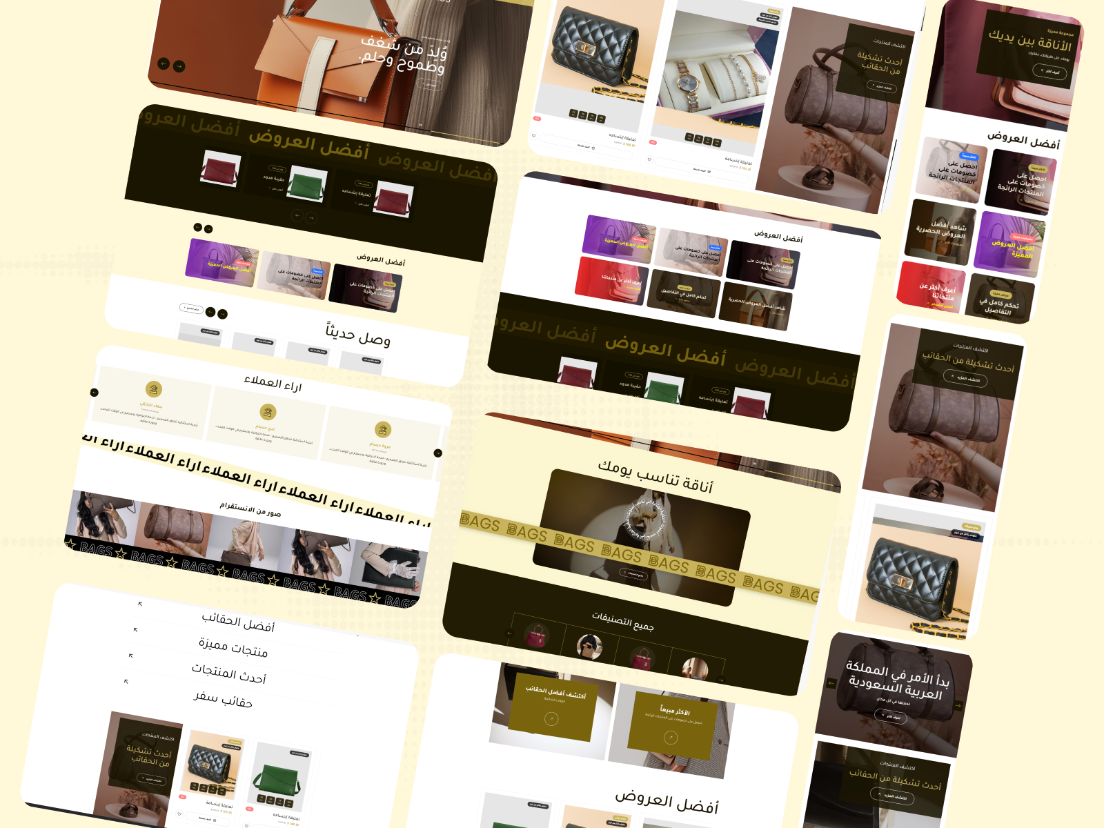
14 main sections
A complete set of ready-made sections to build a professional homepage
Unlimited customization
500+ settings for colors, fonts, spacing, and animation
High performance
Fast loading and optimized code for a smooth user experience
Alert bar + Popup
Built-in marketing tools for ads and promotional offers
Social media integration
Instagram feed display, direct links for every platform, and a floating WhatsApp button
Enhanced shopping experience
Side cart, suggestions display, and sticky product images on scroll
Theme user guide
General settings
The first group in the theme settings controls the core behaviors of the website, primary colors, and the appearance of internal pages. The settings are listed in the exact order they appear in the dashboard:
- Disable Right-Click
[checkbox]— Prevents visitors from opening the right-click menu (to protect images and content from direct copying). Enabled by default. - Show Loading Screen on Site Open
[checkbox]— Displays an elegant loader screen before content appears — improves the first impression for visitors. Enabled by default. - Hide Loading Screen Logo
[checkbox]— Hides the image/logo inside the loading screen (only the background + animation will appear). Enabled by default. - Loading Screen Logo
[image]— The image/logo displayed inside the loader (used only if the previous setting is disabled). - Loading Screen Background Color
[color]— The color of the loader itself — choose a color that matches your store's brand identity. - Hide Animated Line from Loading Screen
[checkbox]— Hides the line/animation inside the loader for a simpler experience. Enabled by default. - Site Text Color
[color]— The default color for all text in the store. - Site Background Color
[color]— The general background color for the entire site. - Button Background Color
[color]— The color of the primary buttons in the store (Add to Cart, Buy Now, etc.). - Button Text Color
[color]— The text color inside buttons — choose a high contrast with the background color for readability. - Site-wide Border Color
[color]— The default border color (cards, fields, tables). - Add Script at the End of Head
[textarea]— A place to add tracking codes (Google Analytics, Meta Pixel, TikTok Pixel) that require early loading. - Add Script at the End of Body
[textarea]— A place for chat widgets and external scripts to minimize their impact on loading speed. - Inner Pages Header Background Color
[color]— The breadcrumb background (the title bar at the top of the product/category/blog page). - Inner Pages Header Text Color
[color]— The breadcrumb text color when there is no background image. - Text Color with Background
[color]— The breadcrumb text color when a background image is present (used automatically when an image is uploaded). - Inner Pages Header Background
[image]— An optional background image that appears behind the breadcrumb (with an adjustable overlay). - Primary Product Color in Side Pages
[color]— The primary color used for the price, badges, and interaction icons inside the product page. - Open Cart Directly When Product is Added
[checkbox]— When enabled: the side cart opens immediately upon clicking "Add to Cart" — for a faster experience. Disabled by default. - Show "You May Also Like" Section on Cart Page
[checkbox]— Displays product suggestions inside the cart to increase the average order value. Enabled by default. - Show "You May Also Like" Section on Product Page
[checkbox]— Displays similar products at the bottom of the product page. Enabled by default. - Sticky Product Images on Scroll
[checkbox]— Keeps product images fixed on the side while the customer reads the description — a professional experience. Disabled by default.
An optional Banners section that appears inside category, product, and search pages to display promotional cards. The settings in order:
- Hide Section
[checkbox]— Completely disables the display of the banners section on internal pages. - Full Width Display
[checkbox]— Makes the section stretch to the full width of the browser. - Top Spacing - Desktop (px)
[select]— Empty space above the section on desktop. Options: 0 / 30 / 50 / 70 / 100. Default is 30. - Bottom Spacing - Desktop (px)
[select]— Empty space below the section on desktop. Same options. - Top Spacing - Mobile (px)
[select]— The mobile equivalent of top spacing. Options: 0 / 20 / 40 / 60. - Bottom Spacing - Mobile (px)
[select]— The mobile equivalent of bottom spacing. - Section Background Color
[color]— The background color of the section (used if no background image is uploaded). - Background Image
[image]— An optional background image for the section. - Background Overlay Color
[color]— The overlay color placed over the background image to improve content readability. Default is #000000. - Background Overlay Opacity
[select]— The opacity percentage of the overlay. Options: 0% / 10% / 30% / 50% / 70%. - Section Title (Optional)
[text]— A title that appears above the cards. Leave it empty to hide the title. - Title Color
[color]— The text color of the title. Default is #1a1502. - Title Alignment
[select]— The position of the title: Start (Right in RTL) / Center / End. - Display Method
[select]— Row — all cards are visible together, or Slider — navigate with arrows. - Number of Cards per Row - Desktop
[select]— 1 / 2 / 3 / 4. Default is 3. - Number of Cards per Row - Mobile
[select]— 1 / 2. Default is 1. - Card Height - Desktop (px)
[text]— The height of the card in pixels. Default is 300. - Card Height - Mobile (px)
[text]— The height of the card on mobile. Default is 240. - Autoplay
[checkbox]— Enables automatic slider navigation (if the display method is slider). - Show Arrows
[checkbox]— Show/hide navigation arrows. - Banners
[list]— A list of banner cards. Each card: image, title, subtitle, CTA button, link.
- Font Name
[select]— The default font for all store text. 8 options: Open Sans, Inter, Changa (default), Cairo, Amiri, Mada, Tajawal, Manrope.
A popup window that appears when the site is opened to display a promotional offer:
- Enable Popup
[checkbox]— Master switch to completely enable/disable the popup. Disabled by default. - Display Popup
[select]— Either display it on the homepage only, or across all store pages. - Loop Slider
[checkbox]— Makes the slides inside the popup return to the beginning after the last slide. - Autoplay
[checkbox]— Enables automatic navigation between slides. - Show Arrows
[checkbox]— Displays manual navigation arrows. - Hide on Mobile
[checkbox]— Hides the popup on mobile screens to avoid annoying visitors. Disabled by default. - Items
[list]— A list of slides. Each slide: image, title, text, button, link.
Customize the visual appearance of the scrollbar:
- Scrollbar Thumb Color
[color]— The color of the thumb (the moving part). - Scrollbar Track Color
[color]— The color of the track (the background). Default is #221c03. - Scrollbar Hover Color
[color]— The color of the thumb when hovered over.
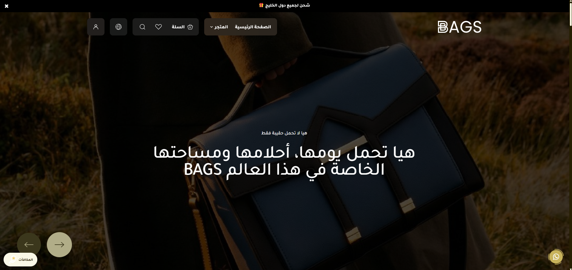
Header
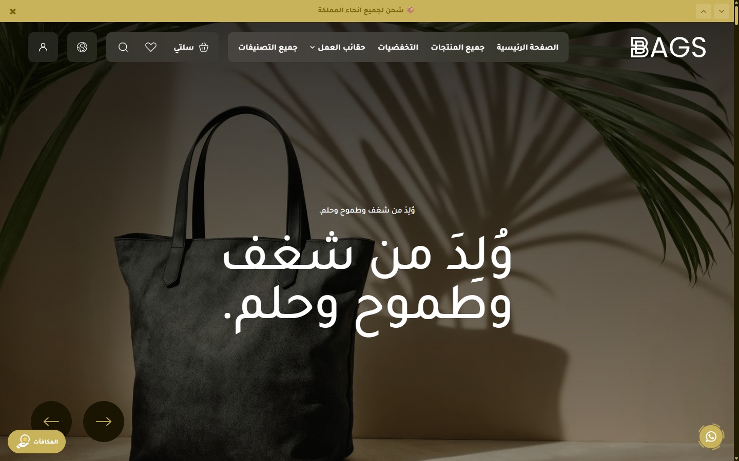
The Bags theme header contains 11 settings groups (over 60 options) to cover every possible scenario: separate logos for each direction and language, an announcement bar, a marquee, different styles for the homepage and inner pages, advanced sticky behavior, and a custom mobile menu.
- Full Width
[checkbox]— Stretches the header across the full width of the browser. Disabled by default (uses a boxed container). - Maximum Container Width (px)
[text]— The maximum width of the content inside the header. Default is 1320 (suitable for large screens).
- Logo
[image]— The main desktop logo (Arabic version). - Favicon
[image]— The small icon in the browser tab. - Mobile Logo
[image]— The mobile-optimized logo version (preferably simpler/smaller). - English Logo
[image]— The alternative logo when switching the language to English (desktop). - Mobile Logo (English)
[image]— The mobile version of the English logo. - Logo Height (px)
[text]— The height of the desktop logo. Default is 40. - Logo Width (px)
[text]— The width of the desktop logo. Default is 145. - Mobile Logo Height (px)
[text]— The height of the mobile logo. Default is 40. - Mobile Logo Width (px)
[text]— The width of the mobile logo. Default is 145.
A thin bar above the header to display rotating promotional messages:
- Show Announcement Bar
[checkbox]— Enable/disable the bar. Enabled by default. - Hide Close Button
[checkbox]— Prevents the user from closing the bar (for important messages). Disabled by default. - Bar Speed (ms)
[text]— The display duration of each message before transitioning to the next. Default is 5000ms (5 seconds). - Messages
[list]— The list of messages. Each message: text + link. - Background Color
[color]— The background color of the bar. Default is #000000. - Text Color
[color]— The text color of the messages. Default is #ffffff.
A horizontal scrolling marquee that appears below the header on inner pages (non-homepage):
- Show Marquee Below Header
[checkbox]— Displays the marquee on inner pages only. Enabled by default. - Text
[text]— The scrolling text. Default is "BAGS". - Show Default BAGS Logo with Text
[checkbox]— Places the Bag logo between text repetitions. Enabled by default. - Custom Logo (Replaces Default Logo)
[image]— Upload an SVG/PNG to replace the default logo. - Background Color
[color]— The color of the marquee bar. Default is #c8b35b (gold). - Text Color
[color]— The color of the scrolling text. Default is #1a1502. - Desktop Text Size (px)
[text]— The font size of the text. Default is 48. - Mobile Text Size (px)
[text]— The text size on mobile. Default is 28. - Scroll Speed (seconds)
[text]— Smaller = faster. Default is 30 seconds for a full loop.
Specific customization for the header appearance over the Hero Slider:
- Transparent Header Over Hero
[checkbox]— Makes the header transparent to blend with the top image. Enabled by default. - Header Shape
[select]— Pill / Full width. Default is pill. - Background Color (when overlay is disabled)
[color]— The fallback color when transparency is turned off. Default is #000000. - Text Color
[color]— The color of all header texts. Default is #ffffff. - Icons Color
[color]— The color of the search, cart, and account icons. Default is #ffffff. - Text Logo Color
[color]— The color of the logo if it is text-based. Default is #ffffff. - Inner Pills Background Color
[color]— The background color of the language/currency buttons. Default is rgba(255,255,255,0.1). - Border Color (search input)
[color]— The border color of the search field. Default is #ffffff.
Independent customization for the header appearance on inner pages:
- Header Shape
[select]— Pill / Full width. Default is full_width. - Background Color
[color]— The header color on inner pages. Default is #79640d. - Text Color
[color]— Default is #ffffff. - Icons Color
[color]— Default is #ffffff. - Text Logo Color
[color]— Default is #ffffff. - Inner Pills Background Color
[color]— Default is rgba(255,255,255,0.1). - Border Color (search input)
[color]— Default is #ffffff.
Header behavior when scrolling the page:
- Header Scroll Behavior
[select]— Always sticky / Hides on scroll down and shows on scroll up / Not sticky. Default is always sticky. - Header Shape on Scroll
[select]— Pill / Full width. Default is full_width. - Background Color on Scroll
[color]— Default is #000000. - Text Color on Scroll
[color]— Default is #ffffff. - Icons Color on Scroll
[color]— Default is #ffffff. - Text Logo Color on Scroll
[color]— Default is #ffffff. - Pills Background Color on Scroll
[color]— Default is rgba(255,255,255,0.1).
Footer
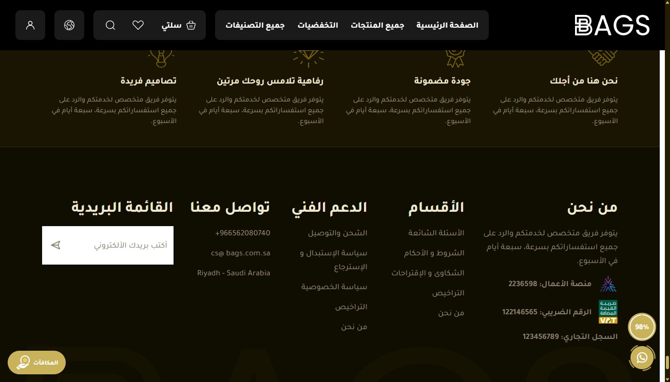
The Bags theme footer is designed to be a comprehensive information hub with 12 settings groups (over 70 options): features bar, about section, 3 link columns, newsletter, watermark, social media, bottom bar, WhatsApp button, back-to-top button, and finally, an independent 15-color palette.
- Full Width
[select]— No (1320px container) / Yes (full width). Default is "No".
The top bar of the footer displays your store's features (free shipping, warranty, etc.):
- Hide Features Bar
[checkbox]— Completely removes the features bar. - Full Width
[select]— No / Yes. Independent of the general footer setting. - Center Content (Icons and Text)
[checkbox]— Makes each feature center-aligned. Default is disabled. - Features
[list]— Each feature: icon, title, subtitle.
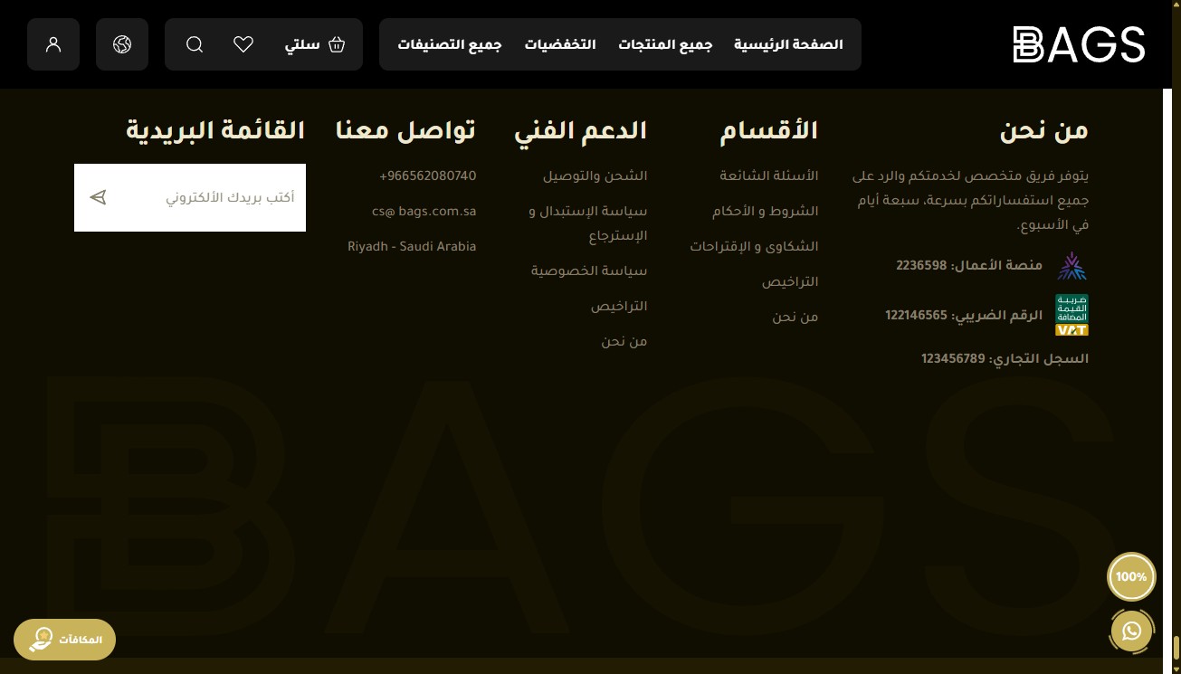
- Hide About Store Section
[checkbox]— Completely removes the about section. - Section Title
[text]— Default is "About US". - Text
[textarea]— A brief introductory paragraph about the store's story. - Business Platform Number
[text]— Displayed for credibility (official registration). - Tax Number
[text]— The facility's tax identification number. - Tax Certificate Link
[text]— Direct link to the tax certificate (for transparency and compliance). - Commercial Registration Number
[text]— The facility's commercial registration number. - iOS App ID
[text]— App Store ID to automatically display the App Store badge. - Android App ID
[text]— Play Store ID to display the Google Play badge.
- Hide
[checkbox]— Hides the first column. - Title
[text]— Column title. Default is "Categories". - Links
[list]— Each link: text + URL.
- Hide
[checkbox]— Hides the second column. - Title
[text]— Default is "Support". - Links
[list]— Same format as the first column.
- Hide
[checkbox]— Hides the third column. - Title
[text]— Default is "Contact". - Phone Number
[text]— Displayed with a phone icon. - Email
[text]— Displayed with an email icon (clickable). - Address
[textarea]— The physical address of the store (multi-line).
- Hide Newsletter
[checkbox]— Completely removes the newsletter section. - Section Title
[text]— Default is "Newsletter". - Email Field Text
[text]— Placeholder inside the email field. Default is "Enter your email". - Submit Button Text
[text]— Default is "Send". - Form Link
[text]— The Action URL for sending emails (Mailchimp / Klaviyo / etc.).
A large text or logo in the footer background — a premium visual touch:
- Show Watermark
[checkbox]— Enabled by default. - Text
[text]— The large text. Default is "BAGS". - Image (Replaces Text)
[image]— If you upload an image, it automatically replaces the text. - Watermark Color
[color]— Default is rgba(133,116,46,0.35) — a transparent color. - Watermark Size (%)
[number]— Percentage of the footer width. Default is 100.
- Hide Social Media
[checkbox]— Removes the social media section. - Instagram Link
[text]— — - Snapchat Link
[text]— — - TikTok Link
[text]— — - WhatsApp Number
[text]— In international format without + or 00. - Facebook Link
[text]— — - Twitter / X Link
[text]— —
- Hide Bottom Bar
[checkbox]— Completely removes the copyright bar. - Hide Payment and Shipping Icons
[checkbox]— Hides Mada/Visa/Mastercard and shipping company icons.
Floating elements in the corner. This is the group with the most settings in the footer:
- Show Back to Top Button
[checkbox]— Enabled by default. - Hide Back to Top Button on Mobile
[checkbox]— Disabled by default. - Back to Top Button Background Color
[color]— — - Back to Top Button Text Color
[color]— — - Back to Top Button Border Color
[color]— The border color. - WhatsApp Number
[text]— In international format. The WhatsApp button links directly to this number. - Show Chatbox
[checkbox]— A mock chatbox before redirecting to WhatsApp. Enabled by default. - Hide WhatsApp Button on Mobile
[checkbox]— — - Header and Footer Background Color
[color]— Colors for the chatbox sections. - Message Box Background Color
[color]— — - Messages Background Color
[color]— — - WhatsApp Icon Background Color
[color]— — - WhatsApp Icon Color
[color]— — - Circle Color
[color]— The color of the circular SVG around the button. - Chat Title
[text]— The title inside the chatbox. - Chat
Homepage components
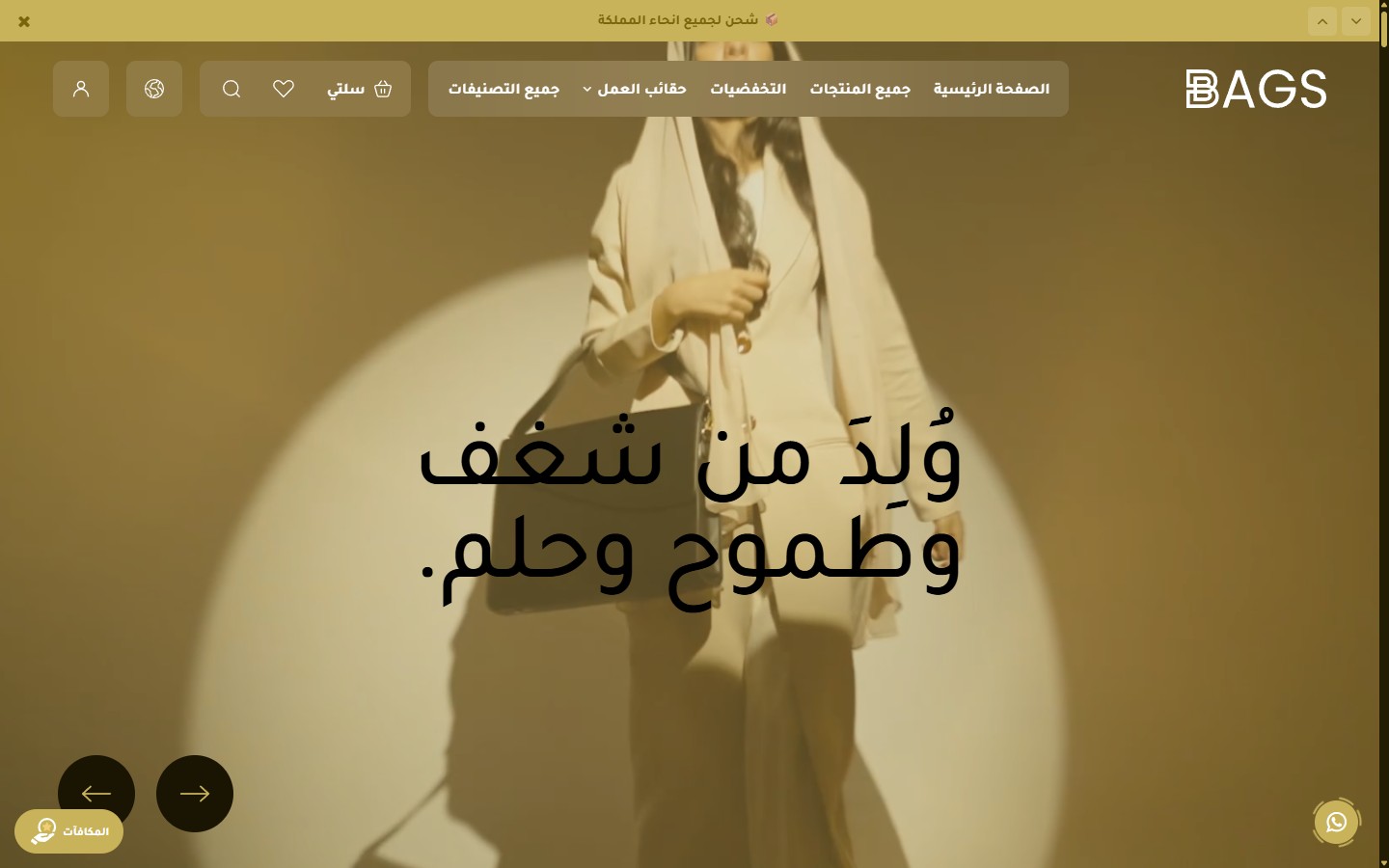
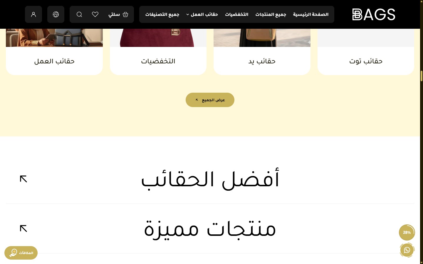
The first and most prominent section on the homepage:
- Hide Section
[checkbox]— Completely disables the slider. - Slider Height - Desktop
[select]— Full Screen / 90% / 80% / 70% / 950px (Default) / 850 / 750 / 650. - Slider Height - Mobile
[select]— Full Screen / 90vh / 80vh (Default) / 650 / 550 / 450 / 350. - Full Width Content
[checkbox]— Makes the content stretch across the full width. Disabled by default. - Autoplay
[checkbox]— Enabled by default. - Autoplay Speed (ms)
[text]— Default is 6000ms (6 seconds). - Infinite Loop
[checkbox]— Enabled by default. - Transition Speed (ms)
[text]— Duration of the transition between two slides. Default is 800ms. - Show Navigation Buttons (Arrows)
[checkbox]— Enabled by default. - Show Progress Bar and Slide Number
[checkbox]— Enabled by default. - Active Arrow Background Color
[color]— Default is #c8b35b. - Inactive Arrow Background Color
[color]— Default is #1a1502. - Arrow Icon Color
[color]— Default is #000000. - Progress Bar Color (Background)
[color]— Default is #000000. - Progress Bar Color (Active Part)
[color]— Default is #c8b35b. - Slide Number Color
[color]— Default is #ffffff. - Slides
[list]— Each slide: media type (image/video/YouTube), desktop and mobile images, overlay, main and sub-title, separate sizes, CTA buttons, links, content alignment.
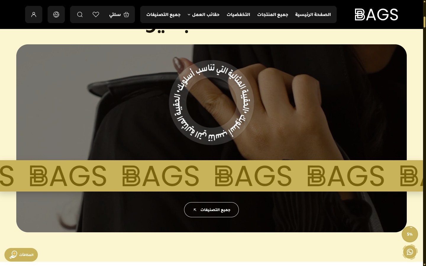
- Hide Section
[checkbox]— — - Top Spacing - Desktop
[select]— 0 / 50 / 100 (Default) / 150. - Bottom Spacing - Desktop
[select]— Same options. - Top Spacing - Mobile
[select]— 0 / 30 / 60 (Default). - Bottom Spacing - Mobile
[select]— 0 / 30 / 60 (Default). - Section Background Color
[color]— Default is #fcf6d0. - Section Background Image
[image]— — - Section Background Overlay Color
[color]— Default is #000000. - Section Background Overlay Opacity
[select]— 0% / 10% / 30% / 50% / 70%. - Title
[text]— Large main title. Default is "Elegance to suit your day". - Title Color
[color]— Default is #1a1502. - Title Size
[select]— 60 / 80 / 100 (Default) / 120 px. - Banner Background Type
[select]— Image / Video. - Banner Image - Desktop
[image]— — - Banner Image - Mobile
[image]— — - Video (File Upload)
[video]— — - YouTube Video Link
[text]— As an alternative to uploading a video. - Banner Overlay Color
[color]— Default is #000000. - Banner Overlay Opacity
[select]— 0% / 15% / 30% / 42% (Default) / 60% / 75%. - Circular Text
[text]— Text rotating around a point (with a • separator). Default is "The perfect bag for your style • ". - Circular Text Color
[color]— Default is #ffffff. - Circular Text Size
[select]— 20 / 24 / 28 (Default) / 32 / 36. - Circular Text Position - Vertical
[select]— Top / 29% (Default) / Top Center / Center. - Circular Text Position - Horizontal
[select]— Right / Center (Default) / Left. - Show Animated Marquee
[checkbox]— Additional marquee over the image. Enabled by default. - Additional Text Inside Marquee
[text]— — - Custom Logo Inside Marquee
[image]— — - Hide Default Logo
[checkbox]— — - Marquee Color
[color]— Default is #c8b35b. - Marquee Text Color
[color]— Default is #1a1502. - Marquee Speed
[select]— 8 options from crawling 120 seconds to lightning 6 seconds. - Marquee Font Size
[select]— 40 / 52 / 64 / 76. - Marquee Position Over Image
[select]— Center / 60% (Default) / Bottom Center / Near Bottom. - Show Button
[checkbox]— Enabled by default. - Button Text
[text]— Default is "All Categories". - Button Link
[url]— Default is /categories. - Button Text Color
[color]— Default is #ffffff. - Button Background Color
[color]— Default is transparent. - Button Border Color
[color]— Default is #ffffff. - Enable Scroll Reveal Animation
[checkbox]— — - Animation Type
[select]— 8 types: fade up/down, fade, zoom, slide, flip. - Animation Duration (ms)
[select]— 400 (Fast) / 600 / 800 (Default) / 1000 / 1400 (Slow).
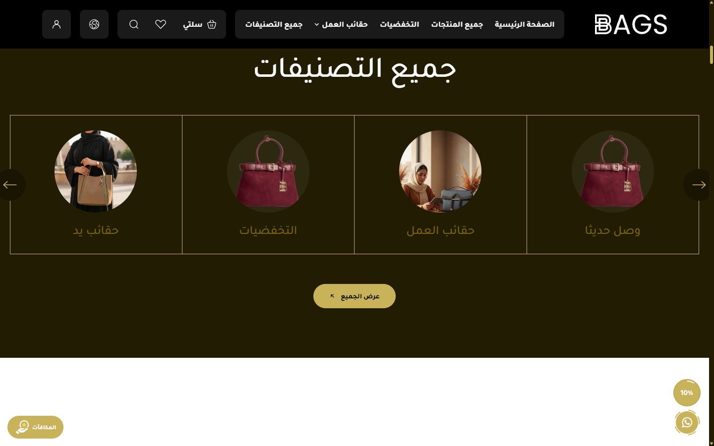
- Hide Section
[checkbox]— — - Full Width
[checkbox]— Enabled by default. - Top Spacing - Desktop
[select]— 0 / 30 / 60 / 100 (Default) / 150. - Bottom Spacing - Desktop
[select]— Same options. - Top Spacing - Mobile
[select]— 0 / 30 / 60 (Default). - Bottom Spacing - Mobile
[select]— 0 / 30 / 60 (Default). - Background Image
[image]— — - Background Overlay Color
[color]— — - Background Overlay Opacity
[select]— — - Design
[select]— Design 1 (Light Background) / Design 2 (Dark Background). Each design has independent colors and properties. - Background Color - Design 1
[color]— Default is #fff8d9 (Cream). - Background Color - Design 2
[color]— Default is #221c03 (Dark Brown). - Title
[text]— Default is "All Categories". - Title Color - Design 1
[color]— Default is #000000. - Title Color - Design 2
[color]— Default is #ffffff. - Title Size - Design 1
[select]— 60 / 80 / 100 (Default) / 120 px. - Title Size - Design 2
[select]— 40 / 50 / 60 (Default) / 80 px. - Card Color - Design 1
[color]— Default is #ffffff. - Active Card Color - Design 1
[color]— Default is #c8b35b (Gold). - Text Color - Design 1
[color]— Default is #161202. - Card Border - Design 2
[color]— Default is #c8b35b. - Active Card Color - Design 2
[color]— Default is #c8b35b. - Text Color - Design 2
[color]— Default is #79640d. - Categories per Row - Desktop
[select]— 3 / 4 (Default) / 5 / 6. - Categories per Row - Mobile
[select]— 1 / 2 (Default) / 3. - Display Style
[select]— Slider (Default) / Grid (Row). - Show Arrows
[checkbox]— Enabled by default. - Arrows Position - Design 1
[select]— Bottom Center (Default) / On Sides. - Arrows Position - Design 2
[select]— Bottom Center / On Sides (Default). - Active Arrow Color
[color]— Default is #c8b35b. - Inactive Arrow Color
[color]— Default is #1a1502. - Active Arrow Icon Color
[color]— Default is #000000. - Inactive Arrow Icon Color
[color]— Default is #c8b35b. - Show View All Button
[checkbox]— Enabled by default. - View All Button Text
[text]— Default is "View All". - View All Link
[url]— Default is /categories. - View All Button Background Color
[color]— Default is #c8b35b. - View All Button Text Color
[color]— Default is #000000. - Categories
[list]— Manual categories list. Each category: name, image, link. - Enable Scroll Reveal Animation
[checkbox]— — - Animation Type
[select]— 8 types available. - Animation Duration (ms)
[select]— 400 / 600 / 800 / 1000 / 1400.
- Hide Section
[checkbox]— — - Full Width
[checkbox]— — - Open First Tab by Default
[checkbox]— Keeps the first tab open when the page loads. - Top Spacing - Desktop
[select]— 0 / 30 / 60 (Default) / 100. - Bottom Spacing - Desktop
[select]— — - Top Spacing - Mobile
[select]— 0 / 30 (Default) / 60. - Bottom Spacing - Mobile
[select]— — - Section Background Color (Closed State)
[color]— Default is #ffffff. - Section Background Image
[image]— — - Background Overlay Color
[color]— — - Background Overlay Opacity
[select]— — - Tab Text Color (Closed)
[color]— Default is #000000. - Tabs Divider Color
[color]— Default is #efefef. - Text Hover Color
[color]— Default is #c8b35b. - Active Tab Background Color
[color]— Default is #1a1502. - Active Tab Text Color
[color]— Default is #c8b35b. - Open Content Background Color
[color]— Default is #1a1502. - Tab Text Size - Desktop
[select]— 40 / 48 / 60 / 72 / 80 (Default) / 100 px. - Tab Text Size - Mobile
[select]— 22 / 28 / 32 / 36 / 40. - Tab Height - Desktop
[select]— 100 / 120 / 140 / 168 (Default) / 200 px. - Tab Height - Mobile
[select]— 80 / 100 / 120 / 140 (Default) / 160. - Tab Font Weight
[select]— 400 (Regular - Default) / 500 / 600 / 700. - Open/Close Speed
[select]— 300ms (Fast) / 500 / 700 (Default) / 900 (Slow). - Products Displayed in Slider - Desktop
[select]— 2 (Default) / 3 / 4. - Products Displayed - Mobile
[select]— 1 (Default) / 2. - Show Slider Arrows
[checkbox]— Enabled by default. - Active Arrow Color
[color]— Default is #c8b35b. - Inactive Arrow Color
[color]— Default is #ffffff. - Arrow Icon Color
[color]— Default is #000000. - Show Corner Arrow (Link to Category)
[checkbox]— Corner arrow linking to the category. Enabled by default. - Show Find More Button
[checkbox]— Enabled by default. - More Button Text
[text]— — - Button Text Color
[color]— Default is #ffffff. - Button Border Color
[color]— Default is #ffffff. - Tabs
[list]— Each tab: title, products source (best_selling / newest / manual / category), number of products, "View All" link. - Enable Reveal Animation
[checkbox]— — - Animation Type
[select]— 8 types. - Animation Duration
[select]— 400 / 600 / 800 / 1000 / 1400.
- Hide Section
[checkbox]— — - Full Width
[checkbox]— — - Top/Bottom Spacing - Desktop
[select]— 0 / 30 / 60 / 100 (Default). - Top/Bottom Spacing - Mobile
[select]— 0 / 30 / 60 (Default). - Section Background Color
[color]— — - Section Background Image
[image]— — - Reverse Banner and Products Order
[checkbox]— Places the banner on the left instead of the right (or vice versa). - Banner Media Type
[select]— Image / Video from device / YouTube link. - Banner Image - Desktop
[image]— — - Banner Image - Mobile
[image]— — - Banner Video - Desktop
[video]— — - Banner Video - Mobile
[video]— — - YouTube Video Link
[text]— — - Overlay Color
[color]— Default is #1a1500. - Content Box Opacity
[select]— 85% / 90% / 95% / 100% (Default opaque). - Subtitle
[text]— Small text above the title. - Subtitle Color
[color]— Default is #ffffff. - Title
[textarea]— Large main title (multi-line). - Title Color
[color]— Default is #c8b35b (Gold). - Button Text
[text]— — - Button Link
[url]— — - Button Text Color
[color]— Default is #ffffff. - Button Border Color
[color]— Default is #ffffff. - Products Display Style
[select]— Grid (with sticky banner) / Slider. - Show Slider Arrows
[checkbox]— Enabled by default. - Slider Autoplay
[checkbox]— Enabled by default. - Select Products List
[products]— Manually select products from the store. - Number of Displayed Products
[select]— All Products / 2 / 4 / 6 / 8 / 10 / 12. - Enable Reveal Animation
[checkbox]— — - Animation Type
[select]— 8 types. - Animation Duration
[select]— 5 options.
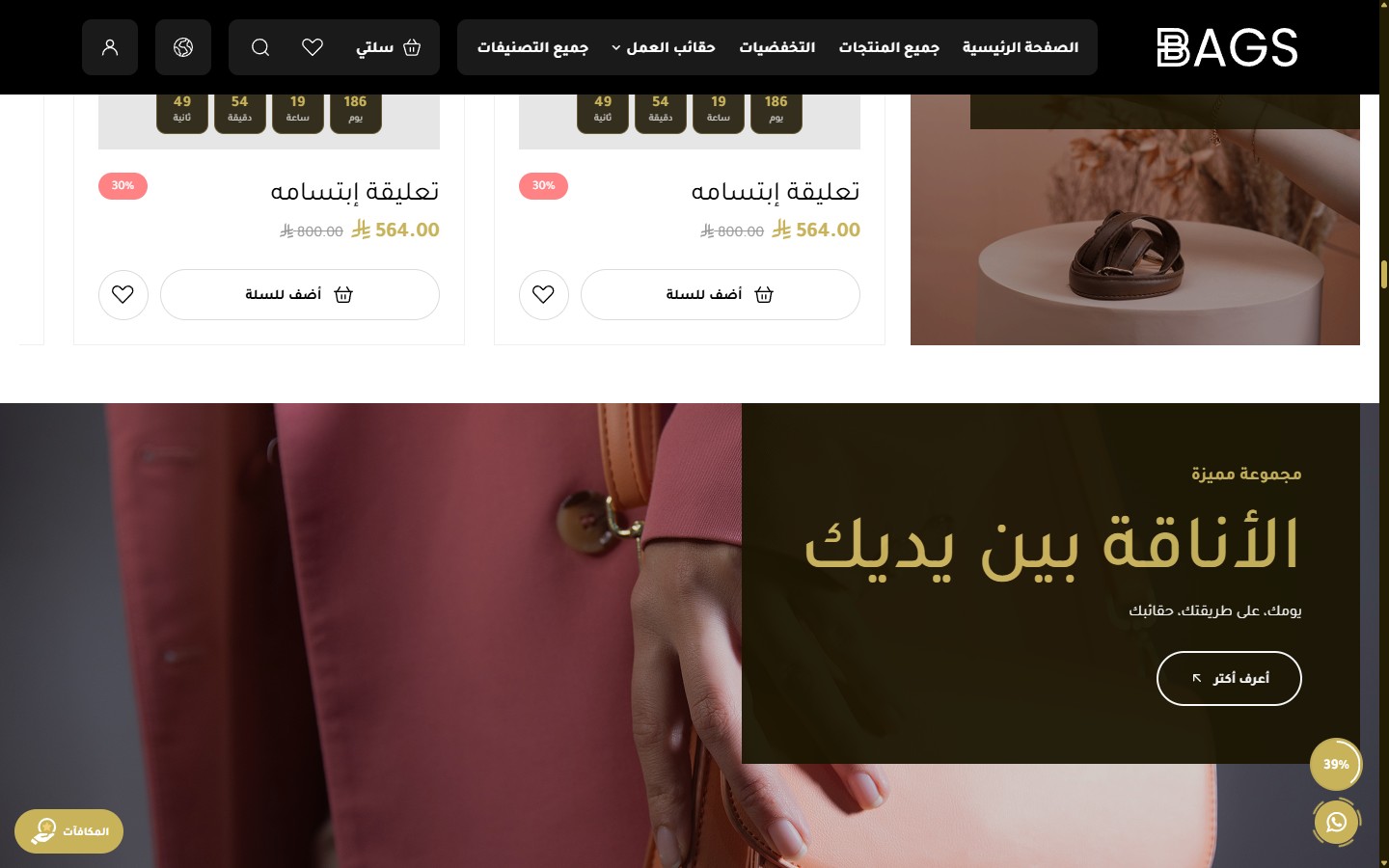
- Hide Section
[checkbox]— — - Full Width
[checkbox]—
Related themes
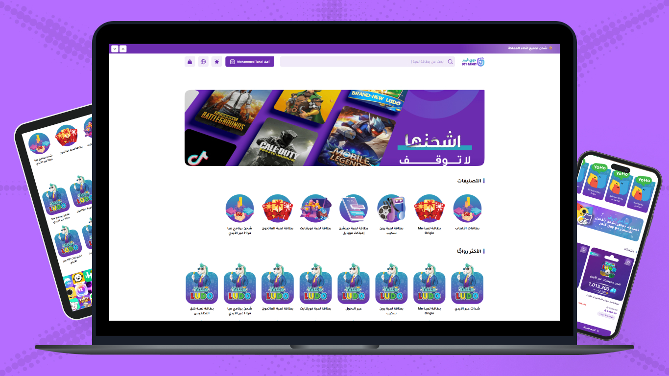
Joygames
A professional theme for digital game card and virtual product stores — 4 category designs with dynamic pricing
Need help choosing the right theme?
Our team is ready to help you pick and customize the theme that's right for your store
Contact us