Joygames
JoyGames is a professional theme designed specifically for digital game card and virtual product stores. It features 4 distinct visual designs for categories, a powerful hero slider, a flexible products section (grid or slider), and an elegant testimonials section. Designed in a style that combines vitality and clarity to professionally showcase the identity of digital game stores.
Theme features
Designed for game stores
A professional design tailored for game cards and digital products
Fully responsive
A seamless experience on every screen size — separate desktop and mobile settings
4 category designs
Four visual styles for categories (circle, square, rectangle, background image) for engaging variety
High performance
Fast loading and optimized code for a smooth user experience
Full customization
240+ settings for colors, spacing, designs, and animation
Alert bar + Popup
Built-in marketing tools with 3 animation styles (vertical scroll, marquee, flash)
Mobile app support
Ready-made iOS and Android app buttons in the footer
Flexible testimonials section
Display 2–6 columns, grid or slider, with full color customization
Theme user guide
General settings
The first group covers the visual identity of the website, the loading screen, and the behavior of the cart and internal pages. The settings in order are:
- Favicon
[image]— The small icon that appears in the browser tab and bookmarks. - Disable Right-Click
[checkbox]— Prevents visitors from opening the right-click context menu (to protect content and images). Enabled by default. - Show Loading Screen on Site Load
[checkbox]— Displays an elegant loader screen before the content loads. Enabled by default. - Loading Screen Logo
[image]— The image displayed inside the loader. By default, it uses the store logo. - Loading Screen Background Color
[color]— The color that appears behind the loader during loading. - Hide Animated Line from Loading Screen
[checkbox]— Hides the animation line inside the loader for a simpler experience. Disabled by default. - Site Text Color
[color]— The default color for all text in the store. - Site Background Color
[color]— The general background color for the entire site. - Button Background Color
[color]— The color of primary buttons (Add to Cart, Buy Now, etc.). - Button Text Color
[color]— The text color inside buttons. Choose a high contrast with the background color for comfortable reading. - Site-wide Border Color
[color]— The default border color (for cards, fields, tables). - Add Script to End of Head
[textarea]— The place to add tracking codes (Google Analytics, Meta Pixel, TikTok Pixel) that require early loading. - Add Script to End of Body
[textarea]— For Live Chat codes and external widgets to minimize their impact on loading speed. - Payment Method Images
[list]— A list of supported payment method icons (Mada, Visa, Mastercard, Apple Pay…). Each icon: image + name. - Hide Countdown Timer on Product Cards (Inner Pages)
[checkbox]— Hides the offer countdown timer on category and search pages. Disabled by default. - Hide Badges on Product Cards (Inner Pages)
[checkbox]— Hides "New / Discount / Featured" badges on inner pages. Disabled by default. - Open Cart Directly When Item is Added
[checkbox]— When enabled: the side cart opens immediately upon clicking "Add to Cart" for a faster shopping experience. Disabled by default.
- Font Name
[select]— The default font for all store text. 8 options: Open Sans, Inter, Changa (default), Cairo, Amiri, Mada, Tajawal, Almarai.
A pop-up window that appears when opening the site to display a promotional offer:
- Enable Pop-up
[checkbox]— Master switch to enable/disable the PopUp entirely. Disabled by default. - Pop-up Display
[select]— Show on the homepage only / on all store pages. - Hide on Mobile
[checkbox]— Hides the PopUp on mobile screens to avoid annoying visitors. Disabled by default. - Loop Slider
[checkbox]— Makes the slides inside the window return to the beginning after the last slide. Enabled by default. - Autoplay
[checkbox]— Enables automatic transition between slides. Enabled by default. - Autoplay Speed (ms)
[number]— The transition duration between slides. Default is 5000ms. - Show Arrows
[checkbox]— Displays manual navigation arrows. Enabled by default. - Show Dots
[checkbox]— Displays navigation dots at the bottom of the window. Enabled by default. - Slides
[list]— List of slides. Each slide: image, title, text, button, link.
An ad slider that appears inside category pages to draw attention to specific offers:
- Hide Ad
[checkbox]— Completely removes the slider from category pages. - Full Width (Unboxed)
[checkbox]— Makes the section stretch across the full width of the screen. - Section Top Padding
[select]— Default value / 0 / 10 / 20 / 30 / 40 / 50 / 60 px. Default is 30. - Section Bottom Padding
[select]— Same options. Default is 30. - Section Top Padding on Mobile
[select]— Same as desktop value / 0-60 px. - Section Bottom Padding on Mobile
[select]— Same as desktop value / 0-60 px. - Loop Slider
[checkbox]— Makes the slides return to the beginning after the last slide. - Autoplay
[checkbox]— Enabled by default. - Autoplay Speed (ms)
[number]— Default is 5000. - Fade Effect Between Slides
[checkbox]— Instead of sliding, the content fades from one slide to another. - Number of Slides on Screen (Desktop)
[select]— One slide (default) / Two slides. - Show Arrows
[checkbox]— Enabled by default. - Show Dots
[checkbox]— Enabled by default. - Dots and Arrows Color
[color]— A unified color for navigation arrows and dots. - Ads
[list]— List of slides. Each slide: image, title, text, button, link.
Settings for the categories section inside the main category page (not the homepage):
- Hide Internal Categories Section
[checkbox]— Removes the display of the categories section on category pages. - Full Width (Unboxed)
[checkbox]— Makes the section stretch across the full width of the screen. - Section Top Padding
[select]— Default value / 0-60 px. Default is 30. - Section Bottom Padding
[select]— Same options. Default is 30. - Section Top Padding on Mobile
[select]— Same as desktop value / 0-60. - Section Bottom Padding on Mobile
[select]— Same as desktop value / 0-60. - Hide Section Title
[checkbox]— Removes the "Categories" title above the section. - Category Title Color
[color]— The text color of the title. - Card Design
[select]— Design 1 (Circular) / Design 2 (Square with title below) / Design 3 (Rectangular with title inside) / Design 4 (Rectangular with primary color background and button). Default is Design 1. - Second Level Card Design (Subcategories)
[select]— Either "Use the same primary design" or an independent Design 1-4. - Third Level Card Design
[select]— Categories within internal categories. Same options as the second level. - Display Type (Desktop)
[select]— Grid / Slider. - Show Arrows (for Slider)
[checkbox]— Enabled by default. - Show Dots (for Slider)
[checkbox]— — - Autoplay (for Slider)
[checkbox]— — - Autoplay Speed (ms)
[number]— Default is 5000.
- Show Back to Top Button
[checkbox]— Enabled by default. - Back to Top Button Background Color
[color]— — - Back to Top Button Text Color
[color]— — - Back to Top Button Border Color
[color]— The border color.
Customize the visual appearance of the Scrollbar:
- Scrollbar Thumb Color
[color]— The color of the Thumb (the moving part). - Scrollbar Track Color
[color]— The color of the Track (the background). - Scrollbar Hover Color
[color]— The color of the Thumb when hovered over.
Header
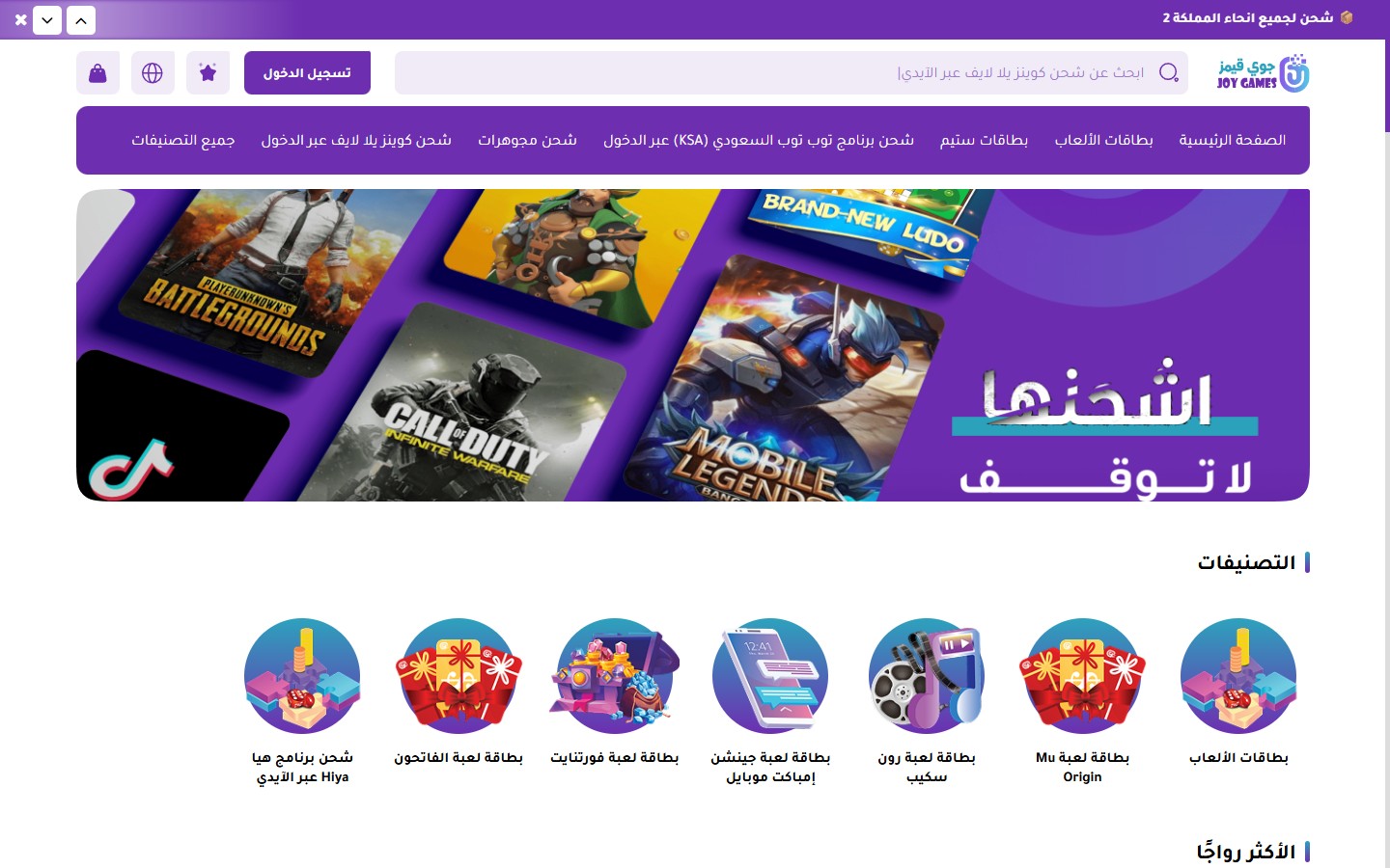
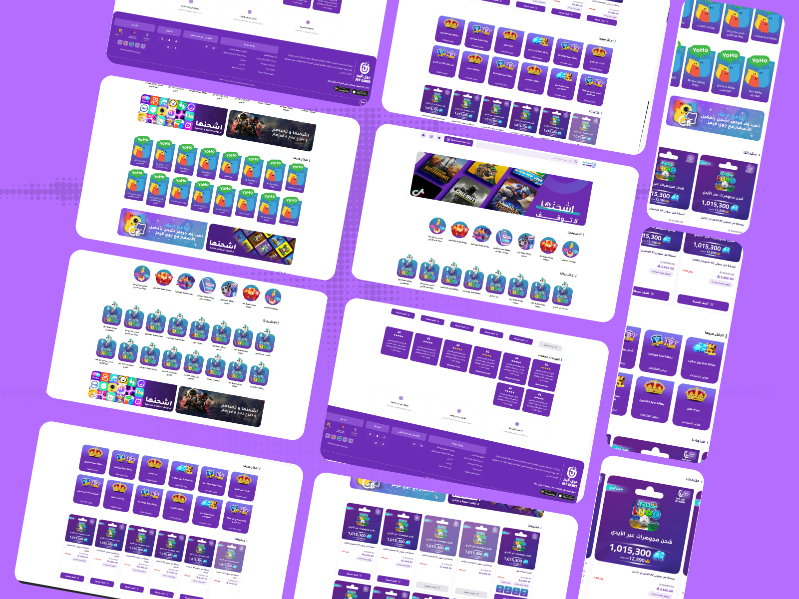
The JoyGames theme header is designed with simplicity and elegance — it features a top announcement bar, logo, large search bar, cart, account, and language icons, along with a row of featured categories as quick-access buttons.
- Full Width
[checkbox]— Stretches the header across the full width of the browser. Disabled by default. - Hide Cart Button on the Left
Footer

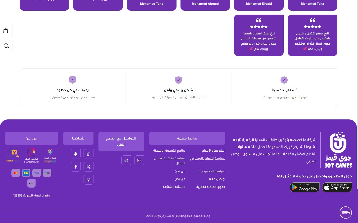
The JoyGames theme footer gathers all important information: a features bar (3 features), store brief with app links, an important links column, technical support contact, social media networks, partner logos, payment methods, commercial license number, and finally the copyright bar.
Ultimate control over all footer colors:
- Full Width
[checkbox]— Disabled by default (footer is inside a boxed container). - Footer Background Color
[color]— Default is #6B2DB5 (Purple). - Card Title Background Color
[color]— The title bar color for each footer card. Default is #8A52D0. - Dividers Color
[color]— The color of the separator lines. Default is #C5ABDF. - Text Color
[color]— Default is #ffffff. - Links Color
[color]— Default is #ffffff. - Links Hover Color
[color]— The color of links when hovered over. Default is #E2D5EF. - Payment Methods Row Background Color
[color]— Default is #E2D5EF80 (Transparent).
- Hide Section
[checkbox]— Completely removes the "About Us" column. - Footer Logo
[image]— The large logo displayed in the footer (usually a light version). - Store Description
[textarea]— An introductory paragraph about the store. - Download App Text
[text]— The title above the app buttons. Default is "Download the app and get an unparalleled experience". - Google Play Link
[url]— Android app link — displays the "Get it on Google Play" button. - App Store Link
[url]— iOS app link — displays the "Download on the App Store" button.
- Hide Section
[checkbox]— — - Title
[text]— Default is "Important Links". - Links (Displayed in two columns)
[list]— Each link: text + URL. The list is displayed in two columns to save space.
- Hide Section
[checkbox]— — - Title
[text]— Default is "Technical Support Contact". - Email
[text]— Displayed with an email icon, clickable. - WhatsApp Number
[text]— In international format without + or 00 (e.g., 966501234567).
Homepage components
The first and most prominent section on the homepage. It supports multiple slides with images, headings, and buttons, along with autoplay and navigation arrows:
- Hide Section
[checkbox]— Completely disables the slider. - Full Width (Unboxed)
[checkbox]— Makes the slider stretch across the entire screen width. - Section Top Padding
[select]— Default value / 0 / 10 / 20 / 30 / 40 / 50 / 60 px. Default is 50. - Section Bottom Padding
[select]— Same options. Default is 50. - Mobile Section Top Padding
[select]— Same as desktop / 0-60. - Mobile Section Bottom Padding
[select]— Same as desktop / 0-60. - Infinite Loop
[checkbox]— Makes the slides loop back to the beginning. Enabled by default. - Autoplay
[checkbox]— Enabled by default. - Autoplay Speed (ms)
[number]— Duration each slide is displayed. Default is 5000ms. - Fade Transition
[checkbox]— Content fades instead of sliding. - Slides Per View (Desktop)
[select]— One slide (default) / Two slides. - Show Arrows
[checkbox]— Enabled by default. - Show Dots
[checkbox]— Enabled by default. - Hide Dots on Mobile
[checkbox]— Cleans up the interface on small screens. - Dots and Arrows Color
[color]— Unified color for navigation arrows and dots. - Default Text Color
[color]— Text color inside slides (if the slide doesn't define its own color). - Default Heading Color
[color]— Main heading color inside slides. - Default Button Background Color
[color]— CTA button color inside slides. - Minimum Slide Height on Mobile (px)
[number]— Ensures the slide doesn't become too short on mobile devices. - Slides
[list]— Each slide: image, heading, subheading, button text, button link, independent colors.
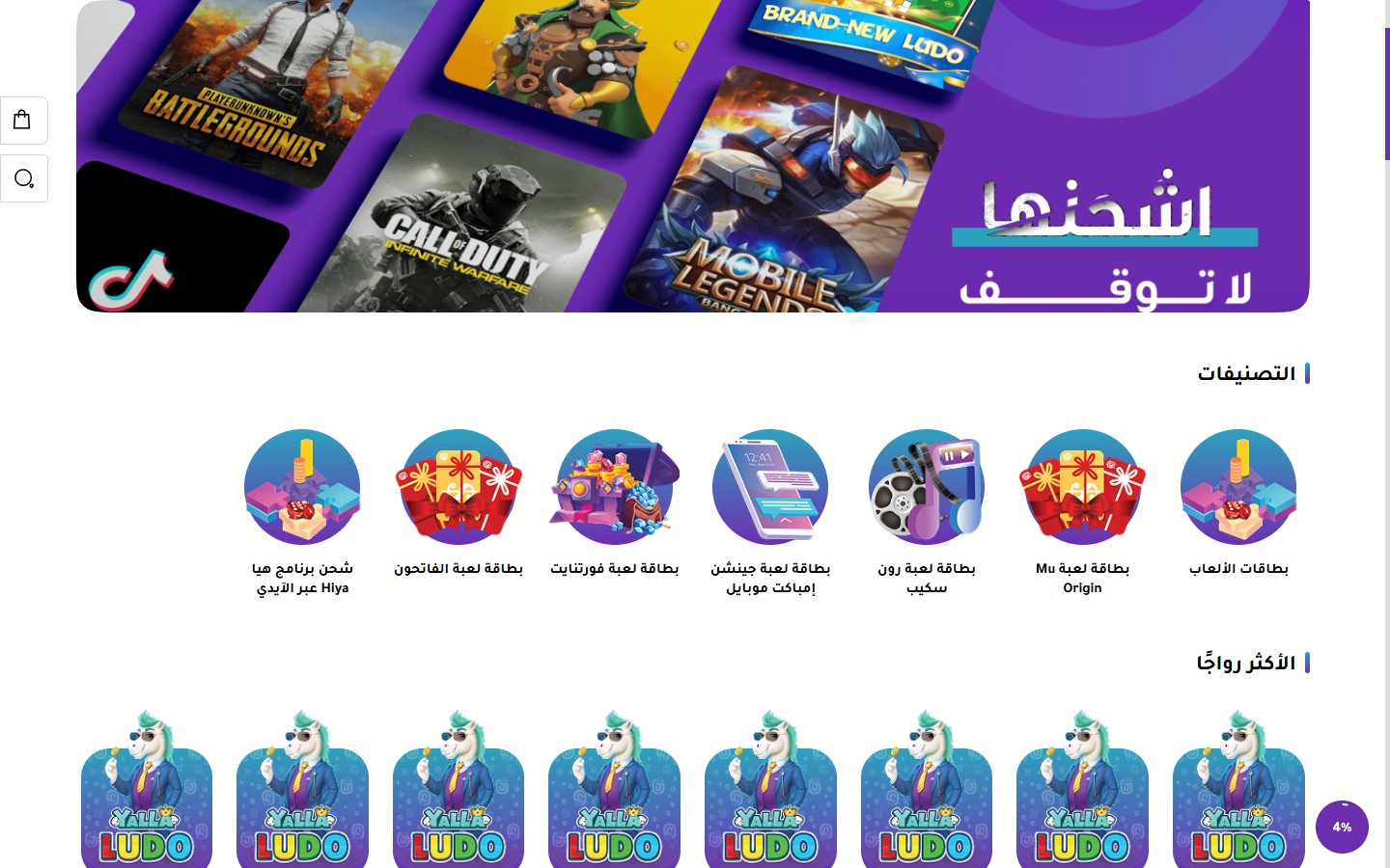
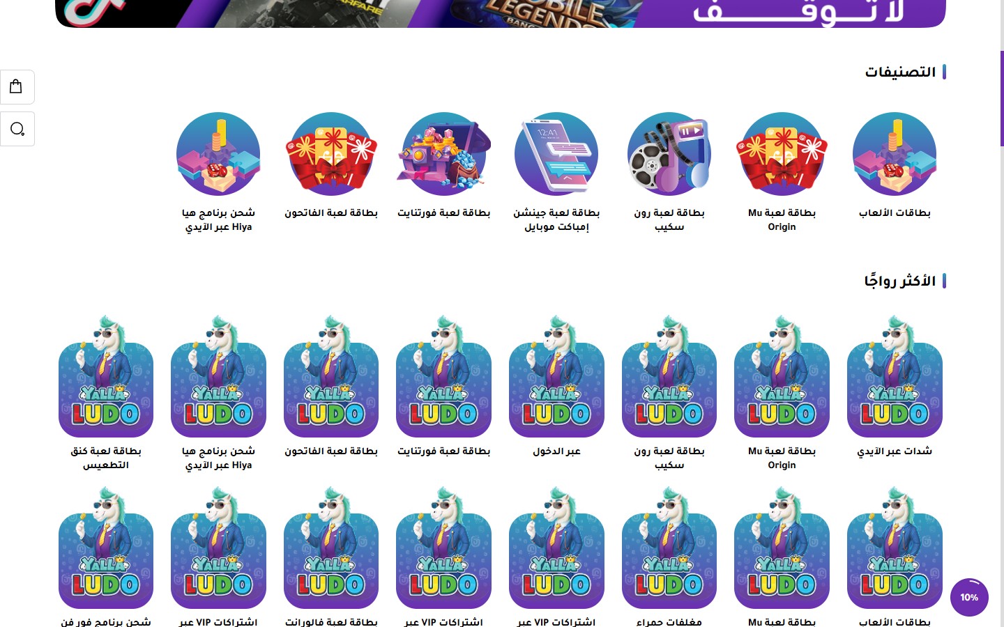
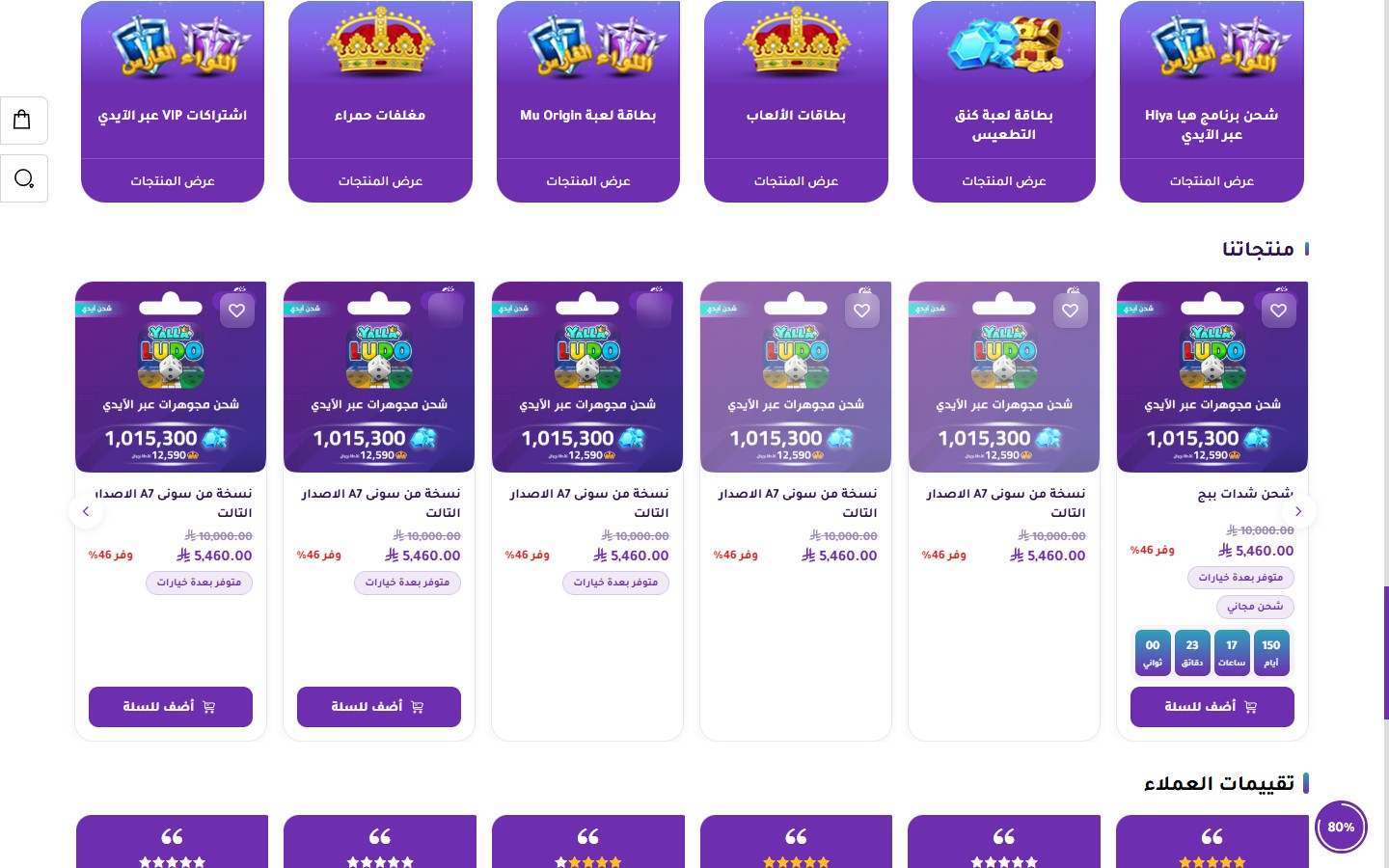
The most powerful section in the theme — it supports 4 different visual designs for categories. The theme itself uses all 4 designs consecutively on the homepage to create a varied visual rhythm.
Design 1 (Circular): Circular categories — perfect for sections with icons
Design 2 (Square with Heading Below): Square images with the heading underneath — classic and elegant
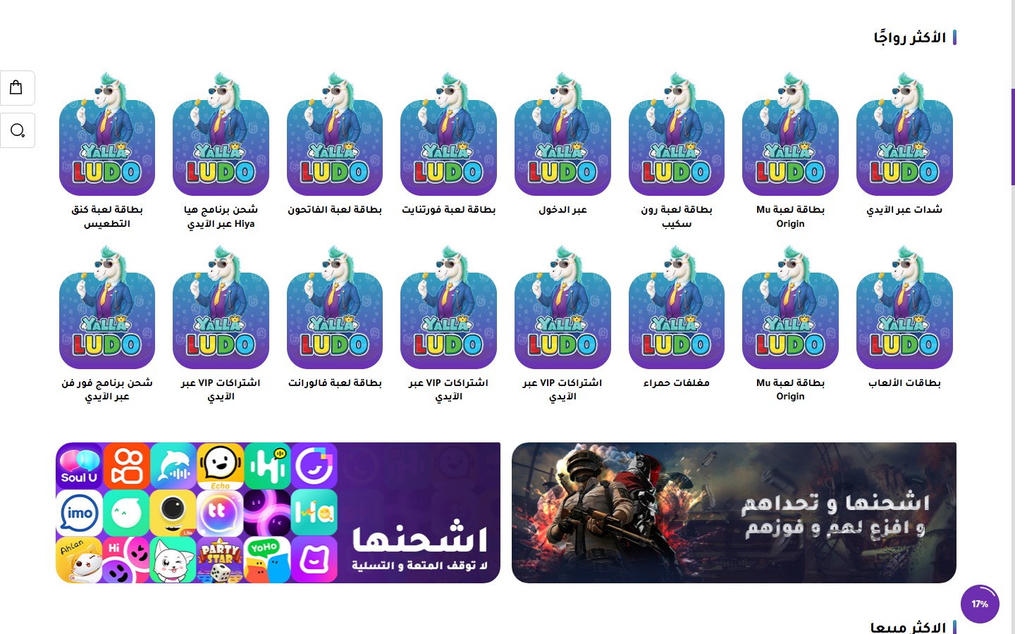
Design 3 (Rectangular with Heading Inside): Cards with large images and the heading appearing over the image
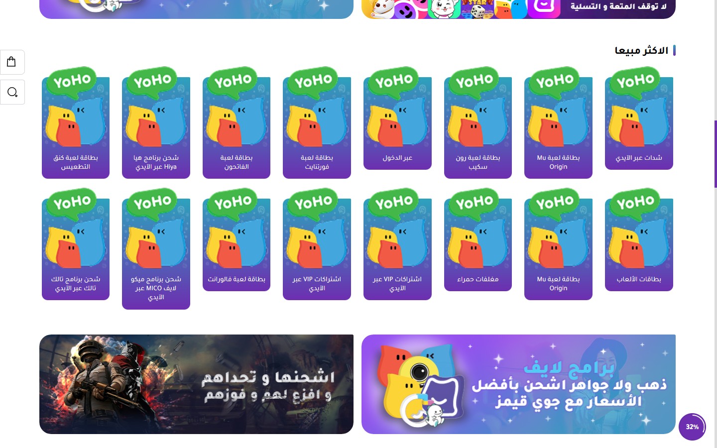
Design 4 (Rectangular with Primary Color Background and Button): Distinctive cards with a "Discover" button
All Settings (26 Settings):
- Hide Section
[checkbox]— — - Full Width (Unboxed)
[checkbox]— — - Section Top Padding
[select]— 0 / 10 / 20 / 30 / 40 / 50 (default) / 60 px. - Section Bottom Padding
[select]— Same options. - Mobile Section Top Padding
[select]— Same as desktop / 0-60. - Mobile Section Bottom Padding
[select]— Same as desktop / 0-60. - Section Heading
[text]— Default is "Trending". - Hide Section Heading
[checkbox]— Removes the heading (useful if the section is visually independent). - Center Heading
[checkbox]— Centers the heading horizontally. - Section Description
[textarea]— Subtext appearing below the heading. - Section Description Color
[color]— Description text color. - Section Background Color
[color]— — - Hide Navigation Arrows
[checkbox]— — - Hide Category Names
[checkbox]— Displays only images without headings. - Show "View More" Button
[checkbox]— Displays a CTA button below the section. Disabled by default. - "View More" Button Text
[text]— e.g., "View All Categories". - "View More" Button Text Color
[color]— — - "View More" Button Border Color
[color]— — - Card Design
[select]— Design 1 (Circular) / Design 2 (Square with Heading Below) / Design 3 (Rectangular with Heading Inside) / Design 4 (With Background and Button). - Display Type (Desktop)
[select]— Grid / Slider. - Category Heading Color
[color]— — - Show Arrows (for Slider)
[checkbox]— Enabled by default. - Show Dots (for Slider)
[checkbox]— — - Autoplay (for Slider)
[checkbox]— — - Autoplay Speed (ms)
[number]— Default is 5000. - Categories
[list]— Manual categories list. Each category: name, image, link.
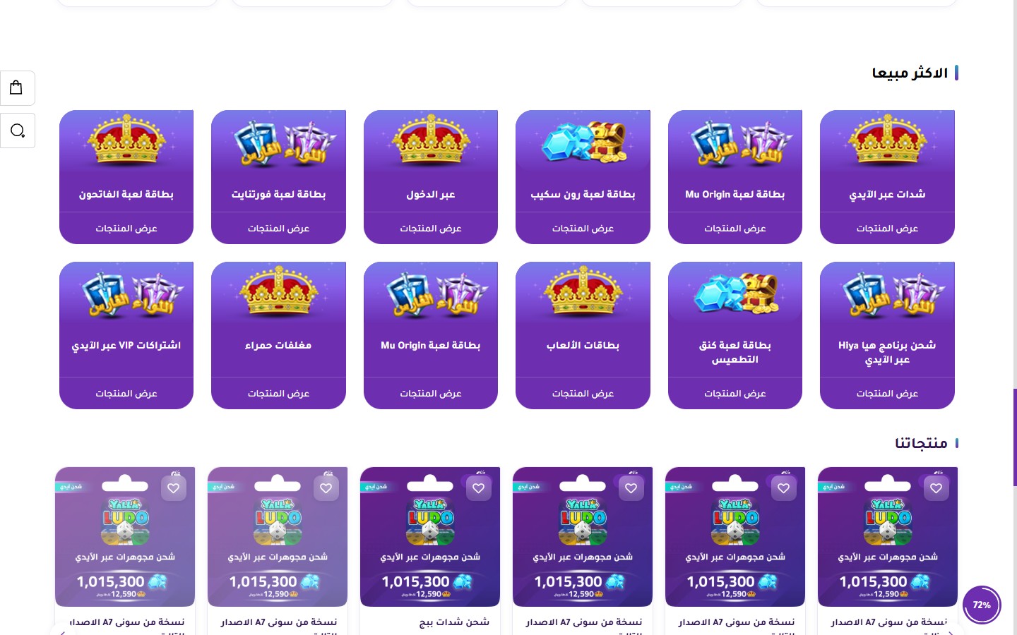
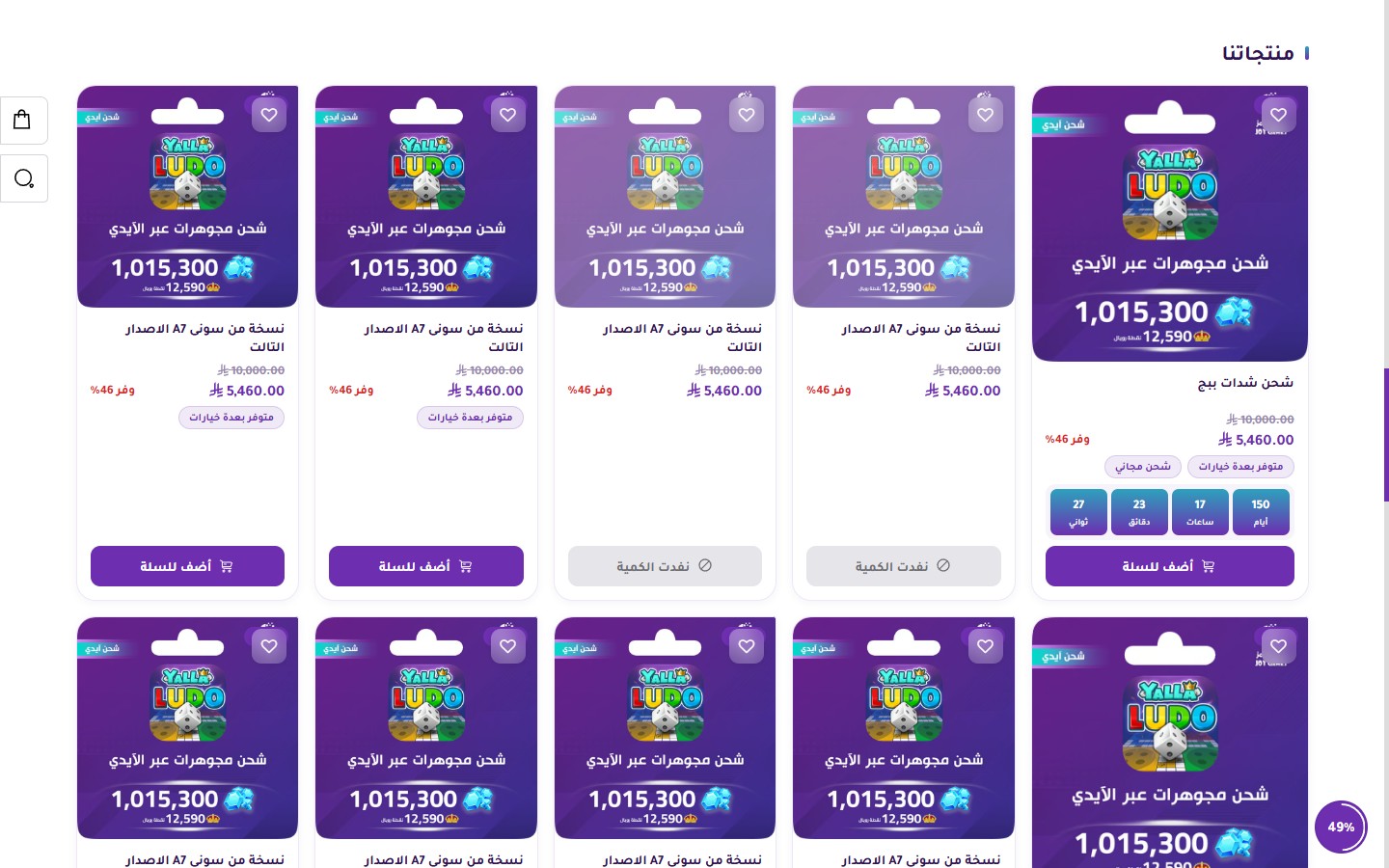
A main section for displaying products. It supports Grid or Slider layouts, an optional section banner, a countdown timer, and custom badges:
- Hide Section
[checkbox]— — - Full Width (Unboxed)
[checkbox]— — - Section Top Padding
[select]— 0 / 10 / 20 / 30 / 40 / 50 (default) / 60 px. - Section Bottom Padding
[select]— Same options. - Mobile Section Top Padding
[select]— Same as desktop / 0-60. - Mobile Section Bottom Padding
[select]— Same as desktop / 0-60. - Section Heading
[text]— Default is "Our Products". - Hide Section Heading
[checkbox]— — - Section Heading Color
[color]— — - Center Section Heading
[checkbox]— — - Section Description
[textarea]— Subtext below the heading. - Section Description Color
[color]— — - Section Background Color
[color]— — - Section Banner
[image]— A banner image displayed next to the products (for featured display). - Section Banner Link
[url]— The URL redirected to when the banner is clicked. - Select Products List
[products]— Manually select products from the store. - Number of Products Displayed
[number]— 0 = Show all. Default is 8. - "View More" Button Text
[text]— e.g., "View All Products". - "View More" Button Text Color
[color]— — - "View More" Button Border Color
[color]— — - Show "View More" Button
[checkbox]— Disabled by default. - Display Type (Desktop)
[select]— Grid / Slider (default). - Number of Columns per Row (Desktop)
[select]— 2 / 3 / 4 (default) / 5 / 6. - Show Arrows (for Slider)
[checkbox]— Enabled by default. - Show Dots (for Slider)
[checkbox]— — - Autoplay (for Slider)
[checkbox]— — - Autoplay Speed (ms)
[number]— Default is 5000. - Infinite Loop
[checkbox]— Enabled by default. - Hide Countdown Timer in Product Cards
[checkbox]— Specifically for cards in this section. Disabled by default. - Hide Badges in Product Cards
[checkbox]— Hides "New / Featured / Sale" badges. Disabled by default.
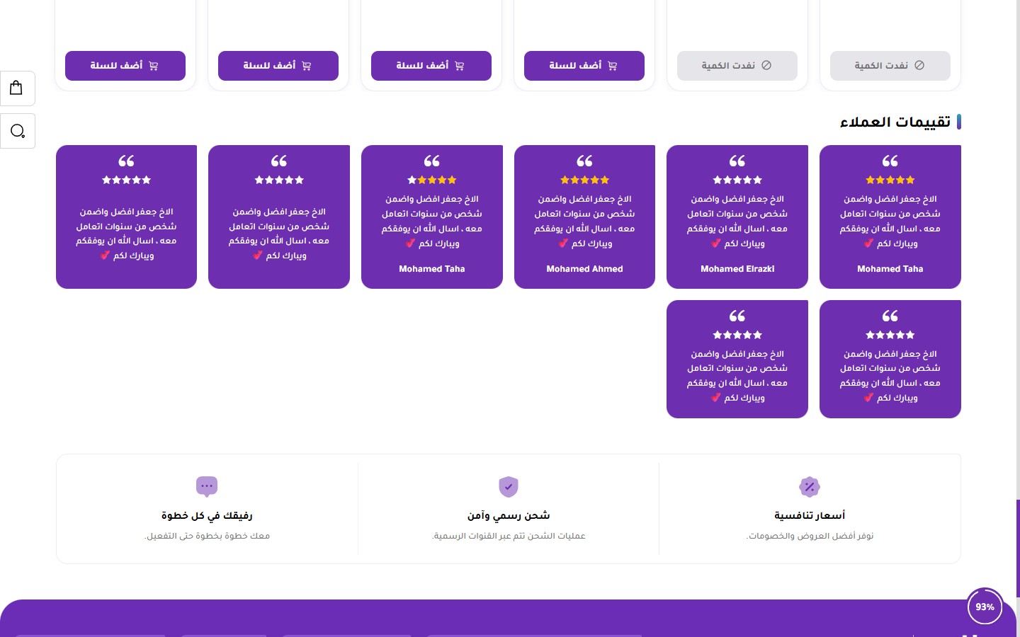
A section to display customer reviews and ratings in an attractive way that builds trust:
- Hide Section
[checkbox]— — - Full Width (Unboxed)
[checkbox]— — - Section Top Padding
[select]— 0 / 10 / 20 / 30 / 40 / 50 (default) / 60 px. - Section Bottom Padding
[select]— Same options. - Mobile Section Top Padding
[select]— Same as desktop / 0-60. - Mobile Section Bottom Padding
[select]— Same as desktop / 0-60. - Section Heading
[text]— Default is "Customer Reviews". - Hide Section Heading
[checkbox]— — - Section Heading Color
[color]— — - Section Description
[textarea]— Subtext below the heading. - Heading Alignment
[select]— Start (default) / Center / End. - Section Background Color
[color]— — - Star and Quote Icon Color
[color]— Color of rating icons and quotation marks. - Controls Color
[color]— Color of navigation arrows and dots. - Display Type (Desktop)
[select]— Grid / Slider. - Number of Columns per Row
[select]— 2 / 3 / 4 / 5 / 6 (default). - Show Arrows (for Slider)
[checkbox]— Enabled by default. - Show Dots (for Slider)
[checkbox]— — - Autoplay (for Slider)
[checkbox]— — - Autoplay Speed (ms)
[number]— Default is 5000. - Customer Reviews
[list]— Each review: customer name, text (customer review), star rating 1-5.
A section to display store features (free shipping, security, competitive prices, etc.) as icons with text. The theme places this section right before the footer:
- Hide Section
[checkbox]— — - Full Width
[checkbox]— — - Section Top Padding
[select]— 0-60 px. Default is 50. - Section Bottom Padding
[select]— Same options. - Mobile Section Top Padding
[select]— Same as desktop / 0-60. - Mobile Section Bottom Padding
[select]— Same as desktop / 0-60. - Section Heading
[text]— — - Hide Section Heading
[checkbox]— — - Main Section Heading Color
[color]— — - Section Description
[textarea]— — - Section Background Color
[color]— — - Default Features Text Color
[color]— — - Feature Heading Color
[color]— Heading color for each feature (e.g., "Competitive Prices"). - Feature Description Color
[color]— Subtext color below each heading. - Feature Card Background Color
[color]— — - Layout Direction
[select]— Horizontal (default) / Vertical. - Heading Alignment
[select]— Start / Center (default) / End. - Features
[list]— List of features. Each feature: icon, heading, description.
Related themes

BAGS
A luxury theme designed exclusively for a high-end bags store — modern elegance and unlimited customization
Need help choosing the right theme?
Our team is ready to help you pick and customize the theme that's right for your store
Contact us