



Theme features
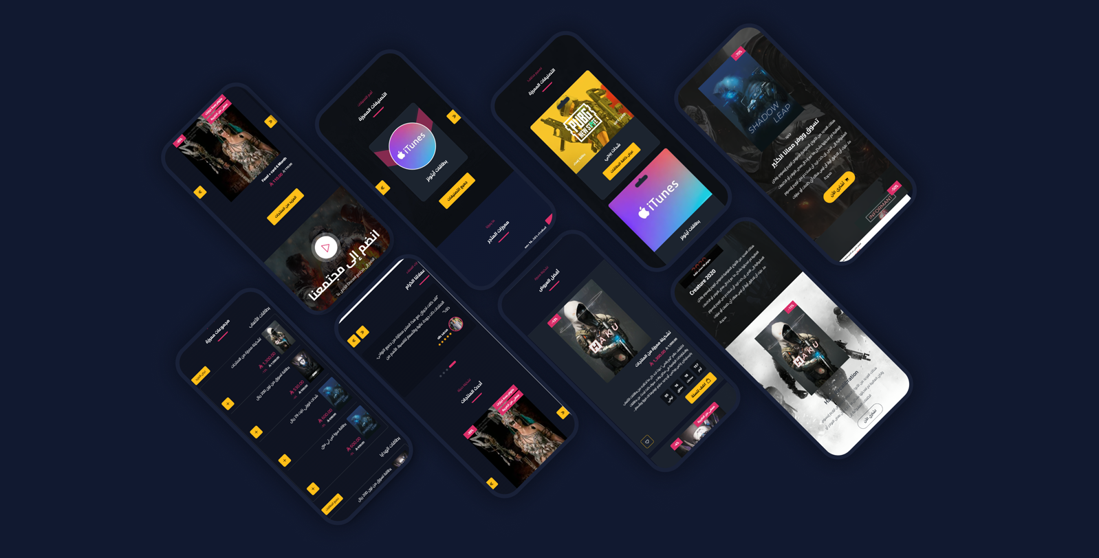
Mobile friendly
A responsive design that fits all screen sizes and devices
High loading speed
Optimized performance for fast loading that improves UX and SEO
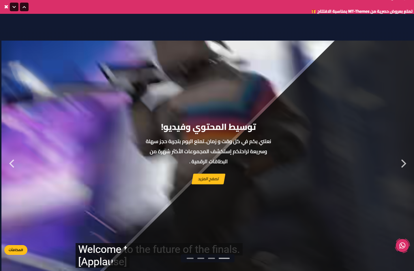
Video support
Main slider and sections supporting YouTube and uploaded videos for a pro look
Rich flexible sections
16+ re-orderable sections: slider, tabs, gallery, mini products, numbers, partners and more
WhatsApp & popup
A floating WhatsApp button with ready messages & chat box, and an advanced popup ad modal
Zid compatible
Built specifically for Zid with full Arabic/English support
Theme user guide
Download the ready-made design
One file gives your store the demo store's look: the home page with its sections and texts, the header and footer, colors and fonts, in both languages. After importing, put in your own texts and pictures.
How to import it
- Download the file.
- In your Zid dashboard, click
Customize
on Raqami, thenImport
and choose the file. - Check the result and press
Publish
.
Import replaces your customization without asking, so press Export
first. Your products and categories stay as they are.
General Settings
- Disable right click: Protect store content from copying
- Loader screen: Show it with a logo, background color, and a spinner icon (1 or 2)
- Website colors: Use the theme default or customize: website background, text color, buttons background & text, and all borders color
- Inner pages (Breadcrumb): Breadcrumb background/text colors, text-with-background color, and a background image
- Product design: Open cart on add, product style (1/2), product background & border colors (style 2), hide description, show days-left for offers, and hide ratings
- Fonts: Pick from 30+ Arabic & English fonts
- Scrollbar: Scrollbar background color, thumb color, and hover color
Ad Modal (Popup)
- Display Ad: Enable the modal and set where (home or all pages)
- Slider behavior: Loop, autoplay, show arrows and dots
- Ad slides: Each slide: reverse, design (1/2), text direction (right/left/center), hide on mobile, center on mobile, background image, small title + title + subtitle, offer date, a button with title & link (new tab), a box image with title, and a discount
Header
- General: Full width, mobile-menu background color, and header bottom border color
- Announcement bar: Show it with hide-close-button, bar speed (seconds), a texts list (text + link), and background/text colors
- Logo: An Arabic logo and an English logo, each with a mobile version
- Colors: Header background, links color, and icons color
- Search bar: Placeholder text and a hide-search option
- Icons: Hide language and hide country name
Footer
- Colors: Footer background, titles, links & inner text, link-hover, address & phone text, social icons background & color, and copyrights/official-numbers colors
- Business info: Footer logo, store address, phone number, and email (with a hide option)
- Social media: Facebook, Instagram, Twitter, Snapchat, TikTok, and website links (with hide)
- Two link columns: Two independent columns, each with a title and a links list (title + link)
- Shipping, payment & numbers: Show/hide shipping & payment logos, business platform, VAT number (with a certificate link), and commercial registration number
- App links: iOS and Android app IDs to show store links
WhatsApp & Back-to-Top
- Back-to-top: Show it with background/text/line colors
- WhatsApp: WhatsApp number with colors (icon background, icon, circle)
- Chat box: Show it with a title & image, header/box/messages colors, circle color above the image, a ready-messages list, a footer title, and the WhatsApp number color inside the chat
Main Slider
- Slider behavior: In a container, loop, autoplay, show arrows and dots
- Slide background: Image or video (YouTube link or uploaded), a web image and a mobile-specific image, and a background color
- Overlay & text: Center content, hide the moving overlay, show an overlay with color & opacity, and text color
- Content: Title, subtitle, button text & link, and an old price and a new price
Store Features
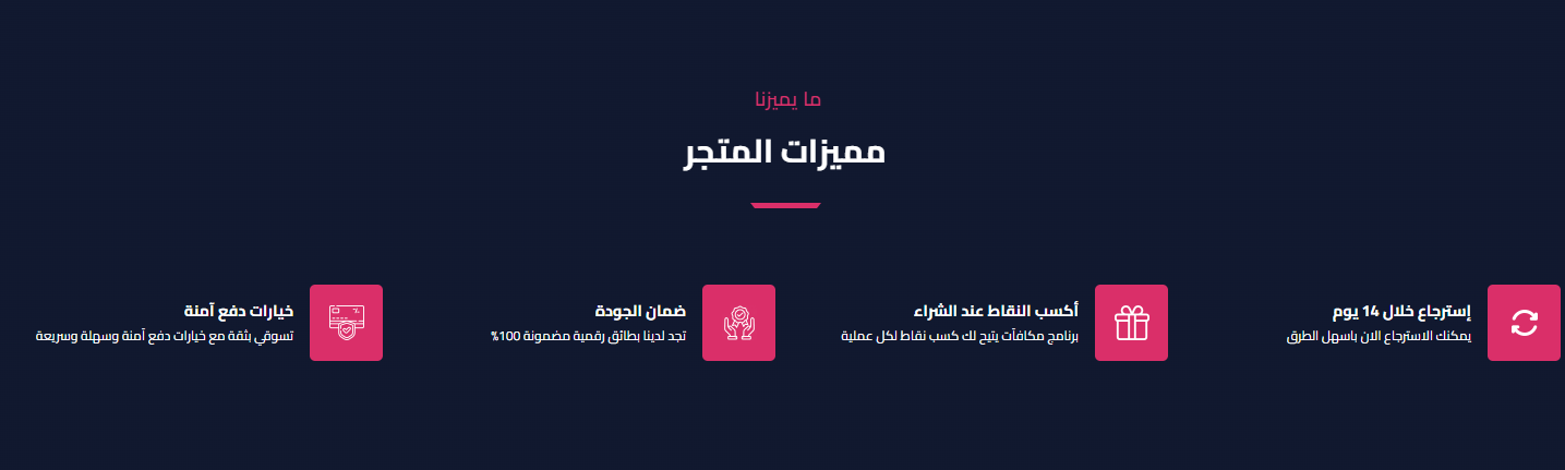
- Spacing & width: Hide the section, make it full width, and control top/bottom padding (0-200px)
- Title: Main and sub title
- Items per row: 4, 3 or 2
- Features: The features list (icon + title + text)
Categories
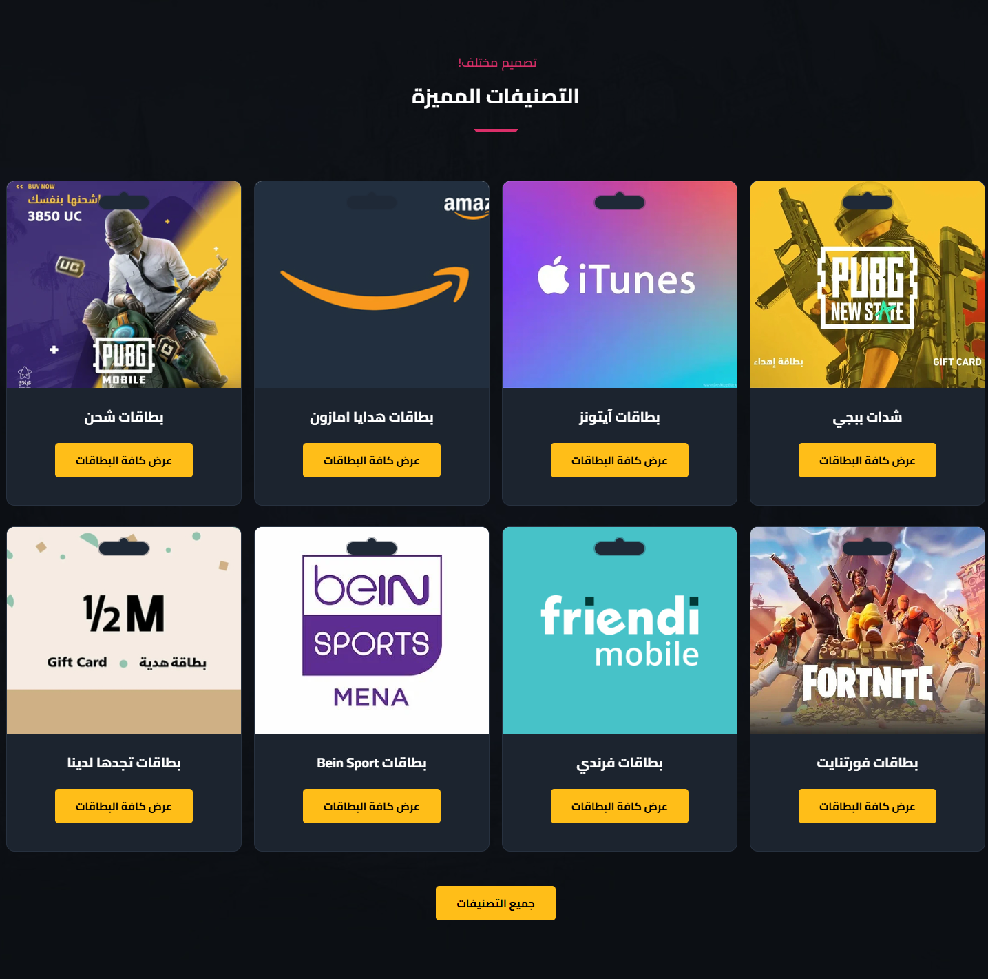
- Spacing & width: Hide the section, make it full width, and control top/bottom padding (0-200px)
- Background: Hide background image, background color, and card background color
- Title: Main and sub title
- Display style: Slider or list, with a card design (1/2) and hide-card-shape
- Slider behavior: Loop, autoplay, and navigation arrows
- Buttons: A button inside the card with text, and an all-categories button with text
- Categories: The list of categories shown
YouTube Videos Slider
- Spacing & width: Hide the section, make it full width, and control top/bottom padding (0-200px)
- Title: Main and sub title
- Slider behavior: Autoplay, show arrows, loop, and show dots
- Items per device: Items count for web and tablet
- Videos: A list of YouTube video URLs
Gallery / Ads
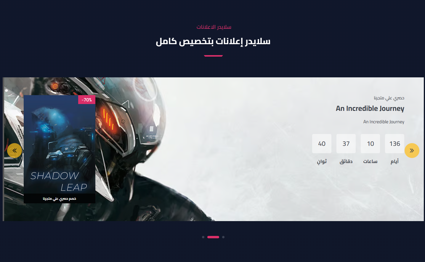
- Spacing & width: Hide the section, make it full width, and control top/bottom padding (0-200px)
- Display options: Remove side padding, hide on mobile, and display type (list or slider)
- Title: Main and sub title
- Slider behavior: Loop, autoplay, show arrows and dots
- Items: Each item: reverse, center on mobile, design (1/2), text direction, hide on mobile, background image, small title + title + subtitle, offer date, a button with link (new tab), a box image with title, and a discount
Testimonials
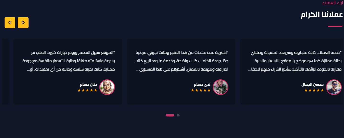
- Spacing & width: Hide the section, make it full width, and control top/bottom padding (0-200px)
- Card color: Testimonial card background color
- Title: Main and sub title
- Slider behavior: Autoplay, loop, show dots and arrows
- Reviews: The reviews list, each with text + show stars + client image + name
Products
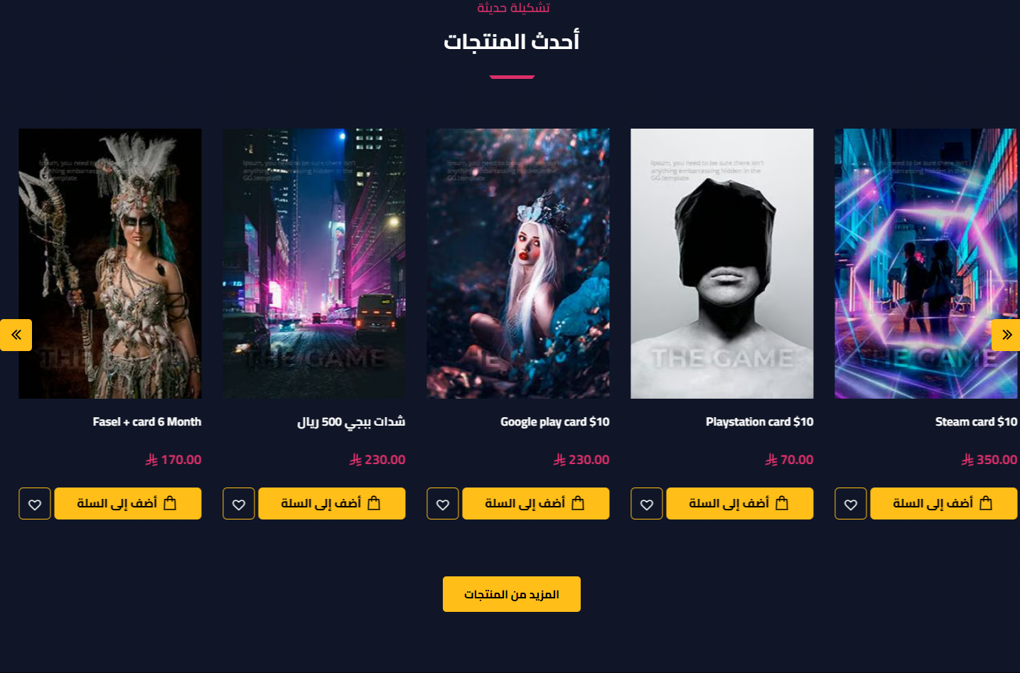
- Spacing & width: Hide the section, make it full width, and control top/bottom padding (0-200px)
- Title: Main and sub title
- Select products: Choose the products list/category
- Display & style: Slider or list, and product style (1/2)
- Slider behavior: Loop, autoplay, and arrows
- Products & items count: Products count (up to 14), items for web/tablet/mobile (with slider + style 1), and items per row (with list)
- Style 2 options: Product background & border colors, and hide description
- Extra options: Show days-left for offers, hide ratings, and a more button (text + link)
Video

- Hide Section: Show or hide the section
- Padding: Top & bottom padding (default 100)
- Background & overlay: Background image, background color, and an overlay with color & opacity
- Content: Video link, title, subtitle, button text & link (opens in new tab)
Mini Products
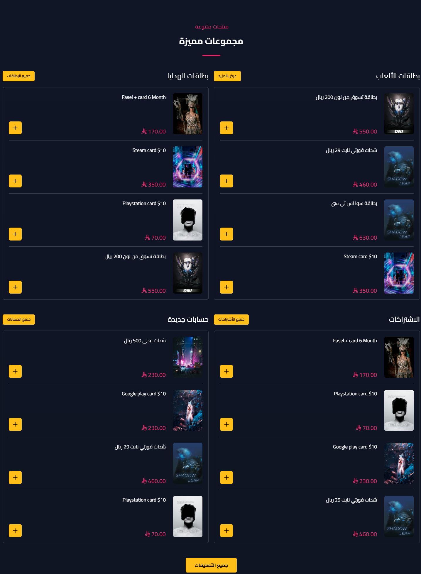
- Spacing & width: Hide the section, make it full width, and control top/bottom padding (0-200px)
- Title: Main and sub title
- Columns: A list of columns, each with a title, a view-all text & link, selected products, and items count (default 4)
- Global more button: Text and link for a view-all button
Products Tabs
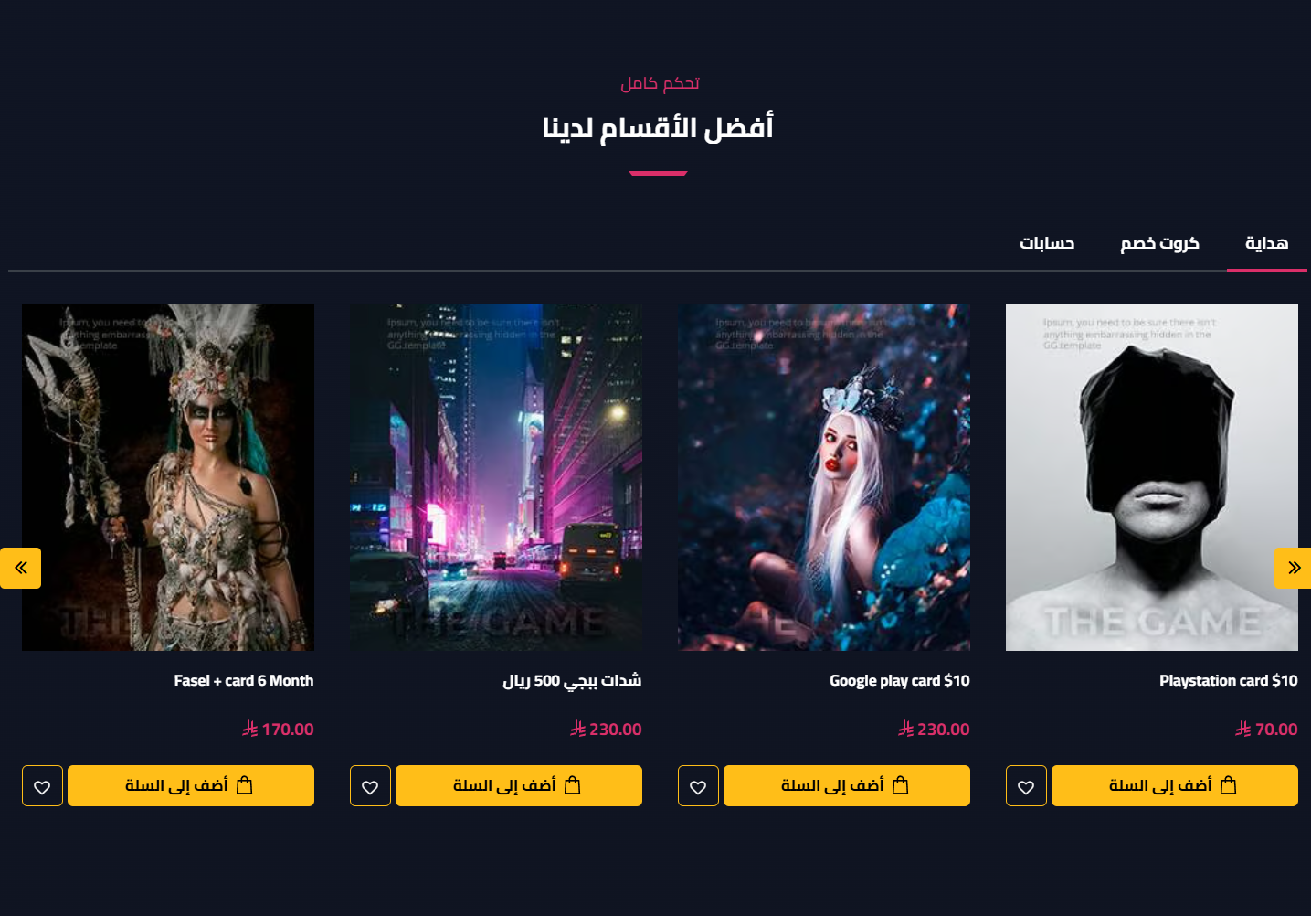
- Spacing & width: Hide the section, make it full width, and control top/bottom padding (0-200px)
- Title: Main and sub title
- Center tabs: Center the tabs bar
- Tabs: A list of tabs, each with: title, selected products, display style (slider/list), product style (1/2), loop/autoplay/arrows, products & items counts per device/row, product background & border colors, hide description, days-left, hide ratings, and a more button
Why Us (Numbers)
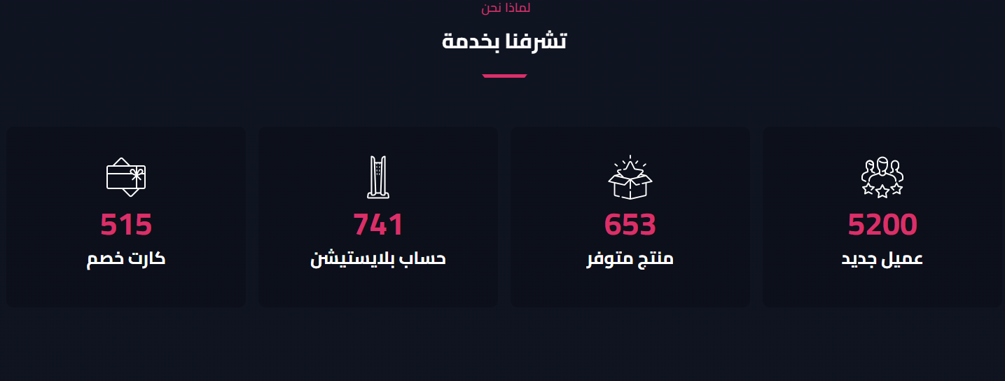
- Spacing & width: Hide the section, make it full width, and control top/bottom padding (0-200px)
- Item color: Item background color
- Title: Main and sub title
- Items per row: 4, 3 or 2
- Items: The numbers list, each with an image + the number to display + a title
Partners
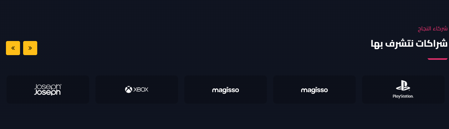
- Spacing & width: Hide the section, make it full width, and control top/bottom padding (0-200px)
- Logo background: Partner logo background color
- Title: Main and sub title
- Items per device: Web (up to 6), tablet (up to 3), and mobile (up to 2)
- Slider behavior: Loop, show arrows, and autoplay
- Items: The partners list, each with an image + link (opens in new tab)
FAQs
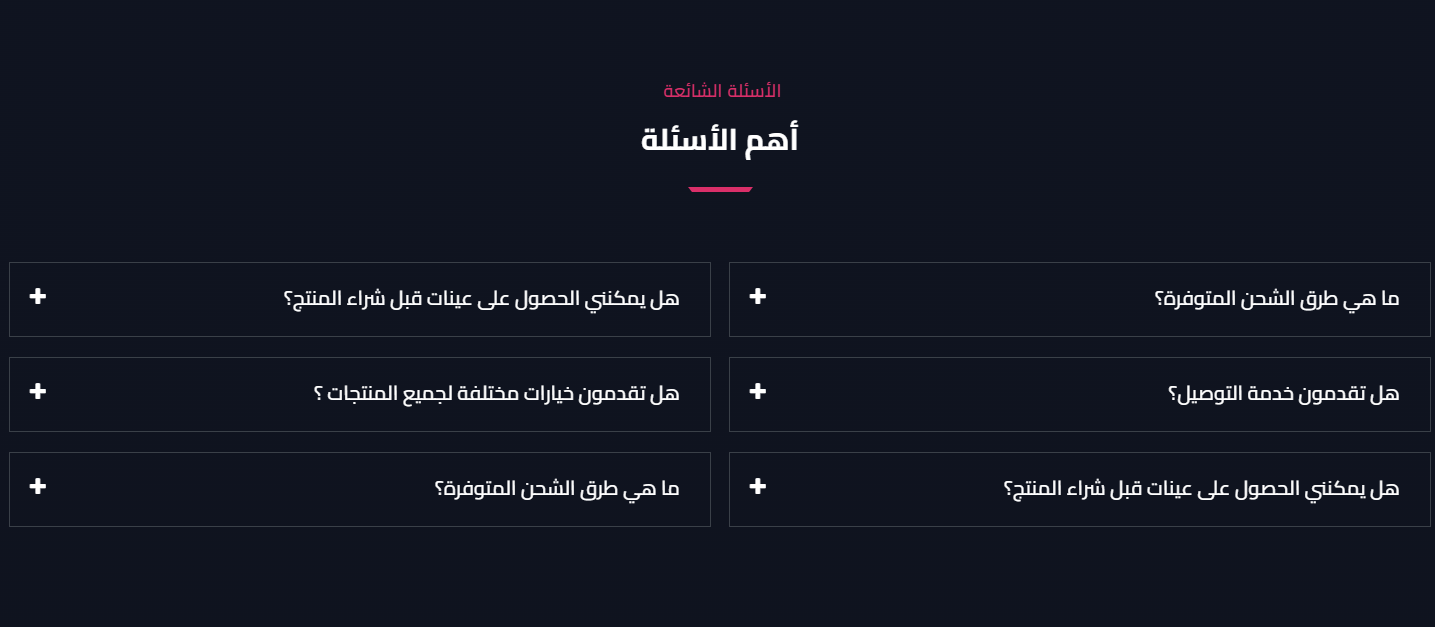
- Spacing & width: Hide the section, make it full width, and control top/bottom padding (0-200px)
- Title: Main and sub title
- Questions: The questions & answers list (question + answer)
Cards Slider
- Padding: Top & bottom padding (default 80)
- Title: Main and sub title
- Slider behavior: Loop, autoplay, show arrows and dots
- Slides: The cards list, each with an image + title + description + button text & link
Ad Image
- Hide Section: Show or hide the section
- Padding: Top & bottom padding
- Image & link: Upload the ad image with a link
Divider / Spacer
- Hide / full width: Hide the divider or stretch it full width
- Color & height: Line color and height
- Padding: Top & bottom padding (default 50)
Related themes
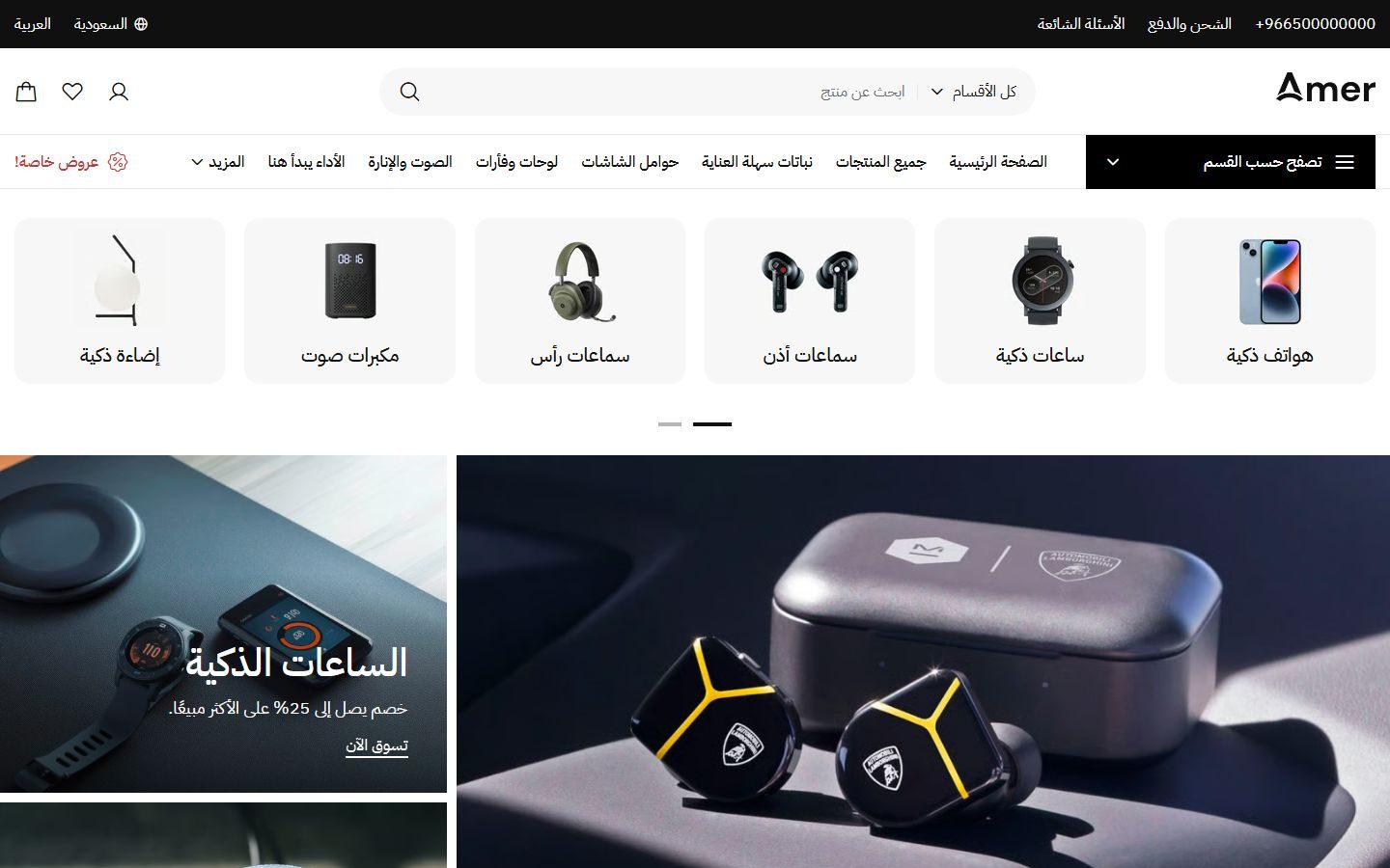
Amer
A Zid theme with 22 ready designs for different kinds of stores, in Arabic and English.
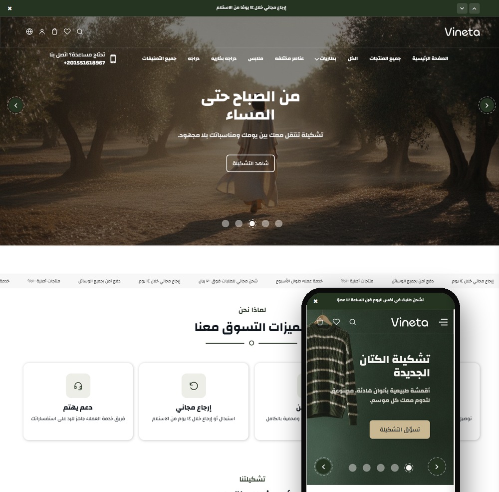
Vineta
A modern Zid theme with 22 sections and two product page designs, a true Arabic/English mirror.
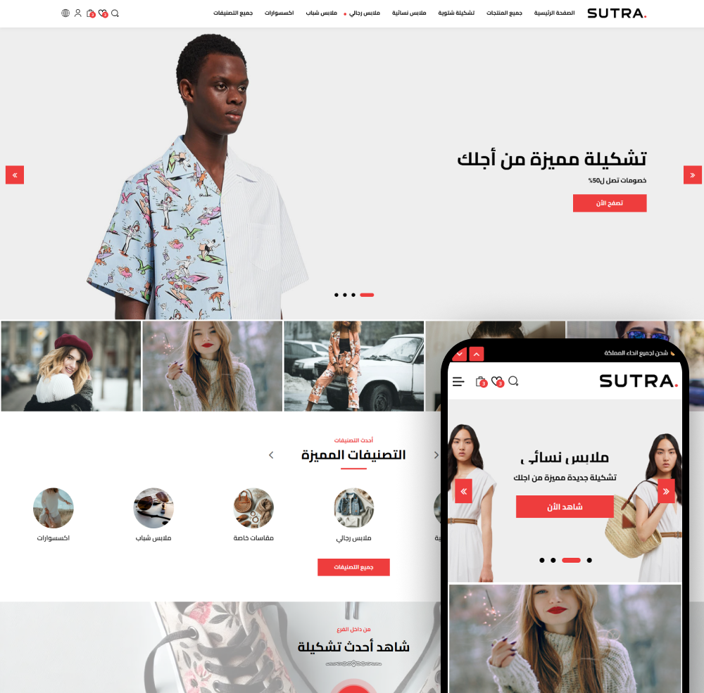
Sutra
Sutra - the best Zid store theme to grow your sales. Modern, mobile-friendly, and easy to customize.
Not sure which theme to pick?
Our team helps you pick the theme and customize it for your store.
Contact us