





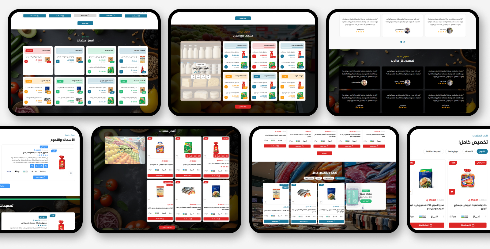
Theme features
Mobile friendly
A responsive design that fits all screen sizes and devices
High loading speed
Optimized performance for fast loading that improves UX and SEO
Easy to customize
An easy control panel to customize colors, fonts and sections with no coding
Rich flexible sections
20+ re-orderable sections: slider, product tabs, categories, reviews, FAQs, branches and more
WhatsApp & popup
A floating WhatsApp button with ready messages, and a popup ad modal for your offers
Zid compatible
Built specifically for Zid with full support for all platform features and Arabic/English
Theme user guide
General Settings
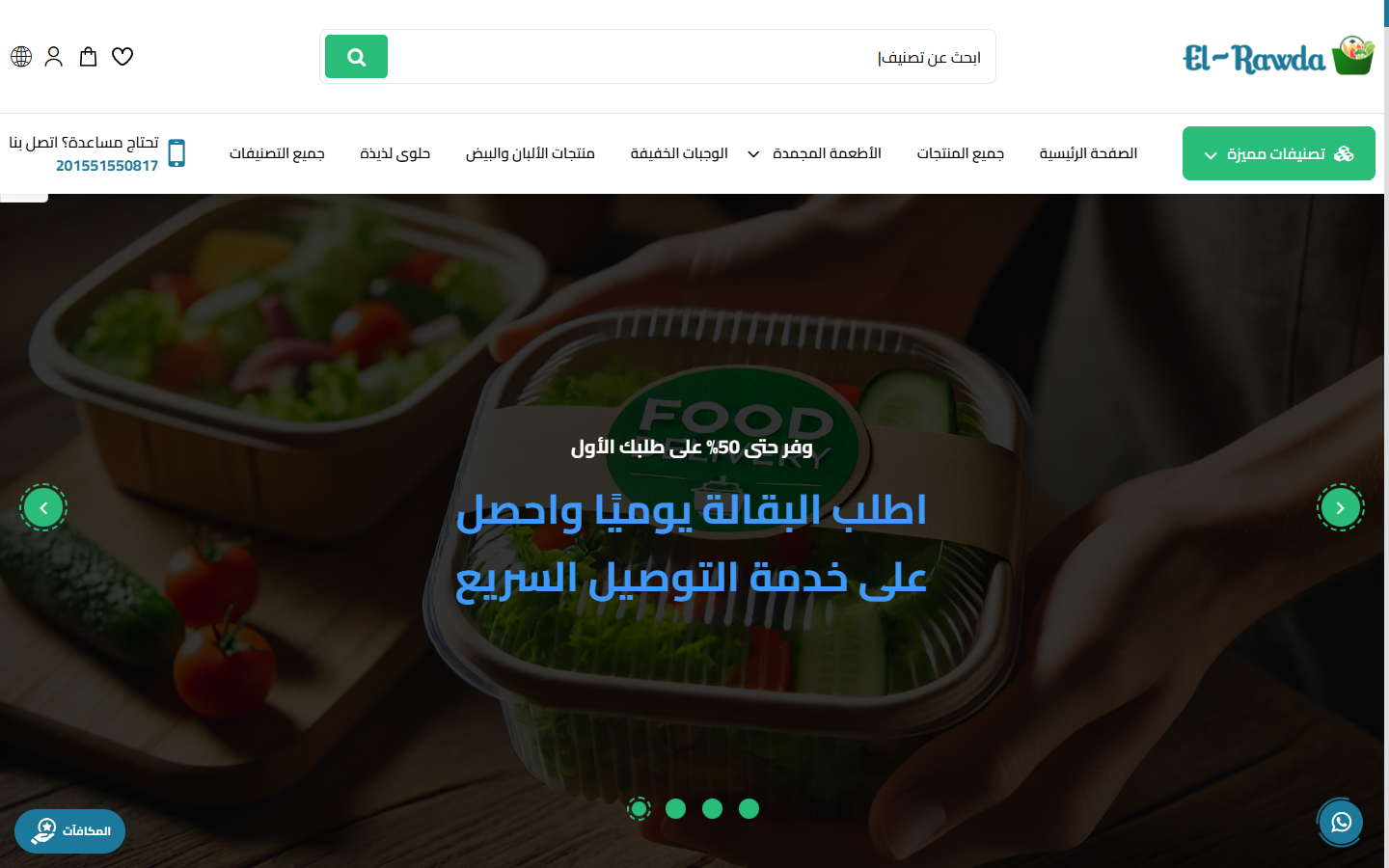
- All sections full width: Enable full-width for every section at once
- Disable right click: Protect store content from copying
- Loader screen: Show a loader on open, with loader logo, background color, hide the moving line, and spinner icon (black/white)
- Website colors: General text color, website background, buttons background & text, and all borders color
- Fonts: Pick from 30+ Arabic & English fonts (Cairo, Tajawal, Almarai, Changa, Reem Kufi… and more)
- Custom scripts: Inject a script at the end of head or body (e.g. tracking codes)
- Payment methods images: Upload payment method images to show in the store
- Inner pages (Breadcrumb): Background/text color and background image for inner page headers
- Default product settings: Products main color, show payments in the card, open cart on add, product style (1/2), border color, hide description, show offer countdown, and hide ratings
Ad Modal (Popup)

- Display Ad: Enable the popup modal
- Where to show: On home page only or on all pages
- Slider behavior: Loop, autoplay, arrows, and hide on mobile
- Ad slides: Each slide: image/background color, overlay, labeled text, title & subtitle, differently-colored price, offer date, and a button with link/text/color that can open in a new tab
WhatsApp & Back-to-Top
- Back-to-top button: Show it with background/text/line color control
- WhatsApp number: The number that receives customer messages
- Chat box: Show a chat box with title & image, and full colors (header, box, messages, icon and circle)
- Ready messages: A list of pre-set messages the customer can pick from
Header

- Logo: A different logo per language (AR/EN) and a mobile version
- Sticky menu: Pin the header to the top when scrolling
- Announcement bar: A moving text with adjustable speed, a link and colors
- Header icons: Toggle search, cart, account, language and currency icons
- Categories menu: Show page links & categories as a mega-menu
Footer
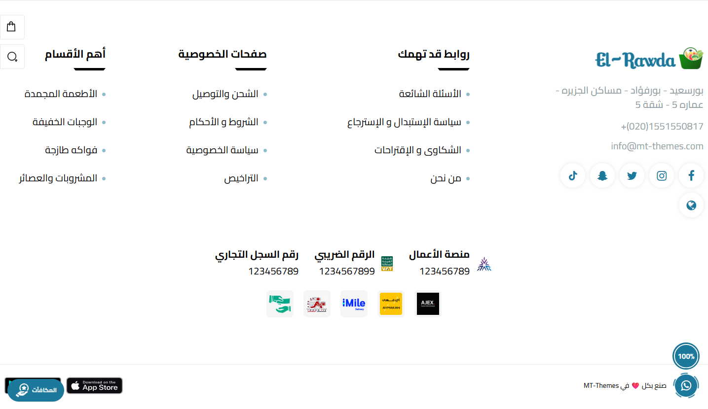
- Link columns: Organize page and policy links into columns
- Social media: Social account icons
- Payment methods: Show available payment method images
- Colors & text: Full control over footer background/text colors
Main Slider
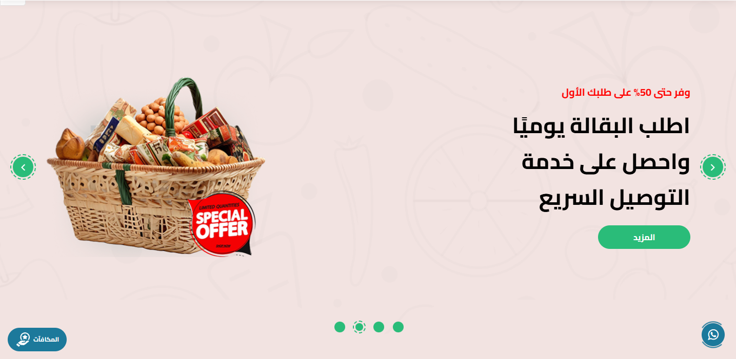
- Slider in a container: Show the slider boxed or full-width
- Slider behavior: Loop, autoplay, arrows, and dots with a unified color
- Slides: Add multiple slides, each with a web image, a mobile image and a link
- Hide Section: Show or hide the whole section from the page
- Full Width: Stretch the section to the full screen width instead of the boxed container
- Top & Bottom Padding: Control spacing above/below the section from 0 to 200px
- Title & Sub Title: Main and sub title text with independent color control for each
- Center Title: Center the title/subtitle or align them to the side
- Title Bottom Spacing: The gap between the title and the section content
- Background: Section background color or image with a fixed-on-scroll option
- Overlay: A color layer over the background image with color + opacity control
Categories
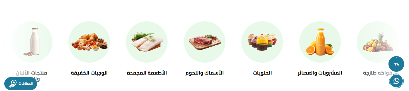
- Display style: Slider or list
- Items per row: 2, 3 or 4 items
- Slider behavior: Loop, autoplay and navigation arrows
- Button inside category: Show a button inside each category with text and background color
- All-categories button: Show a button for all categories with text and color
- Card colors: Card background, image background, and title color
- Categories: The list of categories shown with pictures
- Hide Section: Show or hide the whole section from the page
- Full Width: Stretch the section to the full screen width instead of the boxed container
- Top & Bottom Padding: Control spacing above/below the section from 0 to 200px
- Title & Sub Title: Main and sub title text with independent color control for each
- Center Title: Center the title/subtitle or align them to the side
- Title Bottom Spacing: The gap between the title and the section content
- Background: Section background color or image with a fixed-on-scroll option
- Overlay: A color layer over the background image with color + opacity control
Categories with Background / Ads
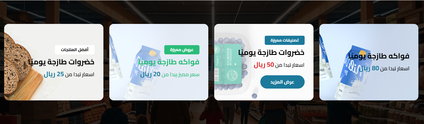
- Display style: Slider or list
- Items per row: 2, 3 or 4 items
- Slider behavior: Loop, autoplay and arrows
- All button: Text, background color, link, and open in new tab
- Items: The list of items/banners with images and links
- Hide Section: Show or hide the whole section from the page
- Full Width: Stretch the section to the full screen width instead of the boxed container
- Top & Bottom Padding: Control spacing above/below the section from 0 to 200px
- Title & Sub Title: Main and sub title text with independent color control for each
- Center Title: Center the title/subtitle or align them to the side
- Title Bottom Spacing: The gap between the title and the section content
- Background: Section background color or image with a fixed-on-scroll option
- Overlay: A color layer over the background image with color + opacity control
Products with Ads
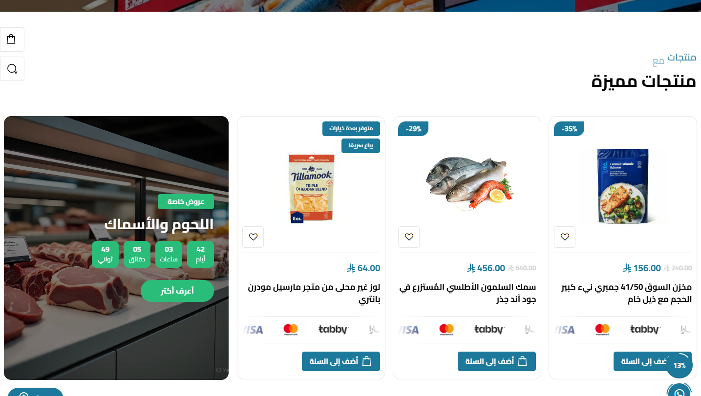
- Select products: Choose the products list/category to show
- Products style: Style 1 or Style 2 for the product card
- Display style: Slider or list with items-per-row and web count
- Products count: From 1 to 14 products (default 8)
- Card options: Show payments, hide out-of-stock, offer countdown, hide description, hide ratings, main & border colors
- More button: Text, link and open in new tab
- Side ad: Show an ad beside products, hide on mobile, full height, reverse order, and its own slider behavior
- Hide Section: Show or hide the whole section from the page
- Full Width: Stretch the section to the full screen width instead of the boxed container
- Top & Bottom Padding: Control spacing above/below the section from 0 to 200px
- Title & Sub Title: Main and sub title text with independent color control for each
- Center Title: Center the title/subtitle or align them to the side
- Title Bottom Spacing: The gap between the title and the section content
- Background: Section background color or image with a fixed-on-scroll option
- Overlay: A color layer over the background image with color + opacity control
Products Tabs
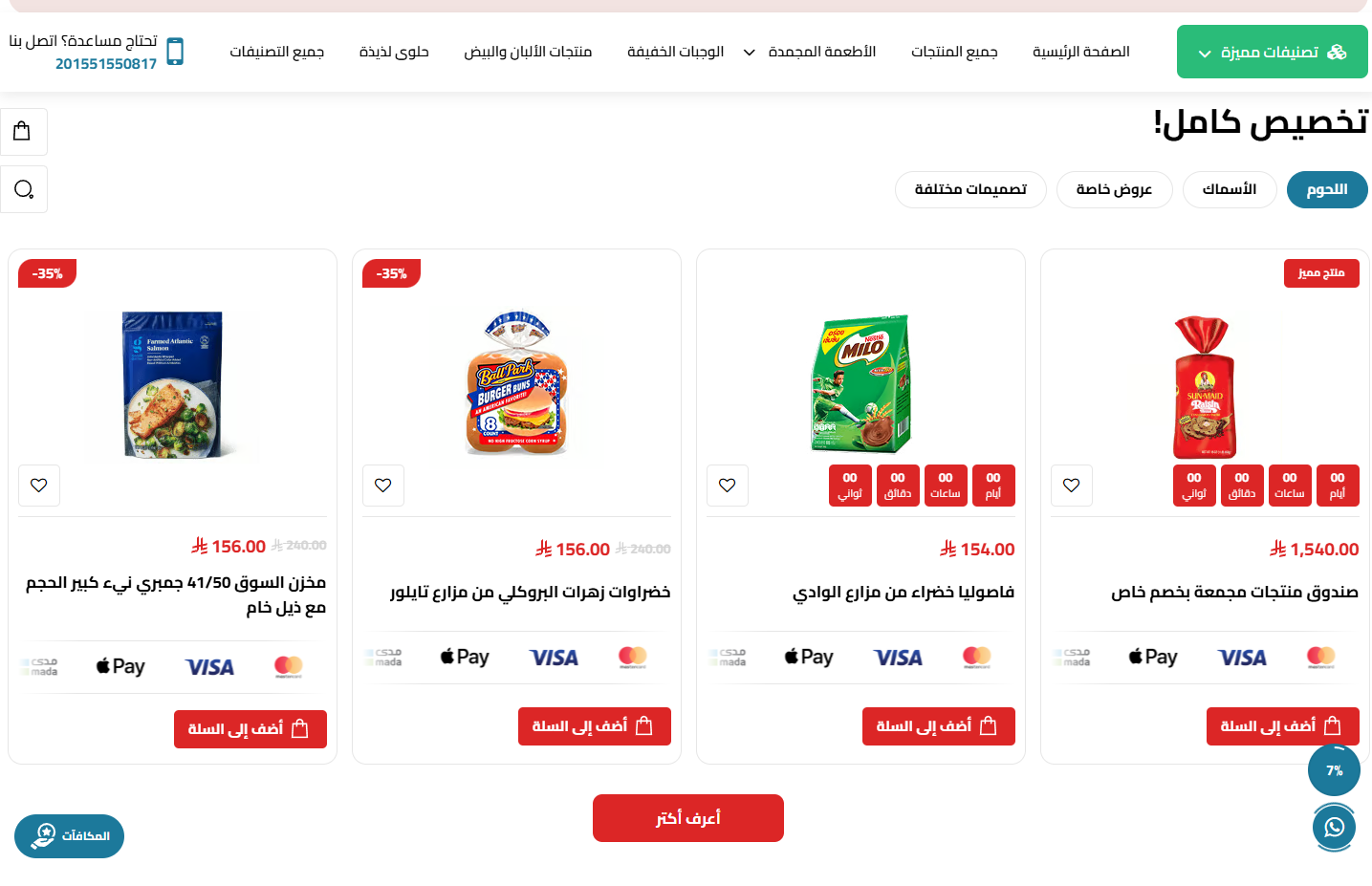
- Tabs: Add multiple tabs, each with its own products
- Center tabs: Center the tabs bar and set its bottom spacing
- Side ad: Show an ad, hide on mobile, full height, reverse order, and its own slider behavior
- Hide Section: Show or hide the whole section from the page
- Full Width: Stretch the section to the full screen width instead of the boxed container
- Top & Bottom Padding: Control spacing above/below the section from 0 to 200px
- Title & Sub Title: Main and sub title text with independent color control for each
- Center Title: Center the title/subtitle or align them to the side
- Title Bottom Spacing: The gap between the title and the section content
- Background: Section background color or image with a fixed-on-scroll option
- Overlay: A color layer over the background image with color + opacity control
Mini Products with Ads
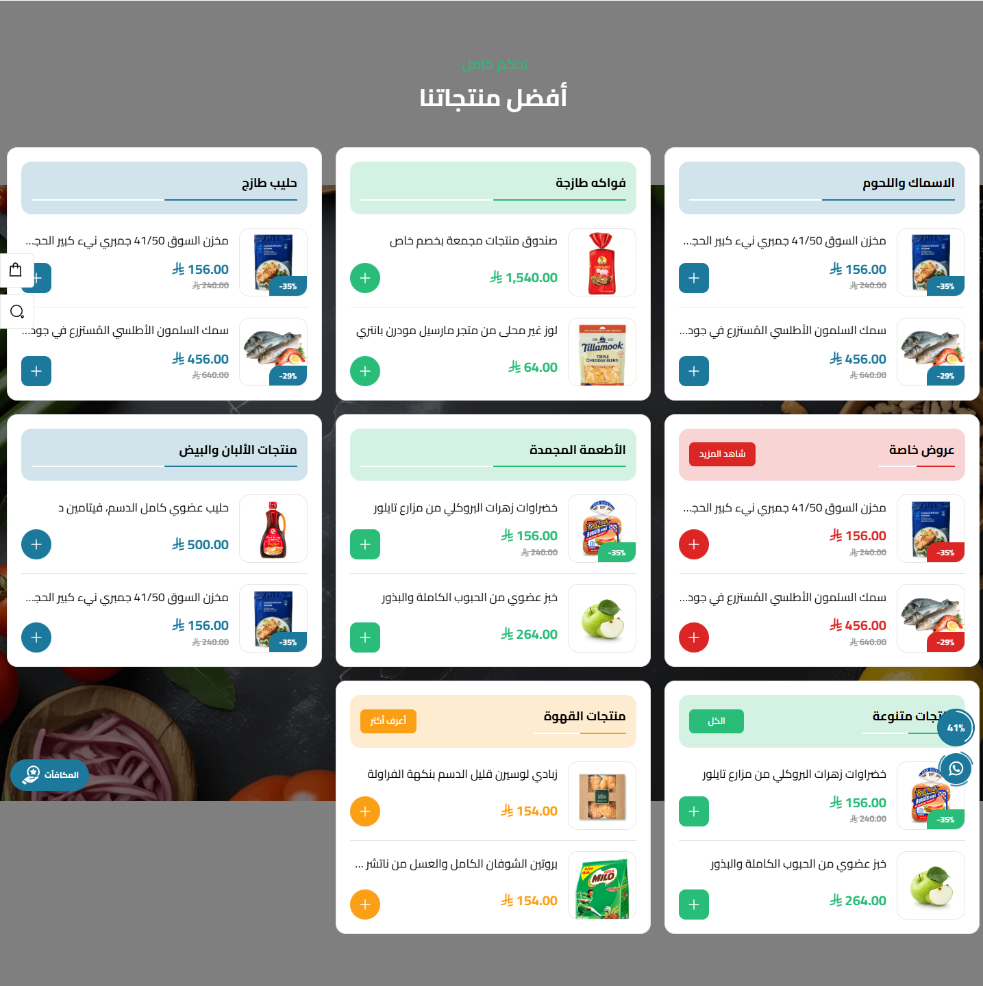
- Display style: Slider or list
- Columns: Set columns and products per slide (1–6)
- All button: Text, link and background color
- Ad: Show ad, hide on mobile, full height, reverse order, and its own slider behavior
- Hide Section: Show or hide the whole section from the page
- Full Width: Stretch the section to the full screen width instead of the boxed container
- Top & Bottom Padding: Control spacing above/below the section from 0 to 200px
- Title & Sub Title: Main and sub title text with independent color control for each
- Center Title: Center the title/subtitle or align them to the side
- Title Bottom Spacing: The gap between the title and the section content
- Background: Section background color or image with a fixed-on-scroll option
- Overlay: A color layer over the background image with color + opacity control
Store Features
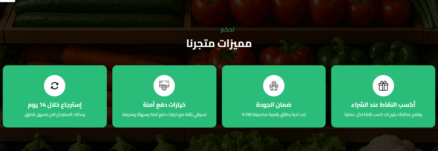
- Items per row: 2, 3 or 4
- Icon shape: Square or circle, with icon background color and convert-to-white option
- Item colors: Item background, border color, and text color, with content centering
- Features: The features list (icon + title + text)
- Hide Section: Show or hide the whole section from the page
- Full Width: Stretch the section to the full screen width instead of the boxed container
- Top & Bottom Padding: Control spacing above/below the section from 0 to 200px
- Title & Sub Title: Main and sub title text with independent color control for each
- Center Title: Center the title/subtitle or align them to the side
- Title Bottom Spacing: The gap between the title and the section content
- Background: Section background color or image with a fixed-on-scroll option
- Overlay: A color layer over the background image with color + opacity control
Features with Image Slider
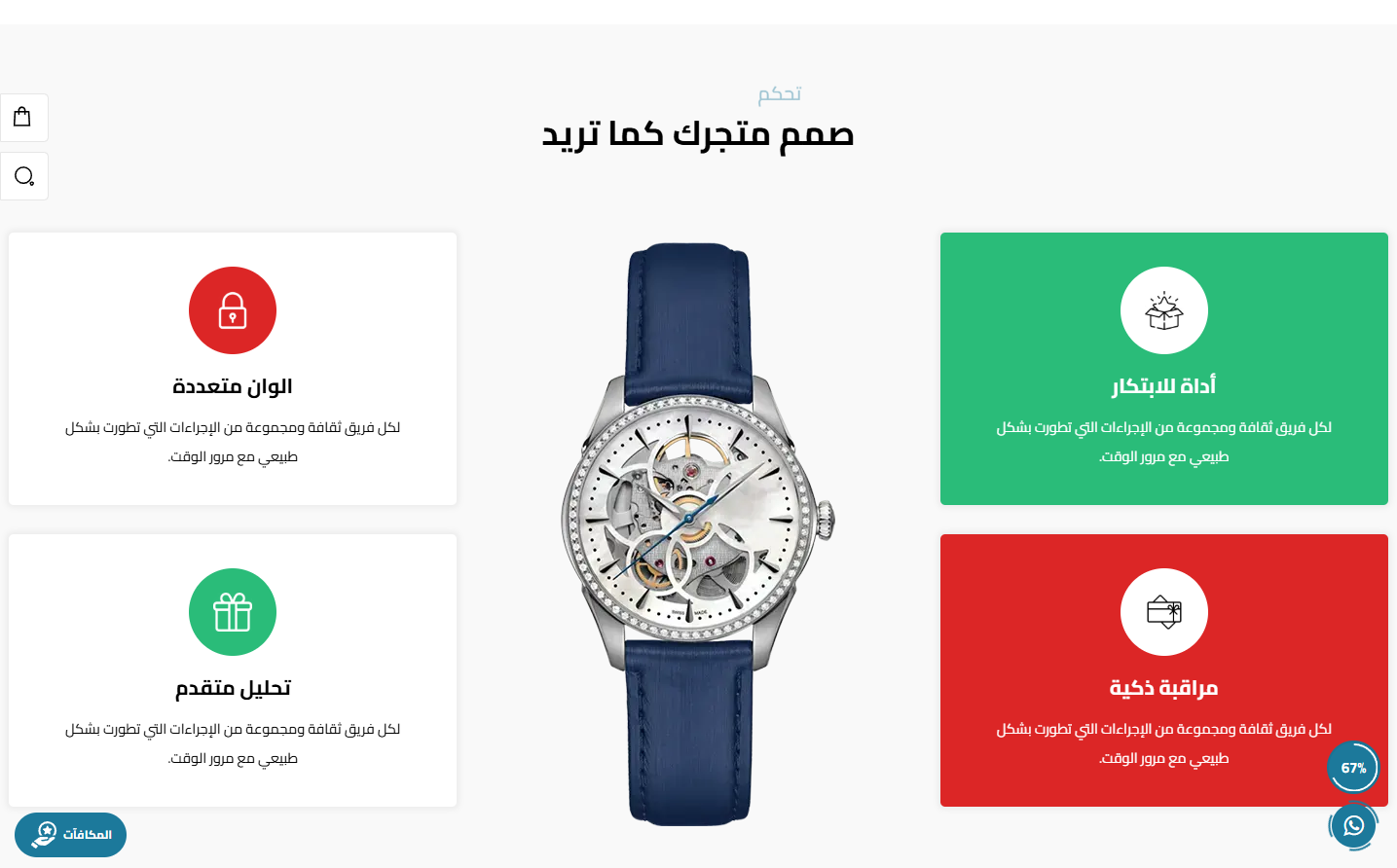
- Slider direction: Horizontal or vertical image slider
- Images: The slider images list
- Items: The features shown beside the images
- Hide Section: Show or hide the whole section from the page
- Full Width: Stretch the section to the full screen width instead of the boxed container
- Top & Bottom Padding: Control spacing above/below the section from 0 to 200px
- Title & Sub Title: Main and sub title text with independent color control for each
- Center Title: Center the title/subtitle or align them to the side
- Title Bottom Spacing: The gap between the title and the section content
- Background: Section background color or image with a fixed-on-scroll option
- Overlay: A color layer over the background image with color + opacity control
Testimonials
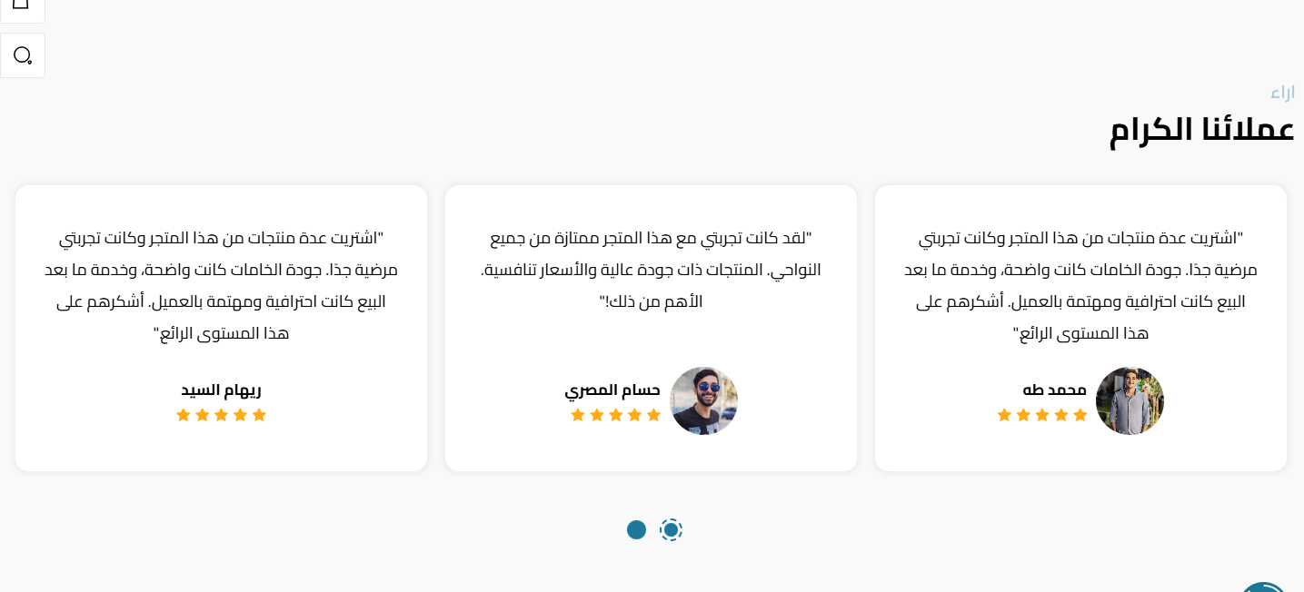
- Display style: Slider or list, with items per row and web count
- Slider behavior: Autoplay, loop, dots and arrows
- Card colors: Card background and text color
- Testimonials: The list of reviews (name + image + text + rating)
- Hide Section: Show or hide the whole section from the page
- Full Width: Stretch the section to the full screen width instead of the boxed container
- Top & Bottom Padding: Control spacing above/below the section from 0 to 200px
- Title & Sub Title: Main and sub title text with independent color control for each
- Center Title: Center the title/subtitle or align them to the side
- Title Bottom Spacing: The gap between the title and the section content
- Background: Section background color or image with a fixed-on-scroll option
- Overlay: A color layer over the background image with color + opacity control
FAQs
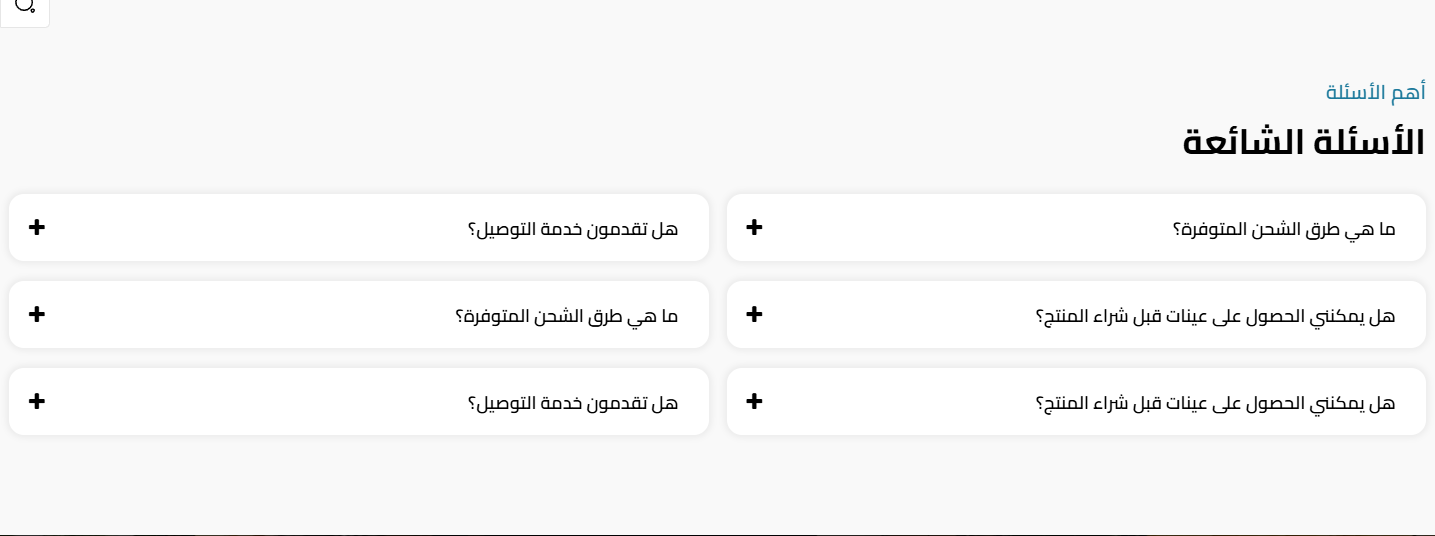
- Items per row: 2 or 3
- Item colors: Title/answer background color and text color
- Questions: The questions & answers list
- Hide Section: Show or hide the whole section from the page
- Full Width: Stretch the section to the full screen width instead of the boxed container
- Top & Bottom Padding: Control spacing above/below the section from 0 to 200px
- Title & Sub Title: Main and sub title text with independent color control for each
- Center Title: Center the title/subtitle or align them to the side
- Title Bottom Spacing: The gap between the title and the section content
- Background: Section background color or image with a fixed-on-scroll option
- Overlay: A color layer over the background image with color + opacity control
Partners
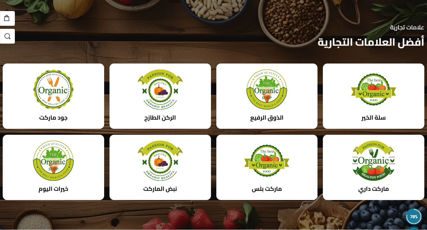
- Display style: Slider or list
- Items count: Items per row and on web (up to 6)
- Slider behavior: Loop, arrows, autoplay and dots
- Logo background: Partner logo background color
- Partners: The partners images list
- Hide Section: Show or hide the whole section from the page
- Full Width: Stretch the section to the full screen width instead of the boxed container
- Top & Bottom Padding: Control spacing above/below the section from 0 to 200px
- Title & Sub Title: Main and sub title text with independent color control for each
- Center Title: Center the title/subtitle or align them to the side
- Title Bottom Spacing: The gap between the title and the section content
- Background: Section background color or image with a fixed-on-scroll option
- Overlay: A color layer over the background image with color + opacity control
Store Branches
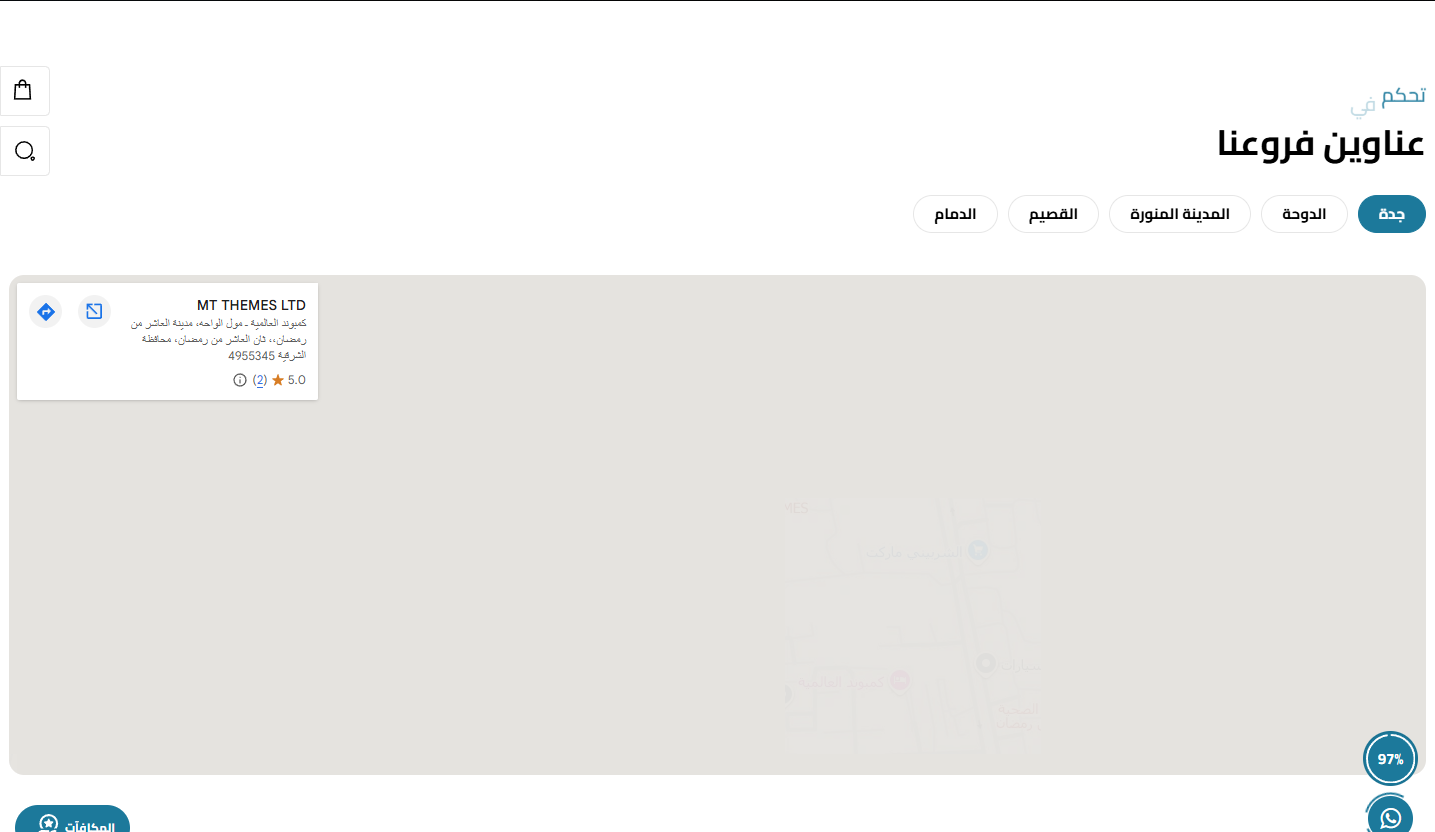
- Center tabs: Center the branches bar and set its spacing
- Branches: The branches list (name + address + details)
- Hide Section: Show or hide the whole section from the page
- Full Width: Stretch the section to the full screen width instead of the boxed container
- Top & Bottom Padding: Control spacing above/below the section from 0 to 200px
- Title & Sub Title: Main and sub title text with independent color control for each
- Center Title: Center the title/subtitle or align them to the side
- Title Bottom Spacing: The gap between the title and the section content
- Background: Section background color or image with a fixed-on-scroll option
- Overlay: A color layer over the background image with color + opacity control
Videos Slider
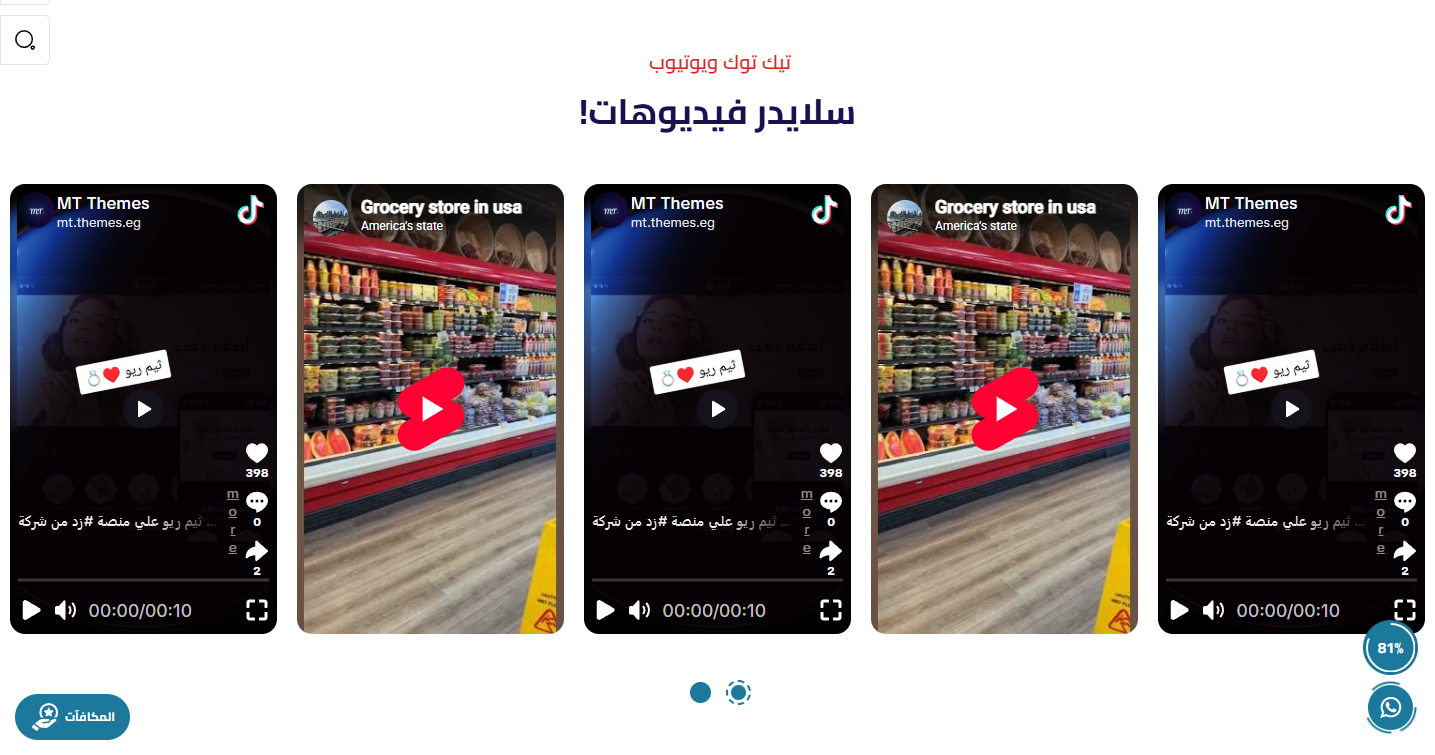
- Videos: The videos shown in the slider
- Display: Supports multiple videos as a slider
- Hide Section: Show or hide the whole section from the page
- Full Width: Stretch the section to the full screen width instead of the boxed container
- Top & Bottom Padding: Control spacing above/below the section from 0 to 200px
- Title & Sub Title: Main and sub title text with independent color control for each
- Center Title: Center the title/subtitle or align them to the side
- Title Bottom Spacing: The gap between the title and the section content
- Background: Section background color or image with a fixed-on-scroll option
- Overlay: A color layer over the background image with color + opacity control
Ad Image
- Image & link: Upload the ad image with a link and open-in-new-tab
- Background color: Section background color behind the image
- Hide Section: Show or hide the whole section from the page
- Full Width: Stretch the section to the full screen width instead of the boxed container
- Top & Bottom Padding: Control spacing above/below the section from 0 to 200px
- Title & Sub Title: Main and sub title text with independent color control for each
- Center Title: Center the title/subtitle or align them to the side
- Title Bottom Spacing: The gap between the title and the section content
- Background: Section background color or image with a fixed-on-scroll option
- Overlay: A color layer over the background image with color + opacity control
Moving Text Ad

- Moving text: The moving ad text with background and overlay
- Hide Section: Show or hide the whole section from the page
- Full Width: Stretch the section to the full screen width instead of the boxed container
- Top & Bottom Padding: Control spacing above/below the section from 0 to 200px
- Title & Sub Title: Main and sub title text with independent color control for each
- Center Title: Center the title/subtitle or align them to the side
- Title Bottom Spacing: The gap between the title and the section content
- Background: Section background color or image with a fixed-on-scroll option
- Overlay: A color layer over the background image with color + opacity control
Key Numbers (Why Section)
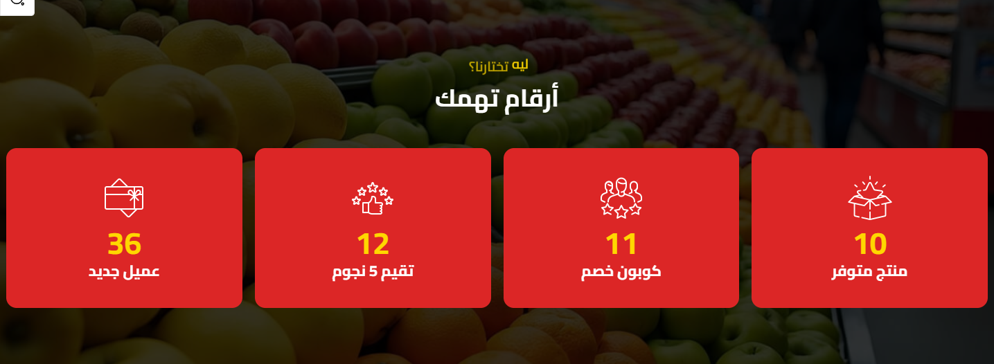
- Items: The numbers/stats list shown
- Styling: Colors, background and overlay for the section
- Hide Section: Show or hide the whole section from the page
- Full Width: Stretch the section to the full screen width instead of the boxed container
- Top & Bottom Padding: Control spacing above/below the section from 0 to 200px
- Title & Sub Title: Main and sub title text with independent color control for each
- Center Title: Center the title/subtitle or align them to the side
- Title Bottom Spacing: The gap between the title and the section content
- Background: Section background color or image with a fixed-on-scroll option
- Overlay: A color layer over the background image with color + opacity control
Divider / Spacer
- Full width: Stretch the divider to full width
- Color: The divider line color
- Height: The space/line height
- Padding: Top & bottom spacing from 0 to 200
Related themes
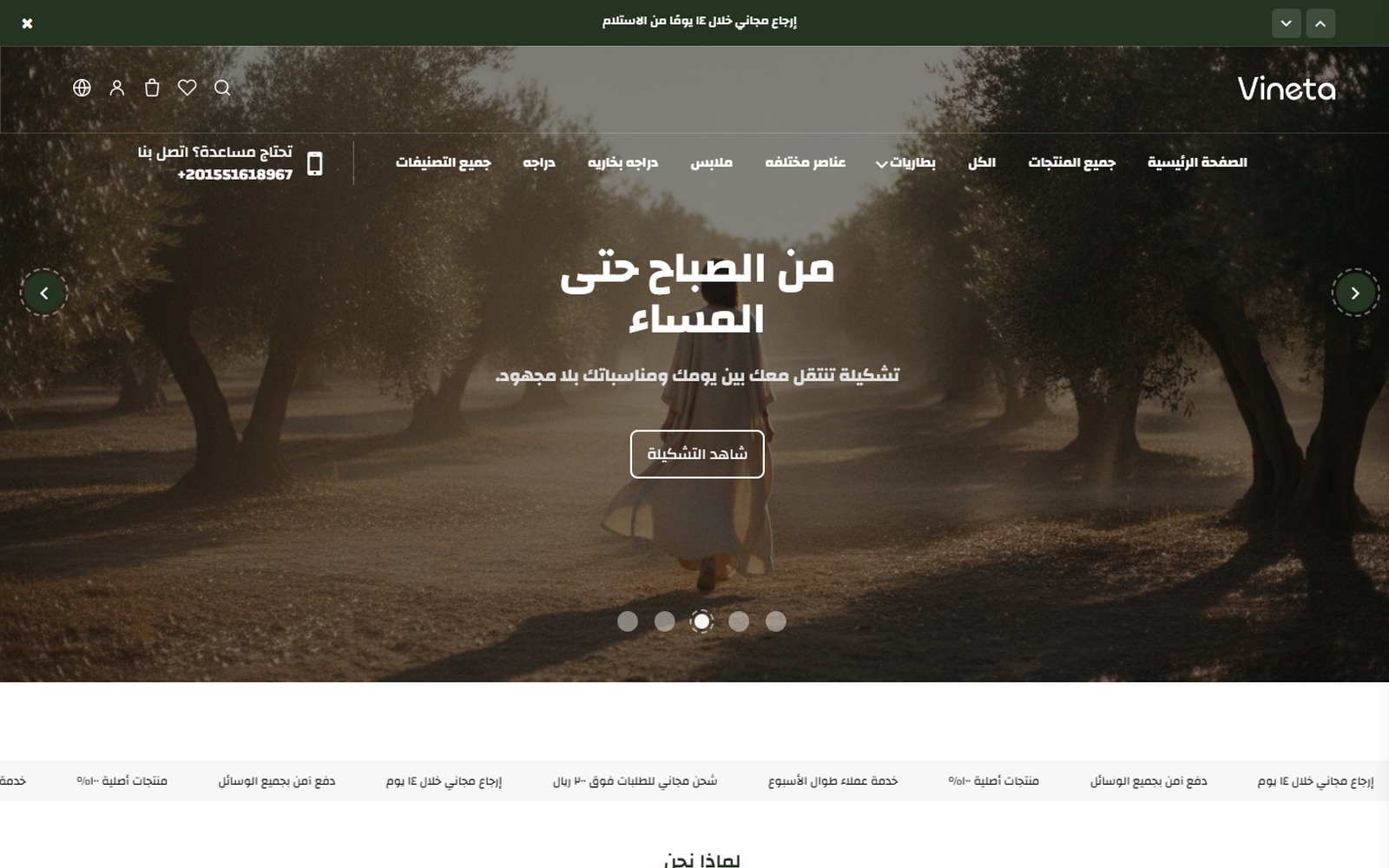
Vineta
A modern Zid theme with 22 sections and two product page designs, a true Arabic/English mirror.
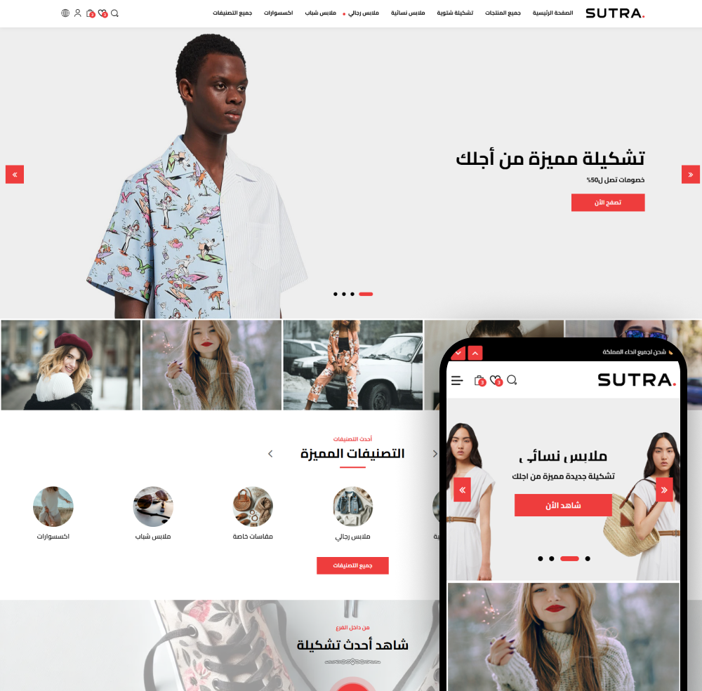
Sutra
Sutra — the best Zid store theme to grow your sales. Modern, mobile-friendly, and easy to customize.
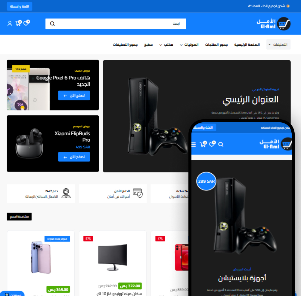
El-Aml
El-Aml — the all-in-one Zid store theme for large stores. A professional design suited to every product, with full customization and unmatched flexibility.
Need help choosing the right theme?
Our team is ready to help you pick and customize the theme that's right for your store
Contact us