



Dana 30 designs
in one theme
Each design is a complete store with its own look and sections. Apply the one closest to your business from the Zid editor; the rest stay in the theme.
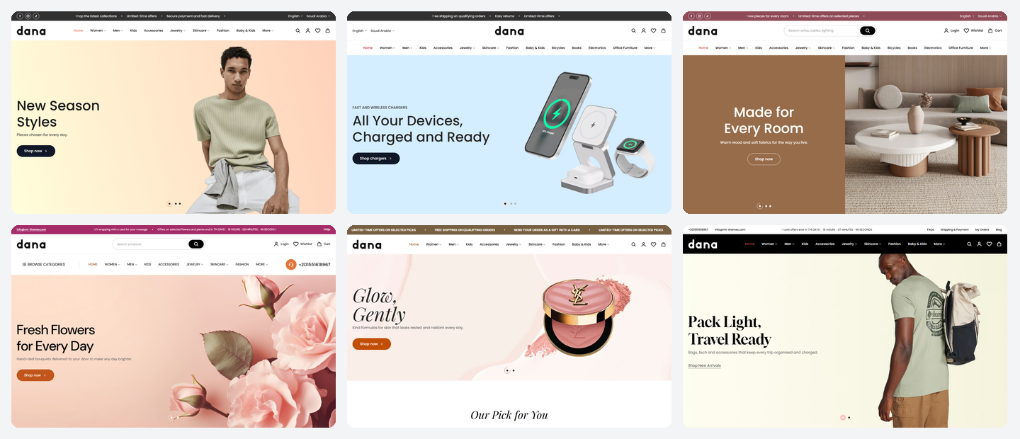
30 designs, ready to apply
Each has its own home page, header, footer, product cards and colors. Try its demo store before you buy.
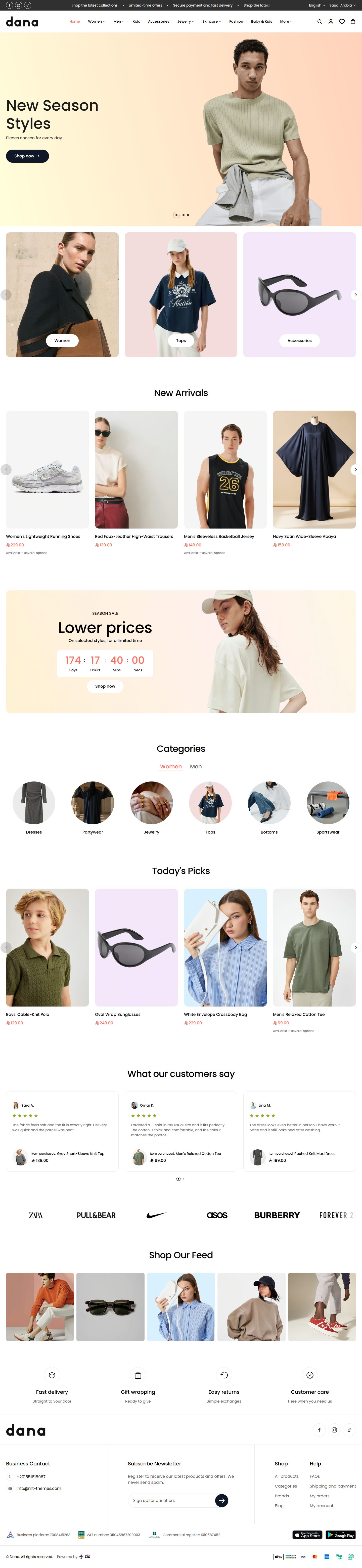

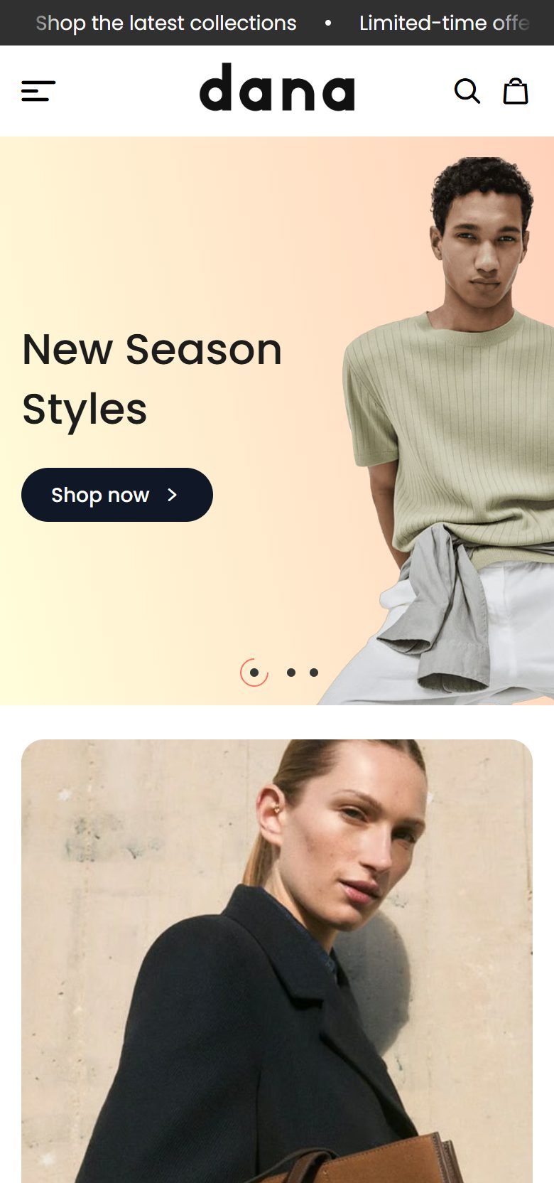
Fashion
The home page opens with a full-screen picture. It has your categories in two carousels, a “Countdown banner” for offers, customer reviews with the product beside them, a moving brand-logo strip and a photo gallery.


Baby
Soft colors and a footer with a cloud edge. The home page has a “Product bundle” for a newborn set, a “Countdown banner” for offers, tips for parents and a contact card beside a picture.
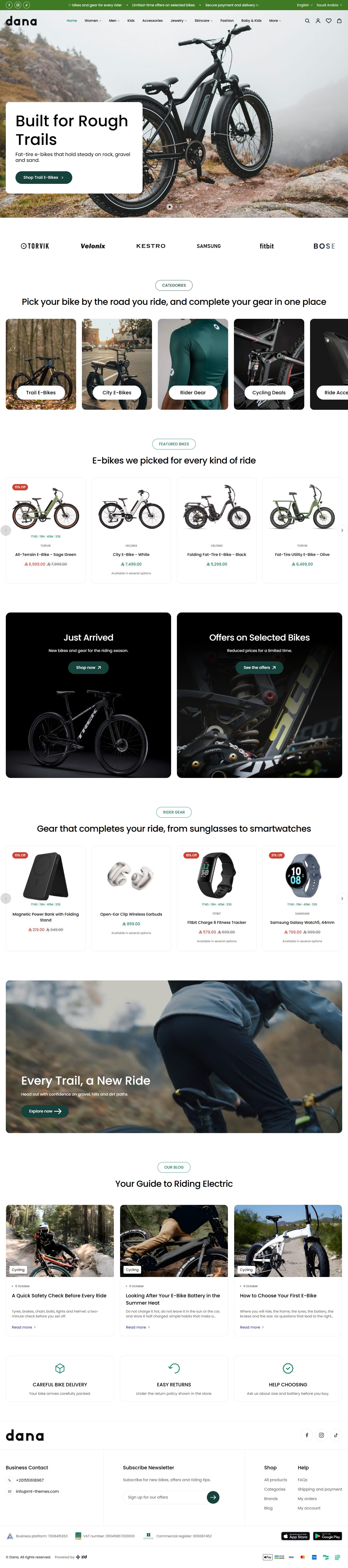

Bicycles
A clear header over a full-screen picture. The home page has a brand-logo strip, a banner grid, two product carousels, a large banner and articles on riding.
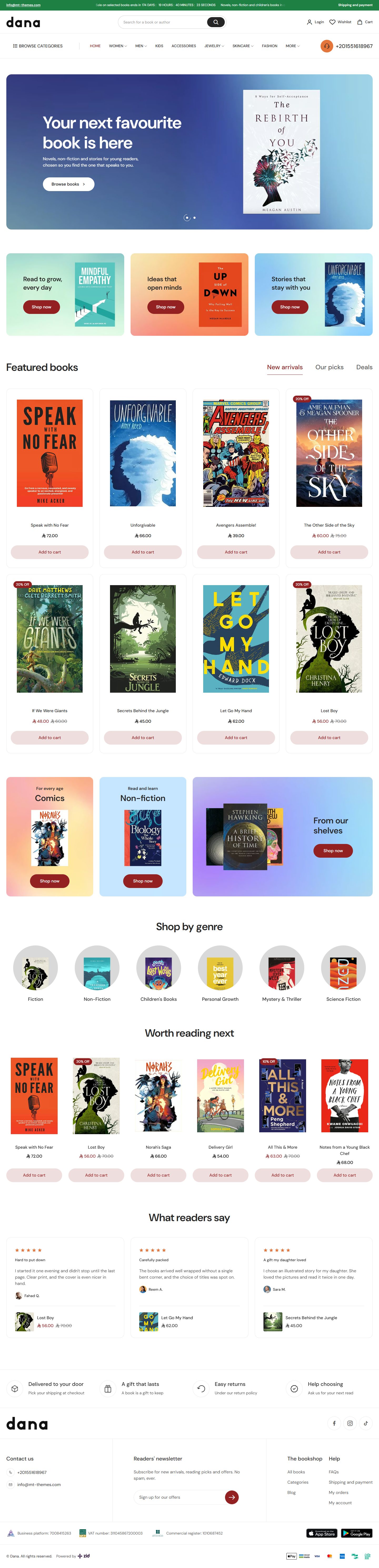

Books
Book-shaped product pictures and framed cards. The home page has “Product tabs” of picked titles, two banner grids, categories by genre and readers' reviews.
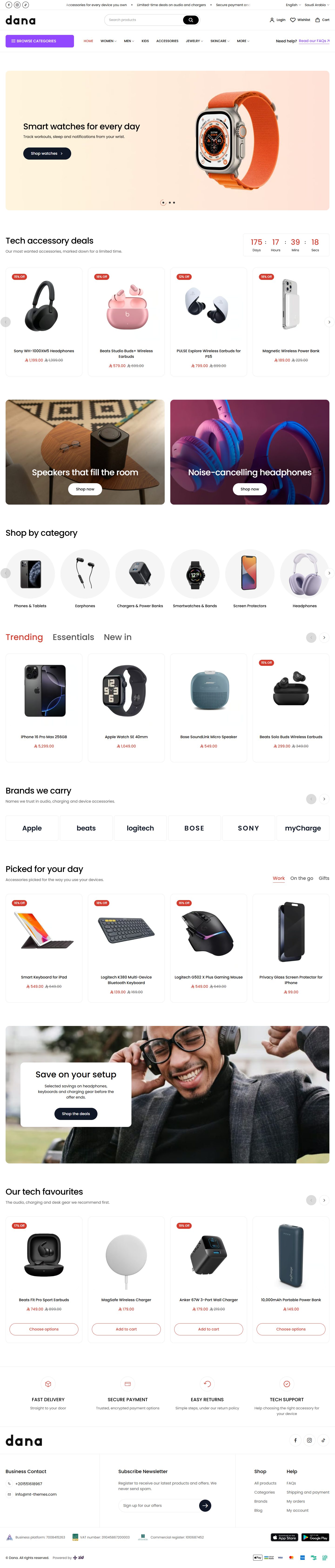

Tech Accessories
A search-row header with the categories button below. The home page has two sets of “Product tabs”, a deals carousel, a banner grid and brand logos in cells.
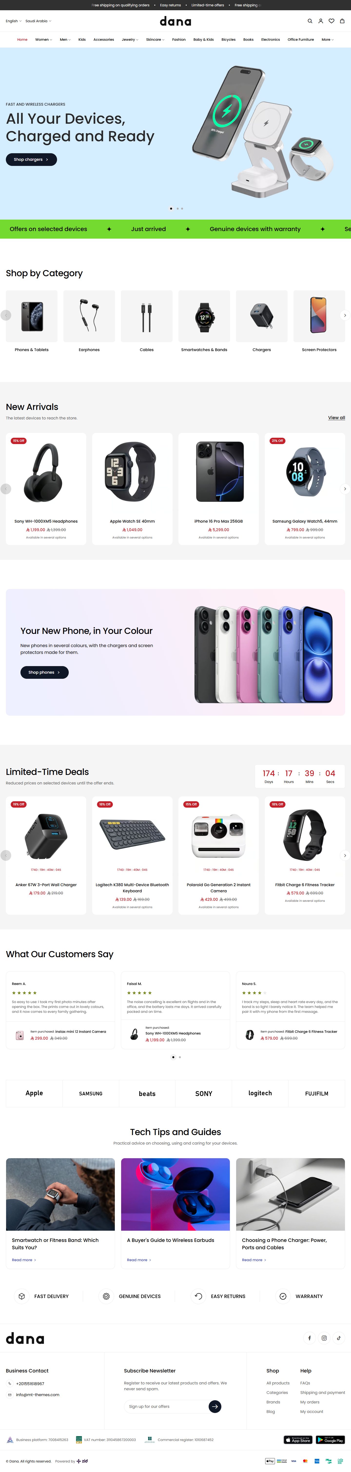

Electronics
Product cards sit on white panels, and the loading screen lifts like a curtain. The home page has a moving text strip, a “Feature banner” with a colored panel, limited-time offers, customer reviews and tech articles.
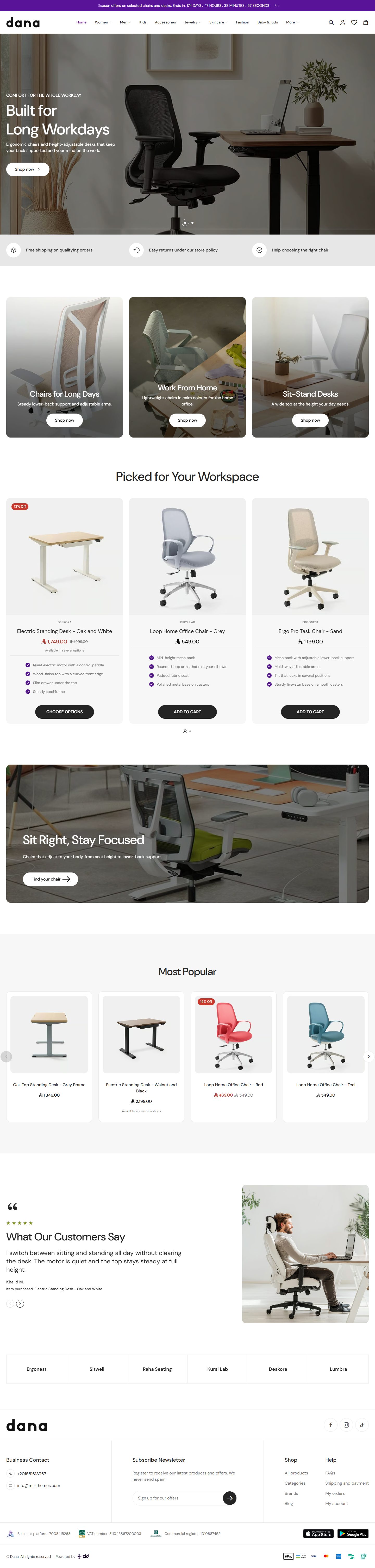

Office Furniture
Wide pictures and framed cards. The home page has your store's benefits under the first picture, a banner grid, two product carousels, reviews with customer photos and brand logos.
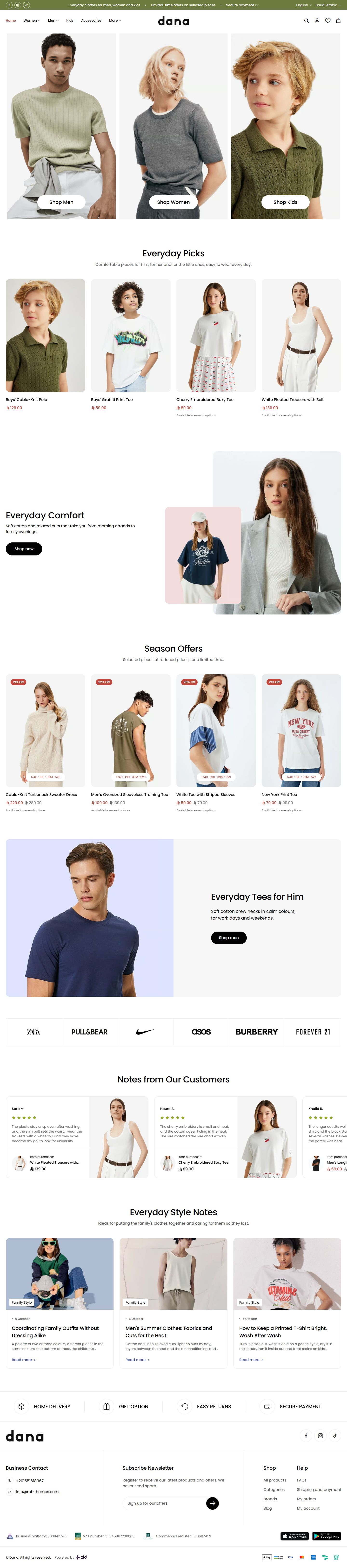

Family Fashion
The home page opens with large category pictures side by side. It has a “Feature banner” with two overlapping pictures, seasonal offers, customer reviews and style articles.
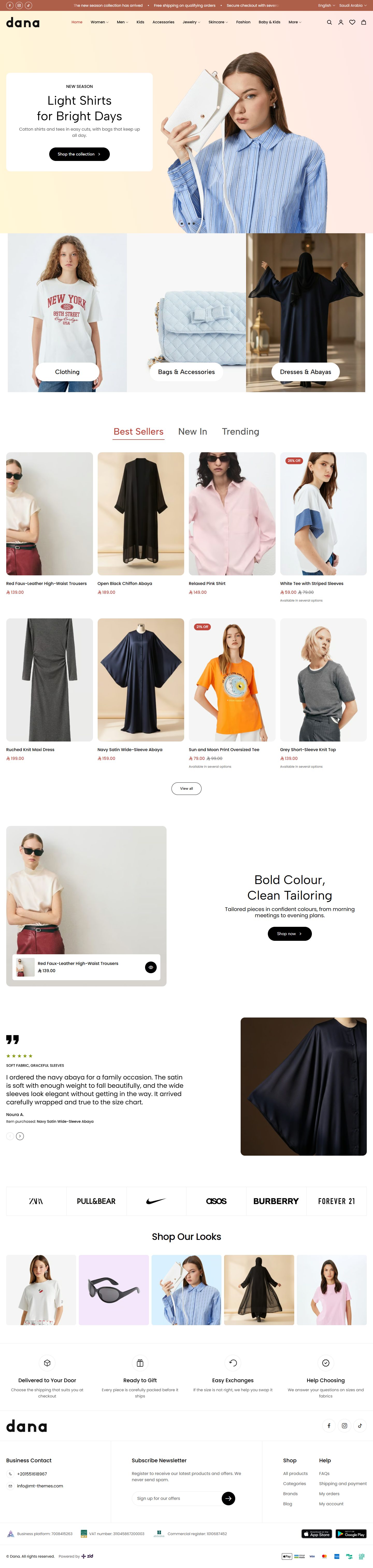

Women's Fashion
A clear header over the first picture and a curtain loading screen. The home page has “Product tabs”, customer reviews with photos, brand logos and a gallery of looks.
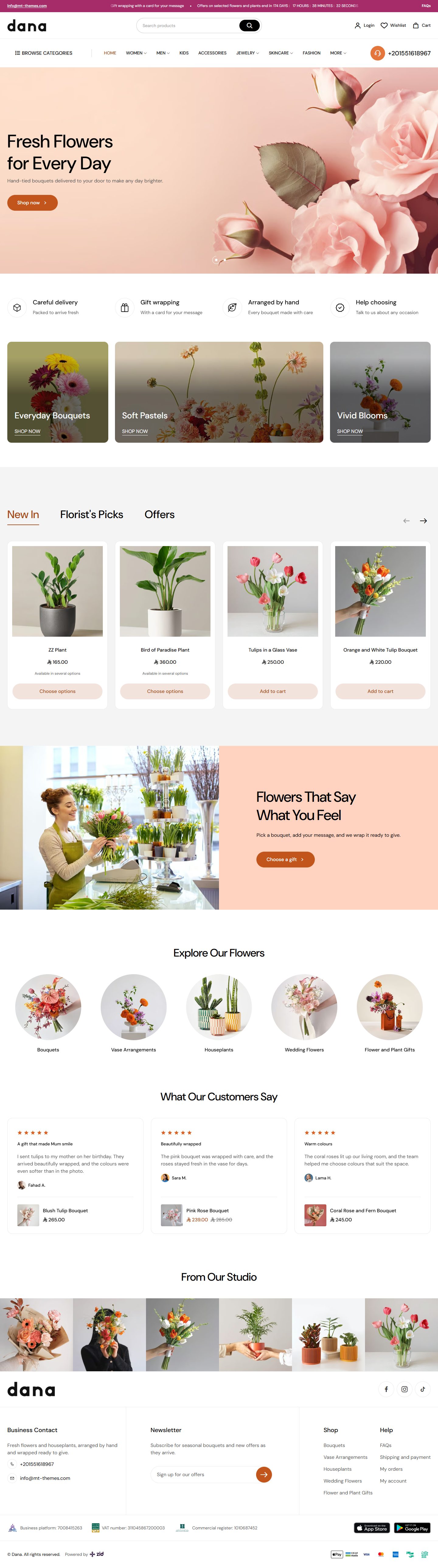

Flowers
The logo fades in and out while the page loads. The home page has a banner grid with a wide one in the middle, “Product tabs”, a “Feature banner” with a colored panel, customer reviews and a photo gallery.
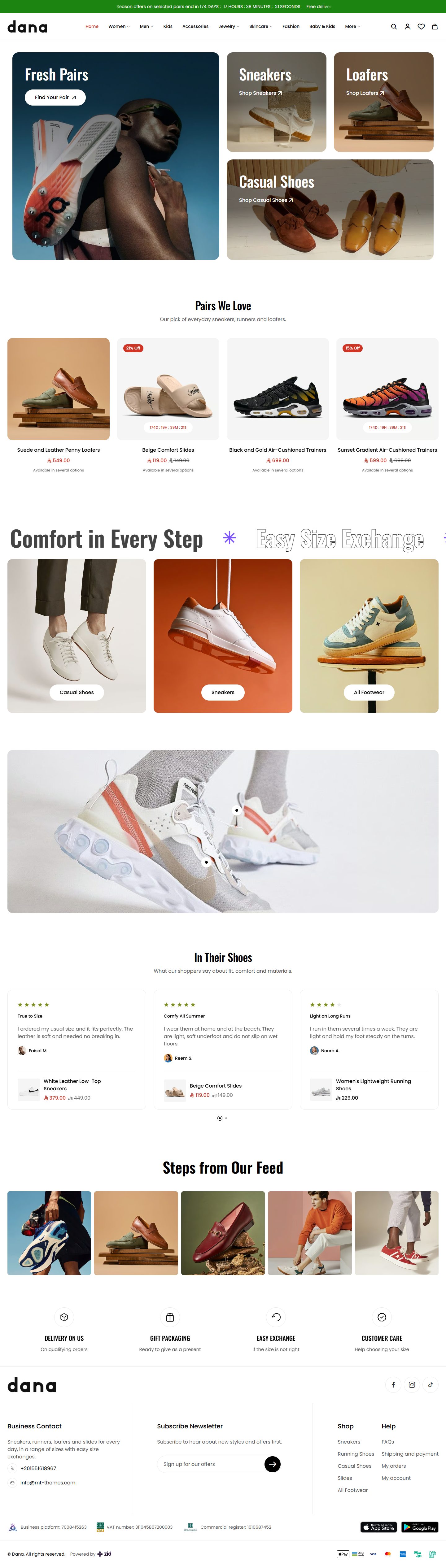

Footwear
The home page opens with a banner grid of categories, then a strip of big solid and outlined words. It has a pinned photo where shoppers tap a pin to buy, brand logos and a photo gallery.
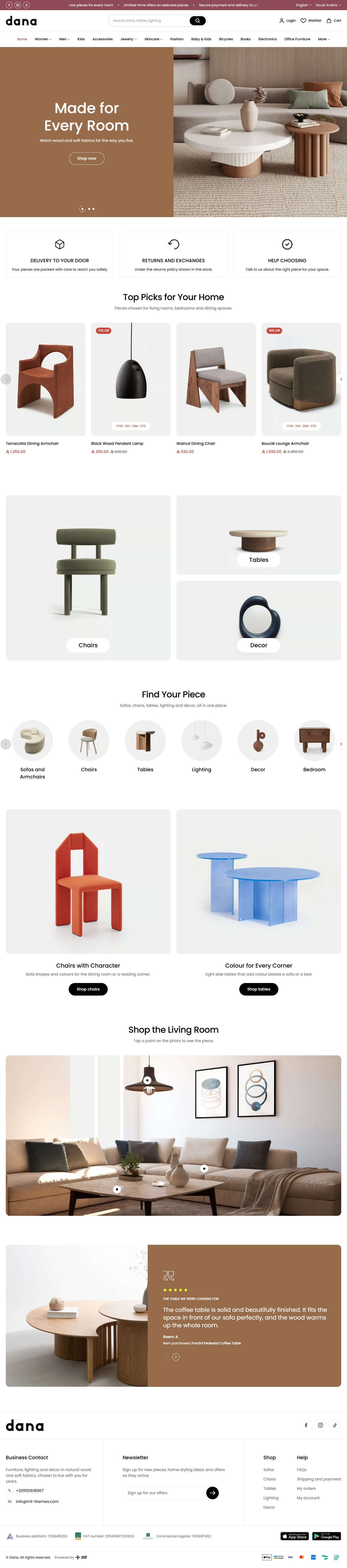

Furniture
A search-row header with the menu centered below. The home page has two banner grids, categories, a room photo with pins on the pieces and reviews with customer photos.
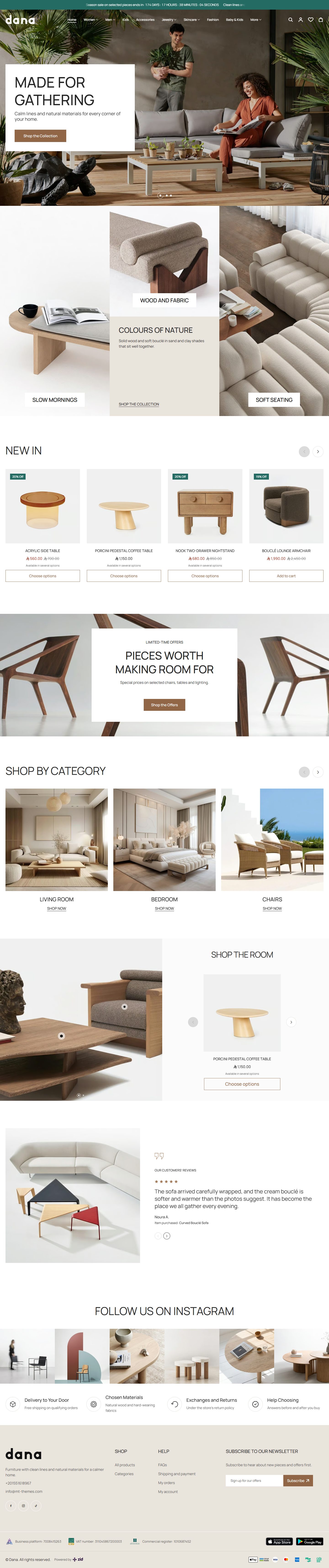

Furnishings
A clear header over a full-screen picture, and a footer with a logo and contact column. The home page has a banner grid, a room photo beside a carousel of its pieces, customer reviews and a photo gallery.
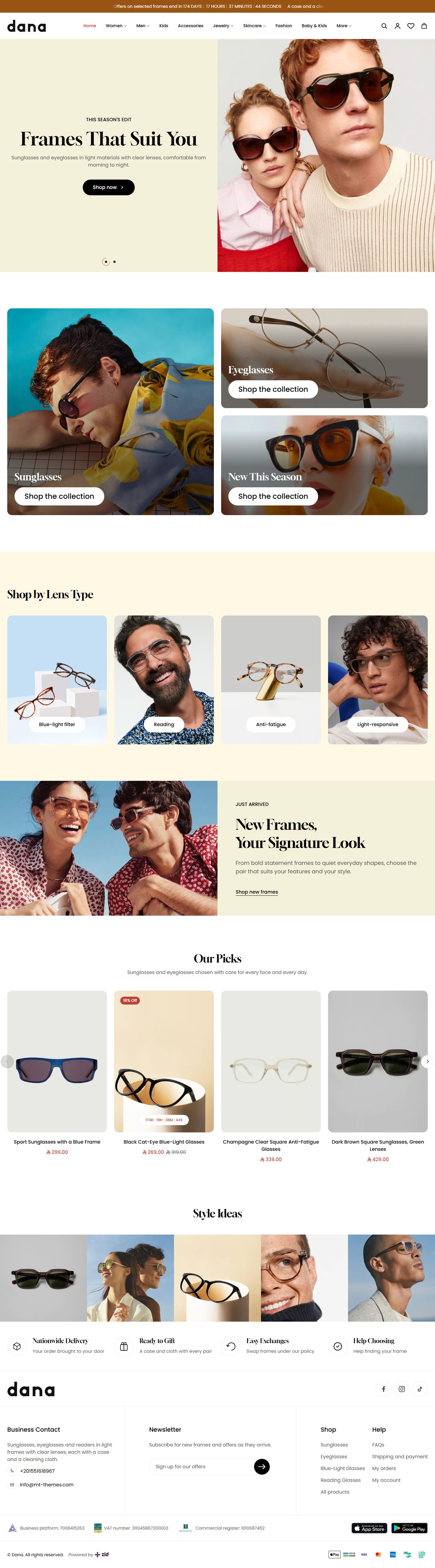

Eyewear
The first picture sits beside a color panel. The home page has shopping by lens type, a tall banner with two beside it, a “Feature banner” with a colored panel and a gallery of looks.
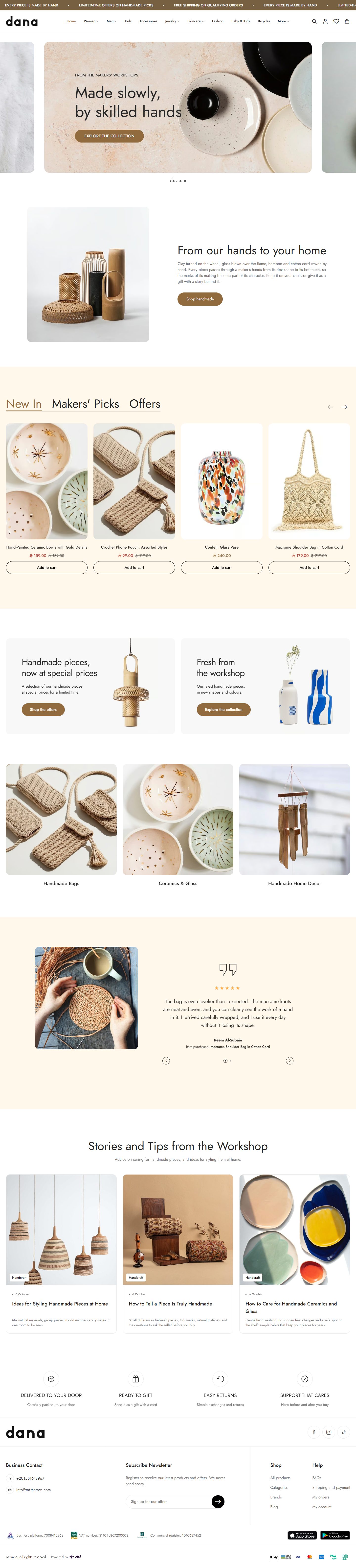

Handmade
The first slider shows a centered slide with its neighbors peeking. The home page has “Product tabs”, a “Feature banner”, reviews with customer photos and workshop articles.
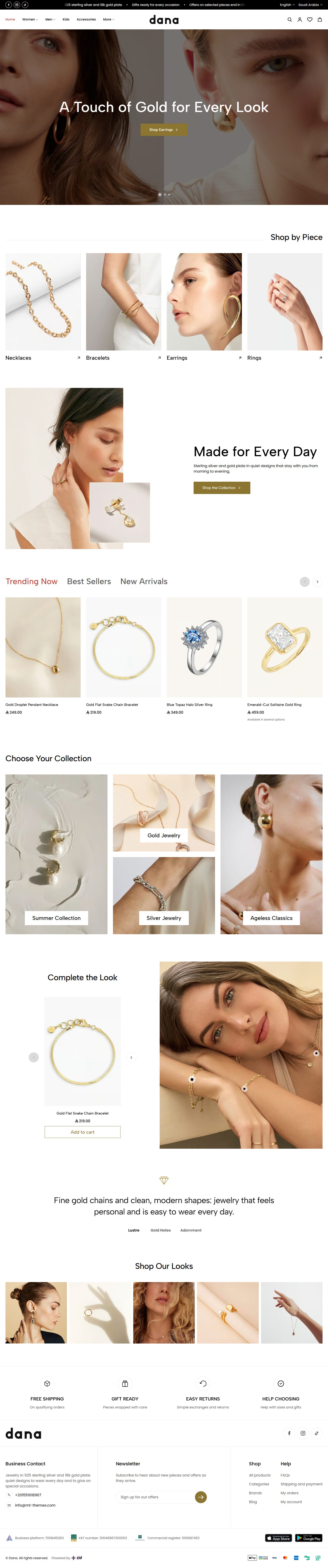

Jewelry
The store name appears in the heading font while the page loads. The home page has “Product tabs” of pieces, a look photo beside a carousel of its pieces, press quotes with their logos and a photo gallery.
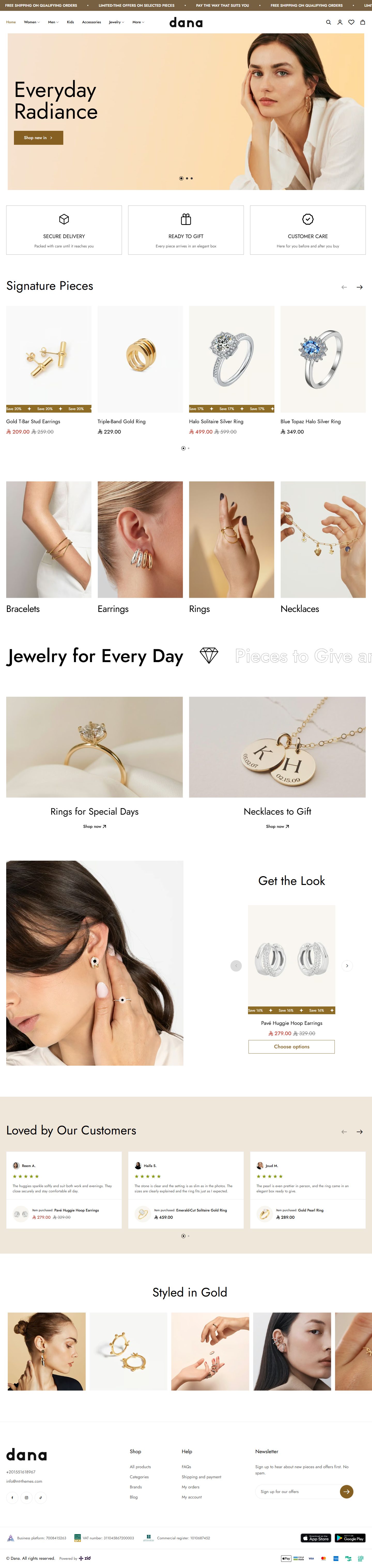

Gold
A footer with a logo and contact column. The home page has a big moving word strip, a look photo beside a carousel of its pieces, reviews with the piece beside them and a photo gallery.


Electronics Market
The home page opens with a large wide banner beside two others. It has “Product tabs” with a column of categories beside the products, more tabs above the products, customer reviews and tech articles.


Pets
A clear header over the first picture. The home page has “Videos with products”, “Product tabs”, two feature banners, customer reviews and a map with your store's details card.
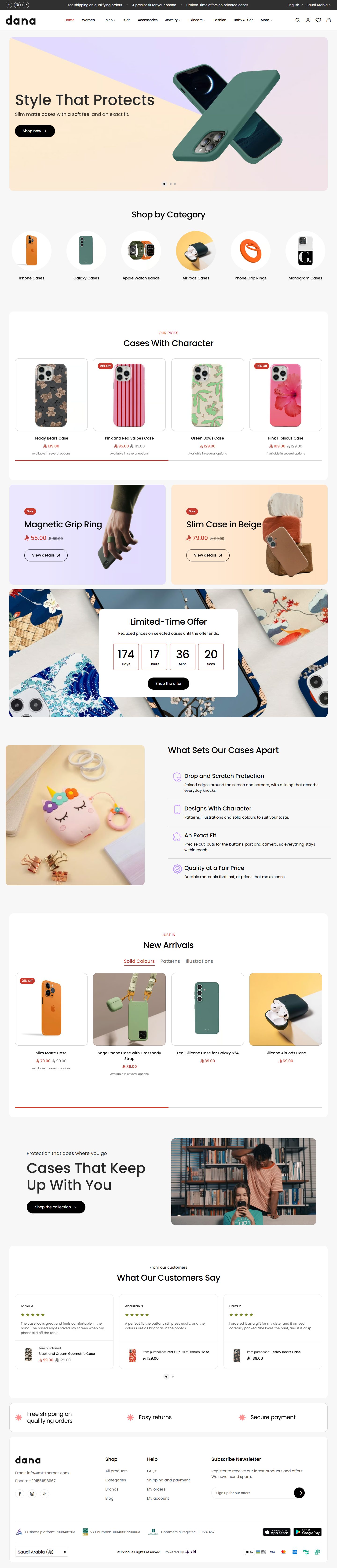

Phone Cases
The whole footer is a rounded card. The home page has a “Countdown banner”, a picture beside your store's benefits, “Product tabs” for new arrivals and customer reviews.
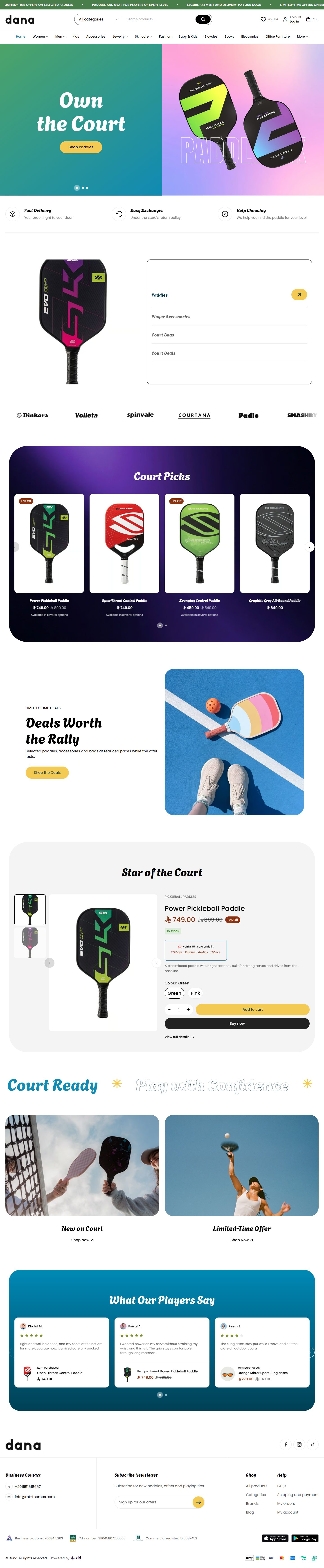

Pickleball
The first picture sits beside a color panel, with bold playful headings. The home page has “Collection tabs” whose big picture changes with each collection, a “Product spotlight”, a big word strip and players' reviews.
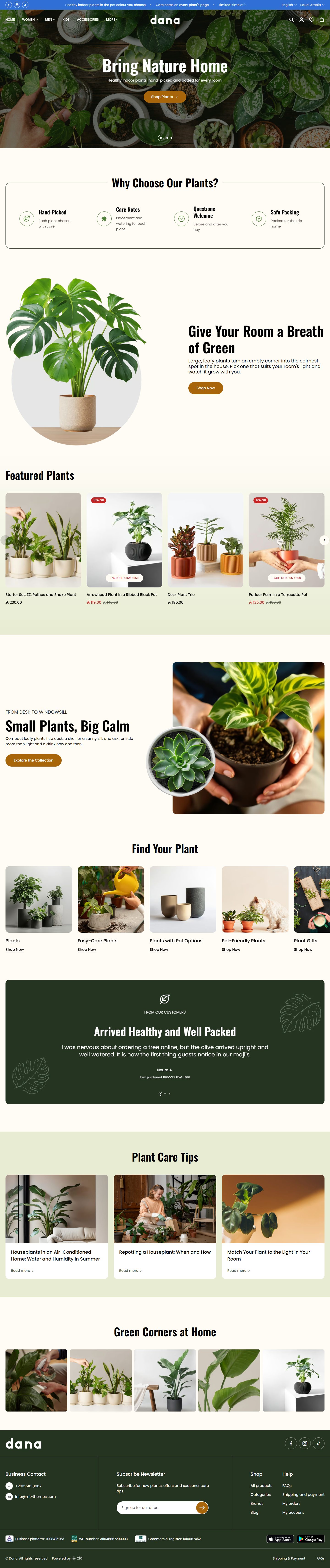

Plants
A clear header over a full-screen picture, with tall condensed headings. The home page has two feature banners, one review on a colored panel, plant-care tips and a photo gallery.


Print on Demand
Bold headings and two moving text strips above and below the first picture. The home page has a “Feature banner” with two pictures and a card between them, two banner grids, “Product tabs”, customer reviews and a photo gallery.


Skincare
A clear header over the first picture. The home page has “Videos with products” for routine steps, a “Before and after” the shopper drags, three feature banners and customer reviews.
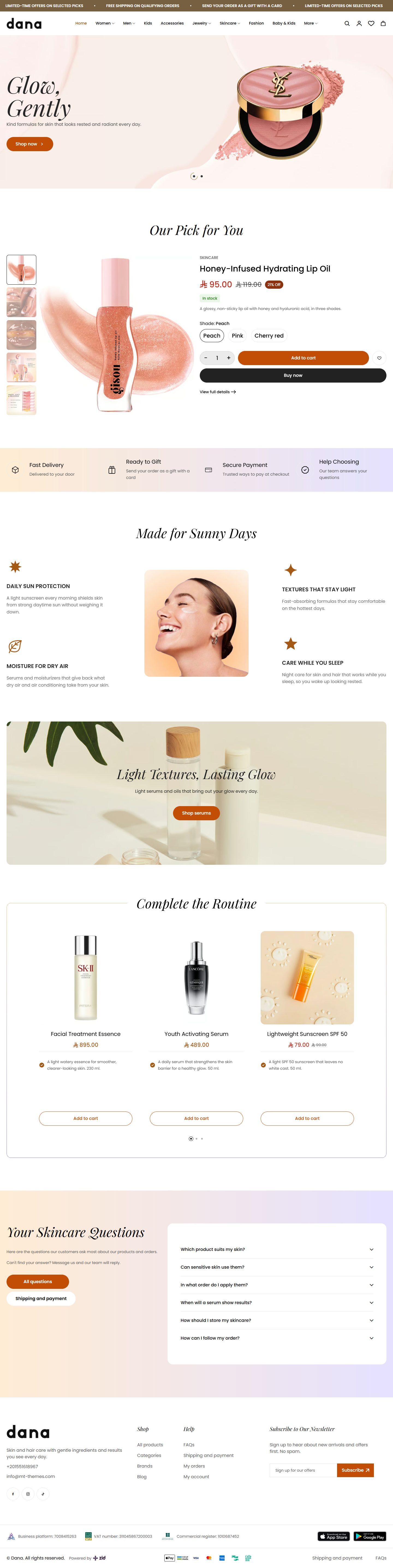

Glow
Product cards show the brand, key points and a button. The home page has a “Product spotlight” after the first picture, your store's benefits around a centered picture, a full routine in a carousel and FAQs.
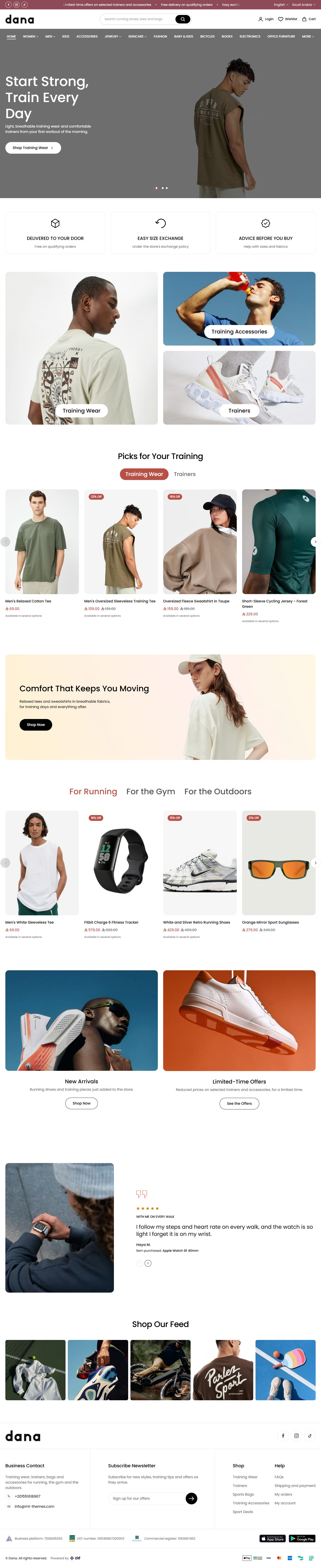

Sportswear
A clear header over the first picture. The home page has two sets of “Product tabs”, one by activity, two banner grids, brand logos and reviews with customer photos.
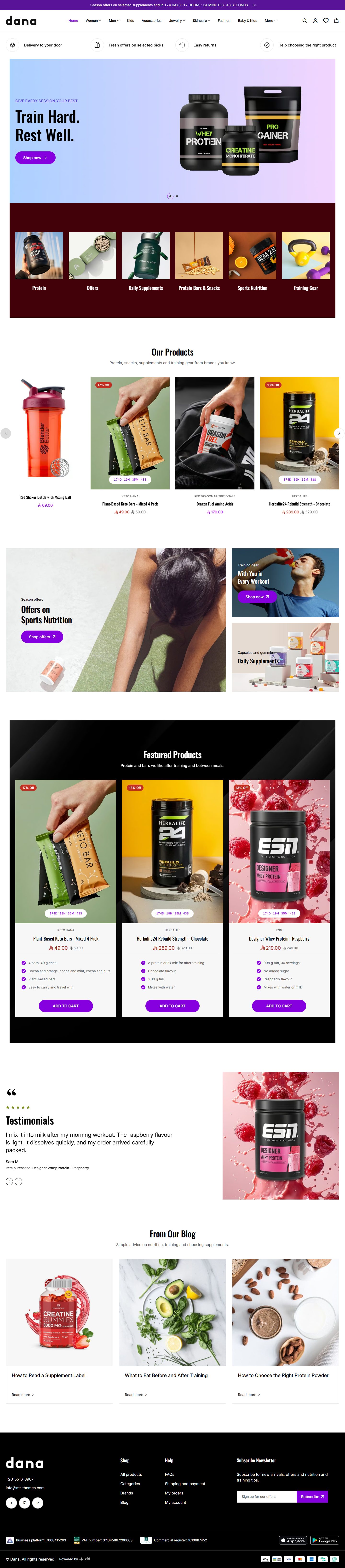

Supplements
Tall athletic headings and a dark footer with a logo and contact column. The home page opens with your store's benefits, and has two product carousels, a large wide banner beside two others, customer reviews and articles.
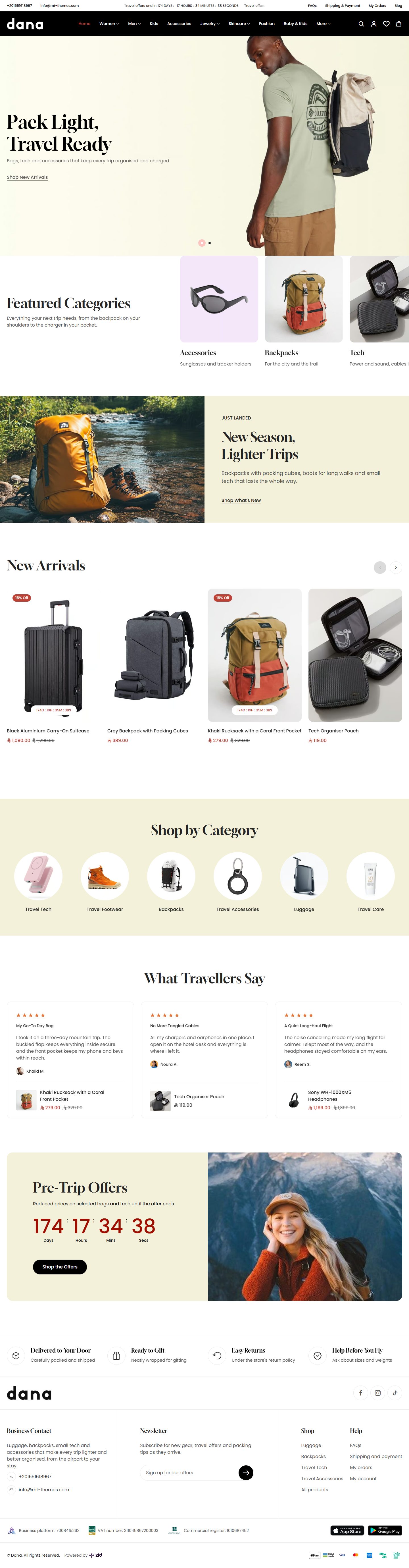

Travel
A dark header over a full-screen picture. The home page has categories in two carousels, a “Feature banner” with a colored panel, travelers' reviews and a “Countdown banner” for pre-trip offers.
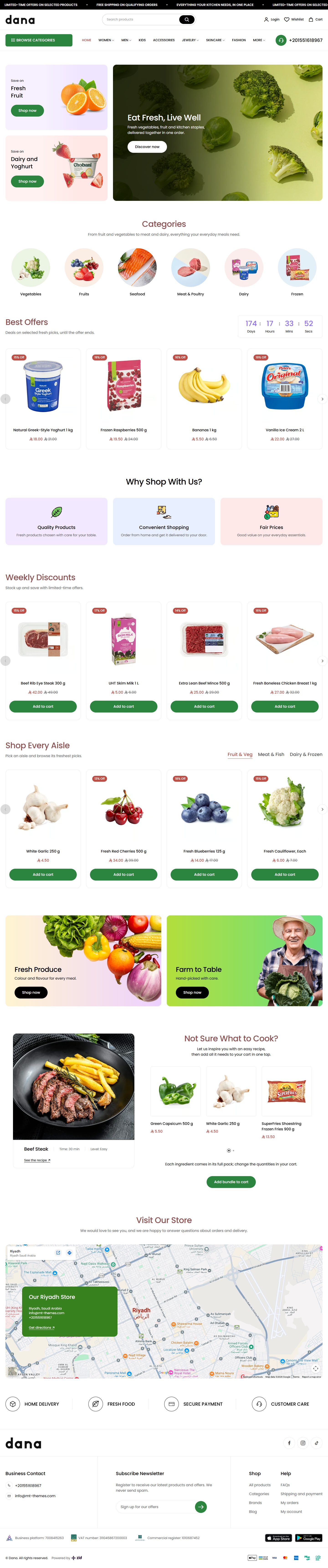

Grocery
The home page opens with a large wide banner beside two others. It has the week's deals, “Product tabs” for each aisle, a “Product bundle” that adds a recipe's ingredients to the cart in one tap, and a map with your store's details card.
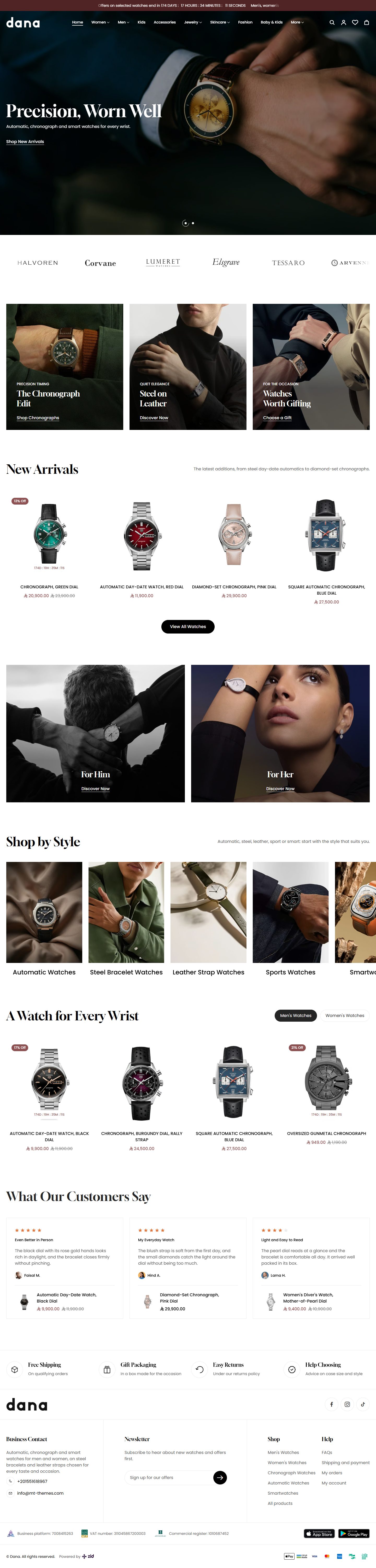

Watches
A clear header over a full-screen wrist picture. The home page has a brand-logo strip, two banner grids, “Product tabs” for men and women and customer reviews.
All designs come in one theme at one price, with the same features and settings.
Compare any 3 designs
Every section and feature is in all of them. Only the look differs.
| Part |  FashionFor clothing, with a full-screen first picture |  BabySoft and playful, for baby and kids' gear |  BicyclesGreen and bold, for e-bikes and riding gear |
|---|---|---|---|
| Header design | Logo at the start, menu in the middle | Country and language, centred logo, menu below | Logo at the start, menu in the middle |
| Product card design | Standard: picture, text below | Standard: picture, text below | Framed: a thin line round the card |
| Footer design | Logo and social on top, divided columns below | Logo and social on top, divided columns below | Logo and social on top, divided columns below |
| Loading screen style | Thin spinning ring | Three bouncing dots | Store name in the heading font |
| Fonts | Poppins | Poppins, headings in Grandstander | Poppins |
| Home page sections | 10 sections | 10 sections | 9 sections |
| Every theme feature | Included | Included | Included |
| Demo store | Live demo | Live demo | Live demo |
You can mix them. Each part has its own style option: a header from one design and product cards from another, with no code.
Switch designs in Zid's editor
No developer, no second install. Every design is inside the theme editor.
-
1
Install Dana
Buy it from Zid's theme store and press
Activate
. -
2
Open
Customize
and clickPreview presets
On Zid's themes page, click
Customize
. In the editor,Switch layouts in one click.
is followed byPreview presets
: click it to open thePresets
panel with every design, its name and pictures. -
3
Choose a design and press
Apply
Zid asks
Apply changes to current theme?
: confirm, and the design replaces your customization in the editor. Visitors see it afterPublish
.
Or import a design from a file. Every design has a ready file: download it, press Import
in the Dana editor and choose it. It does what Apply
does, but at once, with no confirmation. Every design's file
Before you switch
- 1
Choose your design first, then edit it: applying replaces your customization, it does not add to it.
- 2
Before you apply or import, press
Export
. It downloads settings.json with your customization in both languages, unpublished changes included, and importing it brings it all back. - 3
Visitors see no change until you press
Publish
, and your products and categories stay untouched.
Details
Apply
andImport
make the global settings, header, footer and home sections exactly what the file says: a section it lacks is removed, a setting it lacks goes back to its default, and a part it lacks in one language is emptied in that language (a file with no English home page empties yours).- Before publishing:
Undo all changes
returns to the published version and drops every unpublished change. - After publishing: in
History
, pressRestore
on the newest entry (markedCurrent version
). The version live before your last publish comes back as an edit: check it and pressPublish
. - Unpublished changes are not in the history. Only your exported file brings them back:
Import
it, thenPublish
. - The file holds none of your products, categories, store pages or store settings, and its images are only links.
- Import a file only into the theme it came from or was made for: Zid does not check it.
Features in every design
30 ready designs in one theme
Each design is a complete store: sections, texts, colors and fonts.
24 home sections, 53 looks
Sliders, categories, tabs, banners, pinned photos, videos and a before and after, arranged as you like.
Your store's look, colors and fonts
13 colors to set, 29 Arabic and 20 English fonts, and the shape of buttons and corners.
Many header and footer designs
5 headers, 3 top bars and 3 footers, and a header that can sit clear over the first picture.
Product cards that sell
Four designs with a second picture on hover, quick buttons and the discount rate.
Offer countdowns
A countdown on the card and the product page when a sale has an end date, and a “Countdown banner”.
Cart drawer with suggestions
With the discount code and a free shipping bar.
A complete product page
Four gallery layouts, three kinds of zoom, a size guide and an add-to-cart bar that stays in view.
Flexible category pages
Five filter layouts, 2 to 6 products per row, and a grid or list view.
WhatsApp button with a welcome window
With welcome messages and a ready message the customer starts the chat with.
Popup and internal ads
A popup of pictures and offers or of products with a countdown, and ads inside your pages.
Made for phones
A fixed button bar at the bottom and phone spacing in every section.
Arabic and English
Every design in both languages, with the page direction set by itself.
Ready for search engines
One main heading per page, and light pictures that load as the customer reaches them.
Theme user guide
One guide for every design: the settings are the same.
Download any design, ready to import
Every design has a file with its demo store look. Download it, import it into Dana, then put in your own texts and pictures.
-
Fashion
Download
-
Baby
Download
-
Bicycles
Download
-
 Books
Download
Books
Download
-
 Tech Accessories
Download
Tech Accessories
Download
-
 Electronics
Download
Electronics
Download
-
 Office Furniture
Download
Office Furniture
Download
-
 Family Fashion
Download
Family Fashion
Download
-
 Women's Fashion
Download
Women's Fashion
Download
-
 Flowers
Download
Flowers
Download
-
 Footwear
Download
Footwear
Download
-
 Furniture
Download
Furniture
Download
-
 Furnishings
Download
Furnishings
Download
-
 Eyewear
Download
Eyewear
Download
-
 Handmade
Download
Handmade
Download
-
 Jewelry
Download
Jewelry
Download
-
 Gold
Download
Gold
Download
-
 Electronics Market
Download
Electronics Market
Download
-
 Pets
Download
Pets
Download
-
 Phone Cases
Download
Phone Cases
Download
-
 Pickleball
Download
Pickleball
Download
-
 Plants
Download
Plants
Download
-
 Print on Demand
Download
Print on Demand
Download
-
 Skincare
Download
Skincare
Download
-
 Glow
Download
Glow
Download
-
 Sportswear
Download
Sportswear
Download
-
 Supplements
Download
Supplements
Download
-
 Travel
Download
Travel
Download
-
 Grocery
Download
Grocery
Download
-
 Watches
Download
Watches
Download
No design by that name.
How to import it
- Download the file.
- In your Zid dashboard, click
Customize
on Dana, thenImport
and choose the file. - Check the result and press
Publish
.
Import replaces your customization without asking, so press Export
first. Your products and categories stay as they are. More about it in “Switch designs in Zid's editor”.
Start here
New to Dana? Start here: what the theme includes, how to apply one of the 30 designs, where each setting is in the editor, and the picture sizes.
Dana is a Zid theme in Arabic and English with 30 ready designs for many kinds of business, such as fashion, electronics, flowers and books. All come inside the one theme you buy; every name is in “The 30 designs”.
Everything is changed in the Zid theme editor, with no code: look, colours and fonts, the header (5 designs) and top bar (3), the footer (3), the product card (4), home sections (24 kinds), the product, category, cart and blog pages, the cart drawer, the search window, the loading screen, the advertising popup and the WhatsApp button.
Tips
- Start from the design closest to your business and adjust it. Each part has its own design choice, so the header can come from one design and the product card from another.
- Every design has a working copy on the demo store; browse it first.
A design puts a complete home page in your store, with its sections and text, plus its header, footer, colours and fonts. You apply it in the theme editor, and it stays a draft until you press “Publish”.
Note: applying replaces; it does not add. “Page settings”, the header, footer and home sections become exactly the design's, in both languages; sections you added are removed, and settings the design does not set return to their defaults. Your products, categories, pages and store settings are not touched.
Step by step
- On the themes page of your Zid dashboard, press “Customize” on Dana.
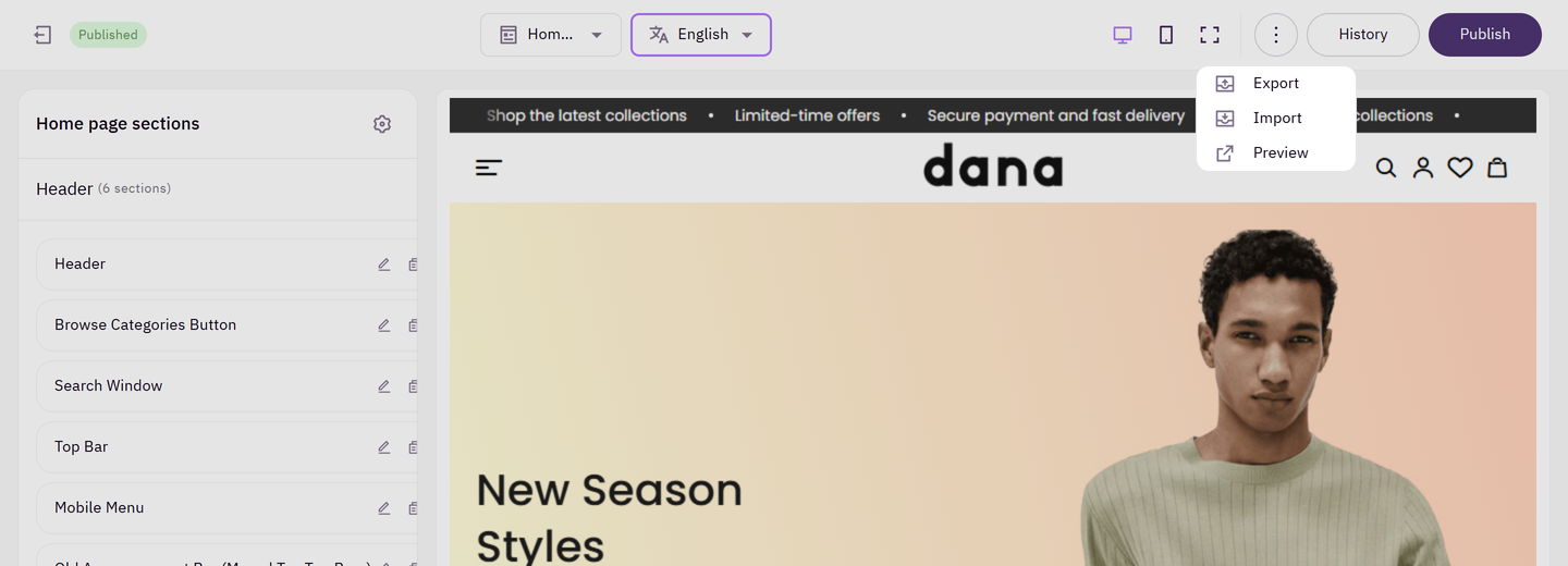
- First press “Export” and keep the file: a copy of your current customization in both languages, to go back to.
- Next to “Switch layouts in one click.” press “Preview presets”; the “Presets” panel lists the designs.
- Choose a design and press “Apply”, and “Apply” again if Zid asks you to confirm.
- Check both languages, swap in your pictures, then press “Publish”.
Tips
- “Import” of a file you exported earlier brings your customization back exactly, in both languages. It applies at once and replaces like “Apply”, so import only a file made for Dana.
- Each design's file is also on Dana's page on mt-themes.com, applied with “Import” the same way.
- A design's pictures come from the demo store so it looks like the demo; swap in your product pictures from each picture field.
- After applying, change anything: a section's look in its first field, the header in “Header design”, any text and colour.
- Changed your mind before publishing? Press “Undo all changes”. After? See “I applied a design and want my old store back” in “Questions and fixes”.
The editor has three parts: “Header” for the header, “Page content” for the home sections, and “Footer” for the footer. A fourth, “Page settings”, holds what applies to every page (look, colours, fonts, product card, product page, cart, WhatsApp).
Settings inside every section come in nearly the same order:
- The section's look.
- Content: title, text, pictures, lists and buttons.
- Layout: width, columns and height.
- Motion: autoplay, arrows and dots.
- Colours and background.
- Spacing.
- “Hide section” last.
Some fields show only with certain looks, or once the option above them is on (“Overlay color” appears with “Enable overlay”). Cannot find a field? Check the chosen look or switch on the option above it.
Step by step
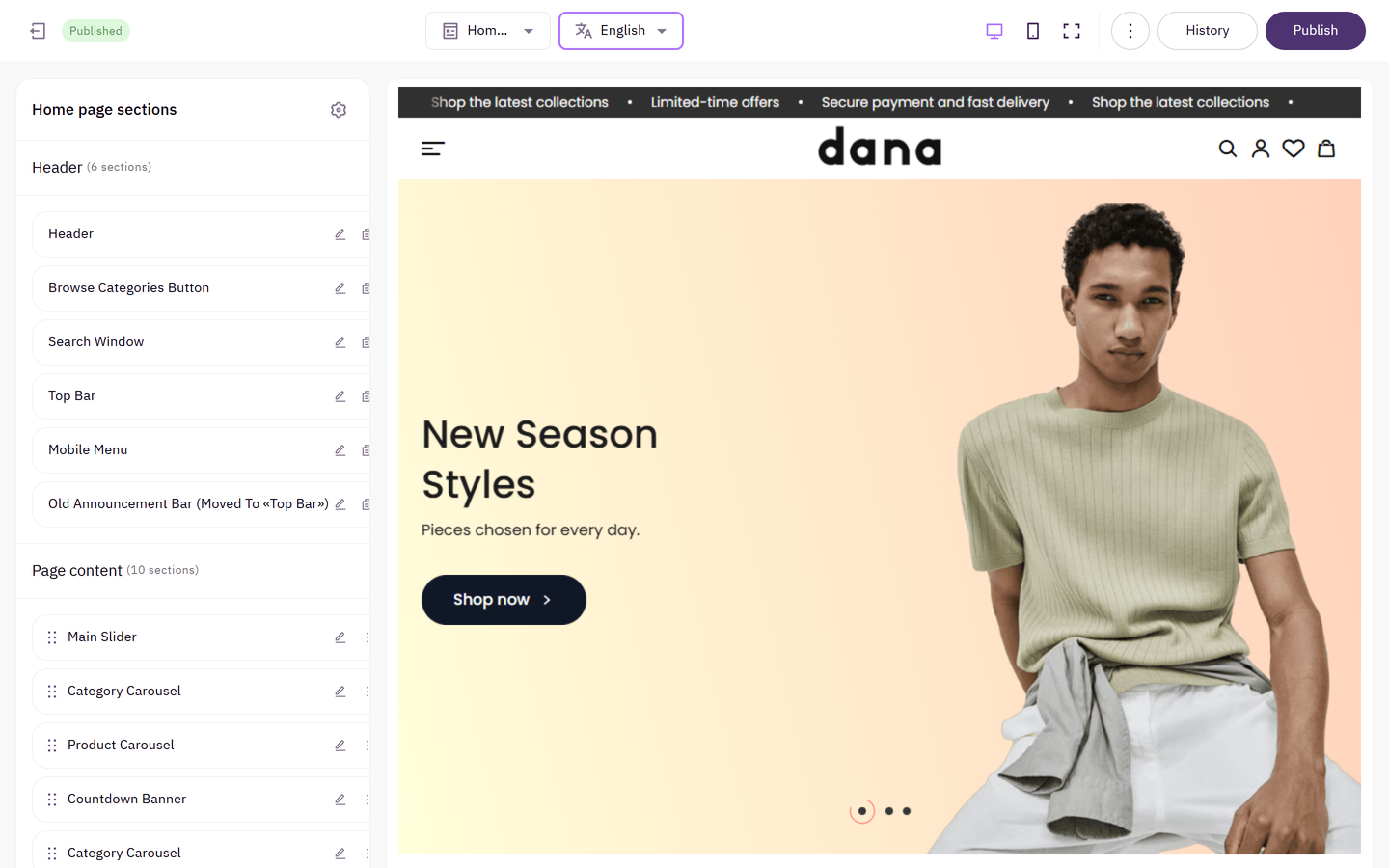
- Under “Page content”, press “Add section”.
- Find the section by name and choose it.
- Drag it into place; the list order is the page order.
- Open its settings, choose its look first, then fill in the content.
- Press “Publish”.
Tips
- To hide a section without deleting it, tick “Hide section” inside it. Its content is kept.
- Arabic and English each have their own sections; see “I edited the Arabic page and the English one did not change” in “Questions and fixes”.
- Changing a section's look changes the look only; what you wrote or uploaded stays.
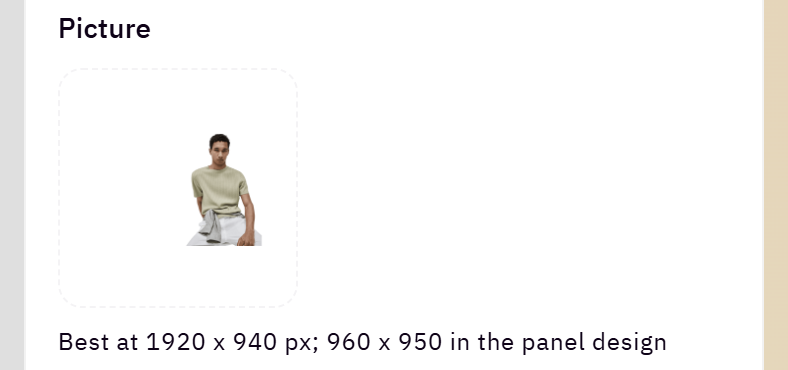
Each picture is uploaded in its field in the section and kept in your Zid store. Most sections show the suggested size under the picture field, in pixels (width x height). Most pictures are cropped to fill their space, so keep what matters (the product, a face, words) in the middle, and upload at the suggested size or a little larger.
Tips
- “Main slider”: about 1920 x 940, 960 x 950 in the panel design, and “Phone picture (optional)” 800 x 800.
- “Category carousel”: about 900 x 1000 for tall pictures and 600 x 600 for circles; empty takes the category's picture from Zid.
- “Countdown banner”: 1440 x 488, and 1050 x 800 for the picture beside the panel.
- “Before and after”: both pictures the same size, about 1440 x 545.
- “Collection tabs”: about 1300 x 1200.
- “Shop the look (pinned photo)”: about 1440 x 688; “Shop the look (photo beside a slider)” about 1000 x 1140.
- “Photo gallery”: square 800 x 800. “Testimonials”: the customer photo 700 x 700.
- “Videos with products”: a portrait 9:16 video with a cover of the same shape.
- Inner pages title bar: 1920 x 360.
- The logo: a wide PNG on a transparent background.
General settings and identity
These change every page at once, under “Page settings” in the editor: look, colours and fonts, the product card, the inner pages' title bar, the category and blog pages, the phone bottom bar, the loading screen, the advertising popup, WhatsApp, internal ads and cart recommendations.
The whole store's character in a few choices: button shape and font, card and picture corners, slider dots and heading weight. A change here applies to every page at once.

Where to find its settings
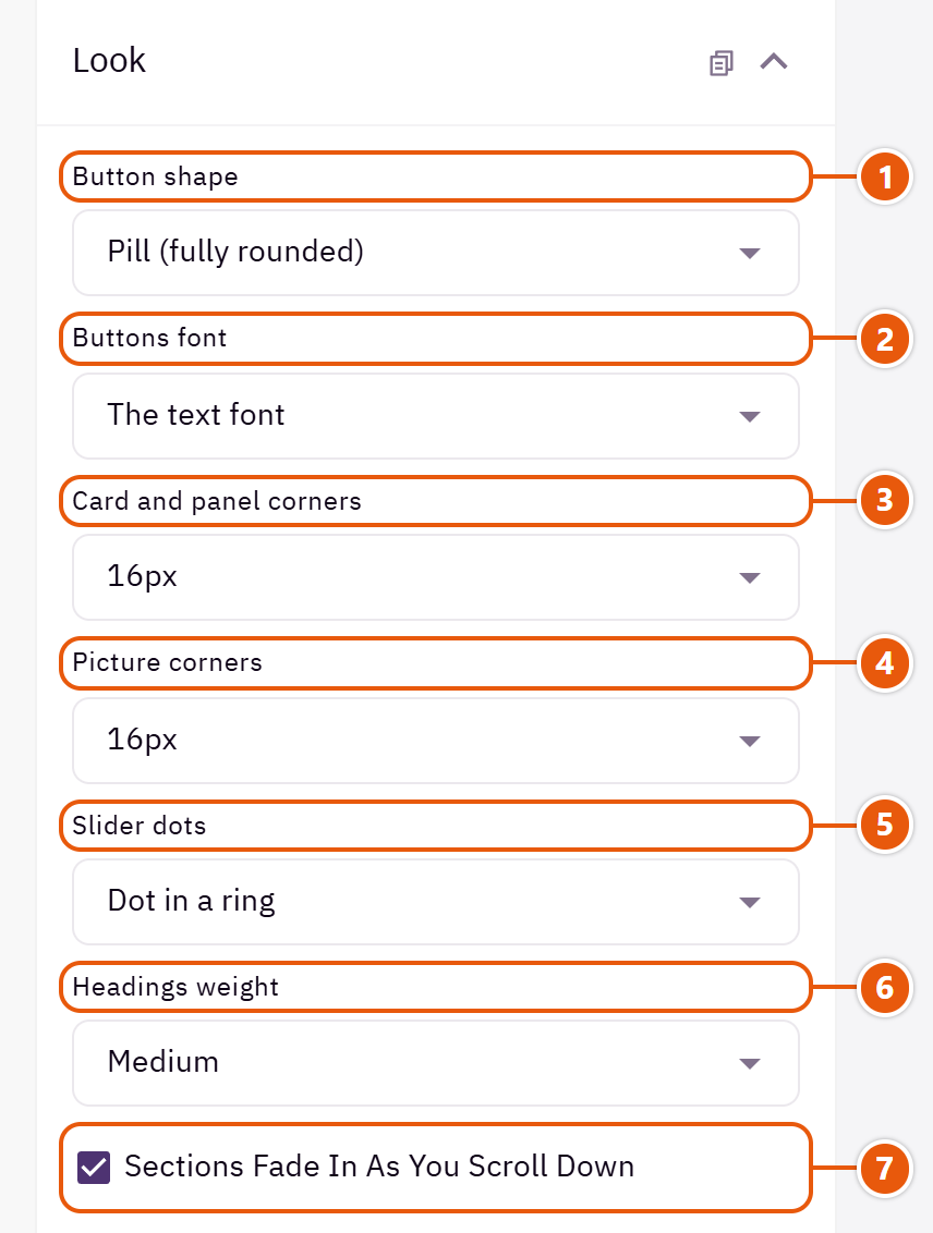
- 1“Button shape”
The shape of every button in the store. - 2“Buttons font”
“The headings font” sets every button in the store in the headings font. - 3“Card and panel corners”
Product cards, boxes and windows. - 4“Picture corners”
Banner and section pictures whose own setting is on “As the other pictures”. - 5“Slider dots”
The dots under every slider. - 6“Headings weight”
How bold headings are across the store. - 7“Sections fade in as you scroll down”
Sections appear with a gentle motion as you reach them. Turn it off for a still page.
All your store's colours in one place. Any empty field keeps the colour of the design you applied, and an empty button colour takes your Zid brand colour. Words on buttons and badges turn white or dark by themselves so they read.

Where to find its settings
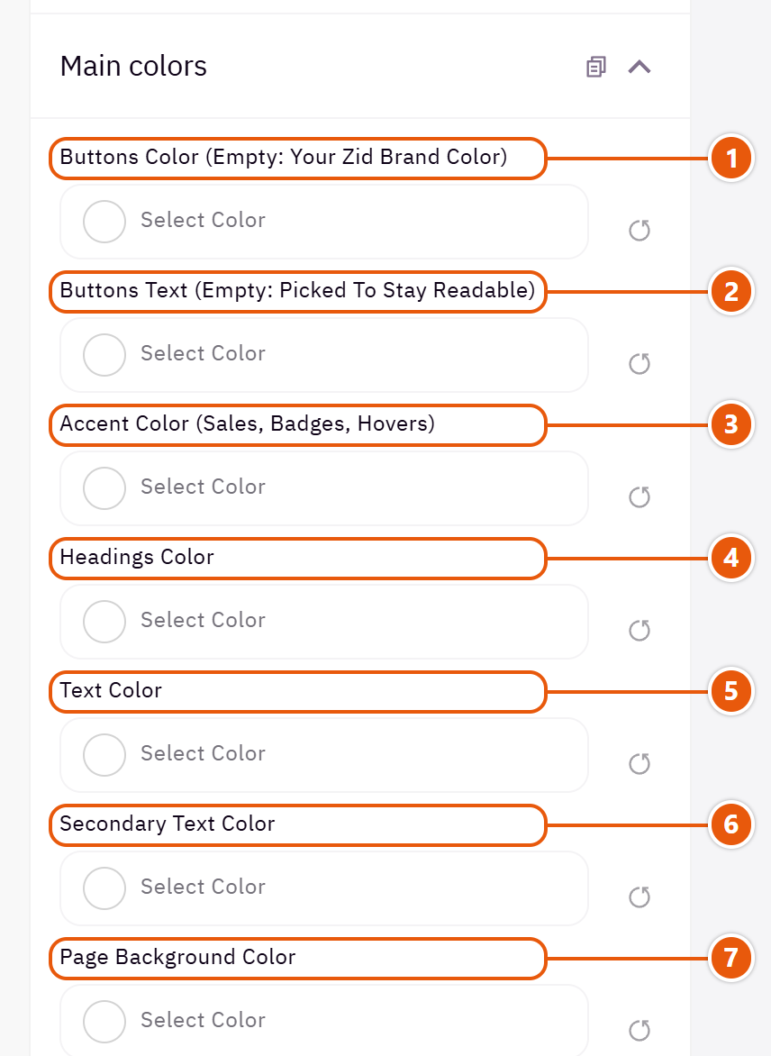
- 1“Buttons color (empty: your Zid brand color)”
The filled buttons on every page. - 2“Buttons text (empty: picked to stay readable)”
Leave it empty unless you want a particular colour. - 3“Accent color (sales, badges, hovers)”
An eye-catching colour: sales, badges and links on hover. - 4“Headings color”
Every heading. - 5“Text color”
The pages' text. - 6“Secondary text color”
Quieter text, such as lines under headings and old prices. - 7“Page background color”
With a dark background, the text turns white by itself.
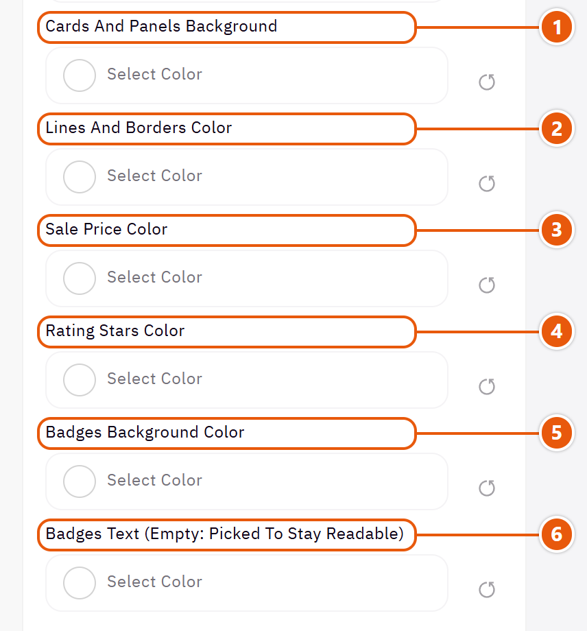
- 1“Cards and panels background”
Cards, boxes and side panels. - 2“Lines and borders color”
Dividers and field borders. - 3“Sale price color”
The discounted price. - 4“Rating stars color”
Rating stars on cards and the product page. - 5“Badges background color”
Badges such as “New” and “Sale” on cards. - 6“Badges text (empty: picked to stay readable)”
Leave it empty unless you want a particular colour.
Tips
- Applying a design writes its colours here. Change only what you need.
A font for Arabic and one for English, and different ones for headings if you like. All are Google fonts loaded with the page.

Where to find its settings

- 1“Arabic font”
The font for Arabic page text. - 2“English font”
The font for English pages. On Arabic pages, English words use the Arabic font's own Latin letters when it has them. - 3“Arabic headings font”
“Same as the Arabic font” keeps headings and text in one font. - 4“English headings font”
“Same as the English font” keeps headings and text in one font.
Tips
- Two fonts at most look cleaner and load faster.
The product card everywhere: home sections, category and search pages. Its look, its picture, the icons on it (cart, wishlist, quick view) and the details it shows. A section with its own card design setting can change it there only.

- 1“Product picture shape”
Pick the closest to your product photos' shape; “Book (taller than portrait)” for book covers. - 2“Card icons (cart, wishlist, quick view)”
Where the cart, wishlist and quick view icons sit on the picture. - 3“Discount percentage on the picture”
Such as “-20%”, only on a real sale. - 4“Product name in the headings font”
The product name in the headings font instead of the text font. - 5“Regular price colour (not the sale price)”
“The text colour” for a quieter price; a sale price keeps its own colour.
Product card design

No frame and no fill. The lightest; suits fashion.

Tidies busy catalogues such as electronics.

A filled card in the “Cards and panels background” colour. Nice on a coloured page.

Shows the brand, short features and a button. For products shoppers compare in detail.
Where to find its settings
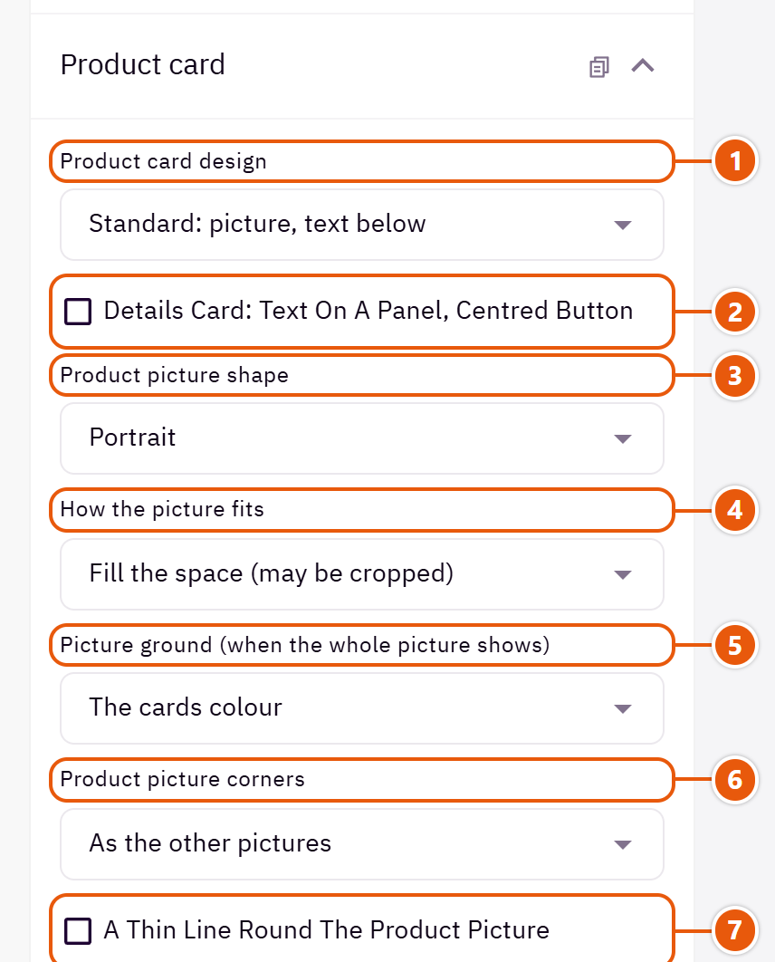
- 1“Product card design”
Changes every card in the store. - 2“Details card: text on a panel, centred button”
With the “Details: brand, features, button” card only: the words sit on a panel in the cards colour that turns dark on hover. - 3“Product picture shape”
- 4“How the picture fits”
“Whole picture, never cropped” for product shots on white, such as electronics. - 5“Picture ground (when the whole picture shows)”
“None” sets a whole picture straight on the card's ground, as book covers on white. - 6“Product picture corners”
“As the other pictures” follows “Picture corners” in “Look”. - 7“A thin line round the product picture”
Good for product shots on white, so their edges show.
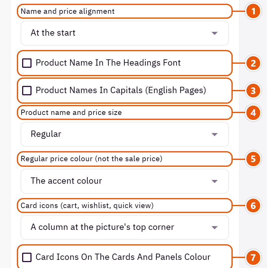
- 1“Name and price alignment”
The name and price at the start or centred. - 2“Product name in the headings font”
- 3“Product names in capitals (English pages)”
English only; Arabic has no capitals. - 4“Product name and price size”
“Large” enlarges the name and price; suits short names. - 5“Regular price colour (not the sale price)”
- 6“Card icons (cart, wishlist, quick view)”
- 7“Card icons on the cards and panels colour”
The icon circles take the cards colour instead of white.
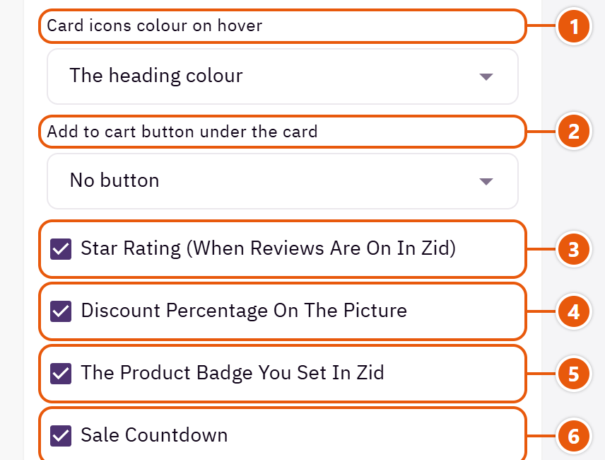
- 1“Card icons colour on hover”
The colour the cart, wishlist and quick view circles take on hover. - 2“Add to cart button under the card”
A visible button under each card; a product with options sends the shopper to its page. - 3“Star rating (when reviews are on in Zid)”
Shows only for products that have reviews. - 4“Discount percentage on the picture”
- 5“The product badge you set in Zid”
The badge you set on the product in Zid, such as “New”. - 6“Sale countdown”
A countdown on the picture when the sale has an end date in Zid.
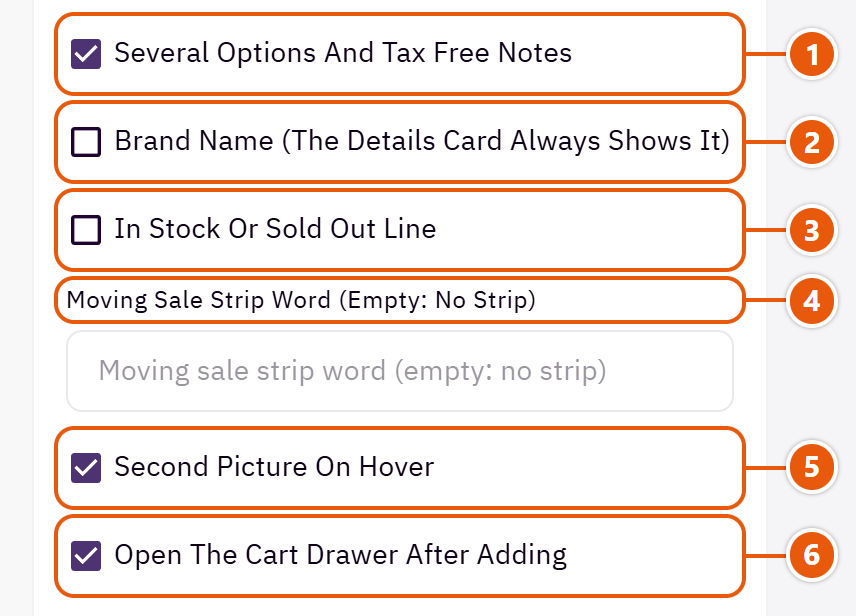
- 1“Several options and tax free notes”
“Available in several options” and “Tax free” lines under the price. - 2“Brand name (the Details card always shows it)”
The brand name above the product name. - 3“In stock or sold out line”
An “In stock” or “Sold out” line under the price. - 4“Moving sale strip word (empty: no strip)”
A word such as “Sale” moving in a strip across discounted products' pictures. - 5“Second picture on hover”
On computers the product's second picture shows on hover. - 6“Open the cart drawer after adding”
After adding, the cart drawer opens; off: the button itself says the product was added.
Tips
- Product photos of one size and background keep the rows tidy.
The bar holding the page title and its path (Home / Category) at the top of category, products, blog, pages and cart. With a picture or two blended colours.

Where to find its settings
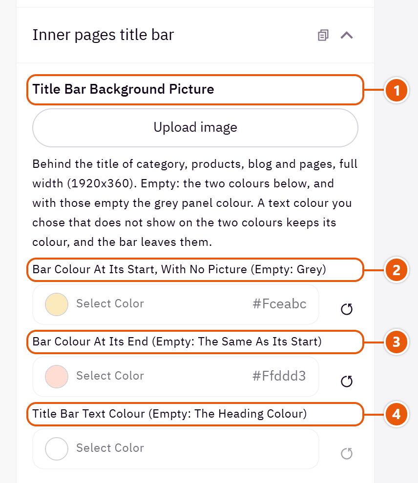
- 1“Title bar background picture”
A calm wide picture about 1920 x 360 behind the title. - 2“Bar colour at its start, with no picture (empty: grey)”
The first colour of the blend, when there is no picture. - 3“Bar colour at its end (empty: the same as its start)”
The blend's last colour; the same as the first for a single colour. - 4“Title bar text colour (empty: the heading colour)”
The title and path on the bar.
The category, all-products and search pages: filters, products per row, how more products load, and the sub-categories strip with pictures. When a category has no sub-categories in Zid, the strip takes them from the header menu.

Where to find its settings
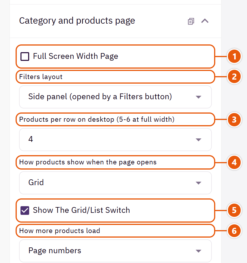
- 1“Full screen width page”
The products take the whole screen width; allows 5 or 6 per row. - 2“Filters layout”
The filters come from Zid's filter settings in your dashboard; this sets their look only. - 3“Products per row on desktop (5-6 at full width)”
On computers; phones show two. - 4“How products show when the page opens”
“List” shows each product on a line with a short description. - 5“Show the grid/list switch”
A switch letting the shopper pick grid or list. - 6“How more products load”
“Load automatically while scrolling” brings more products without a tap.
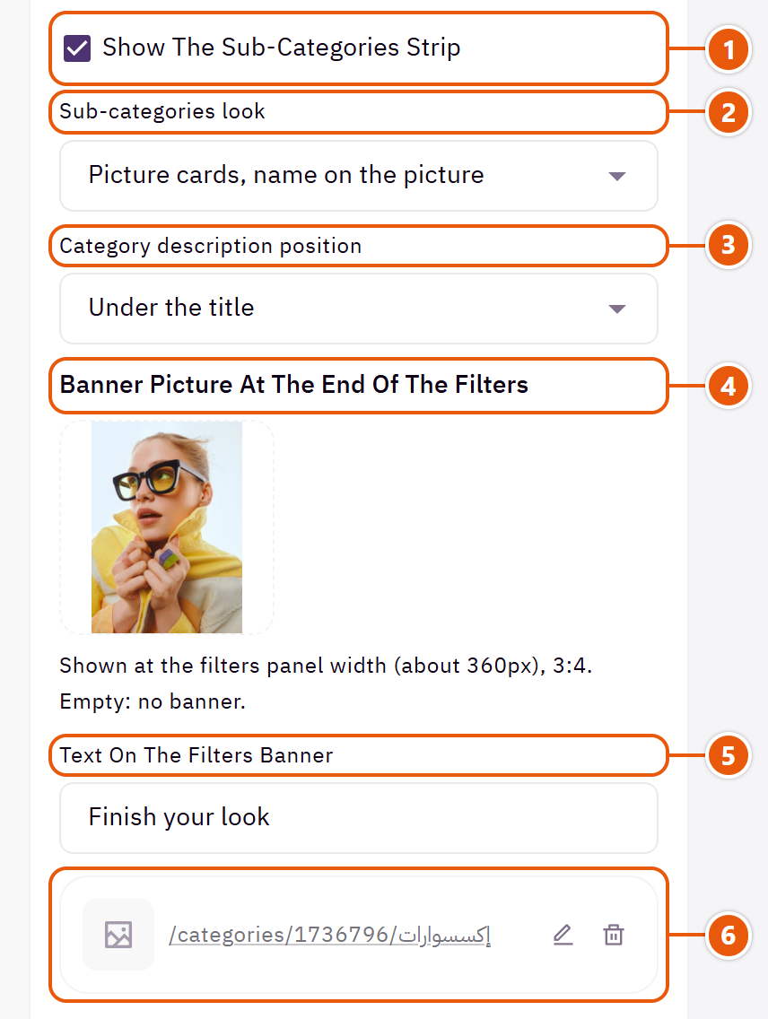
- 1“Show the sub-categories strip”
The sub-categories with pictures above the products. - 2“Sub-categories look”
“Picture cards, name on the picture” are large pictures; “Round pictures, name below” are smaller and fit more in a row.Shown when “Show the sub-categories strip” is on - 3“Category description position”
The category description you write in Zid. - 4“Banner picture at the end of the filters”
A small promo under the filters. - 5“Text on the filters banner”
Words on the promo. - 6“Filters banner link”
The page the promo opens.
A small benefits row (shipping, returns, support...) you write once; it shows on category pages and the categories page, or in the cart, as you choose.

Where to find its settings
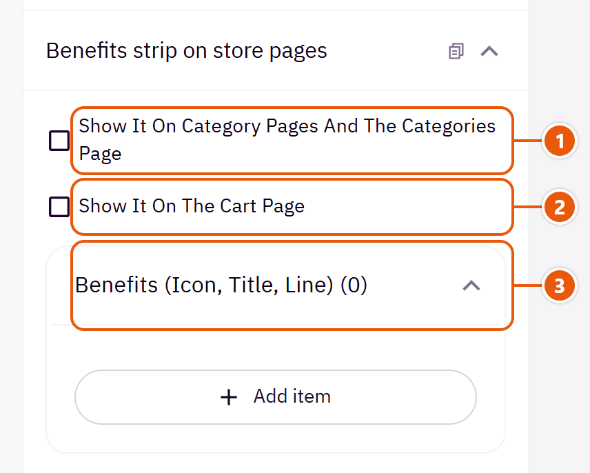
- 1“Show it on category pages and the categories page”
Under the products on category pages. - 2“Show it on the cart page”
The same row reassures shoppers as they review their order before paying. - 3“Benefits (icon, title, line)”Up to 4 items
The other settings
- Benefits (icon, title, line)
- Title: Such as “Fast delivery”.
- Line under the title: Such as “Within 2-4 days”.
- Icon: Pick the closest to the benefit.
The blog and post pages: the posts list layout, the sidebar with blog categories and recent posts, a banner in it, and related posts under each post. The posts themselves are written in the blog in your Zid dashboard.

Where to find its settings
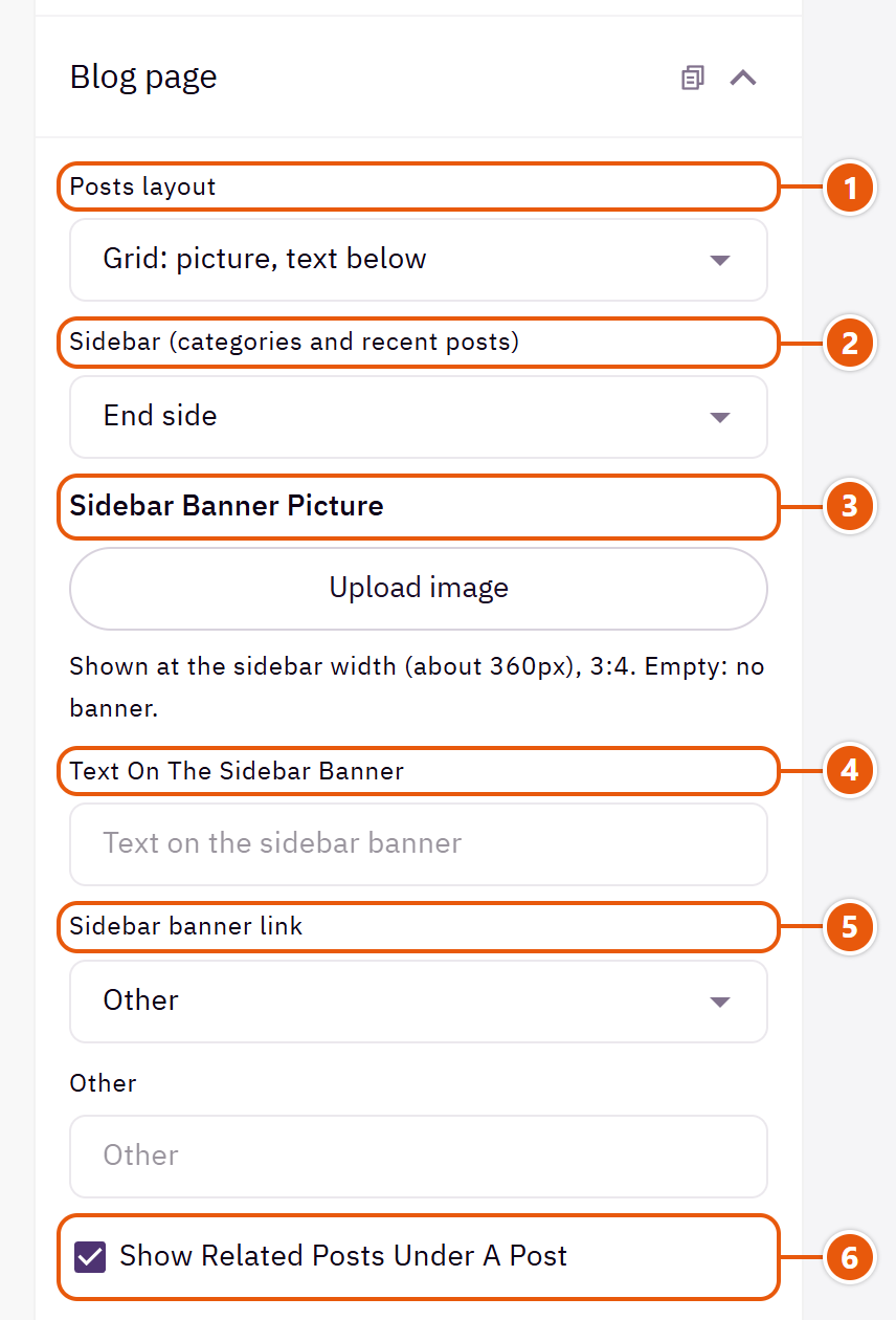
- 1“Posts layout”
How the post cards look on the blog page. - 2“Sidebar (categories and recent posts)”
“No sidebar” gives the posts the full width. - 3“Sidebar banner picture”
A promo in the sidebar, such as an offer or a category. - 4“Text on the sidebar banner”
Words on the promo. - 5“Sidebar banner link”
The page the promo opens. - 6“Show related posts under a post”
Other posts under a post so the reader carries on.
The header's and footer's own colours, and a pattern behind the page if you like. Empty fields follow “Main colors”.

Where to find its settings
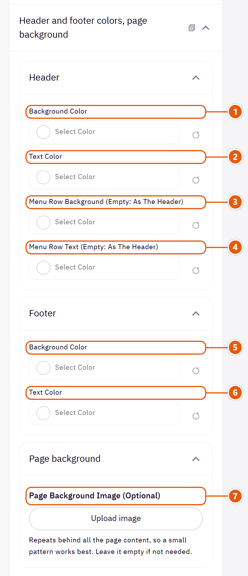
- 1“Background color”
The header's background (logo, menu and icons). - 2“Text color”
The header's words and icons; change it with the background: dark on light, white on dark. - 3“Menu row background (empty: as the header)”
The lower menu row, in the header designs that have one. - 4“Menu row text (empty: as the header)”
The menu words in that row. - 5“Background color”
The footer's background. When dark, its words, lines and logo turn light by themselves. - 6“Text color”
The footer's words and links. - 7“Page background image (optional)”
A pattern repeated behind every page's content; sections with their own background colour cover it.
A bar fixed at the bottom of phones and tablets, with icons for home, account, shop, search, wishlist and the cart with its count. Pick which buttons show; it does not appear on computers.
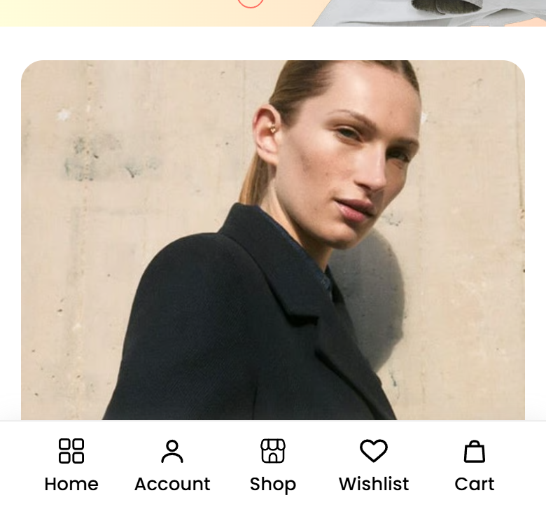
Where to find its settings
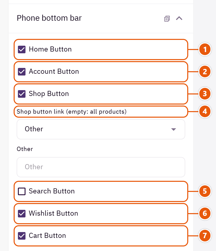
- 1“Home button”
Back to the home page. - 2“Account button”
The customer's account, or sign-in for a guest. - 3“Shop button”
Opens the products page or the link you choose. - 4“Shop button link (empty: all products)”
Such as your offers category.Shown when “Shop button” is on - 5“Search button”
Opens the search window. - 6“Wishlist button”
The wishlist with its count. - 7“Cart button”
Opens the cart drawer with its count.
Tips
- Four or five buttons are easiest to tap on a phone.
A simple screen covering the page for a moment while it loads, in six styles. It leaves as soon as the page is ready, and never stays past “Longest time on screen, in seconds”, even on a slow connection. The page content stays underneath it for Google.

Where to find its settings

- 1“Show the loading screen”
Off: pages open straight away. - 2“Loading screen style”
“Store name in the heading font” suits a store without a logo. - 3“Text shown (empty: the store name)”
Such as your brand name or a short phrase.Shown when “Loading screen style” is “Store name in the heading font” - 4“Logo above the mark (no logo: the store name)”
The header's logo in the middle of the screen. - 5“A small line under the mark (optional)”
Such as “Getting the best offers ready”.

- 1“How often it shows”
“Once per visit” shows on the first page only, the kindest to shoppers. - 2“Shortest time on screen (1000 = 1 second)”
So the motion is not a flicker when the page is quick. 400 is under half a second. - 3“Longest time on screen, in seconds”
After this the screen leaves even if the page is still loading. - 4“Background color (empty: the page's)”
The whole screen's colour. - 5“Mark color (empty: the look's)”
The ring, line or dots.
Tips
- In the theme editor it shows on every reload so you can see its settings; on the store it follows “How often it shows”.
A window that shows a visitor a few seconds after the page opens, with a picture, a title and a button: a first-order discount, a seasonal offer or a new category. It can hold several slides, and you choose where and how often it shows. Or, instead of pictures, it can show products under a countdown to the end of a deal.

Step by step
- Open “Page settings”, then “Advertising popup”, and tick “Enable popup”.
- Choose the “Popup type”.
- For pictures: in “Advertisement content (for the Pictures and offers type)” press “Add item”, upload the “Image”, write the “Title” and “Link text” and pick the “Link”.
- For products: choose the products and type the deal's end date.
- Choose “Display on” and “Frequency”, then publish.
Where to find its settings
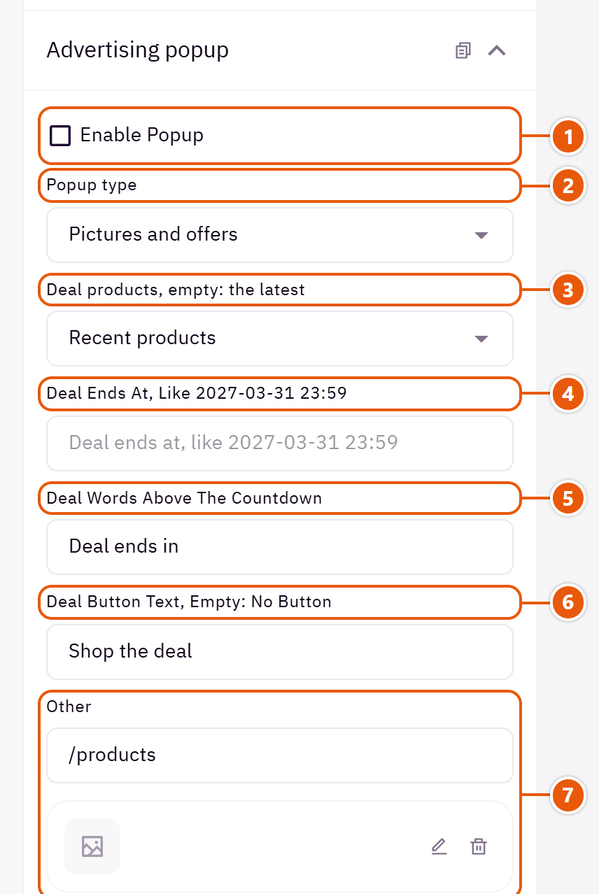
- 1“Enable popup”
The main switch. The popup needs a slide with a picture or words, or products in the products type, to show. - 2“Popup type”
“Products with a deal countdown” shows up to 8 products in a slider under a countdown, instead of picture slides. - 3“Deal products, empty: the latest”
From “Recent products”, “On sale products” or “Category products”. - 4“Deal ends at, like 2027-03-31 23:59”
Empty or a past date: no countdown, and the products still show. - 5“Deal words above the countdown”
Shown with a clock icon above the countdown. - 6“Deal button text, empty: no button”
A button under the products, such as “Shop the deal”. - 7“Deal button link”
Such as your offers category; empty: the all products page.
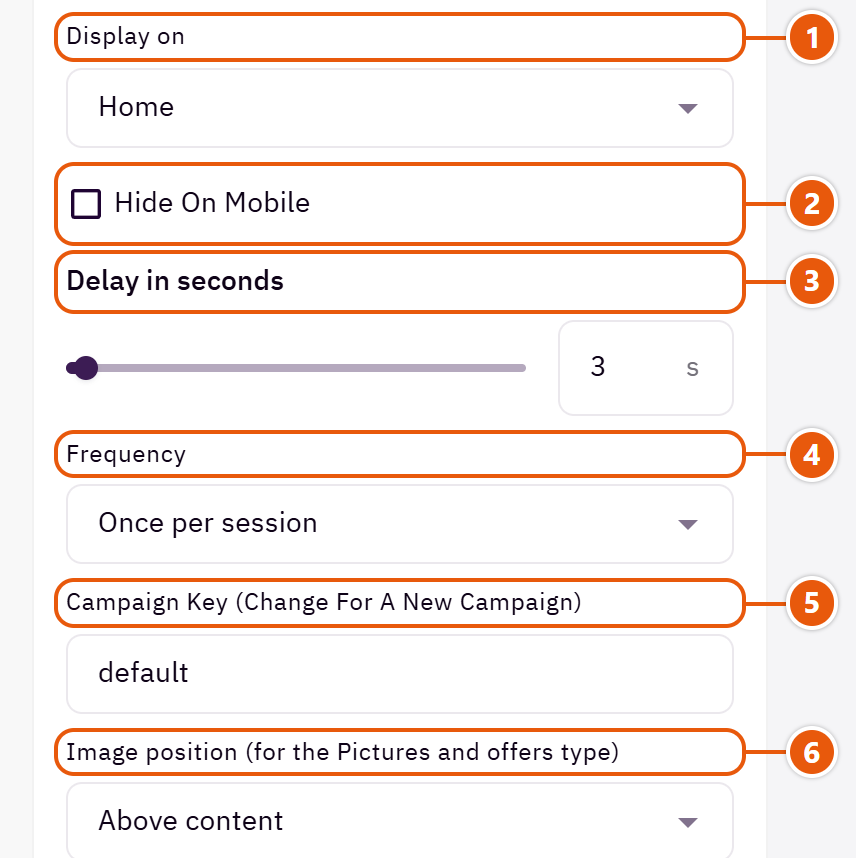
- 1“Display on”
“Home” only or “All pages”. - 2“Hide on mobile”
If it gets in the way on a small screen. - 3“Delay in seconds”
4 to 8 seconds lets the visitor see the store first. - 4“Frequency”
“Once per session” is once while the store stays open in the tab; “Every page visit” shows on every page, which can annoy. - 5“Campaign key (change for a new campaign)”
Customers never see it. Change it for each new offer (“ramadan”, say) and the popup shows again even to those who saw the old one. - 6“Image position (for the Pictures and offers type)”
On computers; phones always put the picture above the words.
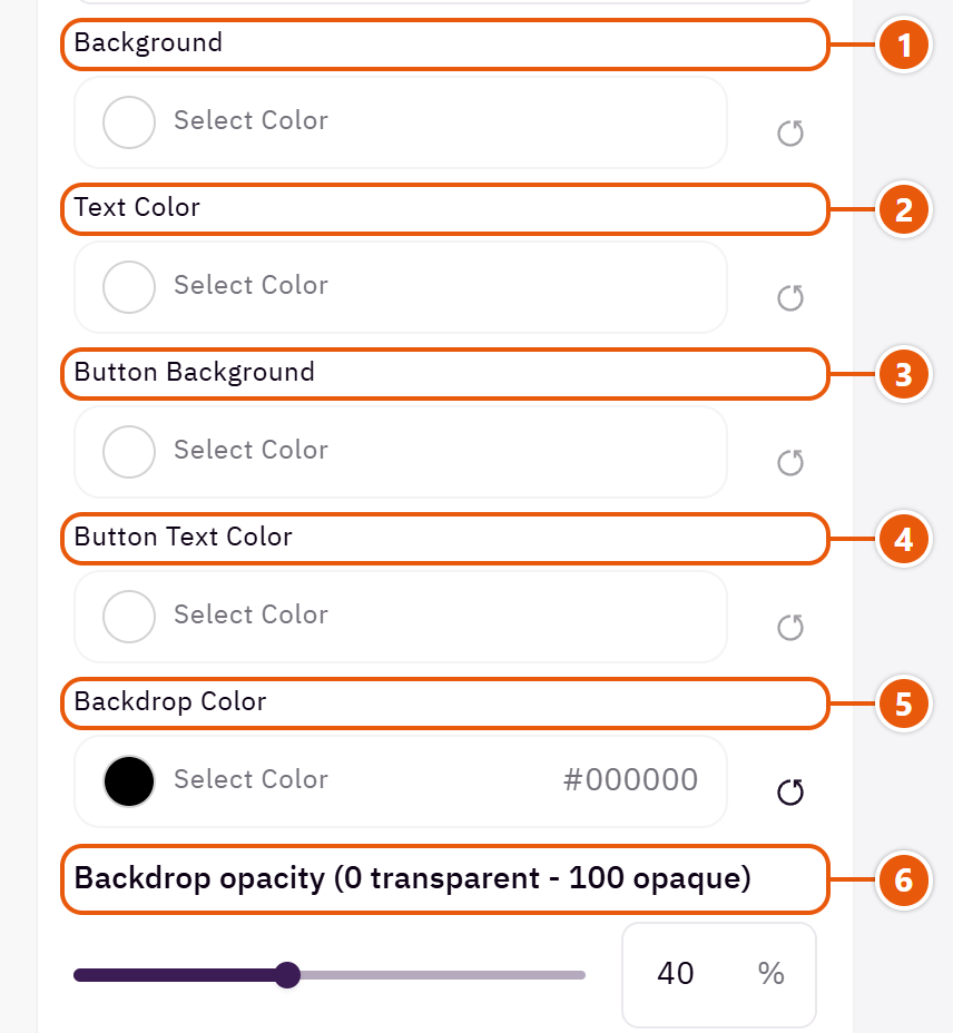
- 1“Background”
With “Text color” empty, the words turn light or dark by themselves. - 2“Text color”
The title and words. - 3“Button background”
Empty: the theme's buttons colour; with a text colour chosen, one that text reads on. - 4“Button text color”
Empty: picked to stay readable on the button. - 5“Backdrop color”
The layer covering the page behind the popup; black is usual. - 6“Backdrop opacity (0 transparent - 100 opaque)”
40 to 50 suits most stores.
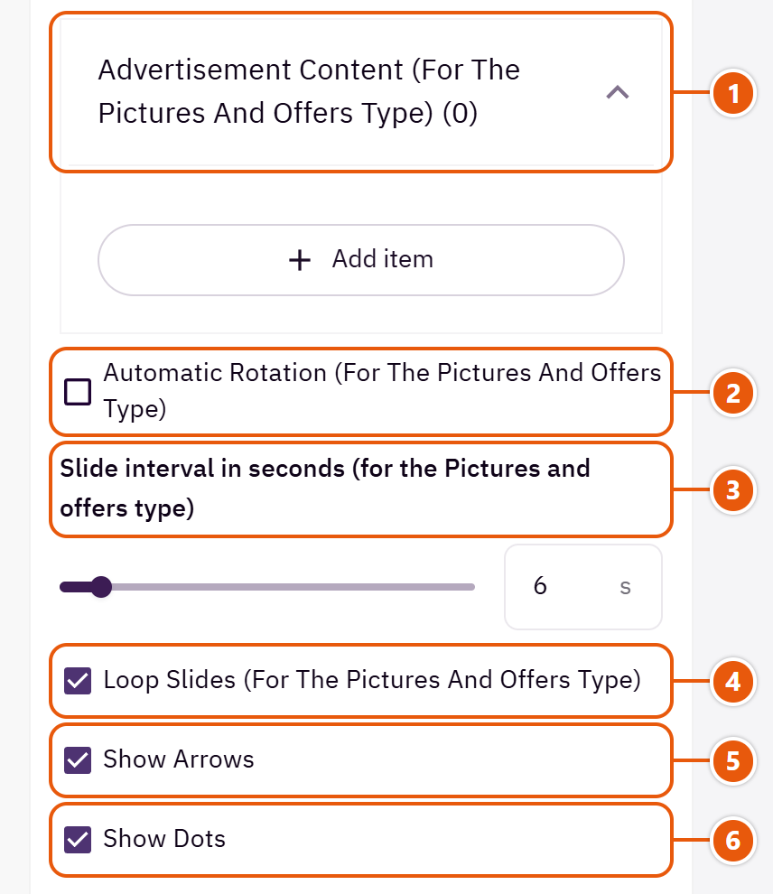
- 1“Advertisement content (for the Pictures and offers type)”
- 2“Automatic rotation (for the Pictures and offers type)”
Slides turn by themselves, with a pause button. - 3“Slide interval in seconds (for the Pictures and offers type)”
With automatic rotation on: how long before the next picture shows. - 4“Loop slides (for the Pictures and offers type)”
Instead of stopping at the last slide. - 5“Show arrows”
To move between slides. - 6“Show dots”
With several slides and arrows, autoplay and dots all off, the dots come back so shoppers can reach the rest.
The other settings
- Advertisement content (for the Pictures and offers type)
- Image: The offer's picture.
- Mobile image: A separate phone picture; landscape works best since it sits above the words.
- Image description: Such as “Winter offer, 30% off”.
- Title: Such as “20% off your first order”.
- Text: Such as “Use the code WELCOME20 at checkout”.
- Link text: The button's words, such as “Shop the offer”. The button needs a link.
- Link: Such as your offers category.
- Open new tab: Only for links outside your store.
Two buttons in the corner of every page: WhatsApp to reach you, and an arrow back to the top. WhatsApp can open a welcome window with your messages first, or the chat straight away.

Step by step
- Open “Page settings”, then “WhatsApp and back to top”.
- Tick “Enable WhatsApp”.
- Type the number with the country code and no leading zero, or leave it empty for your Zid store number.
- Write the welcome messages, then publish.
Where to find its settings
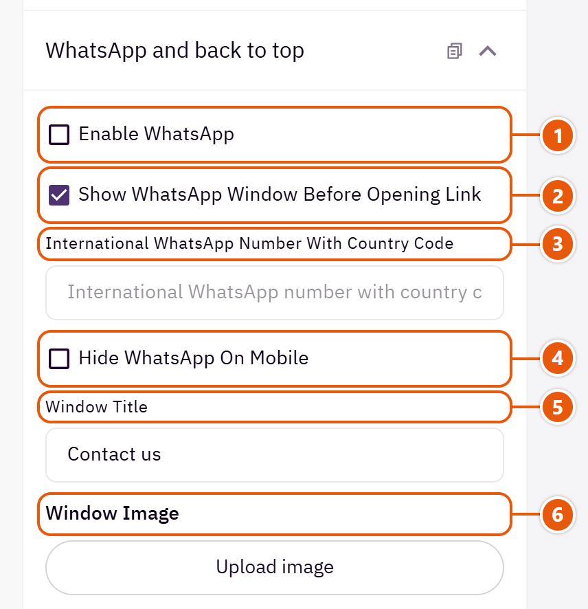
- 1“Enable WhatsApp”
In the corner of every store page. - 2“Show WhatsApp window before opening link”
On: a small window with your welcome and a “Continue in WhatsApp” button. Off: WhatsApp directly. - 3“International WhatsApp number with country code”
With the country code, no + and no leading zero (a Saudi mobile starts 966 5). A wrong number hides the button; empty uses your store's contact number in Zid. - 4“Hide WhatsApp on mobile”
If it covers something on phones. - 5“Window title”
Such as “Customer care”. - 6“Window image”
Your photo or logo in a small circle at the top of the window.
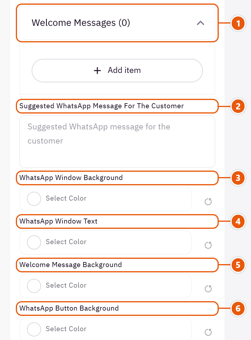
- 1“Welcome messages”
- 2“Suggested WhatsApp message for the customer”
Pre-typed in the message box, such as “Hi, I have a question about a product”; the shopper can edit it. - 3“WhatsApp window background”
The whole window. - 4“WhatsApp window text”
The title and words. - 5“Welcome message background”
The message bubbles. - 6“WhatsApp button background”
The corner WhatsApp button and “Continue in WhatsApp”.

- 1“WhatsApp button text”
The icon and words on the button. - 2“Enable back to top”
An arrow that appears in the corner once the shopper scrolls, back to the top in one tap. - 3“Back-to-top scroll threshold”
300 means after a short scroll. - 4“Back-to-top background”
The button's colour. - 5“Back-to-top text”
The arrow's colour.
The other settings
- Welcome messages
- Message name (for this panel only): A name to find the message in the list; shoppers never see it.
- Message text: Each message shows in its own bubble.
Tips
- Both buttons sit in the right corner in either language, above the phone bottom bar.
A “You may also like” row in the cart drawer and the cart page: products related to what is in the cart (or from your store when there are none), with a quick add button. It raises the order value.

Where to find its settings
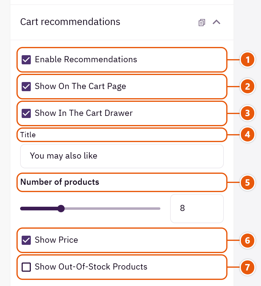
- 1“Enable recommendations”
The main switch; off means no suggestions anywhere. - 2“Show on the cart page”
Under the items on the cart page. - 3“Show in the cart drawer”
Under the items in the cart drawer. - 4“Title”
Such as “Complete your order”. - 5“Number of products”
The most shown; shoppers move through them with arrows or by dragging. - 6“Show price”
Under each product's name. - 7“Show out-of-stock products”
Leave it off so shoppers are not shown what they cannot buy.
Advertising banners above or below the content of inner pages: category, products, product, search, blog and cart. For each ad you choose the pages it shows on, and can limit it to particular categories.

Step by step
- Open “Page settings”, then “Internal advertisements”.
- In “Advertisements” press “Add item” and upload the “Image”.
- Pick the “Link” and the “Placement in the page”.
- Tick the pages, or leave them empty for every page, then publish.
Where to find its settings
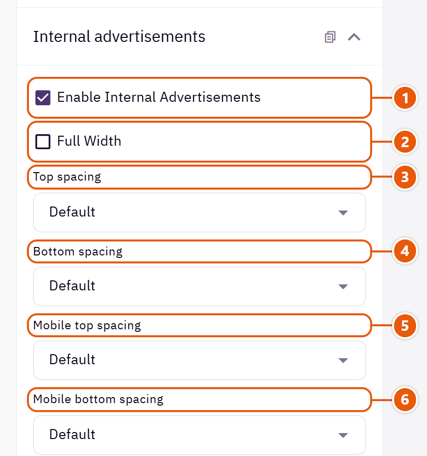
- 1“Enable internal advertisements”
The main switch; off hides every ad without deleting it. - 2“Full width”
Ads edge to edge instead of the page width. - 3“Top spacing”
The space above the ads; “Default” is the theme's own. - 4“Bottom spacing”
The space below the ads. - 5“Mobile top spacing”
On “Default” phones use the desktop space. - 6“Mobile bottom spacing”
On “Default” phones use the desktop space.

- 1“Section title”
A title above the ads, such as “This week's offers”, wherever they show. - 2“Section subtitle”
A short line under the title. - 3“Title alignment”
Where the title and its line sit. - 4“Advertisements”
- 5“Advertisements per view on desktop”
How many ads side by side on computers; more slide. - 6“Advertisements per view on mobile”
One is clearer on a small screen.

- 1“Automatic rotation”
The ads turn by themselves, with a pause button. - 2“Slide interval in seconds”
The time on each ad. - 3“Loop slides”
Instead of stopping at the last ad. - 4“Show arrows”
When there are more ads than fit at once. - 5“Show dots”
Show how many ads there are and which is in view.
The other settings
- Advertisements
- Image: The picture is cropped to fill its place, so keep what matters in the middle.
- Mobile image: For when the computer picture has small writing that phones would cut.
- Image description: Such as “30% off shoes”.
- Title: The large title on the ad.
- Subtitle: A small line, such as “Limited time”.
- Text: A sentence or two.
- Button text: Such as “Shop now”; the button needs a link.
- Link: The whole ad opens it.
- Open in a new tab: Only for links outside your store.
- Placement in the page: Above or below the page content.
- Pages (leave empty for every page): Tick the pages it shows on; none ticked means all.
- Target categories (leave empty for every category)
- Category name (for this panel only): A name to recognise the row; shoppers never see it.
- Select category: The ad shows on this category's page only.
- Text alignment: Where the words sit on the ad.
- Text color: White for dark pictures; on light ones use the overlay or a dark colour.
- Background color without an image: For a words-only ad, such as “Free shipping over 200 SAR”.
- Enable overlay: A see-through layer over the picture so the words show.
- Overlay color: Black is usual.
- Overlay opacity (0 transparent - 100 opaque): 30 to 50 is usually enough.
Turns off the right-click menu on the store to make quick picture saving harder. Not full protection, but it stops casual copying.
Where to find its settings
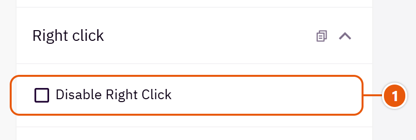
- 1“Disable right click”
Except inside fields shoppers type in (discount code, address) so they can paste. Selecting and keyboard copying still work.
A place for the code services ask you to add to your store, such as ad pixels or chat tools, without editing the theme.
Where to find its settings
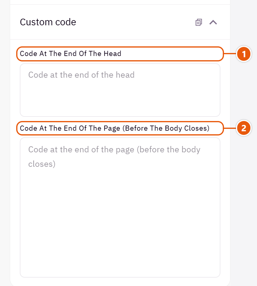
- 1“Code at the end of the head”
For code a service says goes in the head, such as Snapchat, TikTok or Meta pixels and analytics. - 2“Code at the end of the page (before the body closes)”
For code that goes before the body closes, such as chat and support tools.
Tips
- Paste the code exactly as the service gives it. Wrong code can slow the store, so check the page after publishing.
Header
The top of every page, under “Header” in the editor: “Header” (5 designs), “Top bar” (3 designs), “Browse categories button”, “Search window” and “Mobile menu”. Pick the “Header design” first, then the logo.
The header above every page: the logo, the menu from your Zid menus, search, and the account, wishlist and cart icons. Five designs; it can sit clear over the first home section, with a separate logo for English pages.

Header design

Icons at the end. Simple; suits most stores.

An elegant look for fashion and jewellery.

A row with a large search bar, then the “Browse categories” button, the menu and help links. For stores with many products.

Logo, search and labelled icons on top, the menu alone below. For a store that wants search in view and a simple menu.

For stores selling to several countries: on computers the country and language choice is always in view.
Step by step
- Open “Header”, then the “Header” group, and choose the “Header design”.
- Upload the “Logo”, and if your English logo differs, upload it in “English pages logo (optional)”.
- Set “Logo width” and “Logo width on phones”.
- Publish and open both the Arabic and English pages.
Where to find its settings
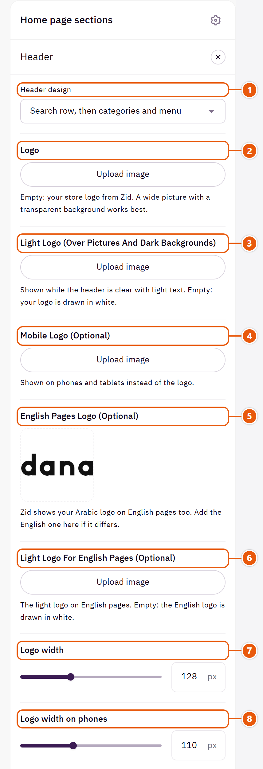
- 1“Header design”
Below 1200px every design becomes one phone row: menu, logo, search and cart. - 2“Logo”
Empty: your Zid store logo, and with no logo at all the store name is written. The footer and loading screen use the same logo where they show one. - 3“Light logo (over pictures and dark backgrounds)”
For a clear header with light text, or a dark background. - 4“Mobile logo (optional)”
A smaller or wider logo for small screens. - 5“English pages logo (optional)”
If you have an English logo, it replaces the Arabic one on English pages, in the header, footer and loading screen. - 6“Light logo for English pages (optional)”
A light version of the English logo. - 7“Logo width”
On computers; the height follows. - 8“Logo width on phones”
On phones and tablets.
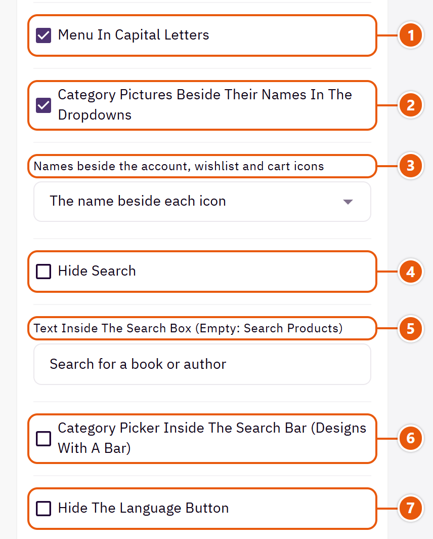
- 1“Menu in capital letters”
Affects English letters only. - 2“Category pictures beside their names in the dropdowns”
A dropdown from the menu shows each category's picture beside its name, from your category pictures in Zid. - 3“Names beside the account, wishlist and cart icons”
“Two lines beside each icon” puts a small word above a larger name. - 4“Hide search”
Removes search from the header. - 5“Text inside the search box (empty: Search products)”
Such as “Search dresses, bags...”. - 6“Category picker inside the search bar (designs with a bar)”
A list in the search bar to pick a category before searching, in the header designs with a search bar. - 7“Hide the language button”
If your store has one language.
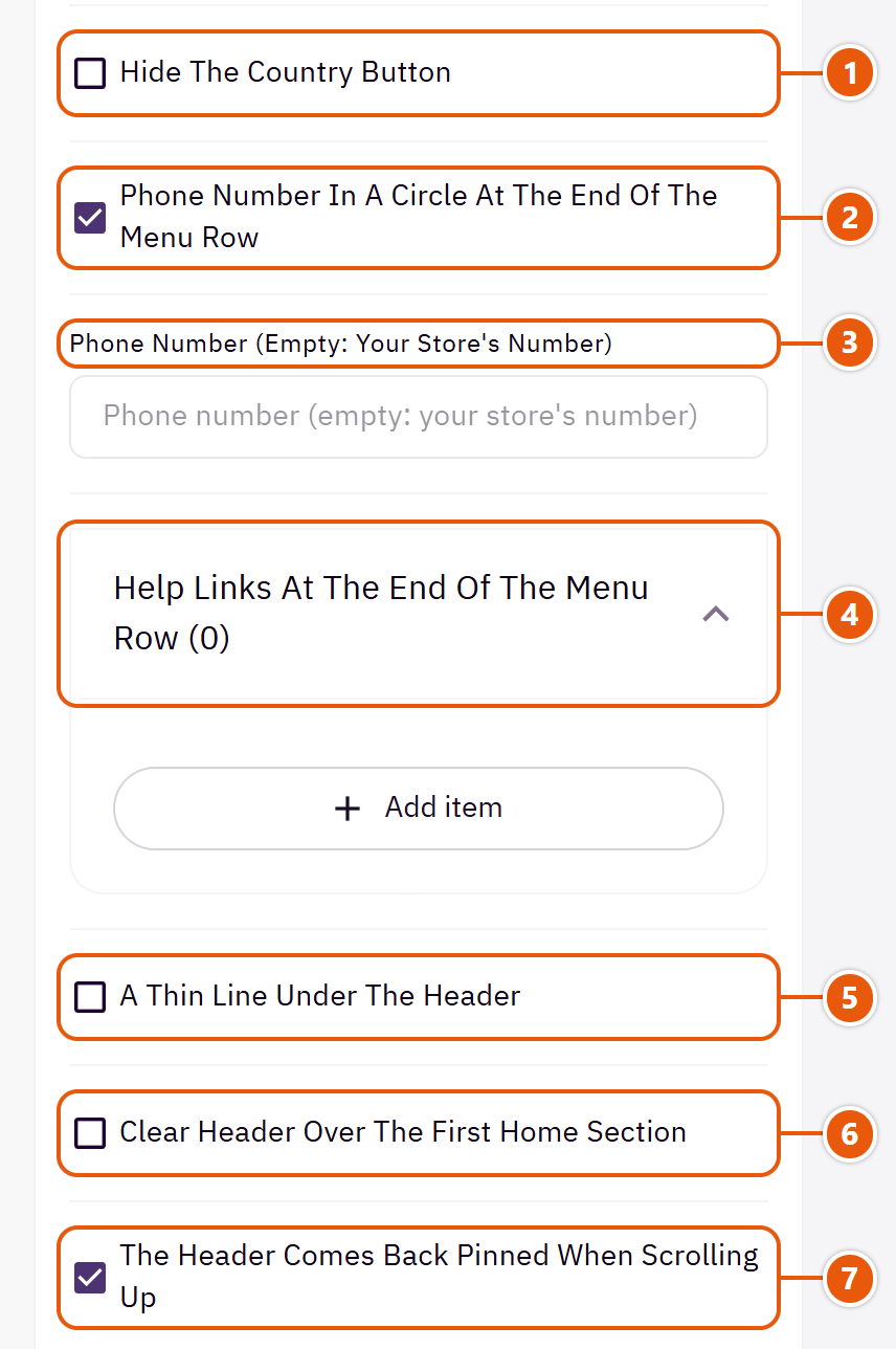
- 1“Hide the country button”
If you sell to one country. - 2“Phone number in a circle at the end of the menu row”
It becomes a link the shopper taps to call.Shown with “Search row, then categories and menu” - 3“Phone number (empty: your store's number)”
A number other than the store's.Shown with “Search row, then categories and menu” and when “Phone number in a circle at the end of the menu row” is on - 4“Help links at the end of the menu row”Shown with “Search row, then categories and menu”Up to 3 items
- 5“A thin line under the header”
A thin line separating the header from the page. - 6“Clear header over the first home section”
The header turns clear over the slider on the home page only, and takes its colour back once pinned. - 7“The header comes back pinned when scrolling up”
The header hides as you scroll down and returns when you scroll up, keeping the menu and cart close.
The other settings
- Help links at the end of the menu row
- Text: Such as “Track your order” or “Help”.
- Link: Empty: the words show without a link.
- Highlighted, underlined, with an arrow: Makes this link stand out from the rest.
- Text while clear: Choose to suit the first section's picture.Shown when “Clear header over the first home section” is on
- Background once pinned (empty: the design's own): Empty: black with light text, or the header's own colour.Shown when “Clear header over the first home section” is on
Tips
- A wide PNG logo on a transparent background, about four times as wide as tall.
Zid shows your Arabic store logo on English pages too. Dana has a field for the English logo, so a shopper on the English pages sees your brand in English in the header, footer and loading screen.

Step by step
- Open “Header”, then the “Header” group.
- Upload the English logo in “English pages logo (optional)”.
- If you have a light version, upload it in “Light logo for English pages (optional)”.
- Publish and open your store in English.
Tips
- Without a light logo, the logo is drawn white by itself over pictures and dark backgrounds.
When a shopper points at a menu item with categories under it, the dropdown shows a small picture beside each category's name. The pictures come from your category pictures in Zid, so there is nothing to upload again.
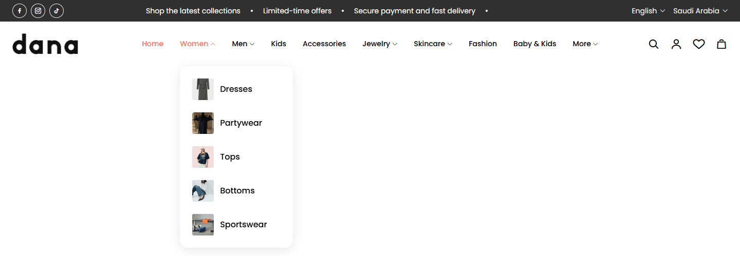
Step by step
- In your Zid dashboard, make the items under each menu item links to categories.
- Upload a picture for each category on its page in Zid.
- In the editor: “Header”, then “Header”, and keep “Category pictures beside their names in the dropdowns” on.
- Publish.
Tips
- A category with no picture shows a tidy placeholder mark, and the dropdown does not shift while pictures load.
The “Browse categories” button in the header design “Search row, then categories and menu”: it opens a list of your categories with pictures. Automatic from your Zid categories, or the ones you choose.

Where to find its settings
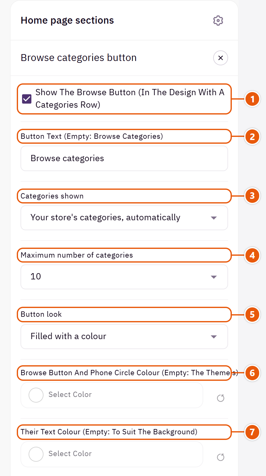
- 1“Show the browse button (in the design with a categories row)”
Shows only in the header design with a categories row. - 2“Button text (empty: Browse categories)”
Such as “All departments” or “Shop by category”. - 3“Categories shown”
“Your store's categories, automatically” takes your store's main categories and keeps up with them. - 4“Maximum number of categories”
The most in the list.Shown when “Categories shown” is “Your store's categories, automatically” - 5“Button look”
“Text only, with a divider after it” is the lightest look. - 6“Browse button and phone circle colour (empty: the theme's)”
The filled button's colour. - 7“Their text colour (empty: to suit the background)”
Empty: white or dark to suit the button.
The other settings
- Categories you chooseShown when “Categories shown” is “Categories you choose”Up to 15 items
- Category: A category from your store.
- Name (empty: the category's name): A shorter or clearer name.
- Small picture beside the name (optional): A picture other than the category's.
The full-screen search window opened from the search icon: the search field, popular searches (or your categories with pictures), and featured products in a slider (or a grid beside your newest articles) before the shopper types. As they type, your products appear under the field at once.

Step by step
- Open “Header”, then “Search window”.
- Add “Popular searches (empty: your categories with pictures)”, or leave them empty.
- In “Products under the search (latest or a category; empty: none)” choose “Recent products”, “On sale products” or “Category products”, then publish.
Settings
- Products in the search window: “A product grid with articles beside it” shows the products in a grid with your 4 newest articles beside it (below it on smaller screens); with the blog off the grid takes the full width.
- Articles title: The title above the articles, beside a “View all” link to the blog.Shown when “Products in the search window” is “A product grid with articles beside it”
- Popular searches (empty: your categories with pictures)Up to 10 items
- Word: A word the shopper taps to search for it at once, such as “Dresses”.
- Title above the products under the search: The title above the featured products.
- Products under the search (latest or a category; empty: none): Up to 8 products from “Recent products”, “On sale products” or “Category products”.
A slim bar above the header with moving messages (such as “Free shipping over 200 SAR”), optionally a countdown beside a message, and social accounts or contact details and links. It scrolls away with the page.

Top bar design

Social on one side, messages in the middle, country and language on the other.

Centred in the bar with nothing beside them. The calmest, for an offer or shipping message.

Email and phone on one side, messages in the middle, links at the end.
Step by step
- Open “Header”, then “Top bar”, and choose the “Top bar design”.
- In “Moving messages” press “Add item” and write the “Message”.
- Publish.
Where to find its settings
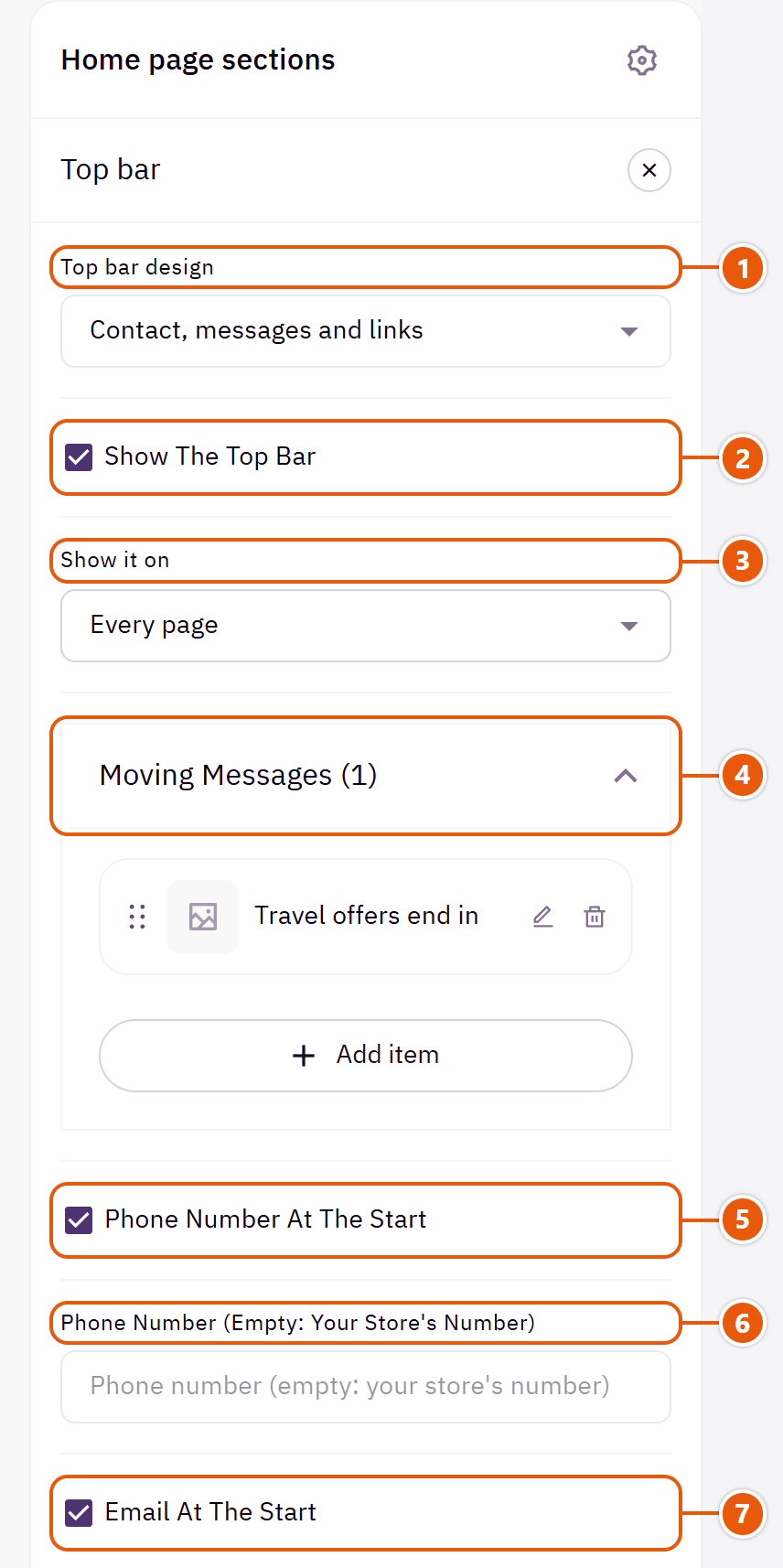
- 1“Top bar design”
On phones only the messages show, in every design. - 2“Show the top bar”
Off: no bar. - 3“Show it on”
“The home page only” to show it there only. - 4“Moving messages”Up to 12 items
- 5“Phone number at the start”
The phone number at the start of the bar.Shown with “Contact, messages and links” - 6“Phone number (empty: your store's number)”
A number other than the store's.Shown with “Contact, messages and links” and when “Phone number at the start” is on - 7“Email at the start”
The email at the start of the bar.Shown with “Contact, messages and links”
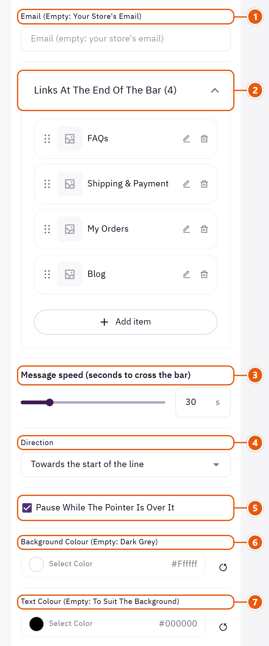
- 1“Email (empty: your store's email)”
An email other than the store's.Shown with “Contact, messages and links” and when “Email at the start” is on - 2“Links at the end of the bar”Shown with “Contact, messages and links”Up to 6 items
- 3“Message speed (seconds to cross the bar)”
A bigger number means slower movement. - 4“Direction”
Which way the messages move. - 5“Pause while the pointer is over it”
So a visitor can read or click a message. - 6“Background colour (empty: dark grey)”
The bar's colour. - 7“Text colour (empty: to suit the background)”
Empty: white or dark to suit the bar.
Inside each item of “Links at the end of the bar” (press the pencil beside it)
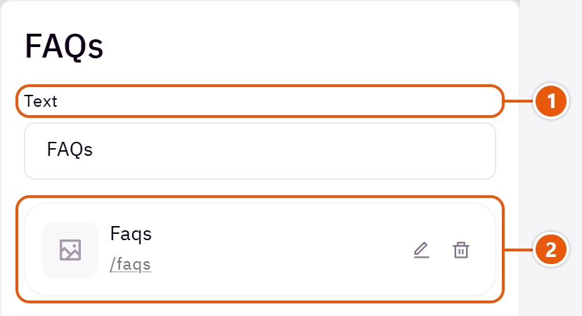
- 1“Text”
Such as “Track order”. - 2“Link”
The page the link opens.
Inside each item of “Moving messages” (press the pencil beside it)

- 1“Message”
A short message. - 2“Link (optional)”
The message becomes a link. - 3“Countdown end, YYYY-MM-DD HH:MM”
A countdown shows beside the message, which leaves by itself when time is up.
The other settings
- Messages across the whole width, in capitals: The messages fill the width, in capitals in English.Shown with “Messages only”
- Social accounts (from your Zid store details): Icons of the accounts in your Zid store details.Shown with “Social, messages, country and language”
- Country and language button: Shoppers change country or language from it.Shown with “Social, messages, country and language”
The menu that slides in on phones and tablets from the menu button: your store menus at every level, the account, language and country, “Need help?” with your contact details, and extra links.
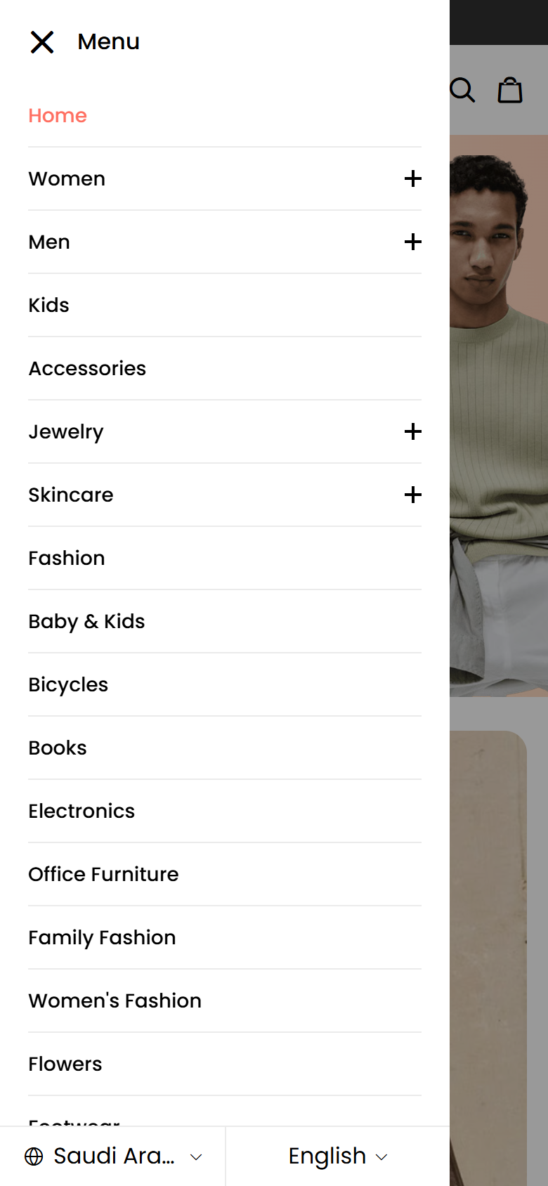
Where to find its settings
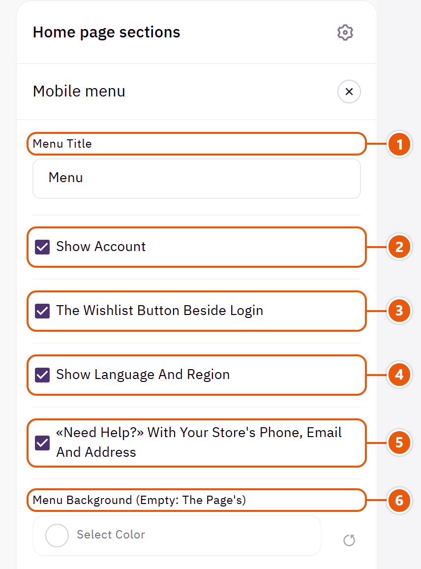
- 1“Menu title”
The title at the top of the menu. - 2“Show account”
Sign in or the shopper's account. - 3“The Wishlist button beside Login”
Opens the shopper's wishlist; shows only with “Show account” on. - 4“Show language and region”
Shoppers change language or country from the menu. - 5“«Need help?» with your store's phone, email and address”
Your phone, email and address from your Zid store details. - 6“Menu background (empty: the page's)”
The menu's colour.
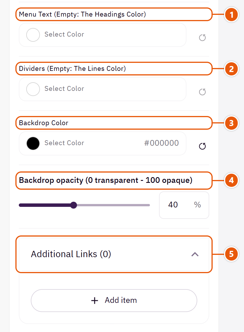
- 1“Menu text (empty: the headings color)”
The menu's words. - 2“Dividers (empty: the lines color)”
The lines between items. - 3“Backdrop color”
The layer covering the page behind the menu. - 4“Backdrop opacity (0 transparent - 100 opaque)”
40 suits most stores. - 5“Additional links”
The other settings
- Additional links
- Title: Such as “Track order”.
- Link: The page the link opens.
- Open new tab: Only for links outside your store.
Tips
- The menu items themselves are edited in your store's menus in the Zid dashboard, not here.
An old group with no settings; the bar moved to “Top bar”, where you write your messages. Leave this one as it is.
Home page sections
The home page is built from sections you add, reorder and hide under “Page content”. Dana has 24 kinds, 13 of them in several looks picked in the section's first field. Options that many sections share (title, width, background, spacing, hiding) are explained once, at the top of this chapter.
These repeat across most sections of the page, so they are stated once here instead of under every one of them. Each section below says which of them it has.
- Title: The section's main heading; leave it empty for none.
- Full width: The content spans the whole screen instead of the page width. Good for banners and large pictures.
- Title colour (transparent = automatic): The section title's colour, and in some sections the words around it, as the field's name says. Transparent keeps the theme's colour.
- Background color: A colour behind the whole section to set it apart. Transparent takes the page colour.
- Background image: A picture behind the whole section, cropped to fit; choose a calm one about 1920 wide.
- Enable overlay: A see-through colour layer over the background or picture so the words read.
- Overlay color: Black darkens for light words; white lightens for dark words.Shown when “Enable overlay” is on
- Overlay opacity (0 transparent - 100 opaque): Start at 40 and raise it if the words still do not read.Shown when “Enable overlay” is on
- Top spacing: “Default” keeps the chosen design's space, “00” removes it, the rest are pixels.
- Bottom spacing: Like “Top spacing”, below the section.
- Mobile top spacing: On “Default” phones use the “Top spacing” number.
- Mobile bottom spacing: On “Default” phones use the “Bottom spacing” number.
- Hide section: Hides the section without deleting it; its content is kept. Handy for a seasonal offer.
- Background picture stays still on scroll: In “Testimonials” only: the background picture stays still while the page moves over it.
The first thing a visitor sees: large slides with a picture, a video or a colour, carrying a title, text and two buttons. Each slide has its own words, colours and text position; the settings under the list (height, motion, dots) apply to every slide.

Section design

The picture spans the screen with the words over it. The most common; suits any business.

A coloured panel with the words beside the picture; the picture on top on phones. For product pictures that need a calm space for words.

The slide in the middle with the edges of its neighbours showing. Tells visitors there is more to see.
Step by step
- Choose the “Section design”.
- In “Slides” press “Add item” and choose the “Slide type”.
- Upload the “Picture” (and a “Phone picture (optional)” if it is wide).
- Write the “Slide title” and “Button text”, and pick the “Button link (needed for the button to show)”.
- Set the “Text position” and colours, then publish.
Where to find its settings
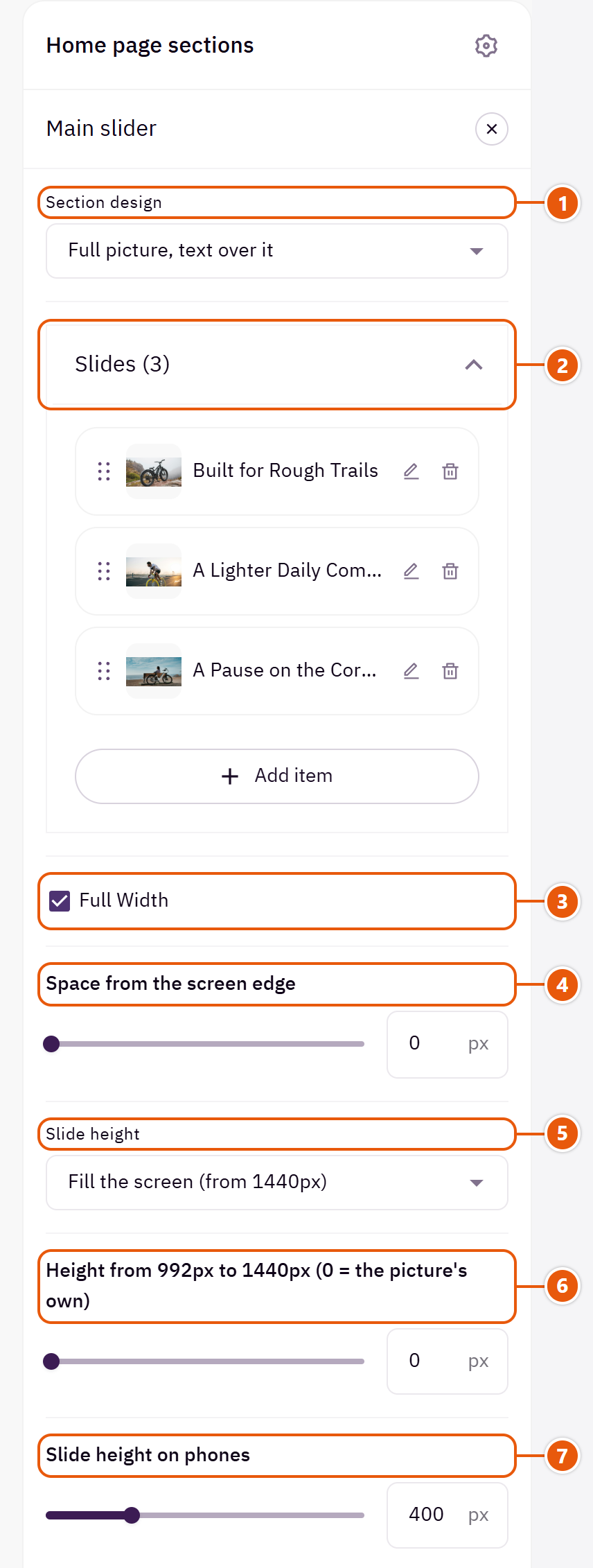
- 1“Section design”
Your slides stay when you switch. - 2“Slides”Up to 12 items
- 3“Full width”
The content spans the whole screen instead of the page width. Good for banners and large pictures. - 4“Space from the screen edge”
A space between the slider and the screen's edge with “Full width”, so it looks like a card.Shown when “Full width” is on - 5“Slide height”
“The picture’s own” shows the whole picture; “Fill the screen (from 1440px)” on large screens; “Fixed height” crops it to the height you choose. - 6“Height from 992px to 1440px (0 = the picture's own)”
For laptops and mid-size screens, before “Fill the screen (from 1440px)” takes over; 700 suits most.Shown when “Slide height” is “Fill the screen (from 1440px)” - 7“Slide height on phones”
Raise it for portrait phone pictures so they are not cropped.
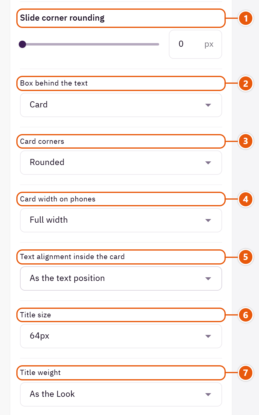
- 1“Slide corner rounding”
Zero: square corners. - 2“Box behind the text”
“Card” puts the words on a card so they read on any picture. - 3“Card corners”
How round the corners of the card behind the words are.Shown when “Box behind the text” is “Card” - 4“Card width on phones”
“Full width” reads easiest; “As wide as the text” leaves more of the picture in view.Shown when “Box behind the text” is “Card” - 5“Text alignment inside the card”
“Centred” centres the words inside the card even when the card sits at a side.Shown when “Box behind the text” is “Card” - 6“Title size”
The slide titles' size on computers; phones scale it down. - 7“Title weight”
“As the Look” follows “Headings weight” in “Look”.
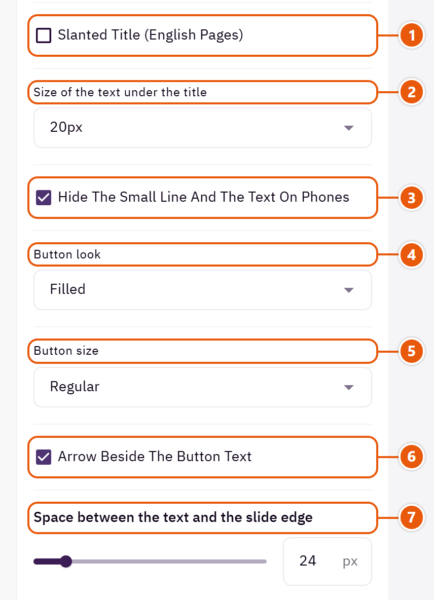
- 1“Slanted title (English pages)”
English only; Arabic has no slanted letters. - 2“Size of the text under the title”
20px for a short line meant to stand out; 16px for longer text. - 3“Hide the small line and the text on phones”
On small screens only the title and button stay, so the slide is not crowded. - 4“Button look”
The button look on every slide. - 5“Button size”
“Large” is a bolder button. - 6“Arrow beside the button text”
A small arrow after the button words. - 7“Space between the text and the slide edge”
The space between the words and the slide's edge on computers.
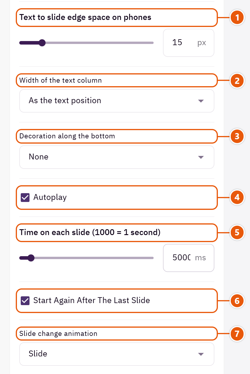
- 1“Text to slide edge space on phones”
Raise it if the words touch the screen's edge. - 2“Width of the text column”
“A narrower column” shortens the lines when the words sit at one side of the slide.Shown with “Full picture, text over it” - 3“Decoration along the bottom”
“Clouds” draws clouds in the page colour along the slider's bottom edge. Suits baby stores. - 4“Autoplay”
Pauses under the mouse. - 5“Time on each slide (1000 = 1 second)”
5000 is 5 seconds.Shown when “Autoplay” is on - 6“Start again after the last slide”
After the last slide it returns to the first. - 7“Slide change animation”
“Fade” is the calmest. “Centered slide, neighbors peeking” always slides.
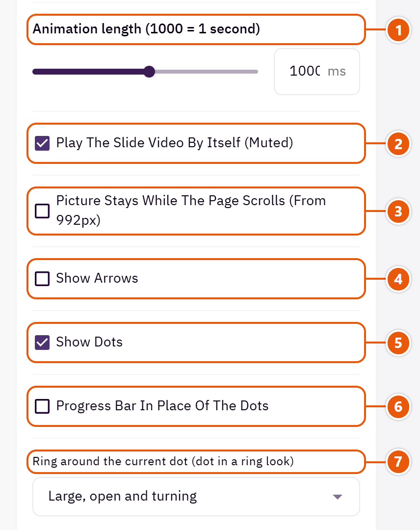
- 1“Animation length (1000 = 1 second)”
1000 is one second. - 2“Play the slide video by itself (muted)”
Off: the video shows play controls and the shopper starts it. - 3“Picture stays while the page scrolls (from 992px)”
The picture moves slower than the page as you scroll, on screens 992px and wider. - 4“Show arrows”
Two arrows beside the slider. - 5“Show dots”
A dot per slide under the slider. - 6“Progress bar in place of the dots”
A line that fills with each slide's time, instead of the dots. - 7“Ring around the current dot (dot in a ring look)”
Applies when “Slider dots” in “Look” is “Dot in a ring”.Shown when “Show dots” is on and when “Progress bar in place of the dots” is off
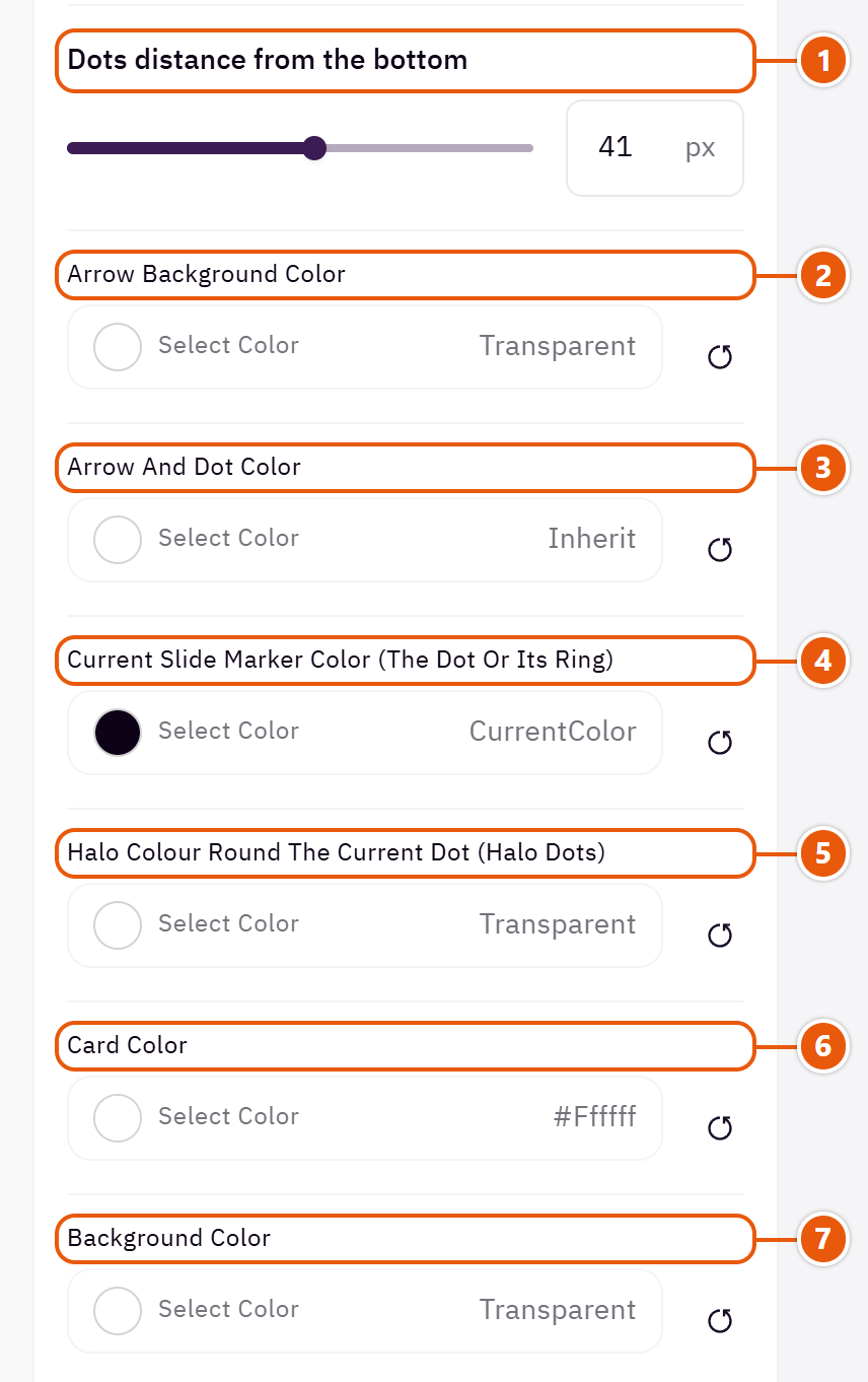
- 1“Dots distance from the bottom”
Raise the dots if they cover something in your picture.Shown with “Full picture, text over it” - 2“Arrow background color”
The arrows' circles. Empty: the “Page background color”. - 3“Arrow and dot color”
Empty: the theme's colours. Change it if the arrows or dots get lost on your pictures. - 4“Current slide marker color (the dot or its ring)”
The current slide's dot or its ring. - 5“Halo colour round the current dot (halo dots)”
Shows when “Slider dots” in “Look” is “Dot with a halo”; left transparent, the usual halo stays.Shown when “Show dots” is on and when “Progress bar in place of the dots” is off - 6“Card color”
The card behind the words.Shown when “Box behind the text” is “Card” - 7“Background color”
A colour behind the whole section to set it apart. Transparent takes the page colour.
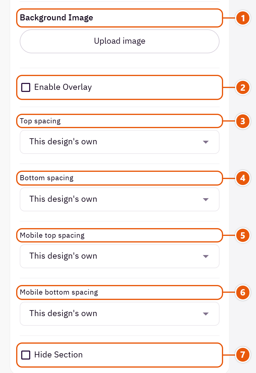
- 1“Background image”
A picture behind the whole section, cropped to fit; choose a calm one about 1920 wide. - 2“Enable overlay”
A see-through colour layer over the background or picture so the words read. - 3“Top spacing”
“Default” keeps the chosen design's space, “00” removes it, the rest are pixels. - 4“Bottom spacing”
Like “Top spacing”, below the section. - 5“Mobile top spacing”
On “Default” phones use the “Top spacing” number. - 6“Mobile bottom spacing”
On “Default” phones use the “Bottom spacing” number. - 7“Hide section”
Hides the section without deleting it; its content is kept. Handy for a seasonal offer.
Inside each item of “Slides” (press the pencil beside it)
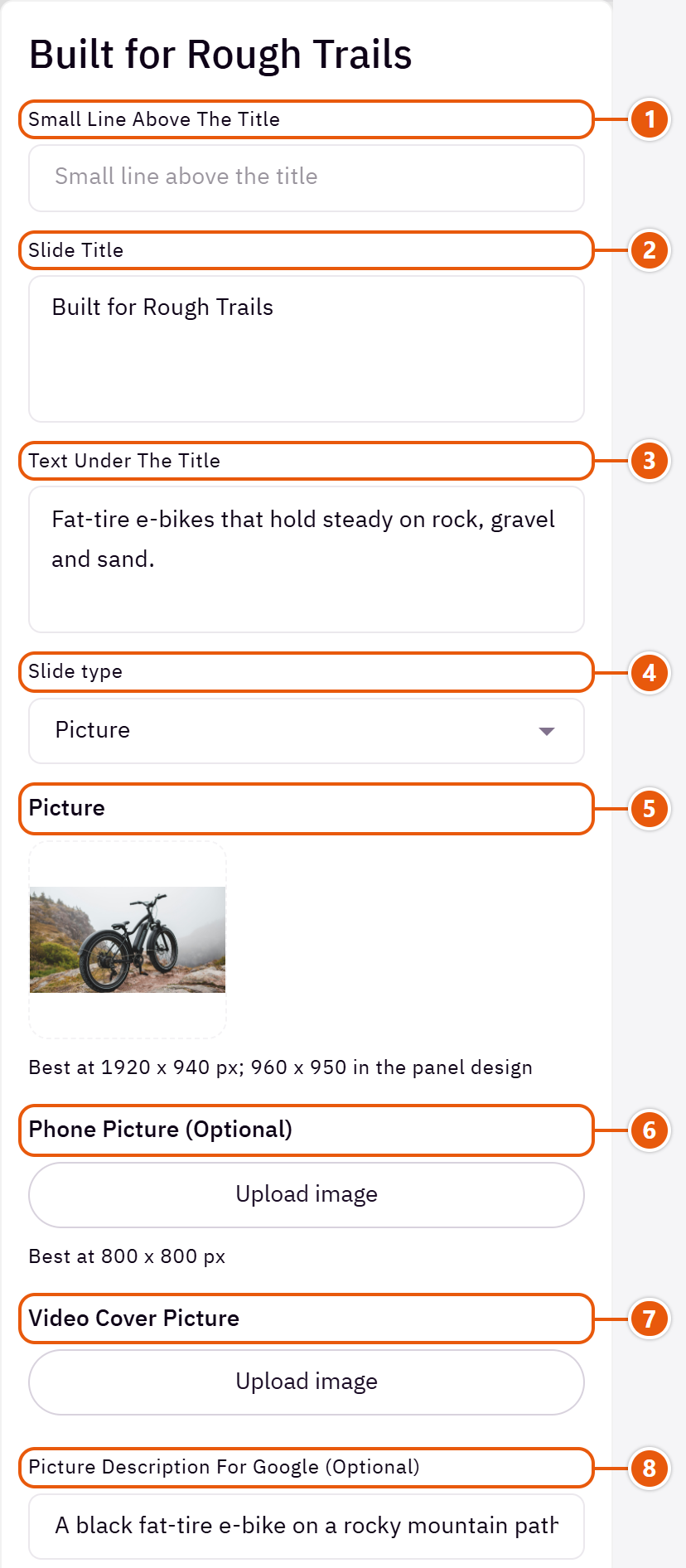
- 1“Small line above the title”
A short phrase above the title, such as “New collection”. - 2“Slide title”
The large title; Enter starts a new line. - 3“Text under the title”
A line or two under the title. - 4“Slide type”
“Color only” is a slide of words on its “Background color (behind the picture, or the panel)”. - 5“Picture”
The slide's picture; the size is under the field. - 6“Phone picture (optional)”
Shown instead of the picture on phones, so a wide picture is not cut. - 7“Video cover picture”
Shown until the video loads. - 8“Picture description for Google (optional)”
A few words describing the picture. Empty: the title is used.
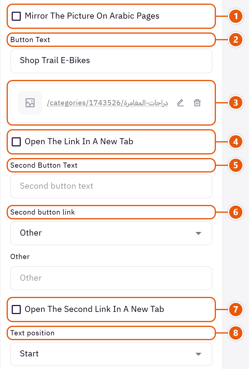
- 1“Mirror the picture on Arabic pages”
Mirrors the picture in Arabic so its empty side falls under the words. Leave it off if the picture has writing. - 2“Button text”
Such as “Shop now”. - 3“Button link (needed for the button to show)”
The page the button opens. - 4“Open the link in a new tab”
Only for links outside your store. - 5“Second button text”
A second button beside the first, such as “Discover more”. - 6“Second button link”
Needed for the second button to show. - 7“Open the second link in a new tab”
Only for links outside your store. - 8“Text position”
“Start” is the right in Arabic and the left in English. Pick the empty side of your picture.
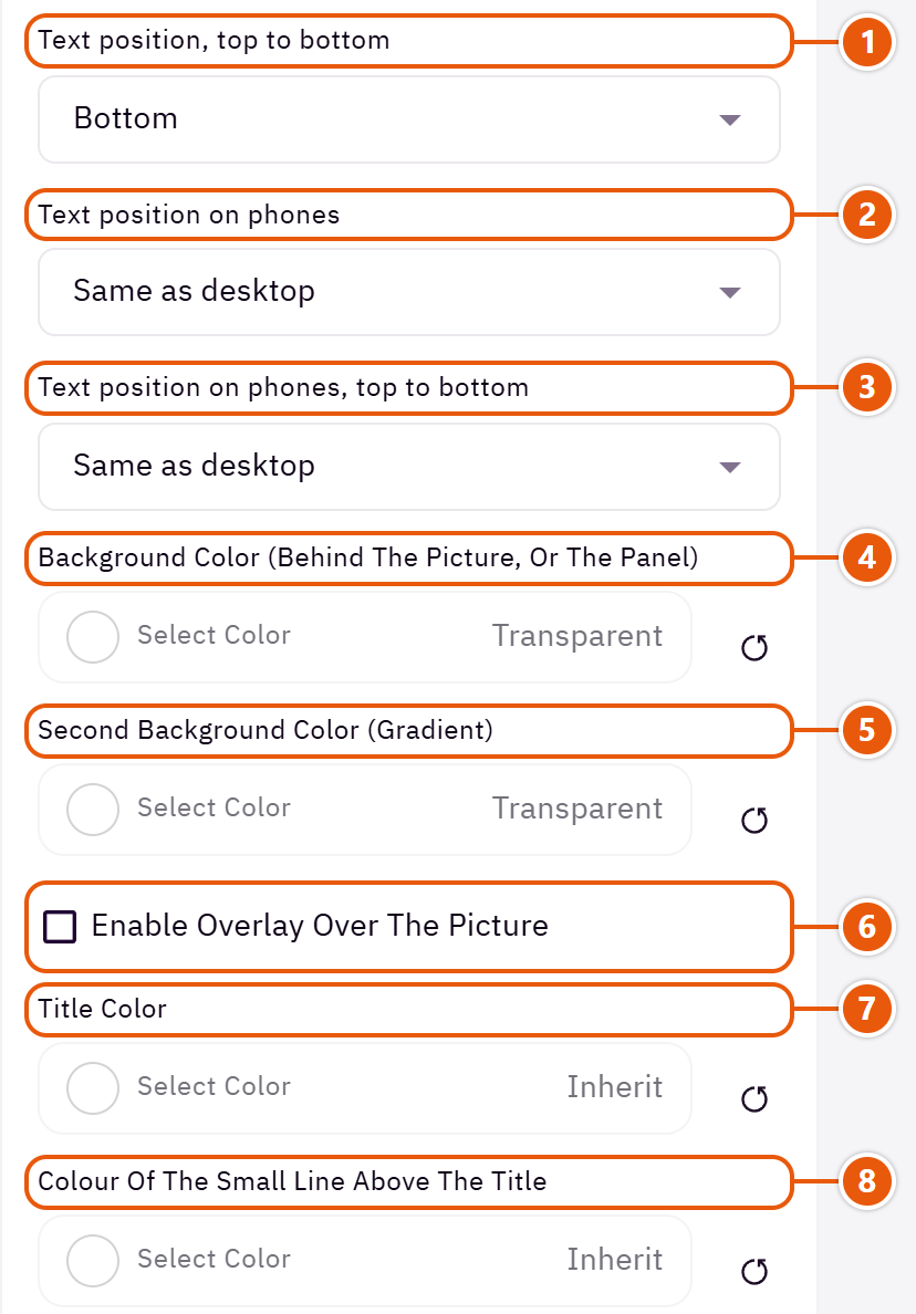
- 1“Text position, top to bottom”
The words at the top, middle or bottom. - 2“Text position on phones”
“Same as desktop” follows “Text position”. - 3“Text position on phones, top to bottom”
“Same as desktop” follows “Text position, top to bottom”. - 4“Background color (behind the picture, or the panel)”
The panel in “Color panel beside the picture”, a slide with no picture, and the ground behind a see-through picture. - 5“Second background color (gradient)”
With the first colour it makes a gradient. - 6“Enable overlay over the picture”
A colour layer over the picture so the words read. - 7“Title color”
Leave it automatic and the theme picks a colour that reads on the picture. - 8“Colour of the small line above the title”
Changes the small line alone; without it, it takes the “Text and small line color”.
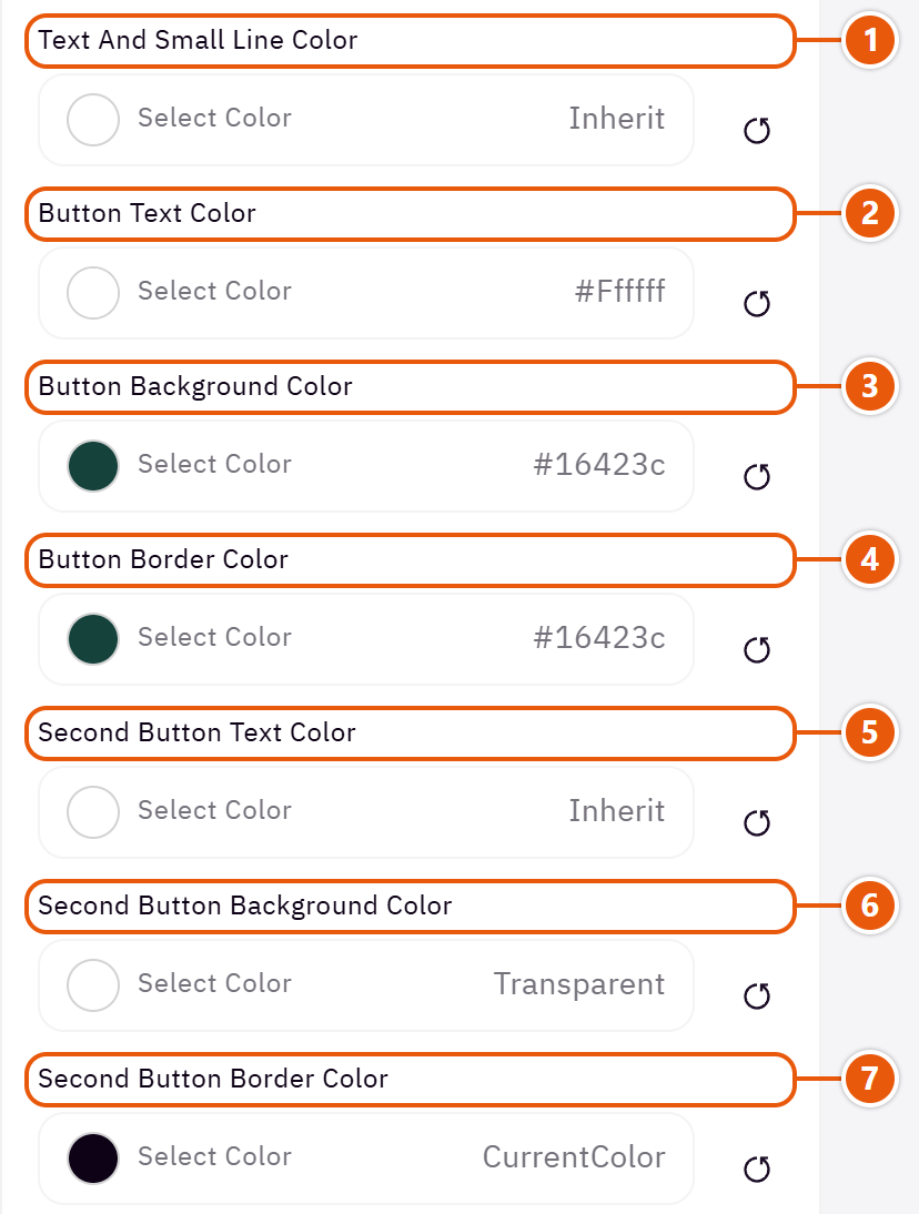
- 1“Text and small line color”
The text under the title and the small line. - 2“Button text color”
The first button's words. - 3“Button background color”
Transparent: the theme's buttons colour. With “Outline” it is the hover fill. - 4“Button border color”
The first button's border. - 5“Second button text color”
The second button's words. - 6“Second button background color”
Transparent: the theme's buttons colour. With “Outline” it is the hover fill. - 7“Second button border color”
The second button's border.
The other settings
- Slides
- Video file: A short, light MP4. It plays muted on a loop.Shown when “Slide type” is “Uploaded video”
- YouTube video link: The video's YouTube link as it is.Shown when “Slide type” is “YouTube video”
- Overlay type: “Gradient” darkens toward the words and leaves the rest of the picture clear.Shown when “Enable overlay over the picture” is on
- Overlay color: Black for white words, white for dark words.Shown when “Enable overlay over the picture” is on
- Overlay opacity (0 transparent - 100 opaque): Start at 40 and raise it if the words still do not read.Shown when “Enable overlay over the picture” is on
- Overlay on phones only: The layer shows on phones only; computers show the picture without it.Shown when “Enable overlay over the picture” is on
- Picture height as a share of its width (0 = the picture's own): Keeps every slide the same height on computers when your pictures differ in size; 50 makes the height half the width.Shown when “Slide height” is “The picture's own”
- Fixed height on desktop: In pixels; 700 suits most screens.Shown when “Slide height” is “Fixed height”
- Progress bar color (empty part): The part not yet filled.Shown when “Progress bar in place of the dots” is on
- Progress bar color (filled part): The part that fills.Shown when “Progress bar in place of the dots” is on
Plus the options in "Options every section shares", in the Home page sections chapter, except "Title", "Title colour (transparent = automatic)", "Background picture stays still on scroll".
Tips
- Pictures: about 1920 x 940, 960 x 950 in “Color panel beside the picture”, and 800 x 800 for phones.
- Keep what matters in the picture away from the side the words sit on.
- Two to four slides are enough; most visitors see only the first.
A strip of words that keeps moving: your offers or promises (“Free shipping”, “14-day returns”) with a separator between messages. It catches the eye between two sections without taking room.

Strip style

A slim one-line strip with a star between messages. Its colour comes from “Background color”.

Very large words, one message solid and the next outlined. For a slogan you want remembered.
Step by step
- Choose the “Strip style”.
- In “Moving messages” press “Add item” and write the “Message text”.
- Choose the “Movement speed” and “Separator between messages”, then publish.
Where to find its settings
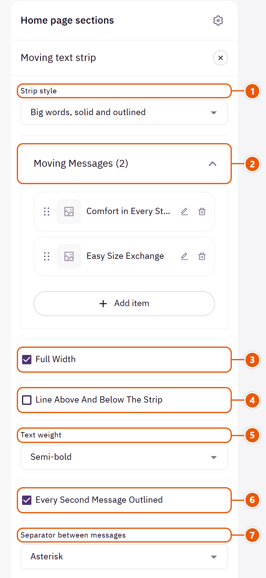
- 1“Strip style”
Your messages stay when you switch. - 2“Moving messages”Up to 10 items
- 3“Full width”
The content spans the whole screen instead of the page width. Good for banners and large pictures. - 4“Line above and below the strip”
A thin line above and below; useful when the strip matches the page colour. - 5“Text weight”
How thick the letters are. - 6“Every second message outlined”
Off: every message is solid.Shown with “Big words, solid and outlined” - 7“Separator between messages”
The mark between one message and the next.
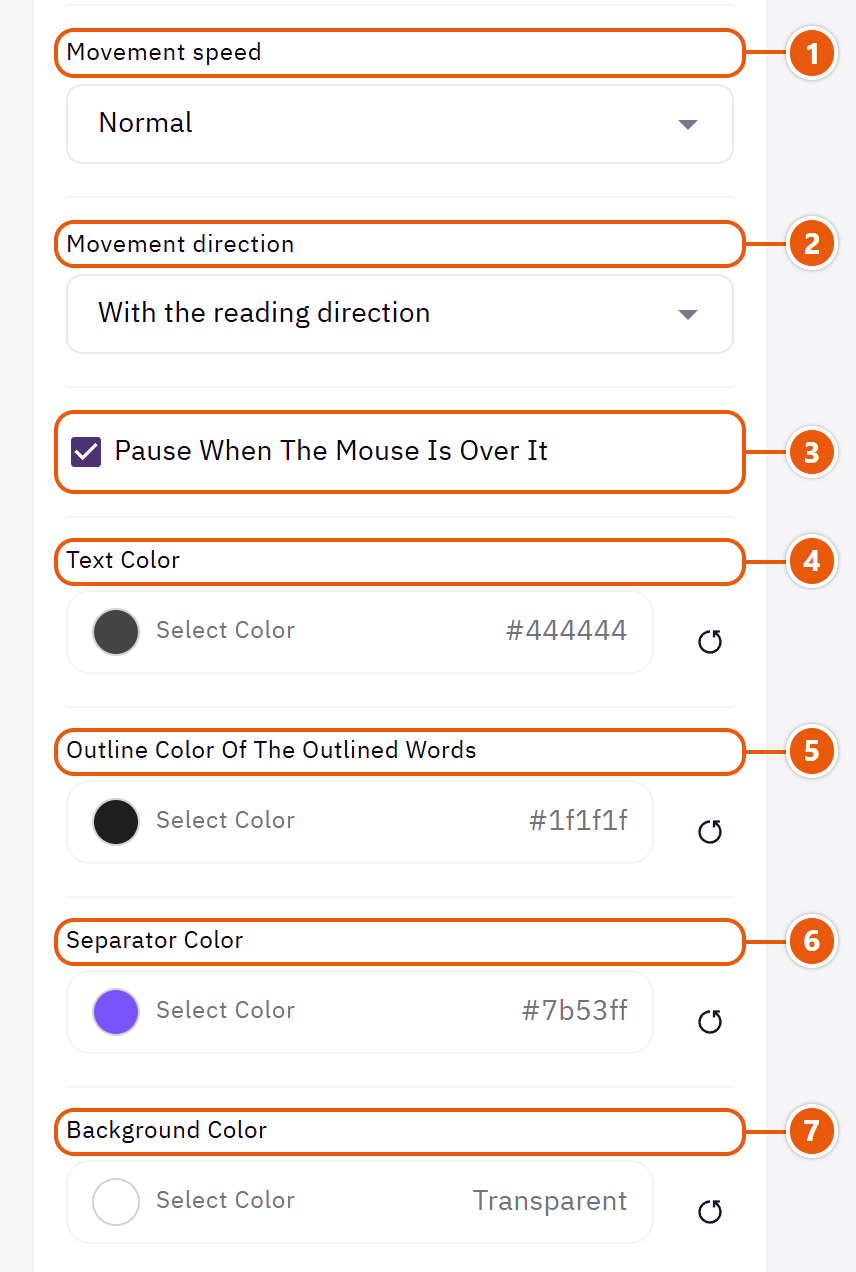
- 1“Movement speed”
“Slow” is easier to read. - 2“Movement direction”
“Against the reading direction” when two strips follow each other and you want them opposite. - 3“Pause when the mouse is over it”
So a visitor can read or click a message. - 4“Text color”
Empty: the “Headings color”. - 5“Outline color of the outlined words”
The outline of the outlined messages.Shown with “Big words, solid and outlined” - 6“Separator color”
The mark between messages. - 7“Background color”
A colour behind the whole section to set it apart. Transparent takes the page colour.
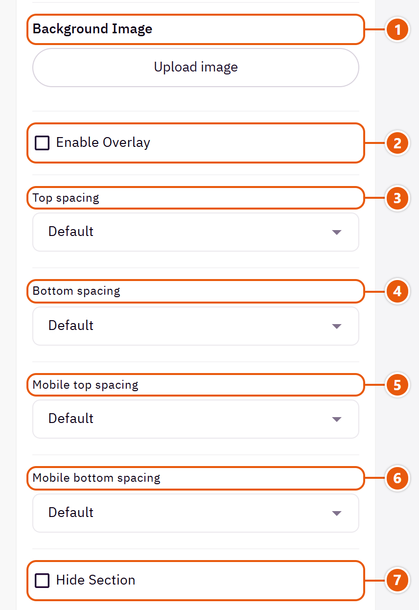
- 1“Background image”
A picture behind the whole section, cropped to fit; choose a calm one about 1920 wide. - 2“Enable overlay”
A see-through colour layer over the background or picture so the words read. - 3“Top spacing”
“Default” keeps the chosen design's space, “00” removes it, the rest are pixels. - 4“Bottom spacing”
Like “Top spacing”, below the section. - 5“Mobile top spacing”
On “Default” phones use the “Top spacing” number. - 6“Mobile bottom spacing”
On “Default” phones use the “Bottom spacing” number. - 7“Hide section”
Hides the section without deleting it; its content is kept. Handy for a seasonal offer.
Inside each item of “Moving messages” (press the pencil beside it)
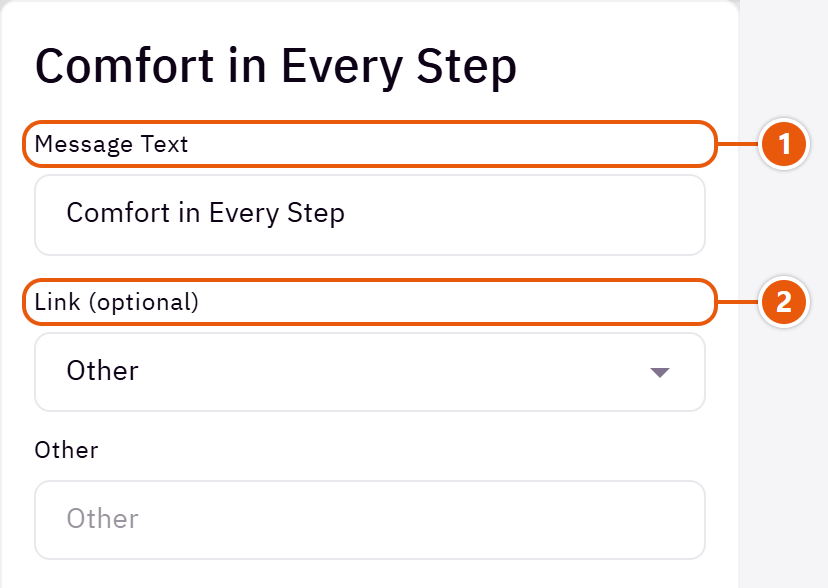
- 1“Message text”
A short message, such as “Free shipping over 200 SAR”. - 2“Link (optional)”
A message with a link can be clicked.
The other settings
- Text size: “Medium” for a quieter strip.Shown with “Slim strip with a star between messages”
Plus the options in "Options every section shares", in the Home page sections chapter, except "Title", "Title colour (transparent = automatic)", "Background picture stays still on scroll".
Tips
- Three to five short messages are enough; the strip repeats them to fill the screen.
Your store's categories with their pictures in a slider; a tap opens the category. Choose them yourself, or leave the list empty and the section fetches your categories, with their names and pictures, from Zid.

Section design

Large pictures with the name on a white button over their foot. For fashion and pictures with a model.

As a circle, a circle on a card or a full picture. Fits more categories in a row.
Step by step
- Choose the “Section design”.
- In “Categories” press “Add item” and pick the “Category”; the name and picture come from Zid.
- Change the name or picture in their fields if you like.
- Or switch on “Pull the store's categories instead of the list”, then publish.
Where to find its settings
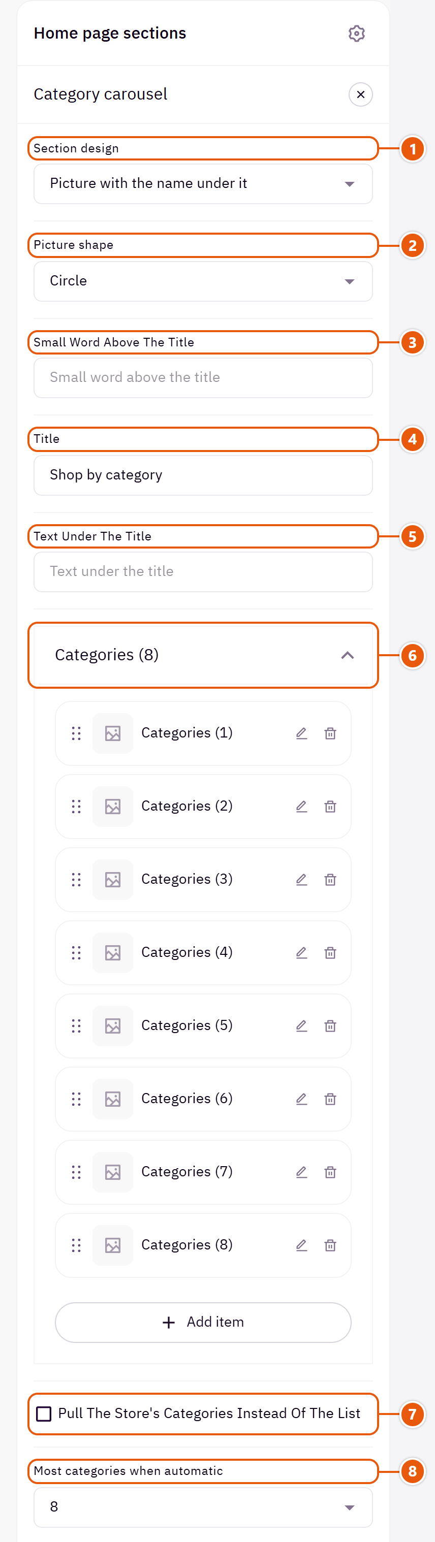
- 1“Section design”
Your categories stay when you switch. - 2“Picture shape”
“Circle on a coloured card” takes its colour from “Colour behind the picture or the card”.Shown with “Picture with the name under it” - 3“Small word above the title”
A short word above the title, such as “Shop by department”. - 4“Title”
The section's main heading; leave it empty for none. - 5“Text under the title”
A short line under the title. - 6“Categories”Up to 12 items
- 7“Pull the store's categories instead of the list”
The section shows your store's categories by itself (those in the header menu first) and keeps up with them. The same happens when the list is empty. - 8“Most categories when automatic”
The most it fetches.
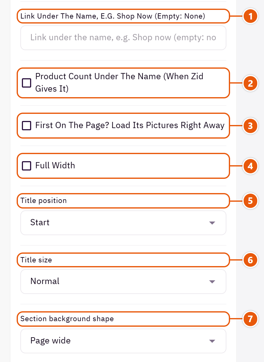
- 1“Link under the name, e.g. Shop now (empty: none)”
A small link under the name.Shown with “Picture with the name under it” - 2“Product count under the name (when Zid gives it)”
Shows only when Zid sends a number above zero.Shown with “Picture with the name under it” - 3“First on the page? Load its pictures right away”
Turn it on only when the section is first on the page. - 4“Full width”
The content spans the whole screen instead of the page width. Good for banners and large pictures. - 5“Title position”
“A column beside the categories” puts the title in a side column. - 6“Title size”
The larger sizes suit a short title; keep a long one “Normal”. - 7“Section background shape”
With a “Background color” or “Background image”: the section shows as a panel in from the screen's edges or with rounded corners.
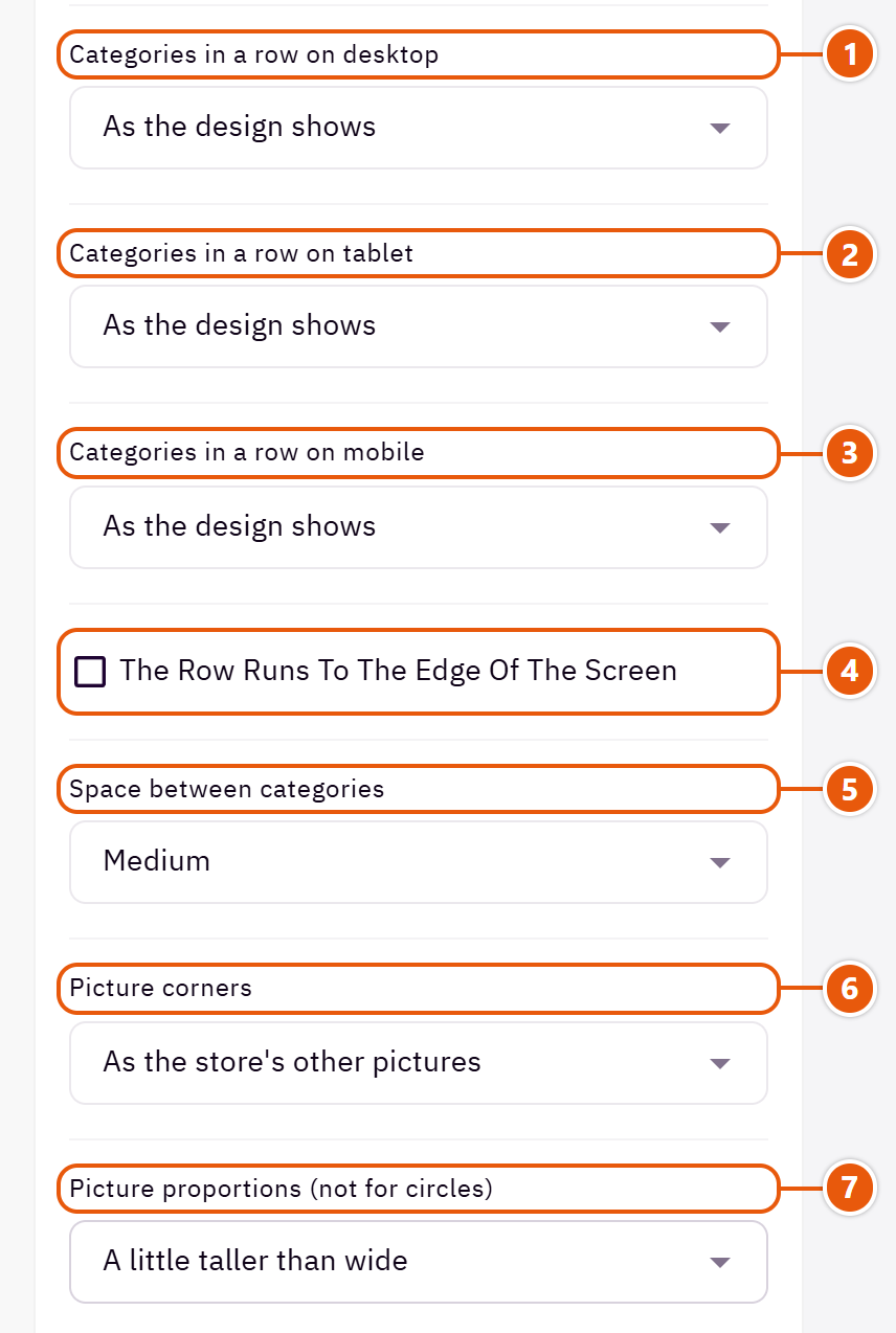
- 1“Categories in a row on desktop”
“As the design shows”: 3 in “Picture with the name on a button over it”, 6 in “Picture with the name under it”. - 2“Categories in a row on tablet”
How many tiles on a tablet. - 3“Categories in a row on mobile”
“One and a half” shows part of the next tile so visitors know to swipe. - 4“The row runs to the edge of the screen”
The row runs to the screen's edge and shows half a tile more, hinting there is more. - 5“Space between categories”
“None” butts the pictures together into one mosaic. - 6“Picture corners”
How round the picture corners are. - 7“Picture proportions (not for circles)”
“As the picture was uploaded” does not crop; the others crop every picture alike.
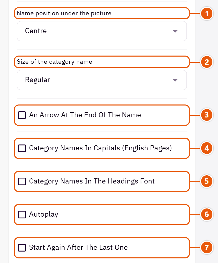
- 1“Name position under the picture”
The name centred or at the start.Shown with “Picture with the name under it” - 2“Size of the category name”
Enlarge it when your category names are short and should stand out; keep long names “Regular”.Shown with “Picture with the name under it” - 3“An arrow at the end of the name”
A small arrow after the name. - 4“Category names in capitals (English pages)”
English only; Arabic has no capitals. - 5“Category names in the headings font”
Instead of the text font; the names then match the section title. - 6“Autoplay”
The slider turns by itself. - 7“Start again after the last one”
Instead of stopping at the last category.
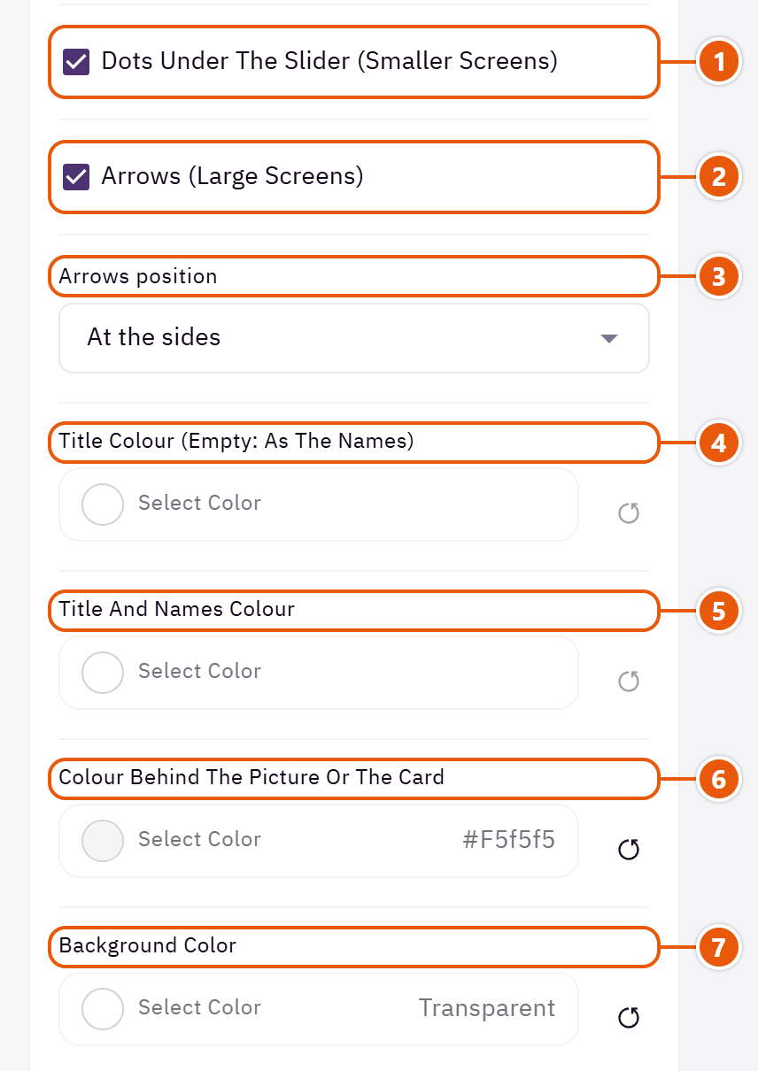
- 1“Dots under the slider (smaller screens)”
Dots under the slider on smaller screens. - 2“Arrows (large screens)”
Arrows on large screens; phones swipe. - 3“Arrows position”
“By the title” puts the two arrows in the title row instead of beside the pictures.Shown when “Arrows (large screens)” is on - 4“Title colour (empty: as the names)”
The section title's colour, and in some sections the words around it, as the field's name says. Transparent keeps the theme's colour. - 5“Title and names colour”
The section title and the category names. - 6“Colour behind the picture or the card”
The card behind the circle, or the ground behind the picture. - 7“Background color”
A colour behind the whole section to set it apart. Transparent takes the page colour.

- 1“Background image”
A picture behind the whole section, cropped to fit; choose a calm one about 1920 wide. - 2“Enable overlay”
A see-through colour layer over the background or picture so the words read. - 3“Top spacing”
“Default” keeps the chosen design's space, “00” removes it, the rest are pixels. - 4“Bottom spacing”
Like “Top spacing”, below the section. - 5“Mobile top spacing”
On “Default” phones use the “Top spacing” number. - 6“Mobile bottom spacing”
On “Default” phones use the “Bottom spacing” number. - 7“Hide section”
Hides the section without deleting it; its content is kept. Handy for a seasonal offer.
Inside each item of “Categories” (press the pencil beside it)
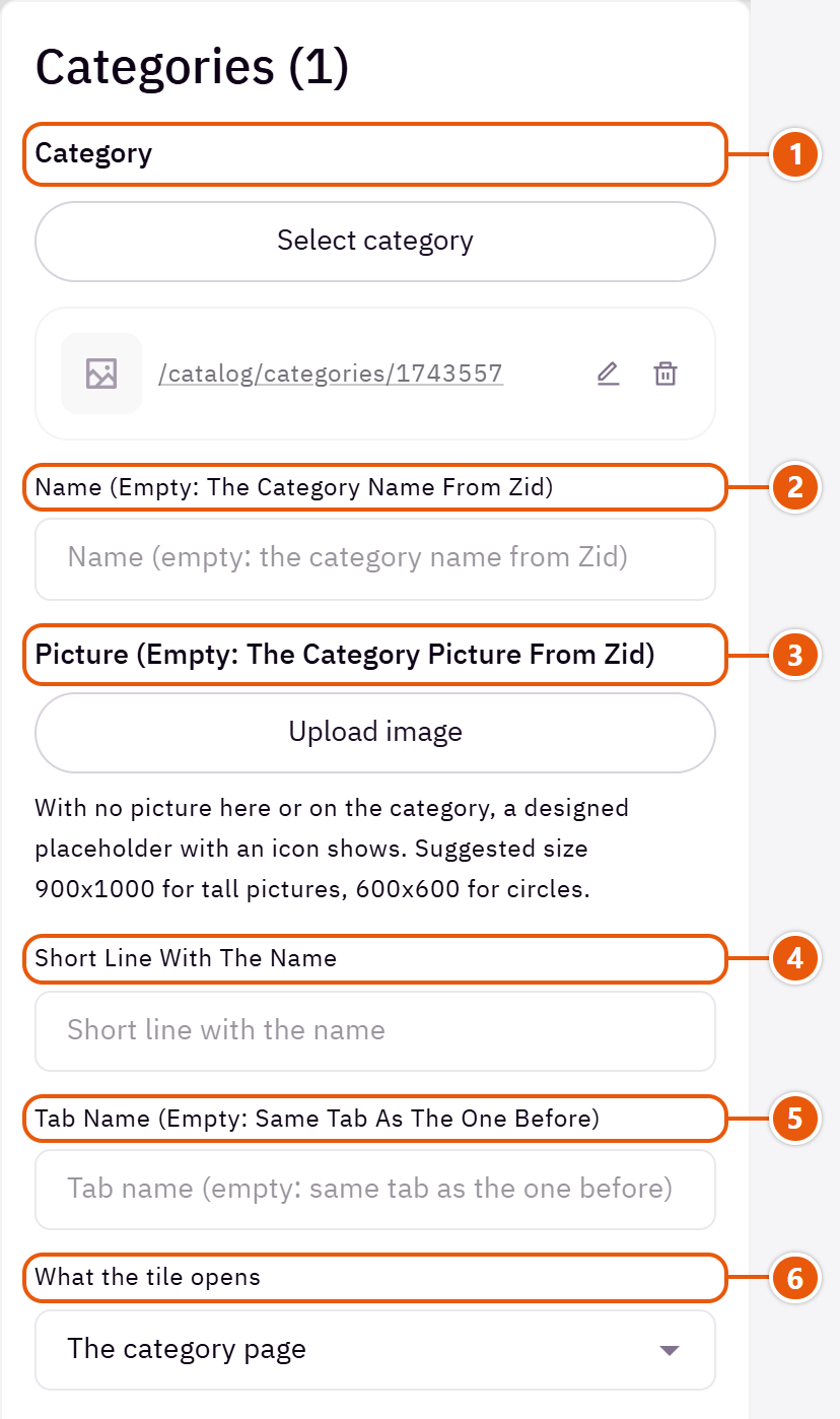
- 1“Category”
A category from your store; it gives the name, picture and link. - 2“Name (empty: the category name from Zid)”
A shorter or clearer name than the category's. - 3“Picture (empty: the category picture from Zid)”
A picture other than the category's in Zid. - 4“Short line with the name”
A small line under the name, such as “Seasonal deals”. - 5“Tab name (empty: same tab as the one before)”
Type a tab name to split the categories into tabs above the slider; the ones after it with no name join the same tab. - 6“What the tile opens”
“A link I choose” to open another page instead of the category.
The other settings
- Categories
- Link: The page the tile opens.Shown when “What the tile opens” is “A link I choose”
- Size of the name button: The size of the white name button.Shown with “Picture with the name on a button over it”
- Pictures fill the first screen (large screens): The pictures grow tall enough to fill the first screen on computers. Suits a section at the top of the page.Shown with “Picture with the name on a button over it”
Plus the options in "Options every section shares", in the Home page sections chapter, except "Background picture stays still on scroll".
Tips
- A category with no picture shows a designed placeholder with an icon, so upload your category pictures in Zid once and every section uses them.
- Picture size: about 900 x 1000 for tall pictures, 600 x 600 for circles.
A row of your store's products in a slider, using the theme's product cards: the newest, those on sale, a category or products you choose. It can carry a countdown to an offer's end by the title, and a “View all” button.

Step by step
- Write the “Title”.
- In “Products (none chosen: the newest)” choose the source.
- Set “Most products to show” and how many sit in a row.
- Fill the “View all” text if you want the link, then publish.
Where to find its settings
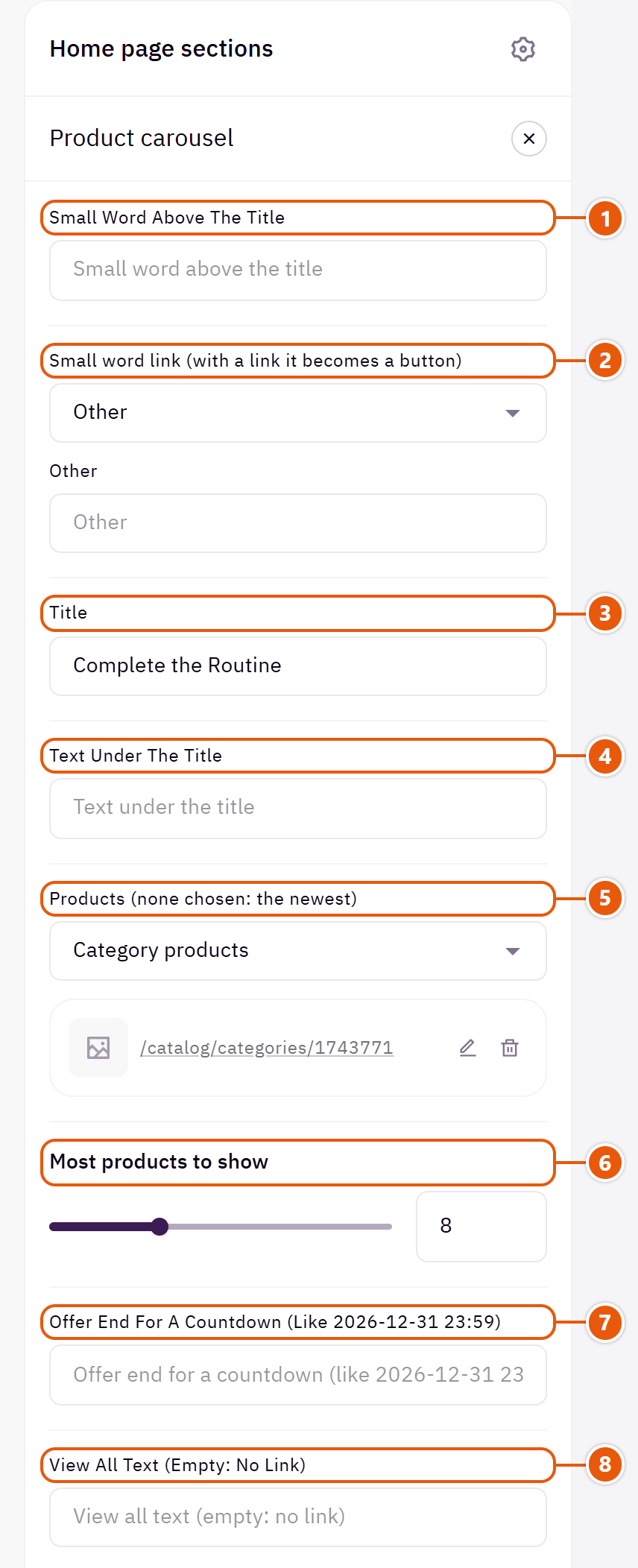
- 1“Small word above the title”
A short word above the title, such as “Best sellers”. - 2“Small word link (with a link it becomes a button)”
With a link the word becomes a small button that opens it. - 3“Title”
The section's main heading; leave it empty for none. - 4“Text under the title”
A short line under the title. - 5“Products (none chosen: the newest)”
Four sources: “Select products” to choose them one by one, “Category products”, “Recent products” or “On sale products”. If the source is empty, the section does not show. - 6“Most products to show”
The most cards in the slider. - 7“Offer end for a countdown (like 2026-12-31 23:59)”
Shows a countdown by the title to this date; it disappears once the date passes. Empty: no countdown. - 8“View all text (empty: no link)”
Such as “View all”.
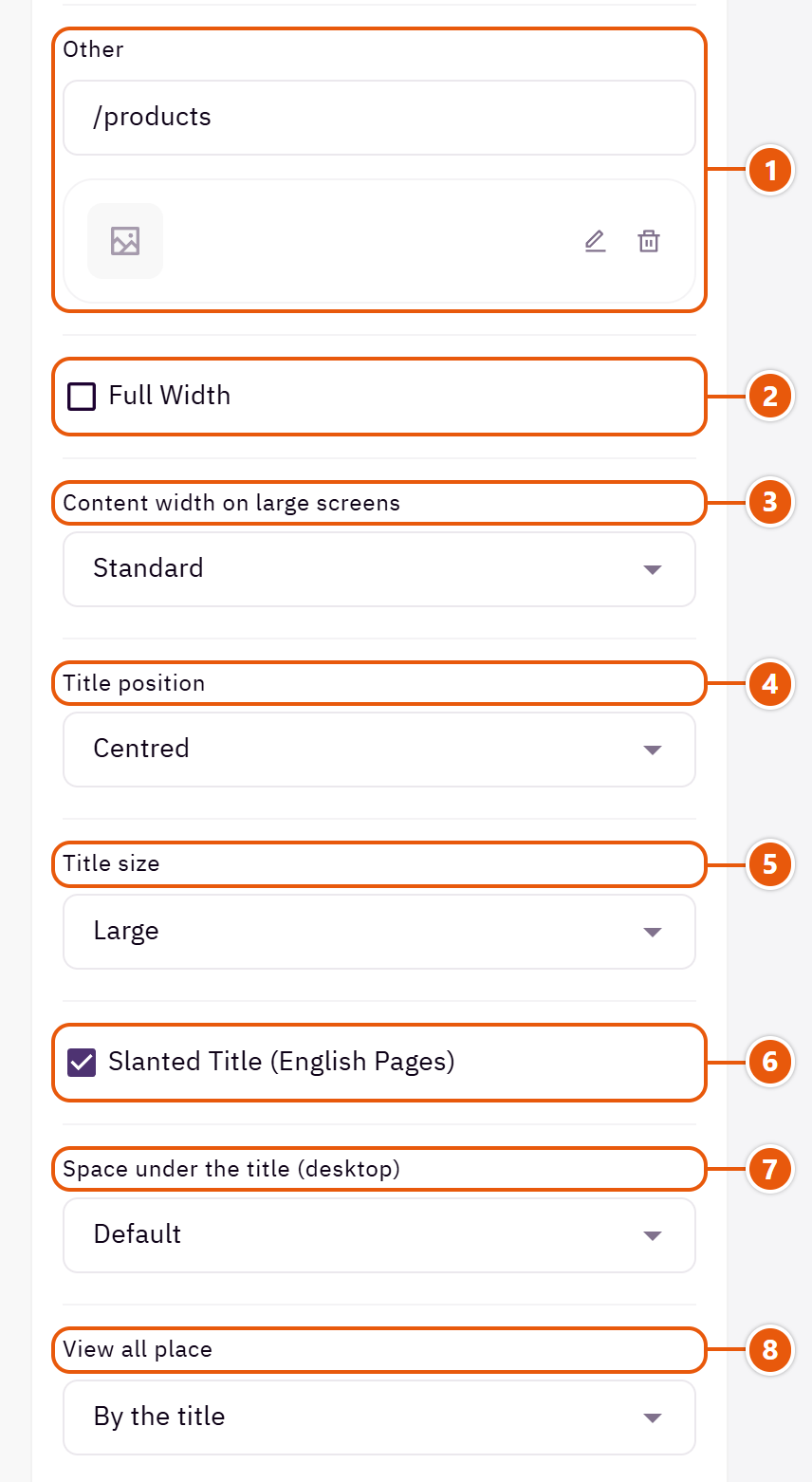
- 1“View all link”
Such as the category the products come from. - 2“Full width”
The content spans the whole screen instead of the page width. Good for banners and large pictures. - 3“Content width on large screens”
“Wider” widens the row on very large screens. - 4“Title position”
The last two put the title at the start of the line and the countdown, “View all”, the arrows or the text at its end. - 5“Title size”
The section title's size. - 6“Slanted title (English pages)”
English only; Arabic has no slanted letters. - 7“Space under the title (desktop)”
The space between the title and the products, in pixels. - 8“View all place”
“By the title” is a small link; “A button under the products” is a clear button.
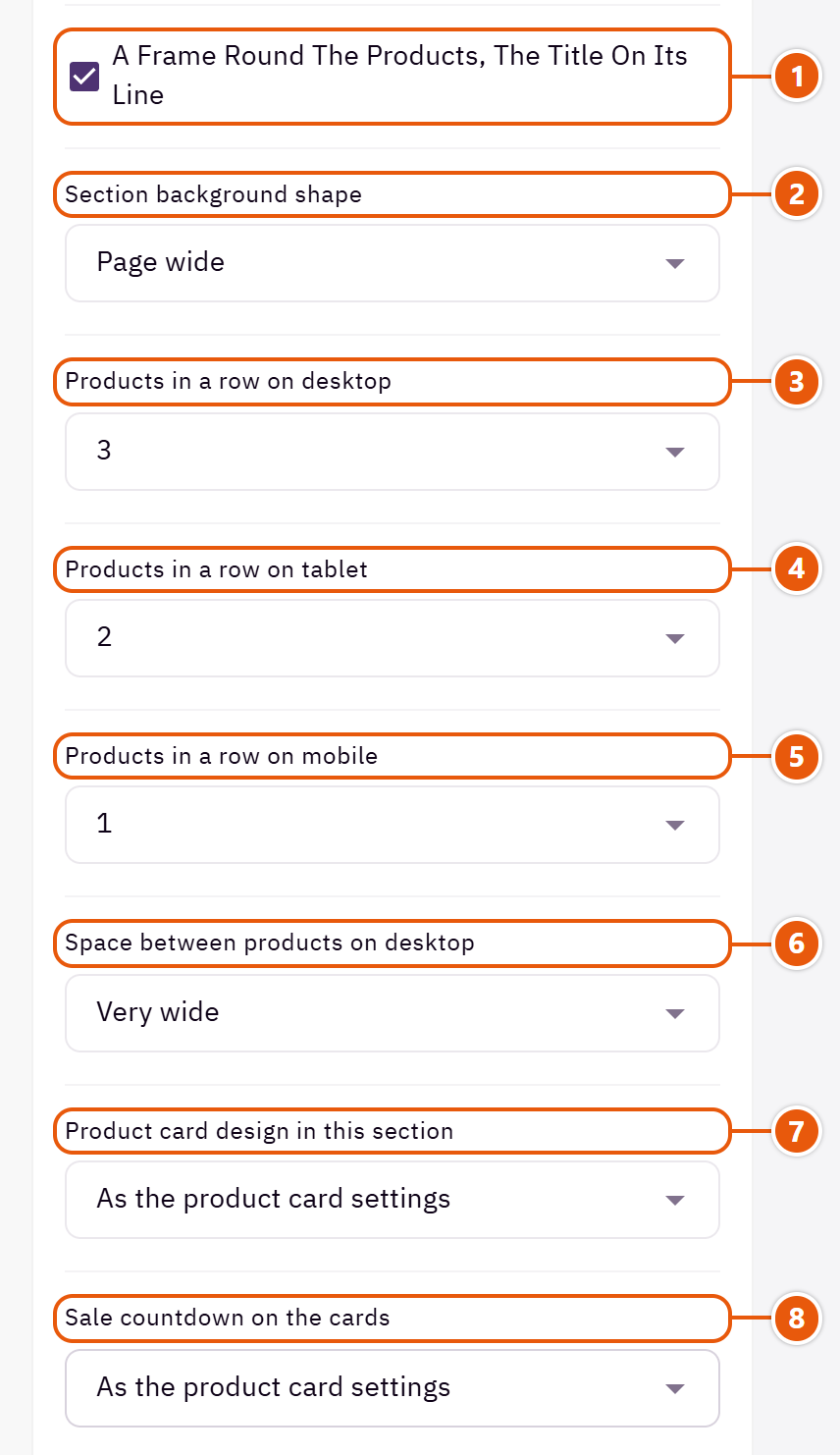
- 1“A frame round the products, the title on its line”
A gradient frame round the products with the title set into its line. - 2“Section background shape”
With a “Background color” or “Background image”: the section shows as a panel in from the screen's edges or with rounded corners. - 3“Products in a row on desktop”
How many products show in a row on computers. - 4“Products in a row on tablet”
Three suits most pictures; four makes the cards small. - 5“Products in a row on mobile”
One shows a bigger picture and fewer products; two shows more. - 6“Space between products on desktop”
Wider gives each card more room; suits calm designs. - 7“Product card design in this section”
“As the product card settings” follows the “Product card” in Page settings. - 8“Sale countdown on the cards”
“As the product card settings” follows “Sale countdown” in “Product card”; “Shown” and “Hidden” apply to this section only.
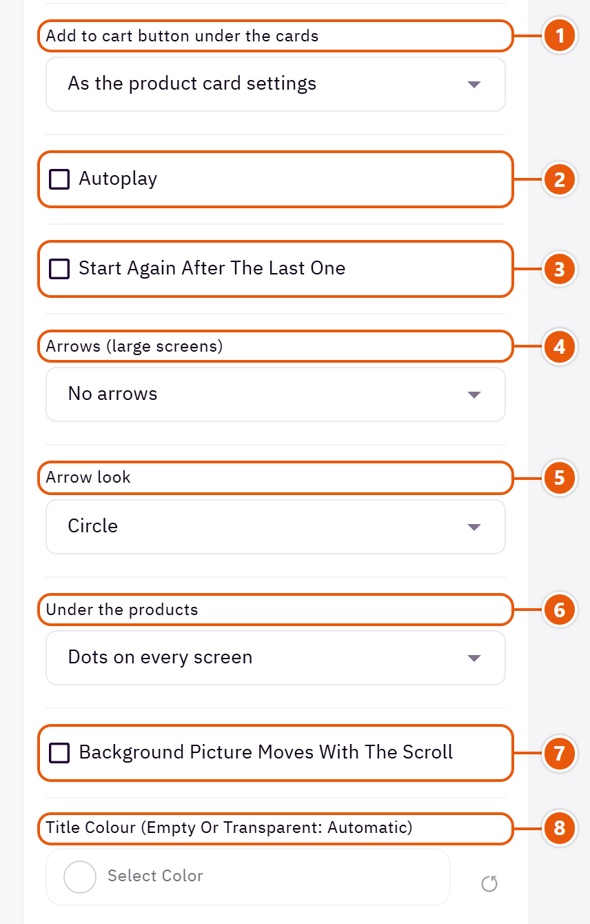
- 1“Add to cart button under the cards”
The cart button under the cards in this section only. - 2“Autoplay”
Pauses under the mouse. - 3“Start again after the last one”
Instead of stopping at the last product. - 4“Arrows (large screens)”
Phones swipe in every case. - 5“Arrow look”
“Larger circle” stands out on big screens; “Arrow, no circle” is quieter. - 6“Under the products”
“A bar that fills as it slides” shows visitors where they are. - 7“Background picture moves with the scroll”
With a “Background image”: the picture moves slower than the page. - 8“Title colour (empty or transparent: automatic)”
The section title's colour, and in some sections the words around it, as the field's name says. Transparent keeps the theme's colour.
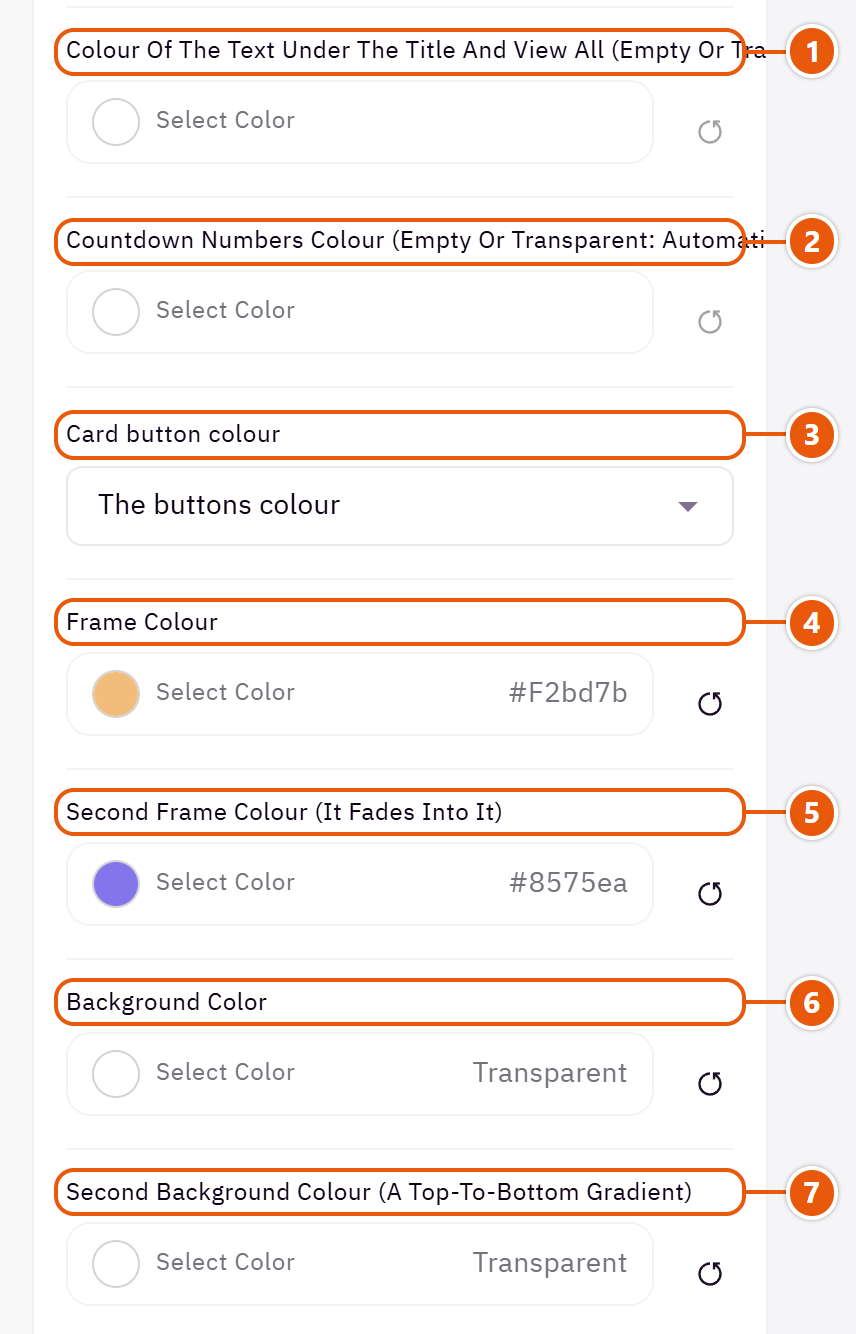
- 1“Colour of the text under the title and View all (empty or transparent: automatic)”
The line under the title and the “View all” link. - 2“Countdown numbers colour (empty or transparent: automatic)”
Empty: the “Accent color (sales, badges, hovers)”. - 3“Card button colour”
The colour of the add to cart button under this section's cards. - 4“Frame colour”
The frame's first colour.Shown when “A frame round the products, the title on its line” is on - 5“Second frame colour (it fades into it)”
The colour the frame fades into.Shown when “A frame round the products, the title on its line” is on - 6“Background color”
A colour behind the whole section to set it apart. Transparent takes the page colour. - 7“Second background colour (a top-to-bottom gradient)”
Makes a gradient from the “Background color” at the top to this colour at the bottom; on its own it fades in from the page.
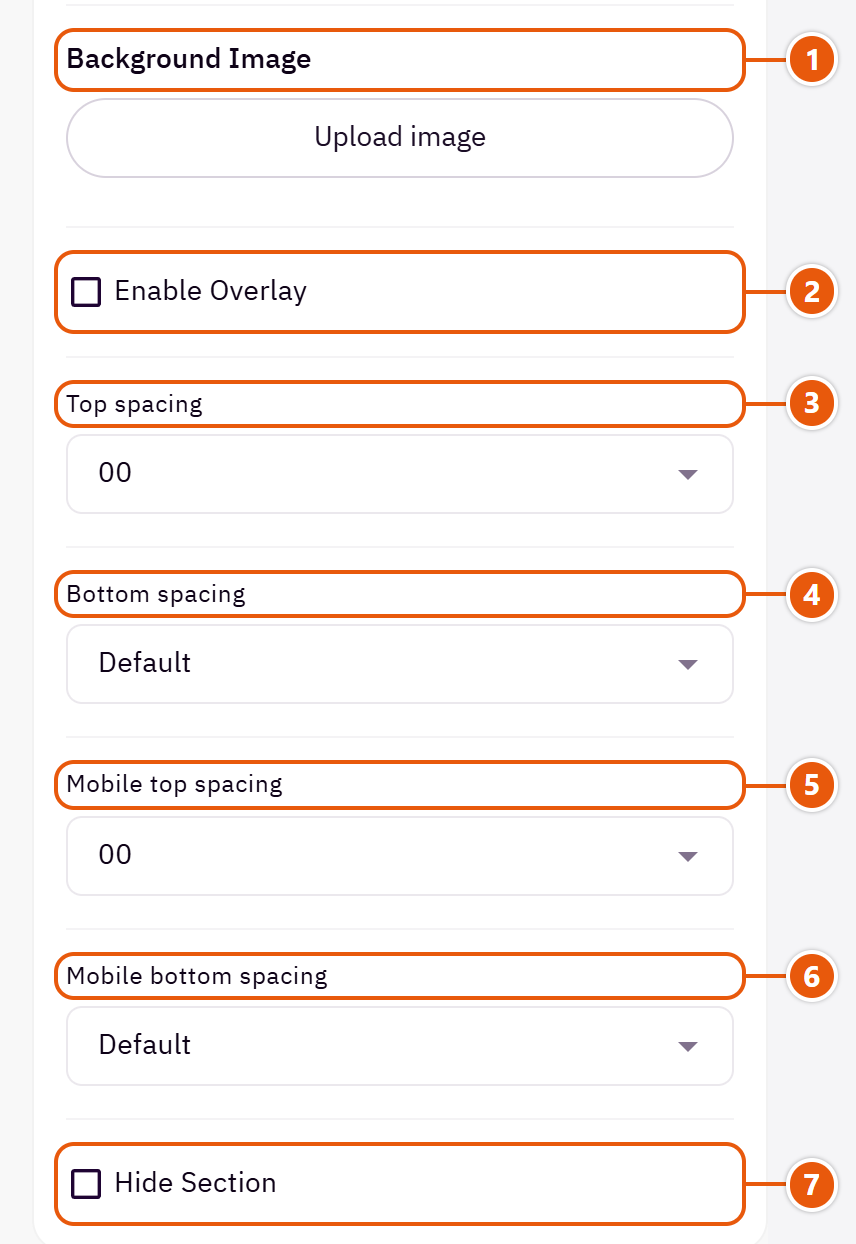
- 1“Background image”
A picture behind the whole section, cropped to fit; choose a calm one about 1920 wide. - 2“Enable overlay”
A see-through colour layer over the background or picture so the words read. - 3“Top spacing”
“Default” keeps the chosen design's space, “00” removes it, the rest are pixels. - 4“Bottom spacing”
Like “Top spacing”, below the section. - 5“Mobile top spacing”
On “Default” phones use the “Top spacing” number. - 6“Mobile bottom spacing”
On “Default” phones use the “Bottom spacing” number. - 7“Hide section”
Hides the section without deleting it; its content is kept. Handy for a seasonal offer.
The other settings
- Time per slide: 5000 is 5 seconds.Shown when “Autoplay” is on
Plus the options in "Options every section shares", in the Home page sections chapter, except "Background picture stays still on scroll".
Tips
- Use it more than once: “New arrivals” with “Recent products”, “Deals” with “On sale products”.
- The countdown writes its words (days, hours) in the page's language.
Several groups of products in one section, each in a tab: “New in”, “Best sellers”, “Deals”... The visitor taps a tab and the products swap without reloading the page.

Design

The products as a slider or a grid; the tabs' look and place are set below.

A column of categories with pictures beside a product grid, with a promo, an offers slider and benefits in the column. For large stores such as electronics.
Step by step
- Choose the “Design”.
- In “Tabs (a tab with no products is not shown)” press “Add item” for each tab.
- Write the “Tab name” and choose the “Tab products (none chosen: the newest)”.
- Drag the tabs into order and publish.
Where to find its settings
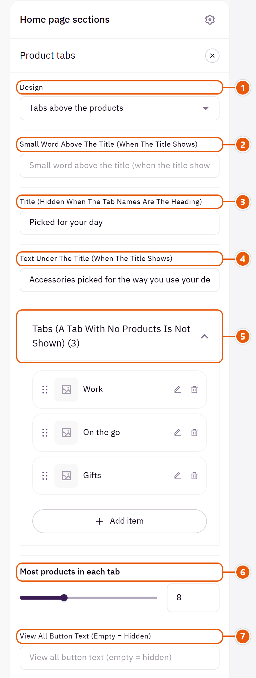
- 1“Design”
Your tabs stay when you switch. - 2“Small word above the title (when the title shows)”
A short word above the title.Shown with “Tabs above the products” - 3“Title (hidden when the tab names are the heading)”
The section's main heading; leave it empty for none. - 4“Text under the title (when the title shows)”
A short line under the title. - 5“Tabs (a tab with no products is not shown)”Up to 8 items
- 6“Most products in each tab”
The most cards in each tab. - 7“View all button text (empty = hidden)”
Such as “View all”.
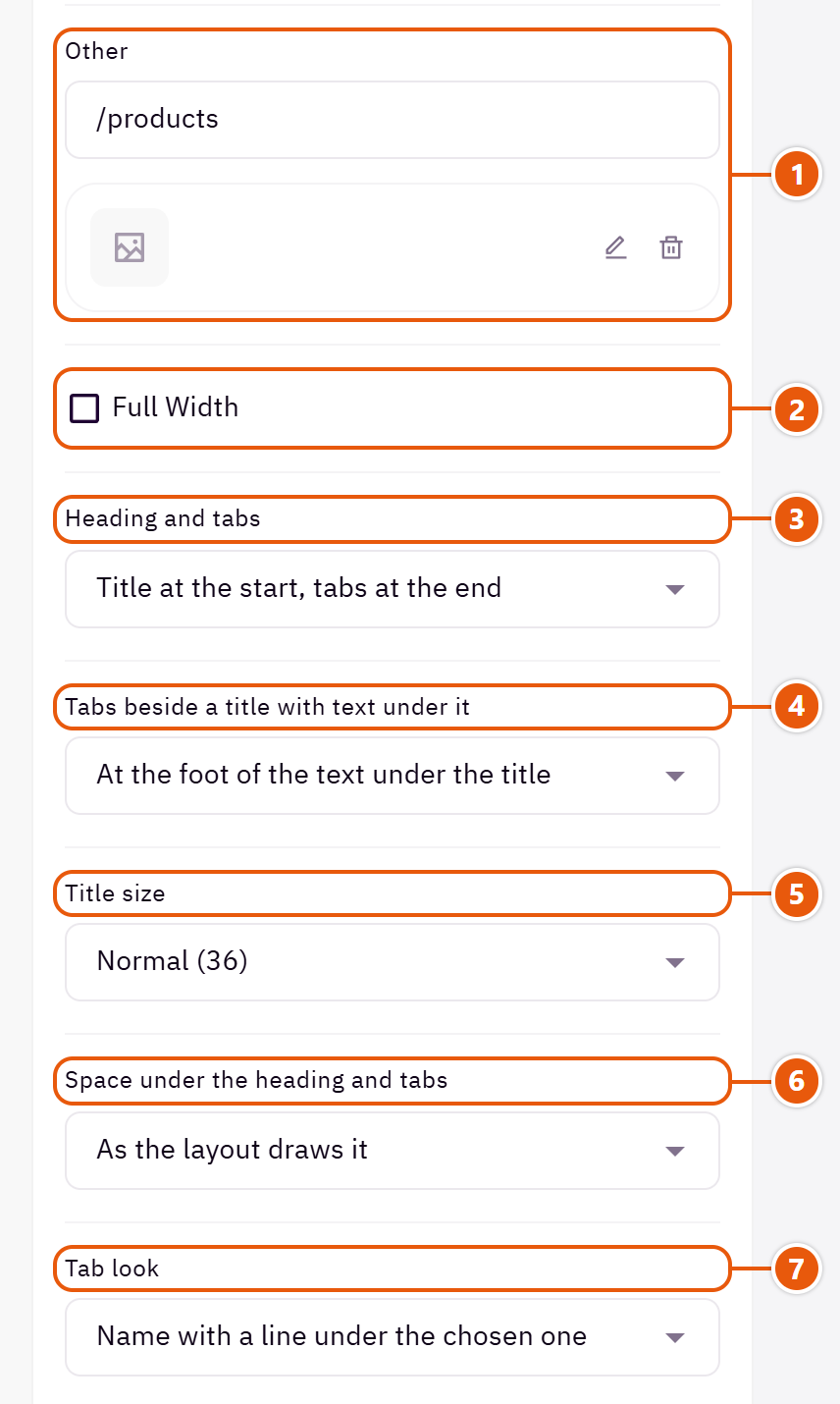
- 1“View all button link”
The page the button opens. - 2“Full width”
The content spans the whole screen instead of the page width. Good for banners and large pictures. - 3“Heading and tabs”
In the first two choices the tab names are the heading and the “Title” is hidden.Shown with “Tabs above the products” - 4“Tabs beside a title with text under it”
When a line of text sits under the title: the tabs at that line's foot or level with the middle of both.Shown with “Tabs above the products” and when “Heading and tabs” is “Title at the start, tabs at the end” - 5“Title size”
The larger sizes suit a short title; keep a long one at “Normal (36)”.Shown with “Tabs above the products” - 6“Space under the heading and tabs”
The space between the heading, tabs and products.Shown with “Tabs above the products” - 7“Tab look”
How the chosen tab is marked.Shown with “Tabs above the products”
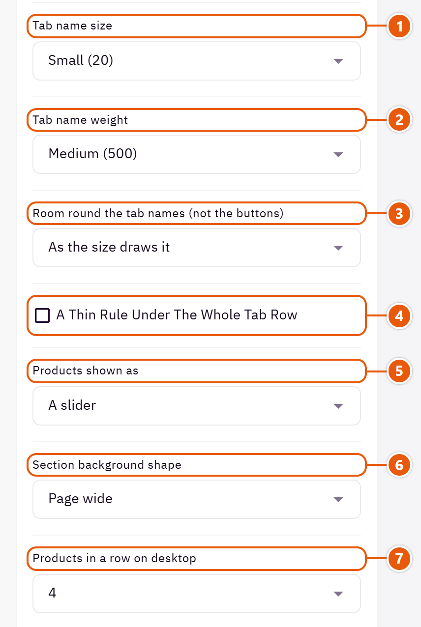
- 1“Tab name size”
The tab names' size; the choices with two numbers shrink on tablets and phones.Shown with “Tabs above the products” - 2“Tab name weight”
How thick the tab names are.Shown with “Tabs above the products” - 3“Room round the tab names (not the buttons)”
“Each name in an equal 148px box” makes the tabs the same width.Shown with “Tabs above the products” - 4“A thin rule under the whole tab row”
Separates the tab row from the products.Shown with “Tabs above the products” - 5“Products shown as”
“A grid” shows every product in rows, no sliding.Shown with “Tabs above the products” - 6“Section background shape”
With a “Background color” or “Background image”: the section shows as a panel in from the screen's edges or with rounded corners. - 7“Products in a row on desktop”
How many products in a row on computers.
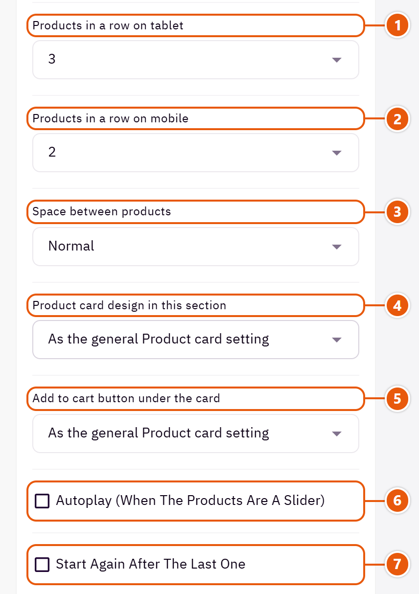
- 1“Products in a row on tablet”
Three suits most pictures; four makes the cards small. - 2“Products in a row on mobile”
One shows a bigger picture and fewer products; two shows more. - 3“Space between products”
“Wider on tablets” leaves more space between cards on tablets. - 4“Product card design in this section”
“As the general Product card setting” follows the “Product card” in Page settings. - 5“Add to cart button under the card”
The cart button under the cards in this section only. - 6“Autoplay (when the products are a slider)”
Pauses under the mouse.Shown with “Tabs above the products” and when “Products shown as” is “A slider” - 7“Start again after the last one”
Instead of stopping at the last product.Shown with “Tabs above the products” and when “Products shown as” is “A slider”
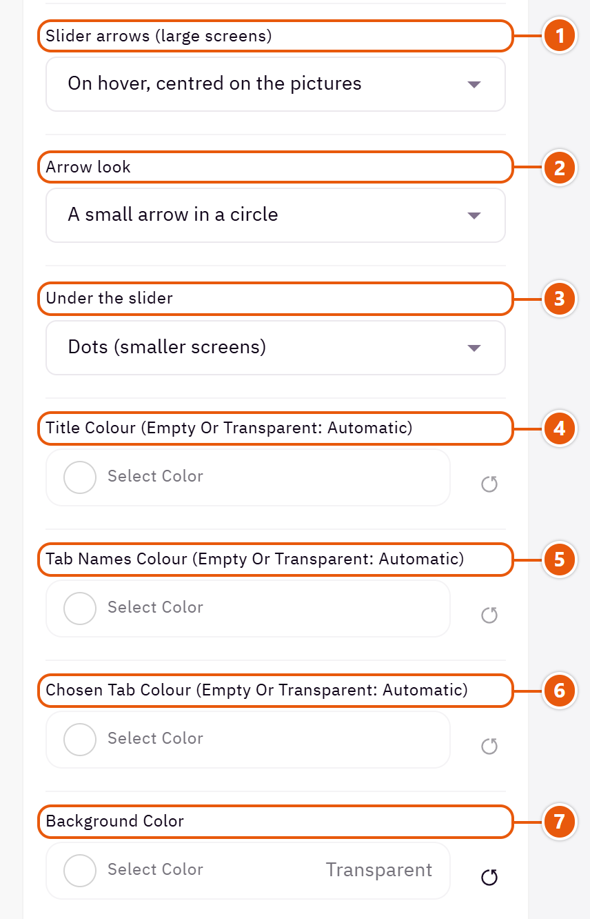
- 1“Slider arrows (large screens)”
Where the slider arrows sit; phones swipe.Shown with “Tabs above the products” and when “Products shown as” is “A slider” - 2“Arrow look”
An arrow in a circle or a long arrow.Shown with “Tabs above the products” and when “Products shown as” is “A slider” - 3“Under the slider”
Dots or a bar under the slider.Shown with “Tabs above the products” and when “Products shown as” is “A slider” - 4“Title colour (empty or transparent: automatic)”
The section title's colour, and in some sections the words around it, as the field's name says. Transparent keeps the theme's colour. - 5“Tab names colour (empty or transparent: automatic)”
The tabs not selected. Empty: the “Secondary text color”, or the “Headings color” with “Outlined buttons”. - 6“Chosen tab colour (empty or transparent: automatic)”
The chosen tab's colour; its words turn white or black by themselves. - 7“Background color”
A colour behind the whole section to set it apart. Transparent takes the page colour.
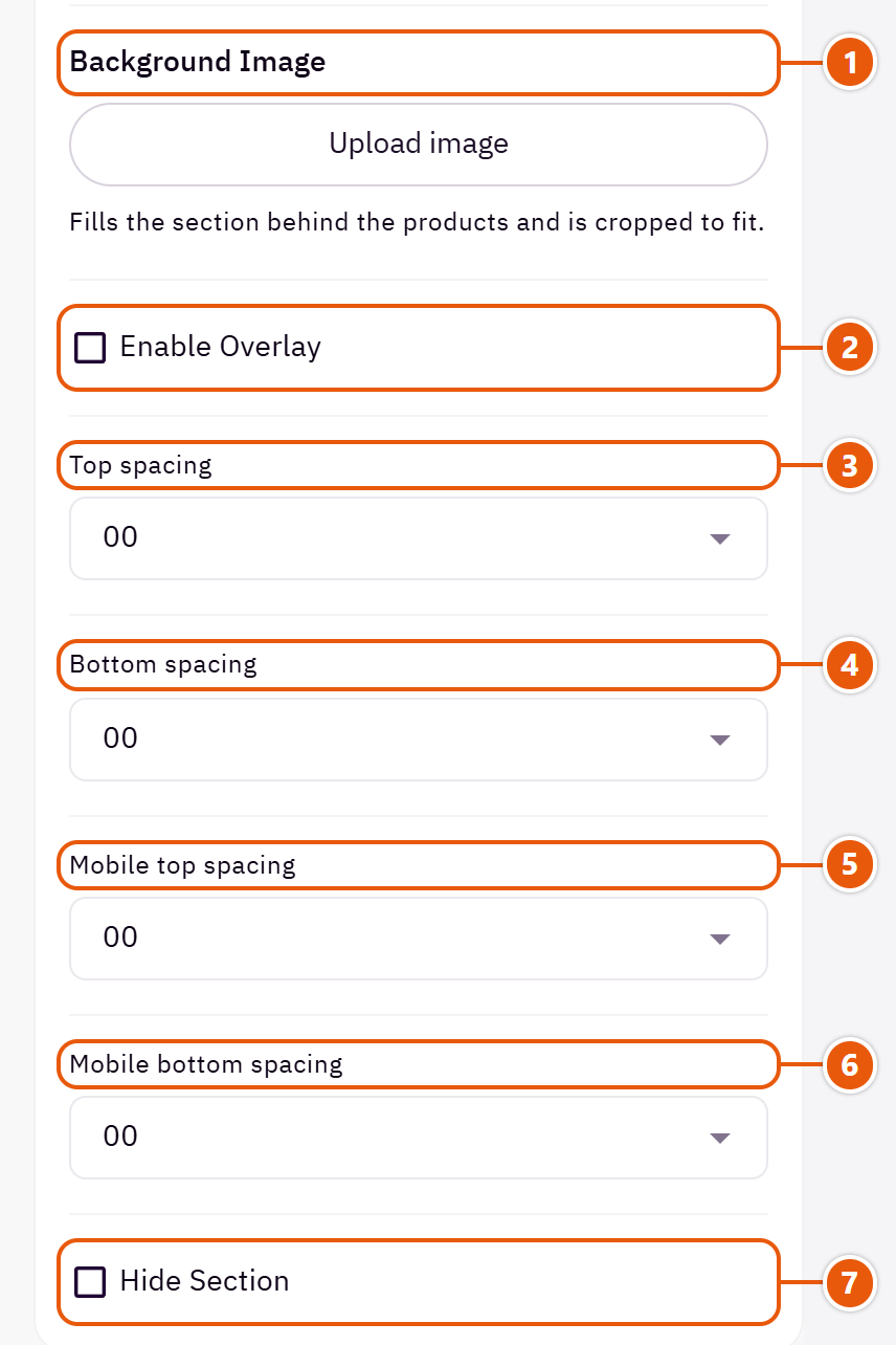
- 1“Background image”
A picture behind the whole section, cropped to fit; choose a calm one about 1920 wide. - 2“Enable overlay”
A see-through colour layer over the background or picture so the words read. - 3“Top spacing”
“Default” keeps the chosen design's space, “00” removes it, the rest are pixels. - 4“Bottom spacing”
Like “Top spacing”, below the section. - 5“Mobile top spacing”
On “Default” phones use the “Top spacing” number. - 6“Mobile bottom spacing”
On “Default” phones use the “Bottom spacing” number. - 7“Hide section”
Hides the section without deleting it; its content is kept. Handy for a seasonal offer.
Inside each item of “Tabs (a tab with no products is not shown)” (press the pencil beside it)
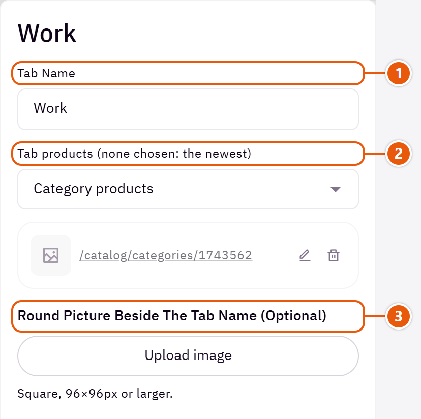
- 1“Tab name”
A word or two, such as “New in”. - 2“Tab products (none chosen: the newest)”
“Select products”, “Category products”, “Recent products” or “On sale products”. An empty tab is not shown. - 3“Round picture beside the tab name (optional)”
A small round picture beside the tab name, such as the category's picture.
The other settings
- Offer end for the countdown (like 2026-12-31 23:59): A countdown by the title to this date. Empty: no countdown.Shown with “A column of categories beside the products”
- Categories box title: Such as “Shop by department”.Shown with “A column of categories beside the products”
- Promo picture in the column: A portrait promo in the column.Shown with “A column of categories beside the products”
- Promo picture description for search (alt): A few words describing the promo picture. Not shown on the page.Shown with “A column of categories beside the products”
- Promo button text: A white button on the promo.Shown with “A column of categories beside the products”
- Promo link: The page the promo opens.Shown with “A column of categories beside the products”
- Offers slider title in the column: Such as “Special offers”.Shown with “A column of categories beside the products”
- Offers slider products (one at a time): Products turning one at a time in the column, such as “On sale products”.Shown with “A column of categories beside the products”
- Benefits under the offers in the columnShown with “A column of categories beside the products”Up to 4 items
- Benefit name: Such as “Free shipping”.
- Short description (optional): A short line under the name.
- Icon type: “Your own picture” for your brand's icon.
- Icon: Pick the closest match.Shown when “Icon type” is “Ready-made icon”
- Icon picture (square): Shown in the icon's place.Shown when “Icon type” is “Your own picture”
- Promo, offers and benefits on desktop: “A full-width row under the products” when the column is much taller than the products.Shown with “A column of categories beside the products”
- Promo, offers and benefits on phones and tablets: “Hidden” leaves the products alone on phones and tablets.Shown with “A column of categories beside the products”
- Time per slide: 5000 is 5 seconds.Shown with “Tabs above the products” and when “Products shown as” is “A slider” and when “Autoplay (when the products are a slider)” is on
- Categories box colour (empty or transparent: automatic): The categories box colour; its words turn white or black by themselves.Shown with “A column of categories beside the products”
Plus the options in "Options every section shares", in the Home page sections chapter, except "Background picture stays still on scroll".
Tips
- Two to four tabs are enough; a tab whose source is empty hides itself.
A large picture beside a list of your collection names; a visitor taps a name and the picture swaps to that collection's, and tapping the picture opens its page. With the list empty it shows your store's first 4 categories.

Section design

The picture on one side and the names in a framed panel on the other. For stores with a few collections and strong pictures.
Step by step
- In “Collections (empty: the store's first 4 categories)” press “Add item”.
- Pick a “Store category (fills an empty name, picture and link)”.
- Change the name or upload a bigger picture if you like, then publish.
Where to find its settings
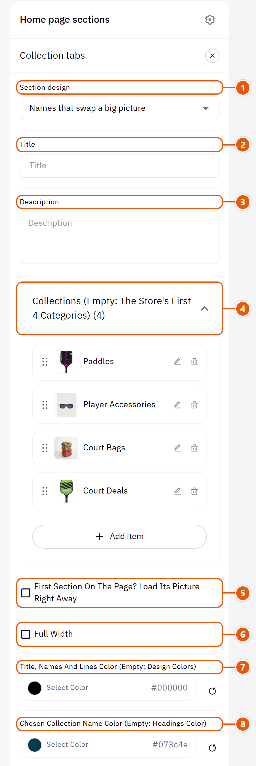
- 1“Section design”
One look today; your collections are kept. - 2“Title”
The section's main heading; leave it empty for none. - 3“Description”
A short line under the title. - 4“Collections (empty: the store's first 4 categories)”Up to 6 items
- 5“First section on the page? Load its picture right away”
Turn it on only when the section is first on the page. - 6“Full width”
The content spans the whole screen instead of the page width. Good for banners and large pictures. - 7“Title, names and lines color (empty: design colors)”
The title, the collection names and the lines between them. - 8“Chosen collection name color (empty: headings color)”
The colour of the name the visitor is on.
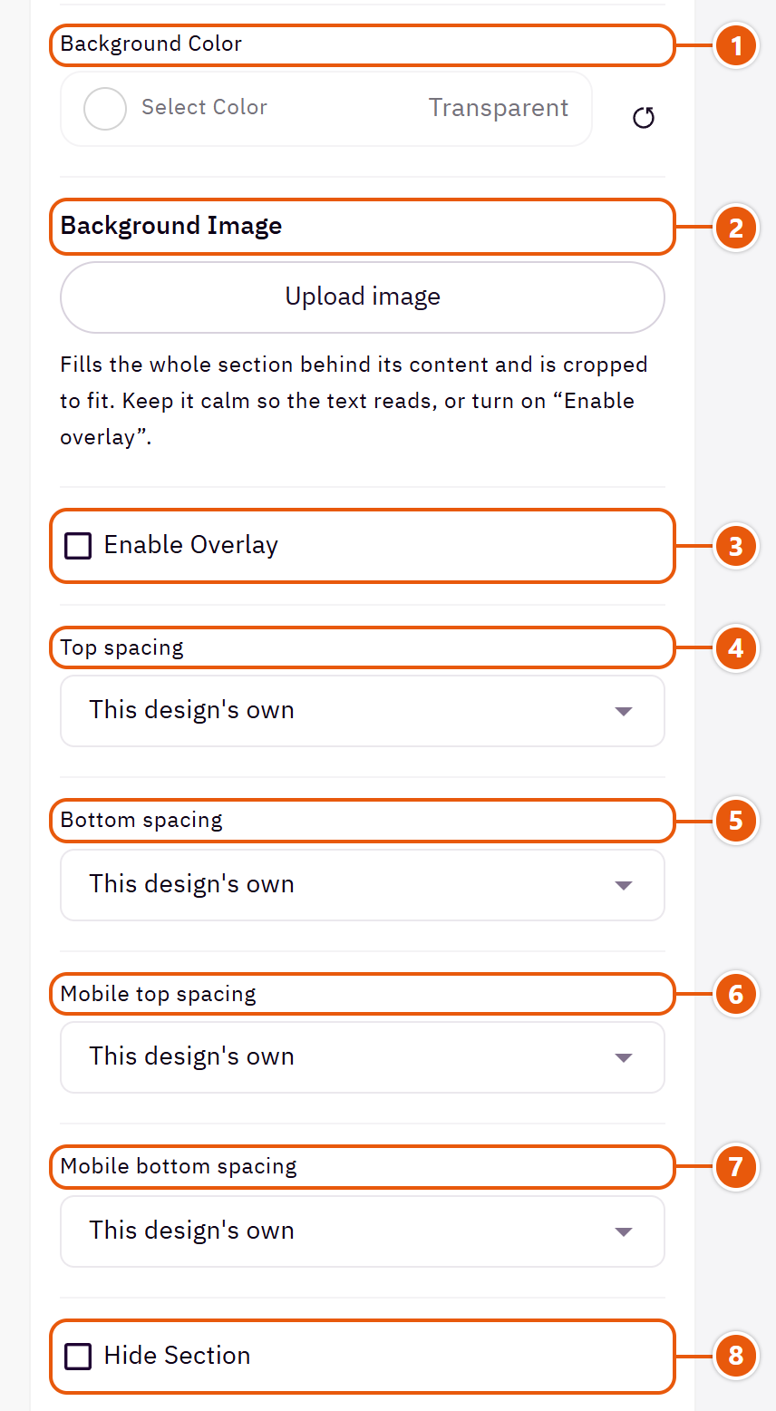
- 1“Background color”
A colour behind the whole section to set it apart. Transparent takes the page colour. - 2“Background image”
A picture behind the whole section, cropped to fit; choose a calm one about 1920 wide. - 3“Enable overlay”
A see-through colour layer over the background or picture so the words read. - 4“Top spacing”
“Default” keeps the chosen design's space, “00” removes it, the rest are pixels. - 5“Bottom spacing”
Like “Top spacing”, below the section. - 6“Mobile top spacing”
On “Default” phones use the “Top spacing” number. - 7“Mobile bottom spacing”
On “Default” phones use the “Bottom spacing” number. - 8“Hide section”
Hides the section without deleting it; its content is kept. Handy for a seasonal offer.
Inside each item of “Collections (empty: the store's first 4 categories)” (press the pencil beside it)
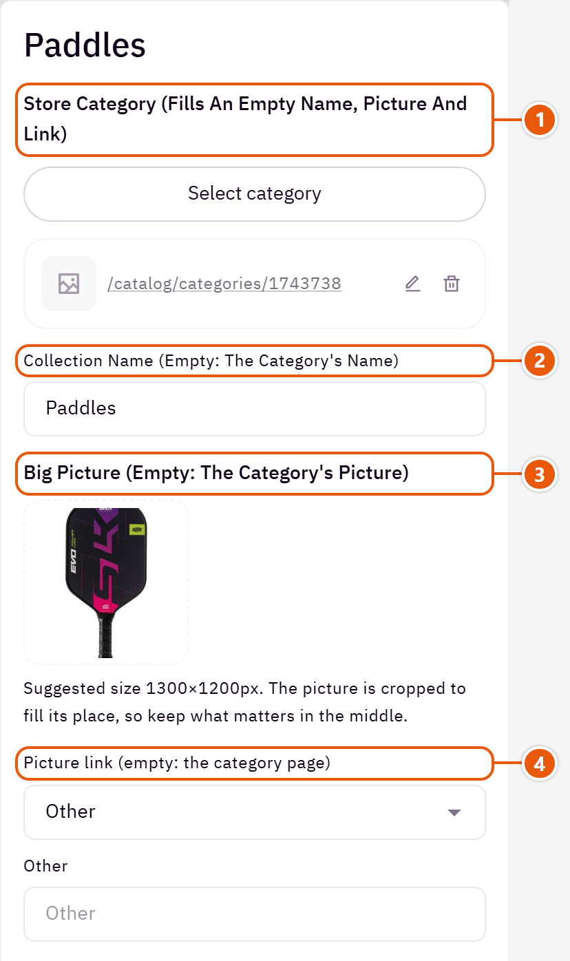
- 1“Store category (fills an empty name, picture and link)”
Gives the name, picture and link you leave empty. - 2“Collection name (empty: the category's name)”
A collection with no name is left out. - 3“Big picture (empty: the category's picture)”
Without one a tidy placeholder takes the picture's place. - 4“Picture link (empty: the category page)”
The page the picture opens.
Plus the options in "Options every section shares", in the Home page sections chapter, except "Title colour (transparent = automatic)", "Background picture stays still on scroll".
Tips
- Three to six collections works best: the list stays short and the picture large.
Your banners (picture, words, link) in a row, a slider or a mosaic of different sizes. Each banner can be tied to a category or a product, which fills the title, picture and link you left empty; a product also shows its price.

Section design

Two or three per row, sliding when there are more. For pictures with a calm area for words.

Words in the page's colours, the whole picture in view. The cleanest for busy pictures.

3 banners: the large one square, the other two half its height. With no button text, the title goes on the button. For one lead category and two beside it.

3 banners: the large one spans two columns, and a linked product's price shows on it in large type. For one main offer and two smaller ones.

4 banners: the tall ones at the ends match the two stacked in the middle. With no button text, the title goes on the button. For four categories.

3 banners: the small ones portrait, the wide one as wide as both; on phones and tablets the wide one moves to the top. For one big offer and two beside it.

3 banners: the small ones square, the middle one as wide as both; on phones and tablets the wide one moves to the top. For three categories, the main one in the middle.

4 banners: the large one takes half the space, the wide one sits under the two small ones. For one main offer and three categories or offers.

4 banners: the tall ones match the two stacked ones together. With no button text, the title goes on the button. For four categories, two of them leading.
Step by step
- Choose the “Section design”.
- In “Banners - fixed layouts show the first 3 or 4” press “Add item” for each banner.
- Upload the “Banner image” and write the “Banner title (Enter starts a new line)”, or pick a category or product to fill what is empty.
- Pick the “Link (the whole banner opens it)”.
- Drag the banners into order and publish.
Where to find its settings
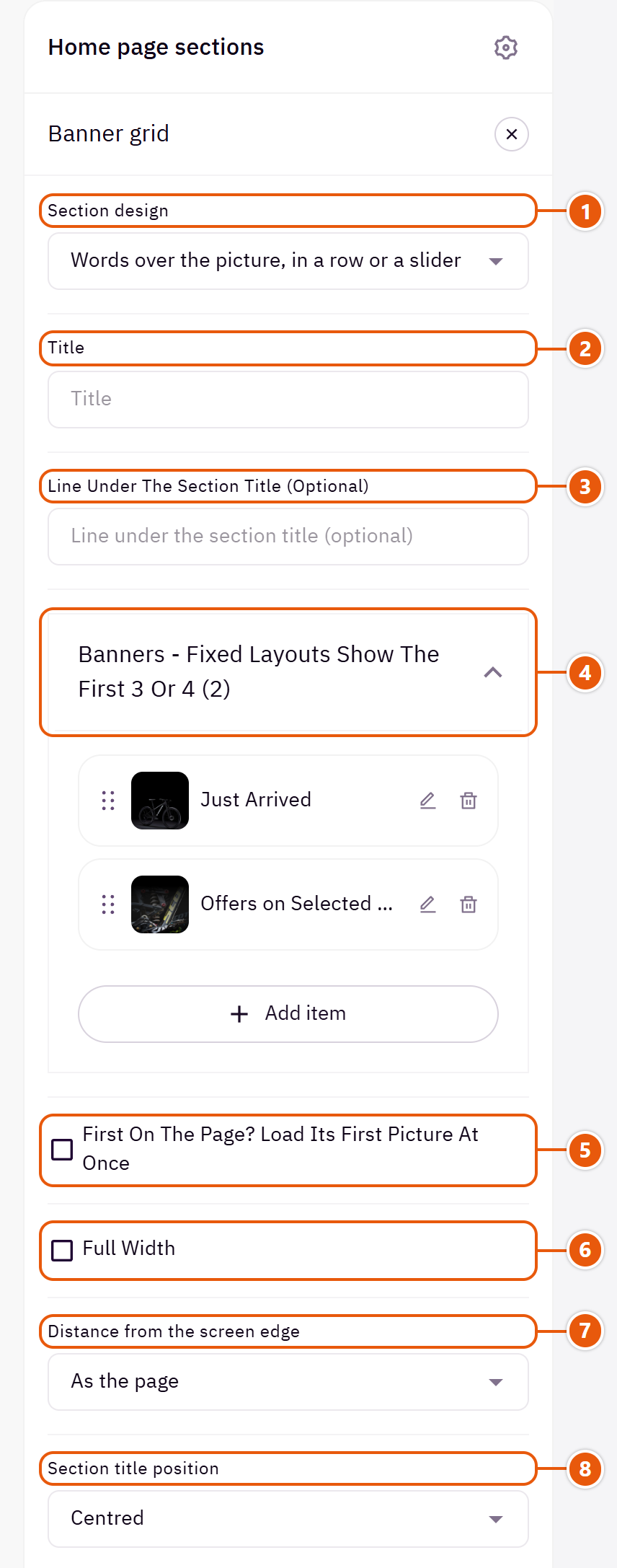
- 1“Section design”
Your banners stay when you switch. The mosaic designs show the first 3 or 4 banners only; with fewer, the shape adjusts to them. - 2“Title”
The section's main heading; leave it empty for none. - 3“Line under the section title (optional)”
A short line under the section title. - 4“Banners - fixed layouts show the first 3 or 4”Up to 6 items
- 5“First on the page? Load its first picture at once”
Turn it on only when the section is the first on the page. - 6“Full width”
The content spans the whole screen instead of the page width. Good for banners and large pictures. - 7“Distance from the screen edge”
“40px on wide screens” widens the banners to 40px from the screen's edge instead of the page's usual width. - 8“Section title position”
“At the start with a line beside it” draws a thin rule beside the title.
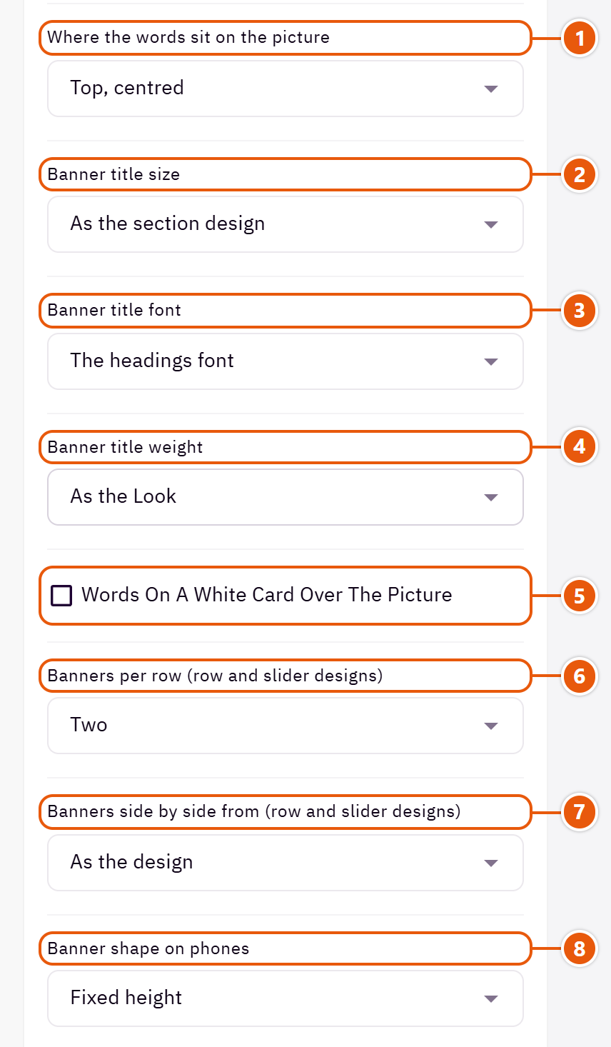
- 1“Where the words sit on the picture”
“As the section design” keeps each banner's place from the original design. - 2“Banner title size”
Each banner title's size. - 3“Banner title font”
“The text font” sets the banner titles in the body font instead of the headings font. - 4“Banner title weight”
“As the Look” follows “Headings weight” in “Look”. - 5“Words on a white card over the picture”
A white card behind the words instead of the shade. Not in “Words under the picture, in a row or a slider”. - 6“Banners per row (row and slider designs)”
On computers; small screens show one. - 7“Banners side by side from (row and slider designs)”
“Larger screens (992px)” shows one banner across the row on tablets. - 8“Banner shape on phones”
Pick the shape closest to your banner pictures so less is cropped on phones; “Fixed height” is the design's own.Shown with “Words over the picture, in a row or a slider”
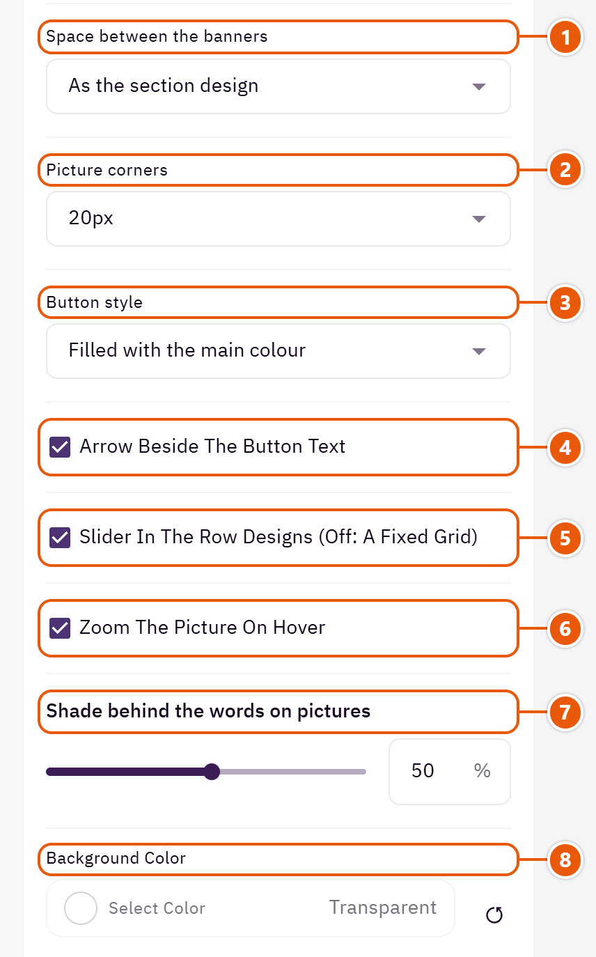
- 1“Space between the banners”
“None” sets the banners edge to edge. - 2“Picture corners”
How round the banners' corners are. - 3“Button style”
The button look on every banner. - 4“Arrow beside the button text”
A small arrow beside the button words. - 5“Slider in the row designs (off: a fixed grid)”
Off: the banners sit in a fixed grid instead of sliding. - 6“Zoom the picture on hover”
A slight zoom on computers. - 7“Shade behind the words on pictures”
A dark shade under the words so they read on the picture. Zero: no shade. - 8“Background color”
A colour behind the whole section to set it apart. Transparent takes the page colour.
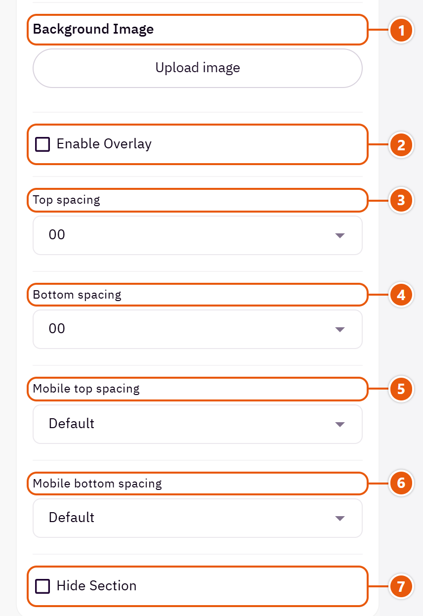
- 1“Background image”
A picture behind the whole section, cropped to fit; choose a calm one about 1920 wide. - 2“Enable overlay”
A see-through colour layer over the background or picture so the words read. - 3“Top spacing”
“Default” keeps the chosen design's space, “00” removes it, the rest are pixels. - 4“Bottom spacing”
Like “Top spacing”, below the section. - 5“Mobile top spacing”
On “Default” phones use the “Top spacing” number. - 6“Mobile bottom spacing”
On “Default” phones use the “Bottom spacing” number. - 7“Hide section”
Hides the section without deleting it; its content is kept. Handy for a seasonal offer.
Inside each item of “Banners - fixed layouts show the first 3 or 4” (press the pencil beside it)
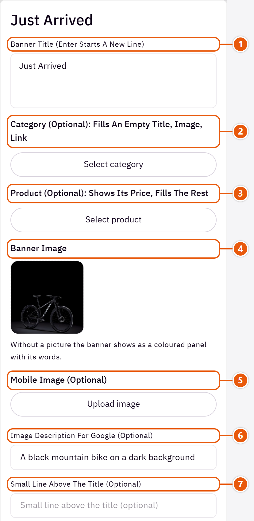
- 1“Banner title (Enter starts a new line)”
Keep it short. Empty: the picked category's or product's name. In “A tall banner, two stacked beside it”, “Tall, two stacked, tall” and “Two tall banners, two stacked”, a banner with no button words shows its title on the button. - 2“Category (optional): fills an empty title, image, link”
Fills the title, picture and link you left empty. - 3“Product (optional): shows its price, fills the rest”
Shows the product's price (and the old price when it is on sale) and fills what is empty, like a category. - 4“Banner image”
The picture is cropped to its place, so keep what matters in the middle. - 5“Mobile image (optional)”
A phone crop for when the computer picture is cut badly. - 6“Image description for Google (optional)”
A few words describing the picture. Not shown on the page. - 7“Small line above the title (optional)”
Such as “New” or “20% off”.
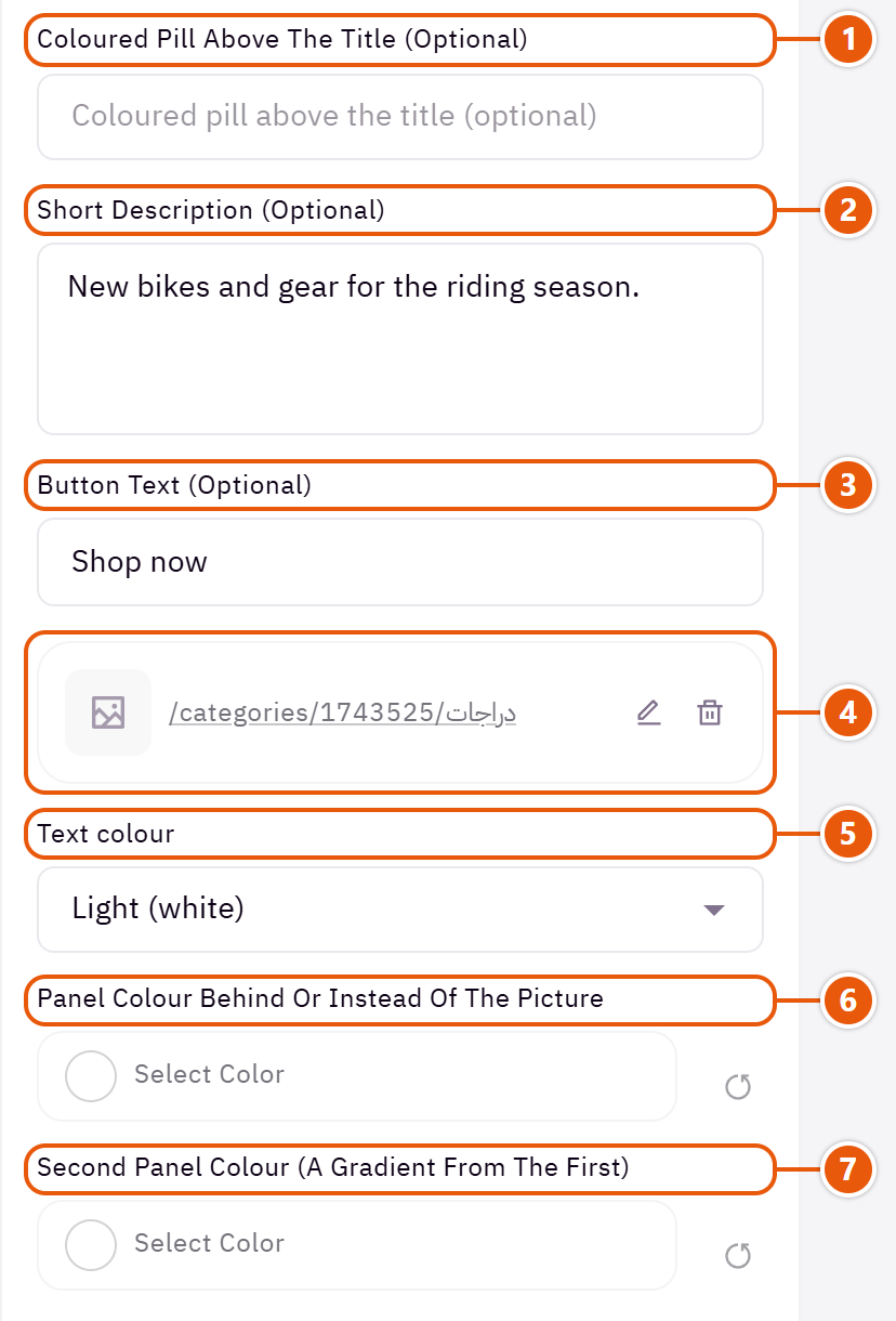
- 1“Coloured pill above the title (optional)”
A bright pill such as “Best seller”. - 2“Short description (optional)”
A short line under the title. - 3“Button text (optional)”
Such as “Shop now”. Left empty, the banner has no button, except in the looks that put the banner's name on a button. - 4“Link (the whole banner opens it)”
Empty: the picked category's or product's link. - 5“Text colour”
“Light (white)” for dark pictures, “Dark (black)” for light ones. - 6“Panel colour behind or instead of the picture”
The colour of a banner with no picture, or the ground behind the picture. - 7“Second panel colour (a gradient from the first)”
With the colour above it the panel becomes a gradient; on its own it is the panel's one colour.
The other settings
- Side of the large banner: Which side the large banner takes.Shown with “A large wide banner, two stacked beside it”
- Shape of the picture above the text: “The picture’s own” does not crop; the others crop every picture alike.Shown with “Words under the picture, in a row or a slider”
Plus the options in "Options every section shares", in the Home page sections chapter, except "Title colour (transparent = automatic)", "Background picture stays still on scroll".
Tips
- A banner with no picture shows as a coloured panel with its words, never an empty box.
- Use pictures of the same size in a row so the banners line up.
A banner for one important message: a new collection, a product to push, or your store's story. One or two pictures (or a video) with a title, a description and a button beside or over them.

Design

The picture fills half the box and the words sit on a coloured panel in the other half. Clear and tidy for any offer.

A large picture or video with the words over it; the whole banner opens the link. For your strongest picture.

A rounded picture beside the words on the section's ground, with an optional small product card over the picture. Calm; suits beauty and fashion.

A large picture with a small one over its corner, beside the words. Shows the product from two angles.

Two pictures side by side with a white card of words over the seam. For a comparison or two collections.
Step by step
- Choose the “Design”.
- Upload the “Picture”, and the second picture in the two-picture looks.
- Write the “Title” and “Description”.
- Fill “Button text (empty: no button)” and pick the “Button link”.
- Adjust “Picture side (when beside the text)” and “Button style”, then publish.
Where to find its settings
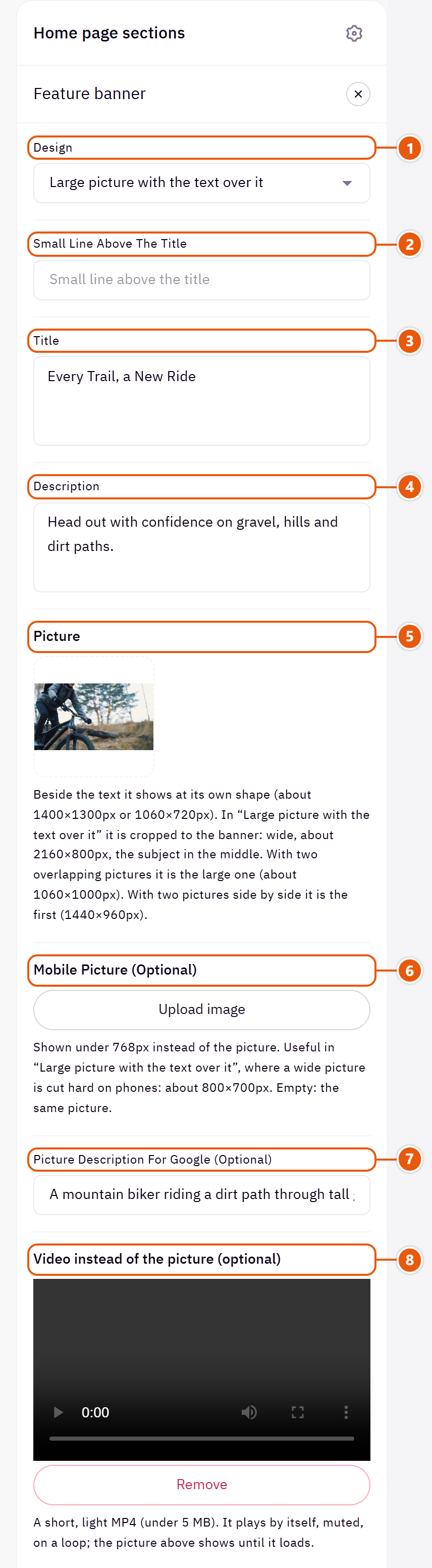
- 1“Design”
Changes how pictures and words are arranged; what you wrote and uploaded stays when you switch. - 2“Small line above the title”
A short phrase such as “New” or “Limited time”. - 3“Title”
The section's main heading; leave it empty for none. - 4“Description”
A line or two explaining the offer. - 5“Picture”
The main picture; each design's size is written under the field. - 6“Mobile picture (optional)”
A phone crop for when the wide picture loses detail on small screens. With a video, phones show it instead of the video. - 7“Picture description for Google (optional)”
A few words describing the picture. Empty: the title is used. - 8“Video instead of the picture (optional)”
Plays in the picture's place, muted. Upload the “Picture” too, so it shows until the video loads.Shown with “Large picture with the text over it”
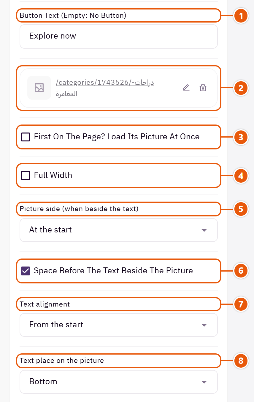
- 1“Button text (empty: no button)”
Such as “Shop now”. The button shows when it has both words and a link. - 2“Button link”
The page the button opens. In “Large picture with the text over it” the whole picture opens it too. - 3“First on the page? Load its picture at once”
Turn it on only when the banner is the first section on the page, so its picture appears sooner. - 4“Full width”
The content spans the whole screen instead of the page width. Good for banners and large pictures. - 5“Picture side (when beside the text)”
In the designs with the picture beside the words: the start is the right in Arabic and the left in English. - 6“Space before the text beside the picture”
In “Picture beside the text” and “Two overlapping pictures beside the text”: a gap between the picture and the words. Turn it off to start the words at their column's edge. - 7“Text alignment”
On phones the words are always centred. - 8“Text place on the picture”
The words at the bottom or in the middle of the picture.Shown with “Large picture with the text over it”
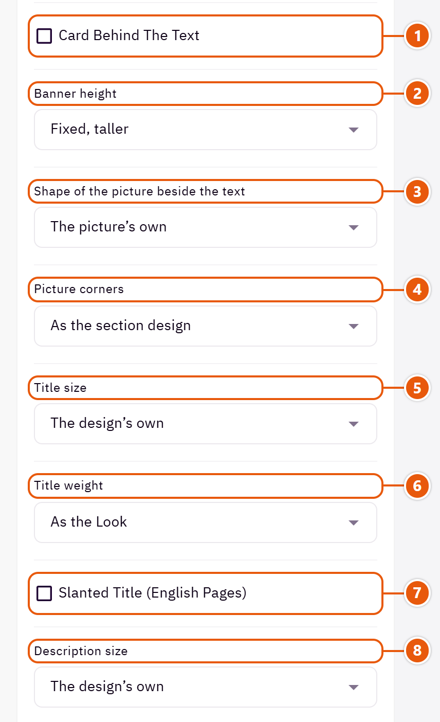
- 1“Card behind the text”
A white card behind the words so they read on any picture. Its colour comes from “Colour of the panel or card behind the text, if any”.Shown with “Large picture with the text over it” - 2“Banner height”
“The picture's own” shows it whole, uncropped; the others are fixed heights the picture is cropped to.Shown with “Large picture with the text over it” - 3“Shape of the picture beside the text”
“The picture’s own” shows it as uploaded; the others crop it to that shape. It has no effect in “Large picture with the text over it” and “Two pictures side by side, a card between”. - 4“Picture corners”
“As the section design” keeps the design's own corners; “Square” has none. - 5“Title size”
“The design’s own” is the original template size. - 6“Title weight”
“As the Look” follows “Headings weight” in “Look”. - 7“Slanted title (English pages)”
English only; Arabic has no slanted letters. - 8“Description size”
“Smaller” suits a long description, so it does not crowd the banner.
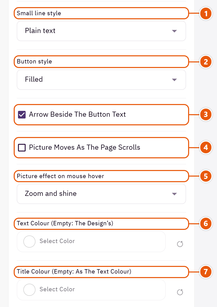
- 1“Small line style”
“In a coloured pill” turns the small line into a badge; “A larger plain line” enlarges it with no pill. - 2“Button style”
“Underlined text” is a plain link with no button shape. - 3“Arrow beside the button text”
A small arrow after the button words. - 4“Picture moves as the page scrolls”
The picture drifts slowly as the page scrolls.Shown with “Large picture with the text over it” - 5“Picture effect on mouse hover”
Computers only; phones show no effect. - 6“Text colour (empty: the design’s)”
The title and description colour. Empty: white on dark grounds and the theme's colour on light ones. - 7“Title colour (empty: as the text colour)”
The section title's colour, and in some sections the words around it, as the field's name says. Transparent keeps the theme's colour.
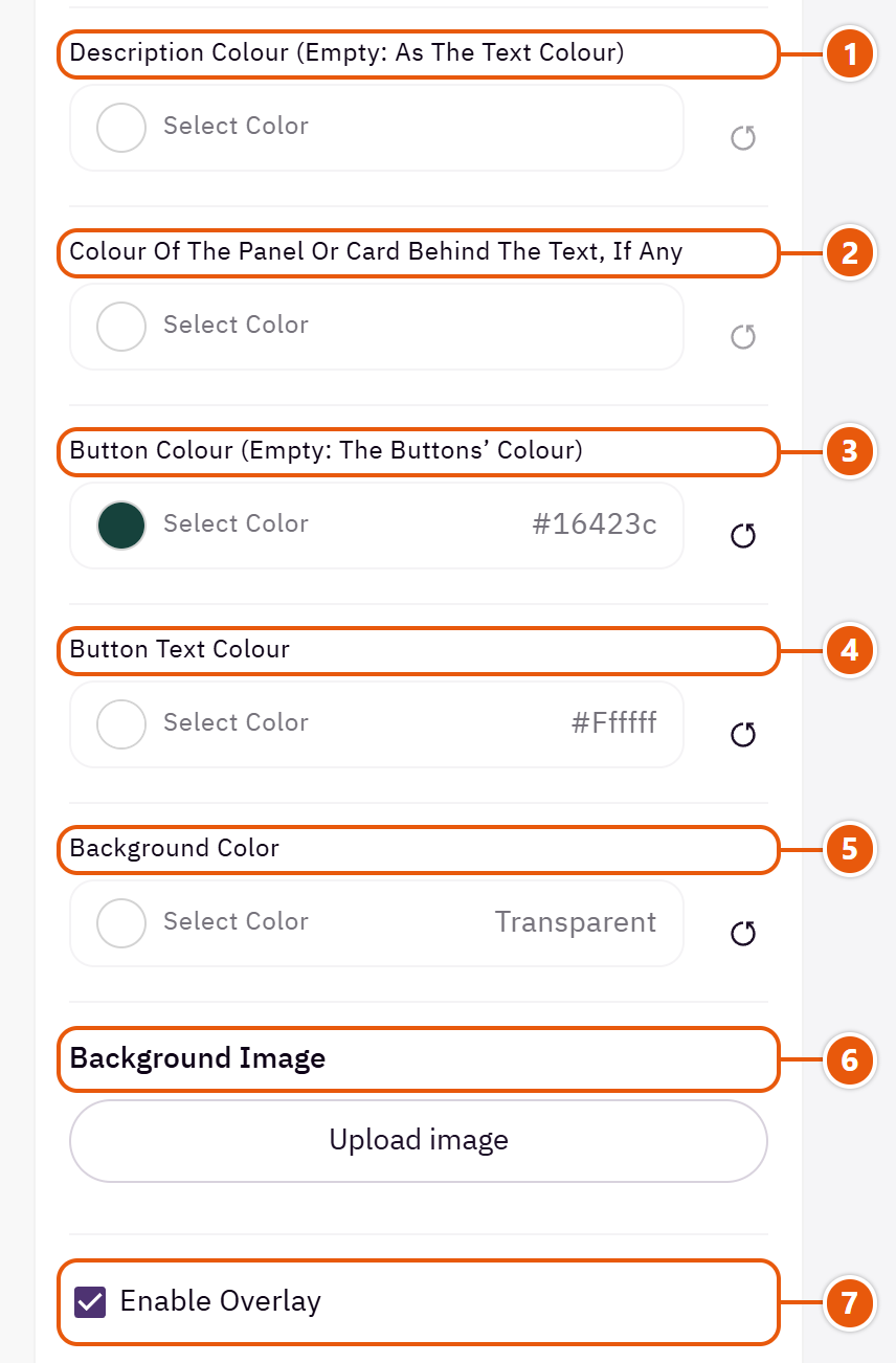
- 1“Description colour (empty: as the text colour)”
Gives the description its own colour, such as grey under a coloured title. - 2“Colour of the panel or card behind the text, if any”
The panel in “Picture beside a coloured panel”, the card with “Card behind the text” and in “Two pictures side by side, a card between”. - 3“Button colour (empty: the buttons’ colour)”
The filled button's colour, or the outline button's line and words. - 4“Button text colour”
Empty: the theme picks white or black to suit the button colour. - 5“Background color”
A colour behind the whole section to set it apart. Transparent takes the page colour. - 6“Background image”
A picture behind the whole section, cropped to fit; choose a calm one about 1920 wide. - 7“Enable overlay”
A see-through colour layer over the background or picture so the words read.
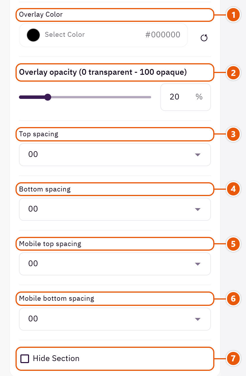
- 1“Overlay color”
Black darkens for light words; white lightens for dark words.Shown when “Enable overlay” is on - 2“Overlay opacity (0 transparent - 100 opaque)”
Start at 40 and raise it if the words still do not read.Shown when “Enable overlay” is on - 3“Top spacing”
“Default” keeps the chosen design's space, “00” removes it, the rest are pixels. - 4“Bottom spacing”
Like “Top spacing”, below the section. - 5“Mobile top spacing”
On “Default” phones use the “Top spacing” number. - 6“Mobile bottom spacing”
On “Default” phones use the “Bottom spacing” number. - 7“Hide section”
Hides the section without deleting it; its content is kept. Handy for a seasonal offer.
The other settings
- Small picture over the large one’s corner: Without it the large picture stands alone.Shown with “Two overlapping pictures beside the text”
- Second picture (the other half): Without it the first picture takes the whole banner.Shown with “Two pictures side by side, a card between”
- Moving decoration beside the banner (optional): A small moving decoration on the banner's corner, such as a leaf or a toy; shown on large screens only.Shown with “Picture beside a coloured panel”
- Product in a card over the picture (optional): A product from your store with its picture, name, price and a quick view button, in a small card over the picture.Shown with “Picture beside the text”
- Space for the two pictures: “Wider than the text” gives the pictures more room, “Half the section” splits it evenly, and “Both pictures smaller, beside the text” gives the words the larger share.Shown with “Two overlapping pictures beside the text”
- Order on phones: On phones the pictures and words stack; choose which comes first.Shown with “Two overlapping pictures beside the text”
- Picture space: “Narrower than the text” makes the picture smaller on large screens and gives the words more room.Shown with “Picture beside the text”
- Card position on the picture: “As the text alignment” centres the card when the words are centred, else puts it at the start.Shown with “Large picture with the text over it” and when “Card behind the text” is on
- Pill colour (empty: the accent): The pill holding the small line; its words turn white or black, whichever reads.Shown when “Small line style” is “In a coloured pill”
- Second panel colour (a gradient from the first): The panel shades from the first colour to this one, and the words turn light or dark to suit the colour under them.Shown with “Picture beside a coloured panel”
Plus the options in "Options every section shares", in the Home page sections chapter, except "Background picture stays still on scroll".
Tips
- Keep the video a short, light MP4 under 5 MB so the page stays fast.
- The banner shows as long as it has a picture or words.
A banner for an offer with an end: a clock counting the days, hours, minutes and seconds to the date you type, with a button to the offer. When time is up the clock hides or a message takes its place, and the rest of the banner stays.

Section design

A section-wide picture with the words, clock and button on it. The strongest for a big offer such as a seasonal sale.

A coloured strip: words and button on one side, the clock on the other. It takes little room between two sections; a picture, if you upload one, sits behind the strip.

A picture beside a coloured panel holding the words, a large clock and the button. On phones the picture sits above the panel.
Step by step
- Choose the “Section design”.
- Write the “Title” and “Description”, and upload the “Banner picture”.
- Type the end in “Offer end (write it like 2026-12-31 23:59)”.
- Choose “When the offer time is up”.
- Fill “Button text (empty: no button)” and pick the “Button link”, then publish.
Where to find its settings

- 1“Section design”
Changes the arrangement only; your words, date and picture stay when you switch. - 2“Small line above the title”
A short phrase such as “Limited time offer”. - 3“Title”
The section's main heading; leave it empty for none. - 4“Description”
A line or two saying exactly what the offer is. - 5“Banner picture”
Its size is written under the field; it is cropped to its place, so keep what matters in the middle. - 6“Phone picture (optional)”
A taller picture for phones, so the wide one is not cut too much on a small screen.Shown with “Picture with the text and countdown over it” - 7“Picture description for Google (alt)”
A few words describing the picture, such as “Summer dresses on sale”. Not shown on the page.
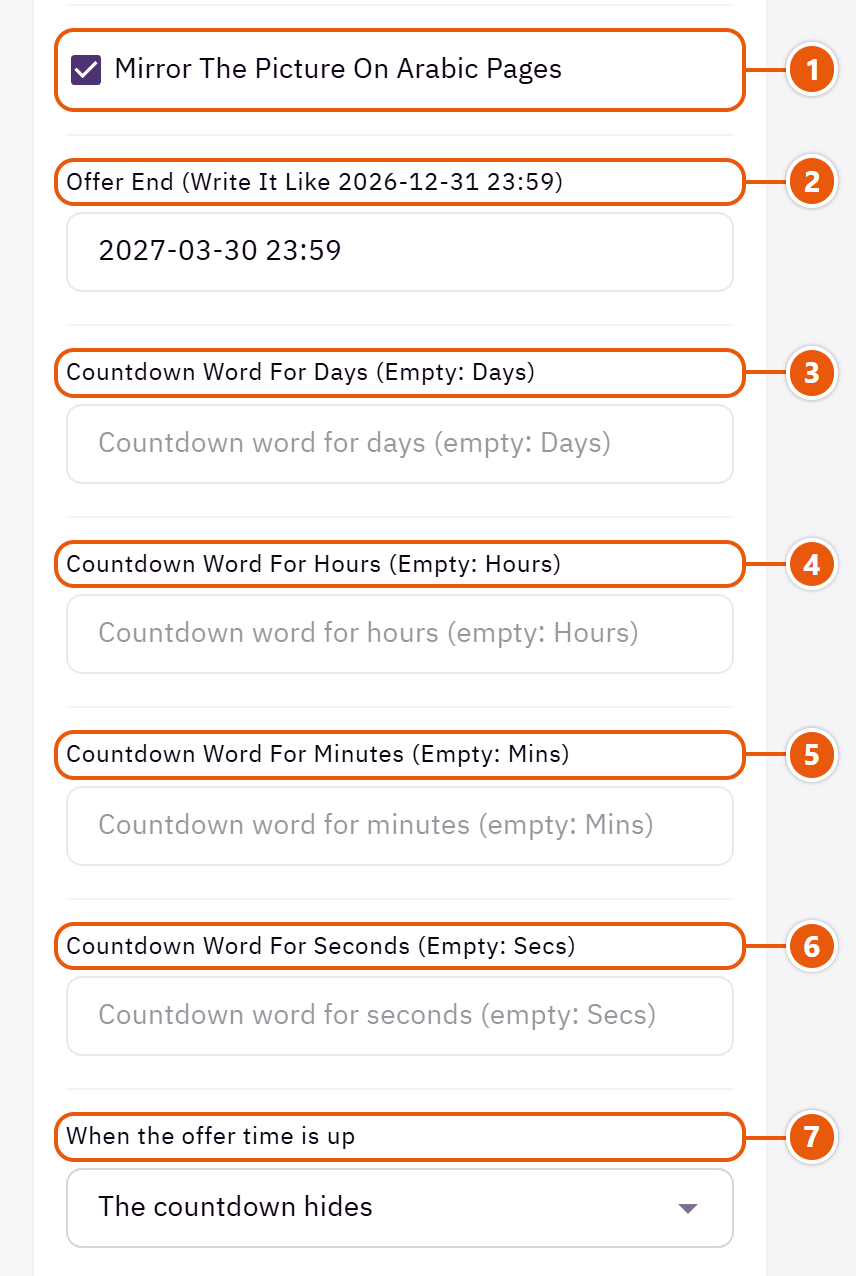
- 1“Mirror the picture on Arabic pages”
Mirrors the picture on Arabic pages so its empty side falls under the words. Turn it off if the picture has writing.Shown with “Picture with the text and countdown over it” - 2“Offer end (write it like 2026-12-31 23:59)”
Year-month-day, then the time on a 24-hour clock. Arabic digits work, and a date with no time counts to the end of that day. Empty: no clock. - 3“Countdown word for days (empty: Days)”
The word under the days number. - 4“Countdown word for hours (empty: Hours)”
The word under the hours number. - 5“Countdown word for minutes (empty: Mins)”
The word under the minutes number. - 6“Countdown word for seconds (empty: Secs)”
The word under the seconds number. - 7“When the offer time is up”
Either way the rest of the banner stays; “A message in its place” shows what you write below.
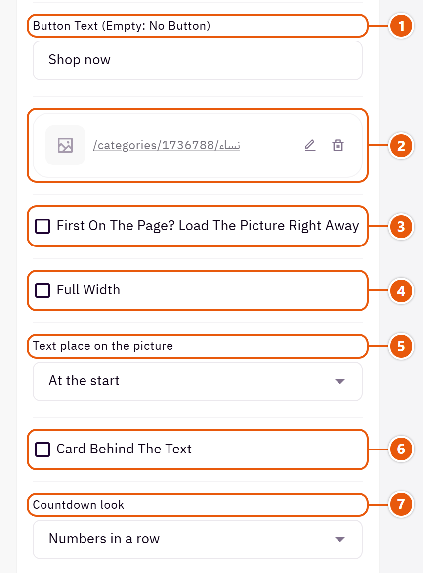
- 1“Button text (empty: no button)”
Such as “Shop now”. The button shows when it has both words and a link. - 2“Button link”
The page the button opens, such as the offer's category. - 3“First on the page? Load the picture right away”
Turn it on only when the banner is the first section on the page, so its picture appears sooner. Anywhere else leave it off. - 4“Full width”
The content spans the whole screen instead of the page width. Good for banners and large pictures. - 5“Text place on the picture”
“At the start” puts the words on the right in Arabic and on the left in English.Shown with “Picture with the text and countdown over it” - 6“Card behind the text”
A white card behind the words so they read on any picture. Its colour comes from “Color of the card, strip or panel behind the text”.Shown with “Picture with the text and countdown over it” - 7“Countdown look”
How the numbers look: in a row, each in a box, or each in a circle.
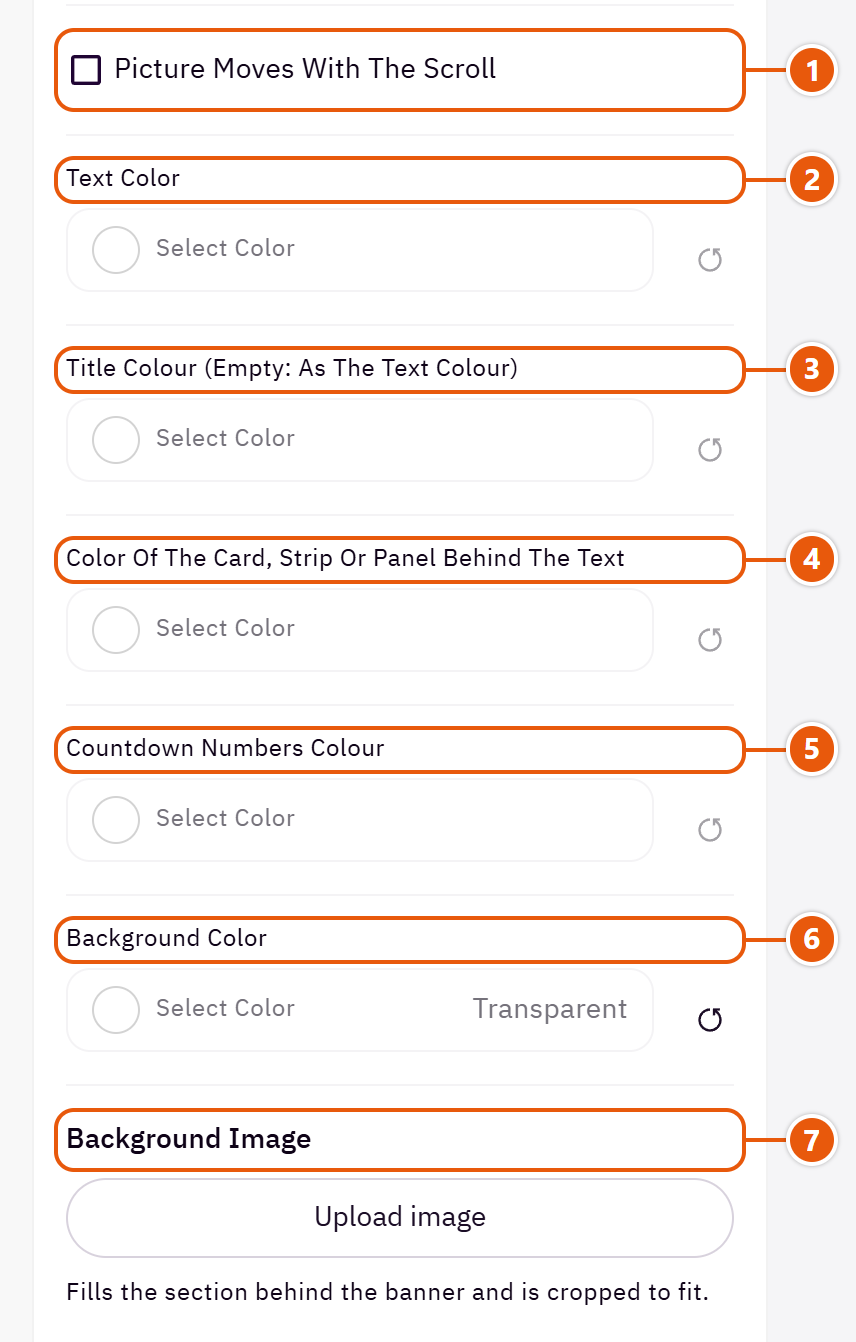
- 1“Picture moves with the scroll”
The picture drifts slowly as the page scrolls. It stays still for visitors who reduce motion on their device.Shown with “Picture with the text and countdown over it” - 2“Text color”
The colour of the title, description and clock words. Empty: the theme picks a colour that reads on what is behind the words. - 3“Title colour (empty: as the text colour)”
The section title's colour, and in some sections the words around it, as the field's name says. Transparent keeps the theme's colour. - 4“Color of the card, strip or panel behind the text”
The words on it turn white or dark by themselves so they read. - 5“Countdown numbers colour”
The digits only. Empty: the theme's colour. - 6“Background color”
A colour behind the whole section to set it apart. Transparent takes the page colour. - 7“Background image”
A picture behind the whole section, cropped to fit; choose a calm one about 1920 wide.
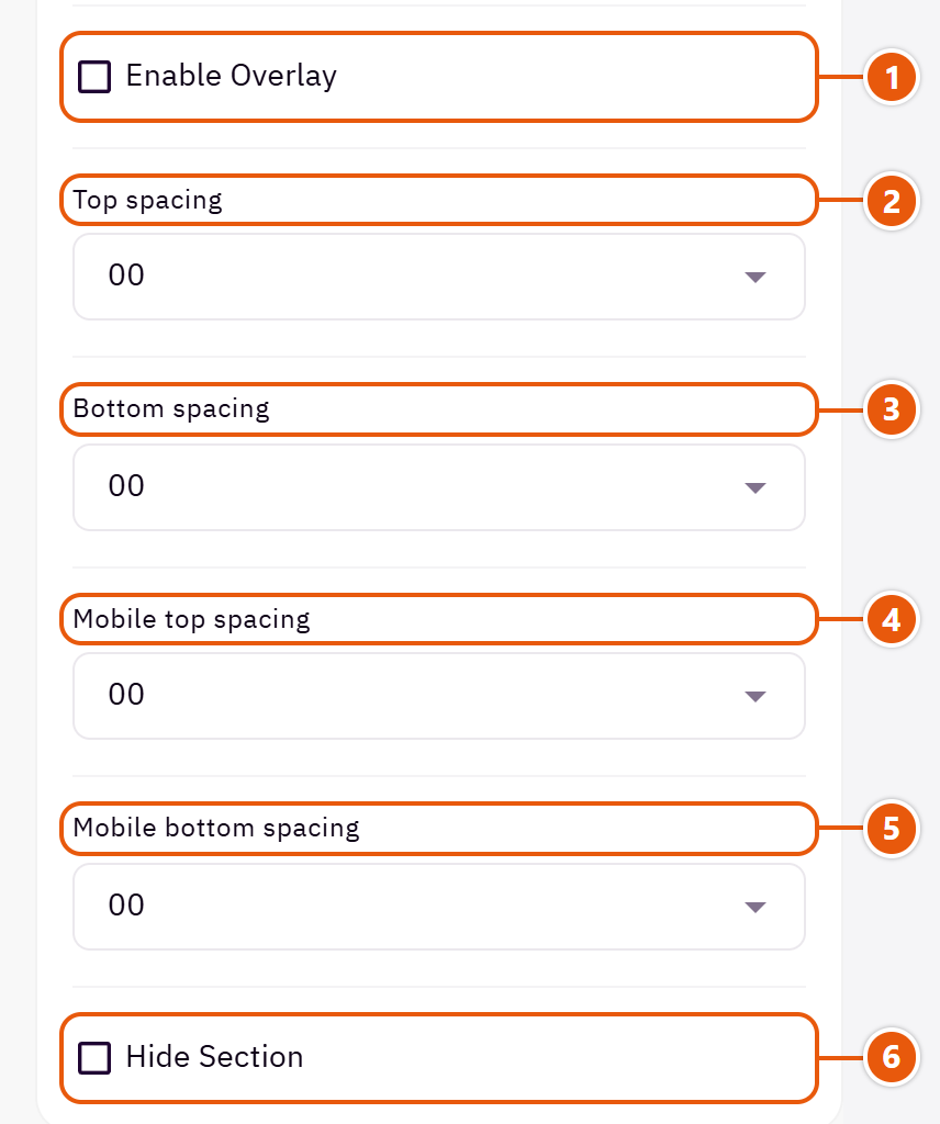
- 1“Enable overlay”
A see-through colour layer over the background or picture so the words read. - 2“Top spacing”
“Default” keeps the chosen design's space, “00” removes it, the rest are pixels. - 3“Bottom spacing”
Like “Top spacing”, below the section. - 4“Mobile top spacing”
On “Default” phones use the “Top spacing” number. - 5“Mobile bottom spacing”
On “Default” phones use the “Bottom spacing” number. - 6“Hide section”
Hides the section without deleting it; its content is kept. Handy for a seasonal offer.
The other settings
- Message after the offer ends: Such as “This offer is over, watch for the next one”.Shown when “When the offer time is up” is “A message in its place”
- Picture side: The picture before or after the panel. On phones it is always on top.Shown with “Picture beside a panel with text and countdown”
Plus the options in "Options every section shares", in the Home page sections chapter, except "Background picture stays still on scroll".
Tips
- The clock runs on the visitor's device time. Change the date with every new offer, or it stays hidden.
- The banner shows as long as it has at least one thing: a picture, words, a date or a button.
One product with its photos, description and the whole buy box on the home page: price, discount, stock, quantity, “Add to cart” and “Buy now”. For your best seller or the product you want to sell today.

Step by step
- In “Product (the first shows; none chosen: the newest)” choose “Select products” and pick the product.
- Write a “Section title” if you like.
- Choose what the buy box shows (rating, stock, countdown, wishlist).
- Publish.
Where to find its settings
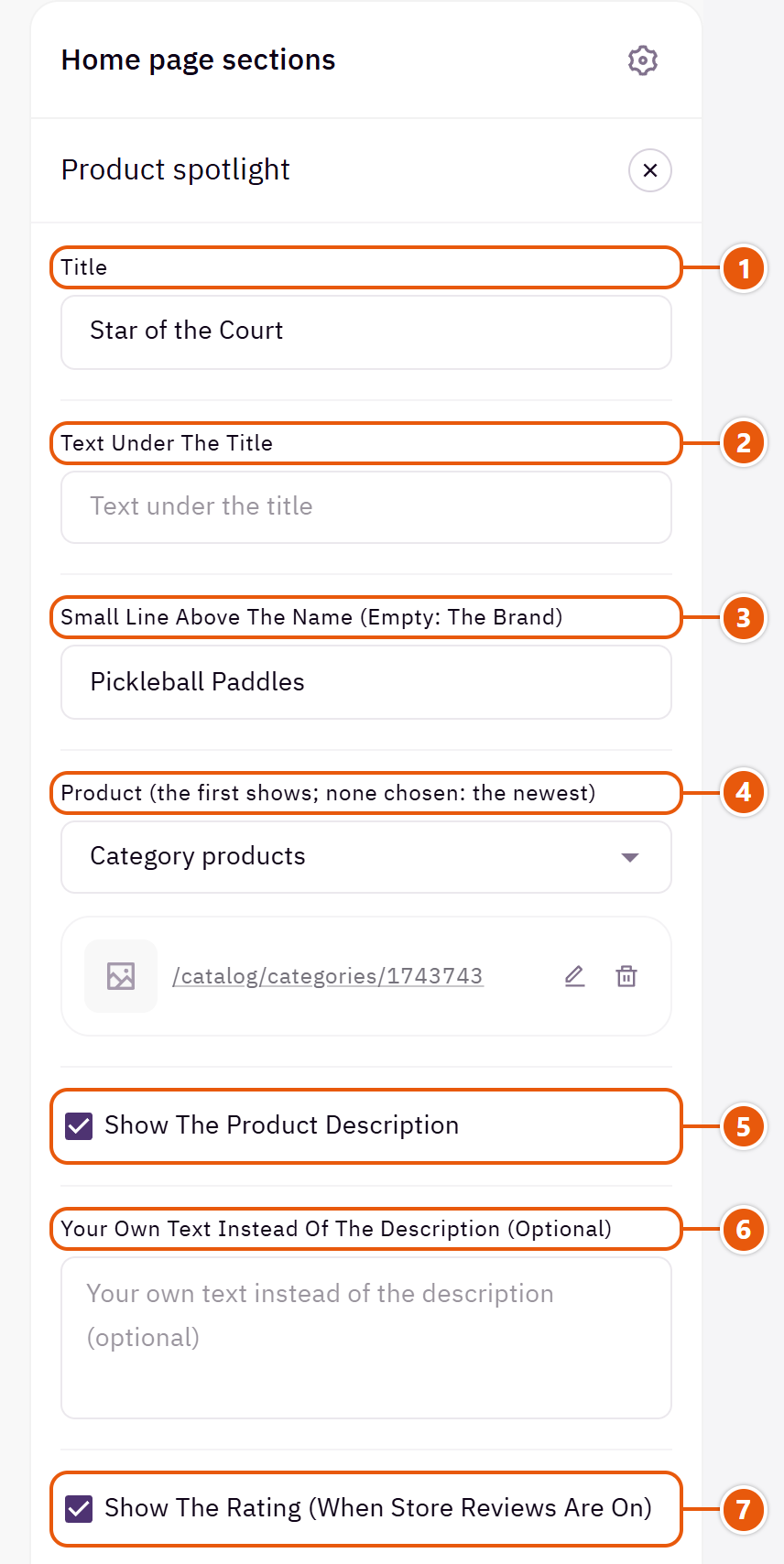
- 1“Title”
The section's main heading; leave it empty for none. - 2“Text under the title”
A short line under the title. - 3“Small line above the name (empty: the brand)”
Such as “Skincare”. Empty: the product's brand. - 4“Product (the first shows; none chosen: the newest)”
The source's first product is the one shown. For a particular product, choose “Select products” and pick only that one. - 5“Show the product description”
Shows the product's short description from Zid, or the full one when there is no short one. - 6“Your own text instead of the description (optional)”
Text you write here shows instead of the product's description.Shown when “Show the product description” is on - 7“Show the rating (when store reviews are on)”
The stars and the number of reviews.
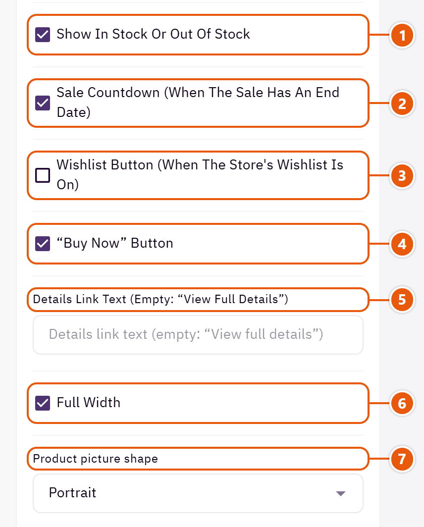
- 1“Show in stock or out of stock”
An “In stock” or “Out of stock” pill. - 2“Sale countdown (when the sale has an end date)”
Counts down to the sale end set on the product in Zid. - 3“Wishlist button (when the store's wishlist is on)”
A heart beside the “Add to cart” button. - 4““Buy now” button”
Adds the product and takes the shopper straight to checkout. - 5“Details link text (empty: “View full details”)”
A link that opens the product page. - 6“Full width”
The content spans the whole screen instead of the page width. Good for banners and large pictures. - 7“Product picture shape”
Pick the shape closest to your product photos so they are not cut.
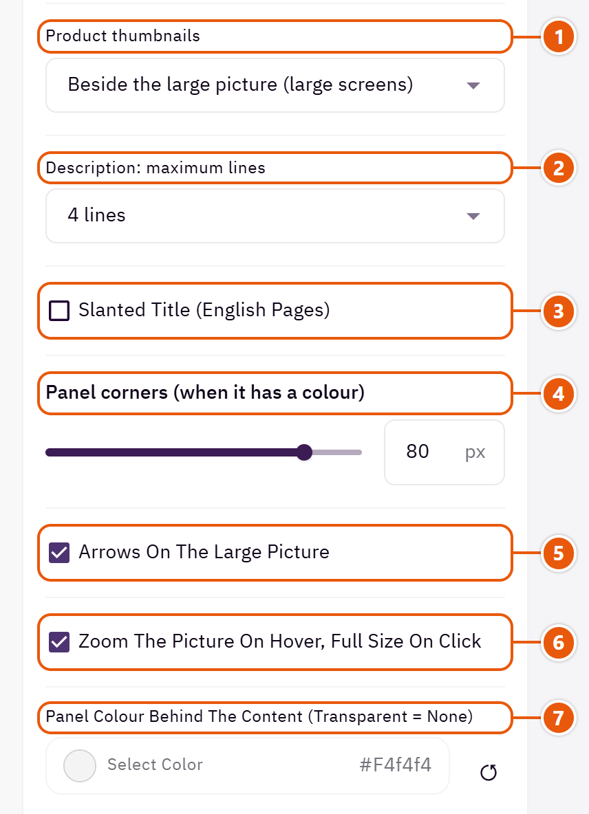
- 1“Product thumbnails”
On phones the thumbnails are always under the large picture. - 2“Description: maximum lines”
A longer description is cut with dots at the end.Shown when “Show the product description” is on - 3“Slanted title (English pages)”
English only. - 4“Panel corners (when it has a colour)”
Works once you choose a “Panel colour behind the content”. - 5“Arrows on the large picture”
Two arrows on the large picture to move between photos. - 6“Zoom the picture on hover, full size on click”
On computers the mouse magnifies part of the photo, and a click opens it full size. - 7“Panel colour behind the content (transparent = none)”
A rounded coloured panel behind the whole product.
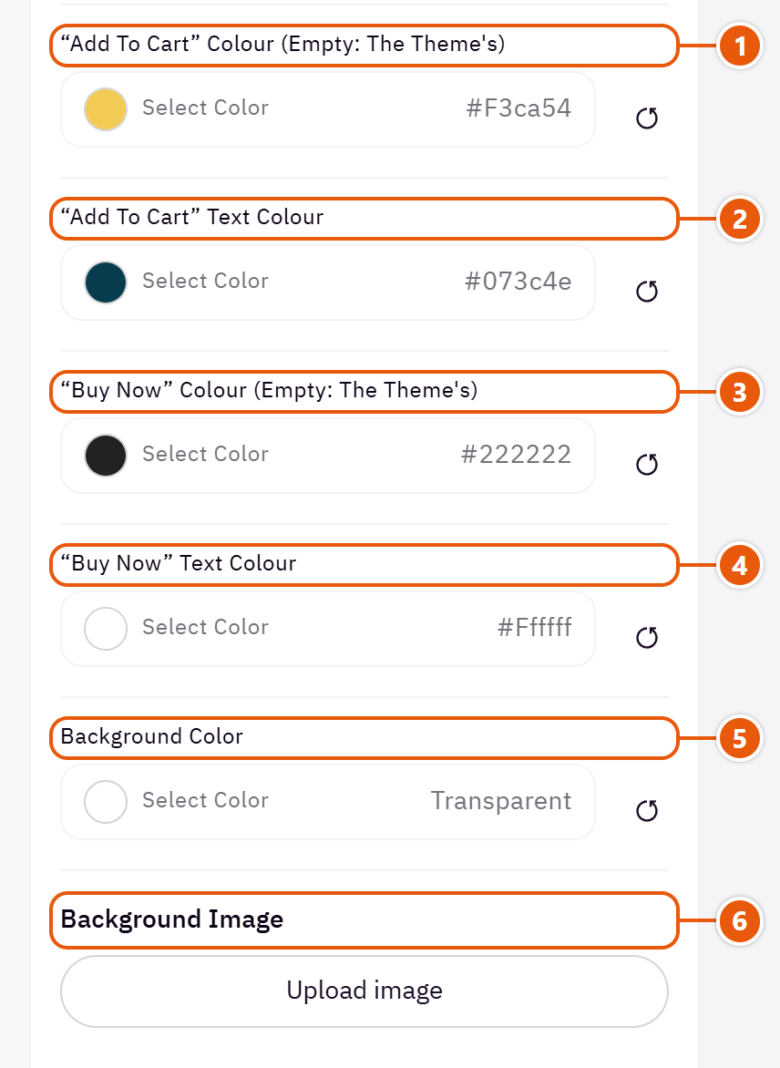
- 1““Add to cart” colour (empty: the theme's)”
The “Add to cart” button colour here only. - 2““Add to cart” text colour”
Empty: picked to stay readable on the button. - 3““Buy now” colour (empty: the theme's)”
The “Buy now” button colour here only.Shown when ““Buy now” button” is on - 4““Buy now” text colour”
Empty: picked to stay readable on the button.Shown when ““Buy now” button” is on - 5“Background color”
A colour behind the whole section to set it apart. Transparent takes the page colour. - 6“Background image”
A picture behind the whole section, cropped to fit; choose a calm one about 1920 wide.
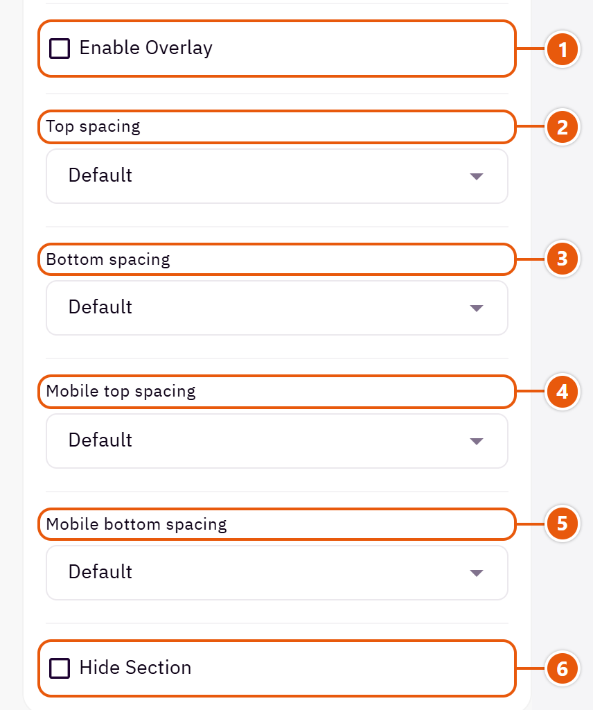
- 1“Enable overlay”
A see-through colour layer over the background or picture so the words read. - 2“Top spacing”
“Default” keeps the chosen design's space, “00” removes it, the rest are pixels. - 3“Bottom spacing”
Like “Top spacing”, below the section. - 4“Mobile top spacing”
On “Default” phones use the “Top spacing” number. - 5“Mobile bottom spacing”
On “Default” phones use the “Bottom spacing” number. - 6“Hide section”
Hides the section without deleting it; its content is kept. Handy for a seasonal offer.
Plus the options in "Options every section shares", in the Home page sections chapter, except "Title colour (transparent = automatic)", "Background picture stays still on scroll".
Tips
- A product with sizes or colours shows a “Choose options” button that opens its page.
- Choose a product with a good description; the section shows it.
A set of products sold together: a picture beside a slider of the products, and one button that adds them all to the cart at once and opens the cart drawer. A product that needs a size or colour is chosen on its own page, and a sold-out one is left out.

Design

A framed box with the title on its line, beside the picture, and a swinging sticker on its corner. Playful; suits baby goods and gifts.

The picture with a bar of short details under it (such as “Fresh” and “Same-day delivery”) and a link. Tidy; suits grocery and baskets.
Step by step
- Choose the “Design” and upload the “Picture”.
- In “Bundle products” choose “Select products” and pick the bundle's products, then set “Products in the bundle”.
- Write the “Title” and a “Line above the button (optional)” if you want.
- Publish and try the button on the store.
Where to find its settings
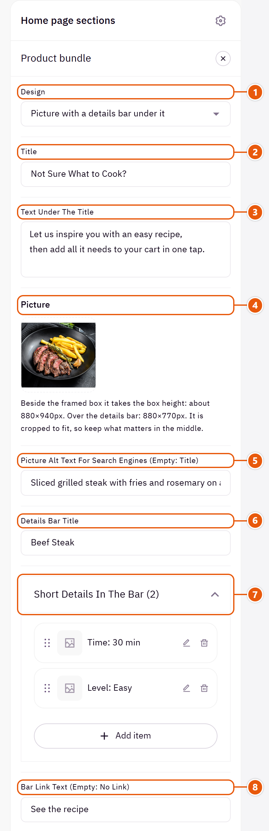
- 1“Design”
Your products and words stay when you switch. - 2“Title”
The section's main heading; leave it empty for none. - 3“Text under the title”
A short line on why this bundle is worth it. - 4“Picture”
Without it the box stands alone. - 5“Picture alt text for search engines (empty: title)”
A few words describing the picture for Google. Not shown on the page. - 6“Details bar title”
The first word in the bar, such as “Weekly basket”.Shown with “Picture with a details bar under it” - 7“Short details in the bar”Shown with “Picture with a details bar under it”Up to 4 items
- 8“Bar link text (empty: no link)”
Such as “Learn more”.Shown with “Picture with a details bar under it”
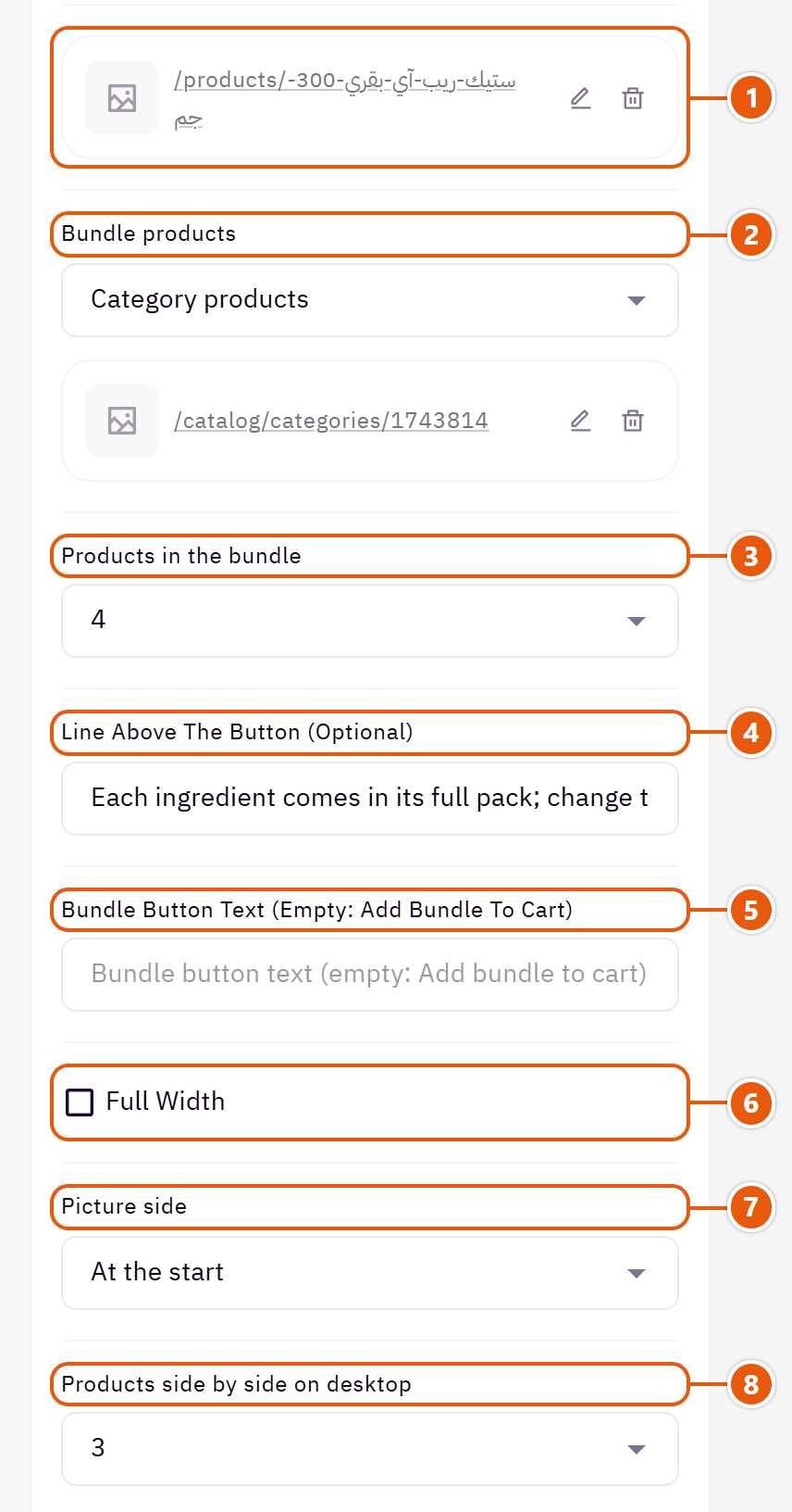
- 1“Bar link”
The page the bar's link opens.Shown with “Picture with a details bar under it” - 2“Bundle products”
Four sources: “Select products” to choose the bundle's products yourself, “Category products”, “Recent products” or “On sale products”. With no products the section does not show. - 3“Products in the bundle”
How many of the source's first products make the bundle. - 4“Line above the button (optional)”
Such as “Save 15% when you buy them together”. - 5“Bundle button text (empty: Add bundle to cart)”
The words on the add button. - 6“Full width”
The content spans the whole screen instead of the page width. Good for banners and large pictures. - 7“Picture side”
The picture at the start of the line (the right in Arabic) or the end. - 8“Products side by side on desktop”
How many product cards show side by side.
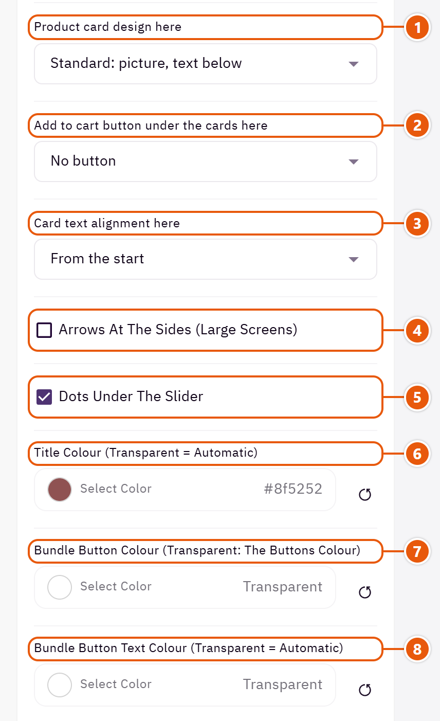
- 1“Product card design here”
“As the rest of the store” follows the “Product card” in Page settings. - 2“Add to cart button under the cards here”
The cart button under each card, here only. - 3“Card text alignment here”
The product name and price alignment in these cards only. - 4“Arrows at the sides (large screens)”
On large screens; phones swipe. - 5“Dots under the slider”
Dots showing where the visitor is among the products. - 6“Title colour (transparent = automatic)”
The section title's colour, and in some sections the words around it, as the field's name says. Transparent keeps the theme's colour. - 7“Bundle button colour (transparent: the buttons colour)”
The add button's colour. - 8“Bundle button text colour (transparent = automatic)”
Transparent: the theme picks white or black to suit the button.
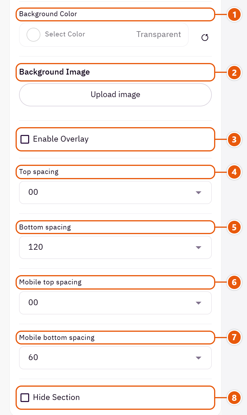
- 1“Background color”
A colour behind the whole section to set it apart. Transparent takes the page colour. - 2“Background image”
A picture behind the whole section, cropped to fit; choose a calm one about 1920 wide. - 3“Enable overlay”
A see-through colour layer over the background or picture so the words read. - 4“Top spacing”
“Default” keeps the chosen design's space, “00” removes it, the rest are pixels. - 5“Bottom spacing”
Like “Top spacing”, below the section. - 6“Mobile top spacing”
On “Default” phones use the “Top spacing” number. - 7“Mobile bottom spacing”
On “Default” phones use the “Bottom spacing” number. - 8“Hide section”
Hides the section without deleting it; its content is kept. Handy for a seasonal offer.
Inside each item of “Short details in the bar” (press the pencil beside it)
- 1“Detail”
A couple of words, such as “Same-day delivery”.
The other settings
- Swinging sticker on the picture corner: A playful touch, such as a “Sale” badge or a drawing.Shown with “Framed box beside the picture, with a sticker”
- Box frame colour (transparent: the buttons colour): The line round the box, with the title set into it.Shown with “Framed box beside the picture, with a sticker”
Plus the options in "Options every section shares", in the Home page sections chapter, except "Background picture stays still on scroll".
Tips
- Choose products without sizes or colours so the button adds them all in one go.
A wide photo (or more) with pins; each pin opens a small card with the product's picture, name, price and an add to cart button. For a furnished room, a full outfit or a shelf of products.

Step by step
- In “Photos (a photo's number is its place here)” press “Add item” and upload the “Photo”.
- In “Pins on the photos (each opens a product card)” press “Add item” and pick the product.
- Set the “Number of the photo the pin sits on” and move it with the two position fields until it sits on the product.
- Publish.
Where to find its settings
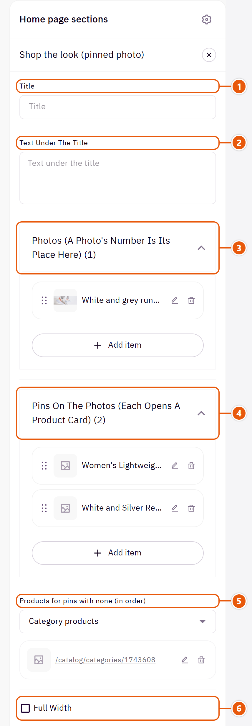
- 1“Title”
The section's main heading; leave it empty for none. - 2“Text under the title”
A short line under the title. - 3“Photos (a photo's number is its place here)”Up to 6 items
- 4“Pins on the photos (each opens a product card)”Up to 12 items
- 5“Products for pins with none (in order)”
Supplies pins with no product, in order. A pin with no product at all is not drawn. - 6“Full width”
The content spans the whole screen instead of the page width. Good for banners and large pictures.
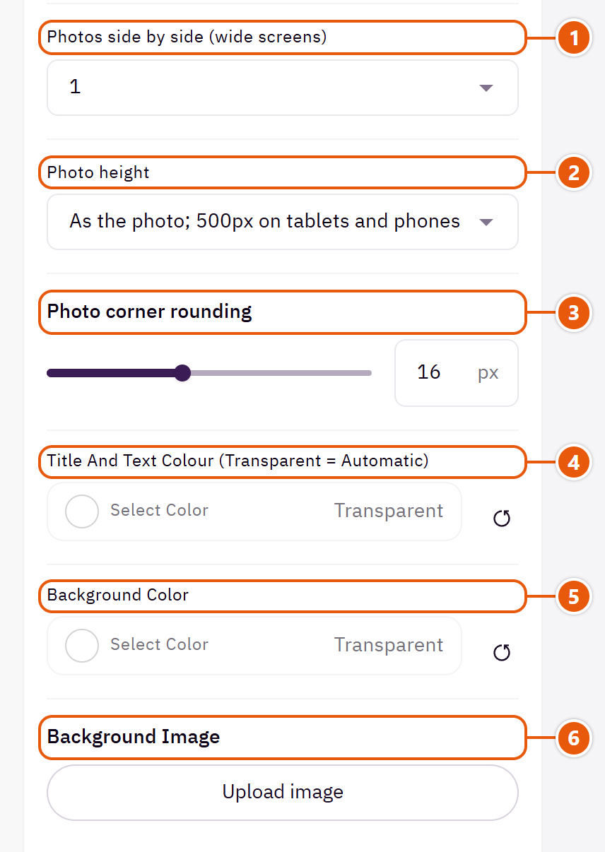
- 1“Photos side by side (wide screens)”
With more than one photo, they sit side by side on wide screens. - 2“Photo height”
The first choice fixes the height at 500px on tablets and phones, cropping from the centre. - 3“Photo corner rounding”
Zero: square corners. - 4“Title and text colour (transparent = automatic)”
The title and the line under it. - 5“Background color”
A colour behind the whole section to set it apart. Transparent takes the page colour. - 6“Background image”
A picture behind the whole section, cropped to fit; choose a calm one about 1920 wide.
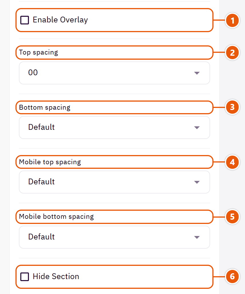
- 1“Enable overlay”
A see-through colour layer over the background or picture so the words read. - 2“Top spacing”
“Default” keeps the chosen design's space, “00” removes it, the rest are pixels. - 3“Bottom spacing”
Like “Top spacing”, below the section. - 4“Mobile top spacing”
On “Default” phones use the “Top spacing” number. - 5“Mobile bottom spacing”
On “Default” phones use the “Bottom spacing” number. - 6“Hide section”
Hides the section without deleting it; its content is kept. Handy for a seasonal offer.
Inside each item of “Photos (a photo's number is its place here)” (press the pencil beside it)
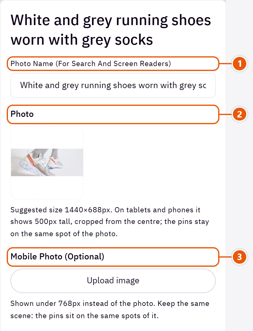
- 1“Photo name (for search and screen readers)”
A few words describing the photo. Not shown on the page. - 2“Photo”
The photo the pins sit on. - 3“Mobile photo (optional)”
A phone crop of the same scene.
Inside each item of “Pins on the photos (each opens a product card)” (press the pencil beside it)
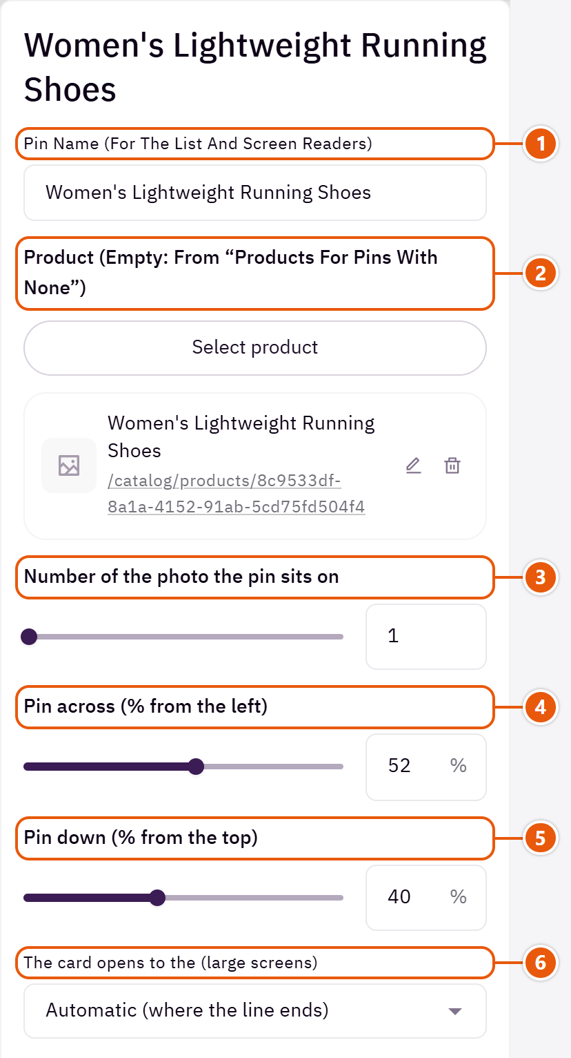
- 1“Pin name (for the list and screen readers)”
A short name read before the product's for screen readers, such as “By the window”. - 2“Product (empty: from “Products for pins with none”)”
The product the card shows. - 3“Number of the photo the pin sits on”
1 for the first photo in the list, 2 for the second, and so on. - 4“Pin across (% from the left)”
0 is the left edge and 100 the right, in both languages. - 5“Pin down (% from the top)”
0 is the top and 100 the bottom. The pin stays on the same spot if the photo is cropped. - 6“The card opens to the (large screens)”
Choose a side if the card covers another product. On phones it opens above the pin.
Plus the options in "Options every section shares", in the Home page sections chapter, except "Title colour (transparent = automatic)", "Background picture stays still on scroll".
Tips
- A photo about 1440 x 688 with the products away from the edges.
A look photo with pins, beside a slider showing one product at a time. Tapping a pin turns the slider to its product, and the product in view lights its pin. If you pick no products for the pins, it takes your latest products in order.

Step by step
- Upload the “Photo with the pins”.
- In “Pins on the photo (a pin turns the slider to it)” press “Add item” and pick the product.
- Move the pin with “Pin across (% from the left)” and “Pin down (% from the top)” until it sits on the product in the photo.
- Publish.
Where to find its settings
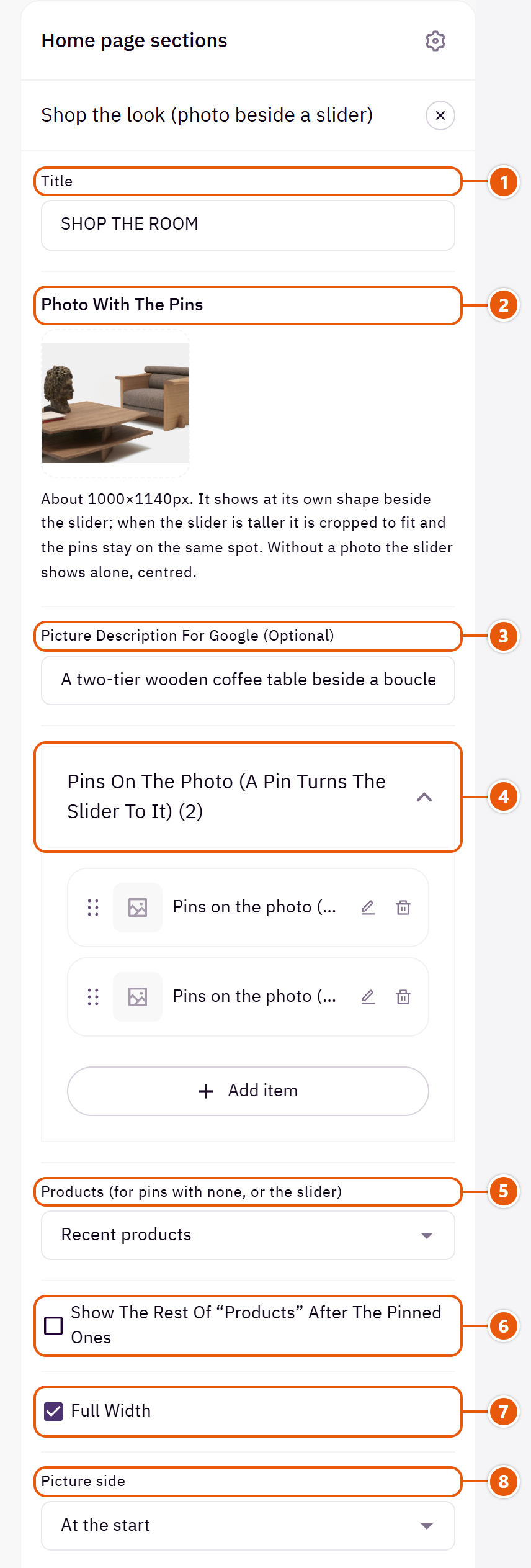
- 1“Title”
The section's main heading; leave it empty for none. - 2“Photo with the pins”
Without it the slider shows alone, centred. - 3“Picture description for Google (optional)”
A few words describing the photo. Not shown on the page. - 4“Pins on the photo (a pin turns the slider to it)”Up to 6 items
- 5“Products (for pins with none, or the slider)”
Supplies pins with no product, or the slider when there are no pins. - 6“Show the rest of “Products” after the pinned ones”
Adds the rest of the products to the slider after the pinned ones, up to 12. - 7“Full width”
The content spans the whole screen instead of the page width. Good for banners and large pictures. - 8“Picture side”
The photo at the start of the line or its end.
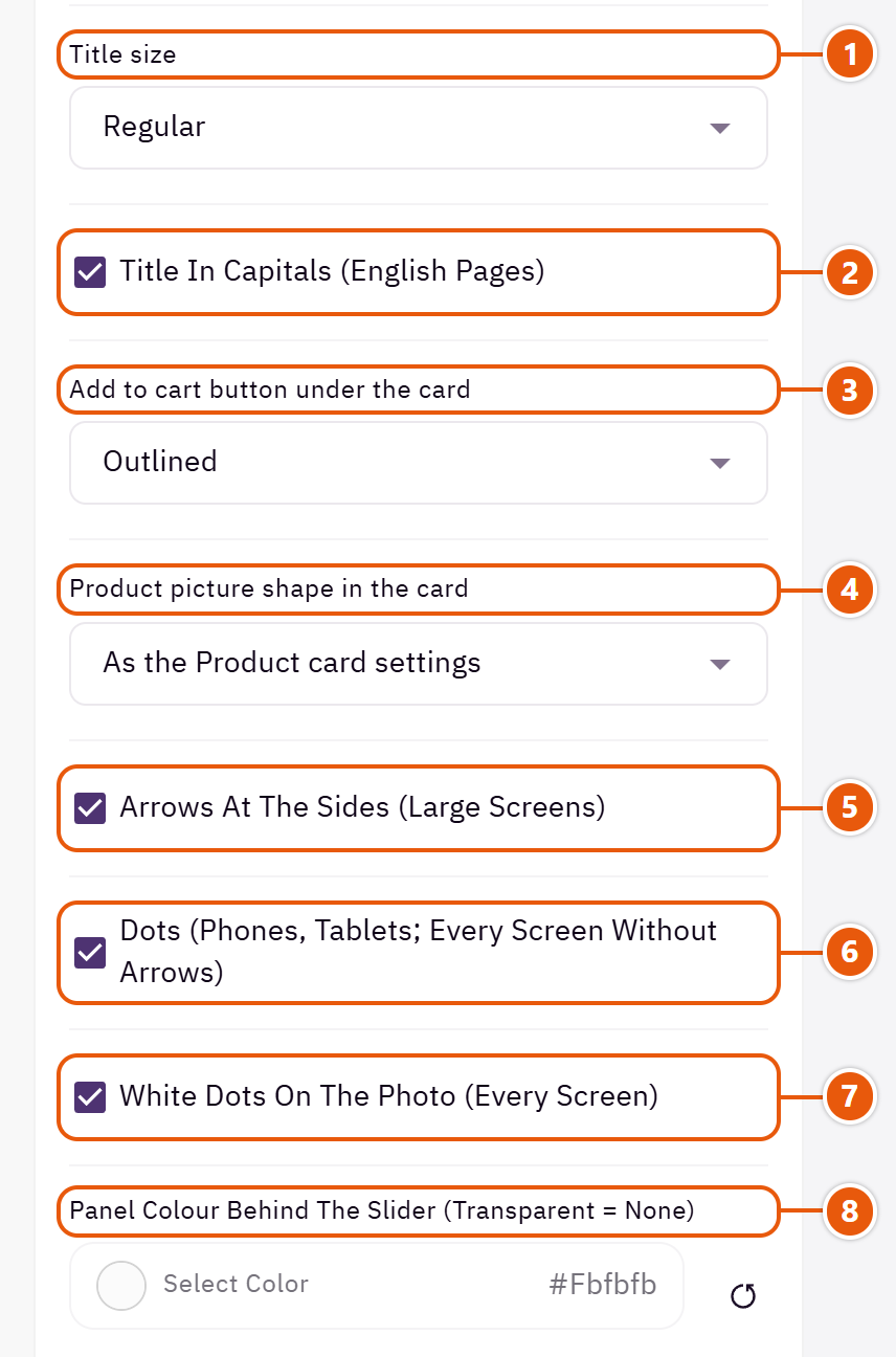
- 1“Title size”
The section title's size. - 2“Title in capitals (English pages)”
Affects English letters only. - 3“Add to cart button under the card”
The cart button under the product card, here only. - 4“Product picture shape in the card”
The product picture shape in this card only. - 5“Arrows at the sides (large screens)”
On large screens; phones swipe. - 6“Dots (phones, tablets; every screen without arrows)”
Under the card on phones and tablets, and on every screen with the arrows off. - 7“White dots on the photo (every screen)”
The dots sit white on the photo instead of under the card.Shown when “Dots (phones, tablets; every screen without arrows)” is on - 8“Panel colour behind the slider (transparent = none)”
The panel holding the title and slider.
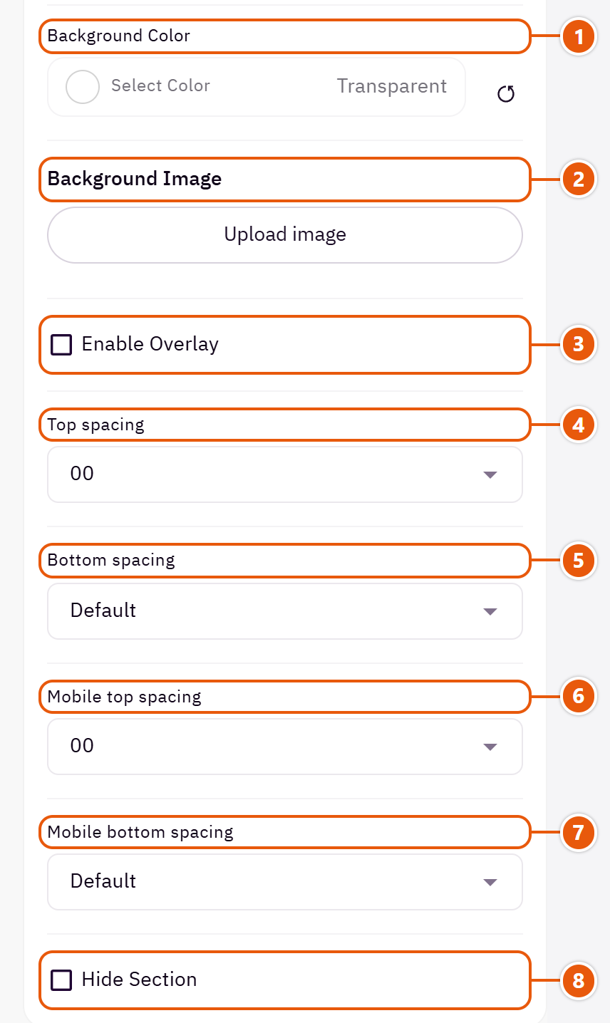
- 1“Background color”
A colour behind the whole section to set it apart. Transparent takes the page colour. - 2“Background image”
A picture behind the whole section, cropped to fit; choose a calm one about 1920 wide. - 3“Enable overlay”
A see-through colour layer over the background or picture so the words read. - 4“Top spacing”
“Default” keeps the chosen design's space, “00” removes it, the rest are pixels. - 5“Bottom spacing”
Like “Top spacing”, below the section. - 6“Mobile top spacing”
On “Default” phones use the “Top spacing” number. - 7“Mobile bottom spacing”
On “Default” phones use the “Bottom spacing” number. - 8“Hide section”
Hides the section without deleting it; its content is kept. Handy for a seasonal offer.
Inside each item of “Pins on the photo (a pin turns the slider to it)” (press the pencil beside it)
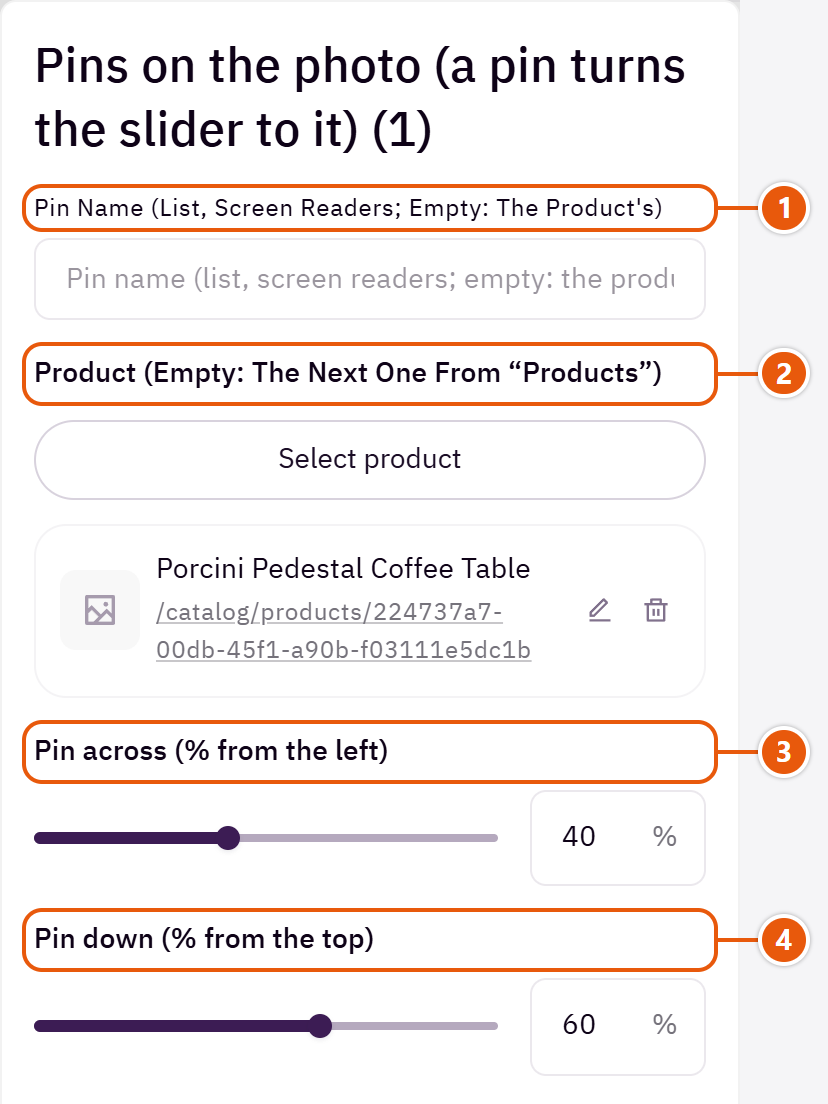
- 1“Pin name (list, screen readers; empty: the product's)”
A short name for the pin; not shown on the photo. - 2“Product (empty: the next one from “Products”)”
The product the pin shows in the slider. - 3“Pin across (% from the left)”
0 is the left edge and 100 the right, in both languages. - 4“Pin down (% from the top)”
0 is the top and 100 the bottom. The pin stays on the same spot if the photo is cropped.
Plus the options in "Options every section shares", in the Home page sections chapter, except "Title colour (transparent = automatic)", "Background picture stays still on scroll".
Tips
- Use a photo about 1000 x 1140, with the products away from the edges so the pins are never cut.
A large picture with your reasons to buy (quality, shipping, warranty...), each with an icon, a name and a short line.

Section layout

The picture on one side, the title and the points listed beside it.

The picture in the middle with the points split into two columns around it. Best with a product picture on a clear background.
Step by step
- Choose the “Section layout” and upload the “Picture”.
- In “Points” press “Add item” for each one and fill “Point name” and “Short description”.
- Choose an “Icon” or upload an “Icon picture (square)”, then publish.
Where to find its settings
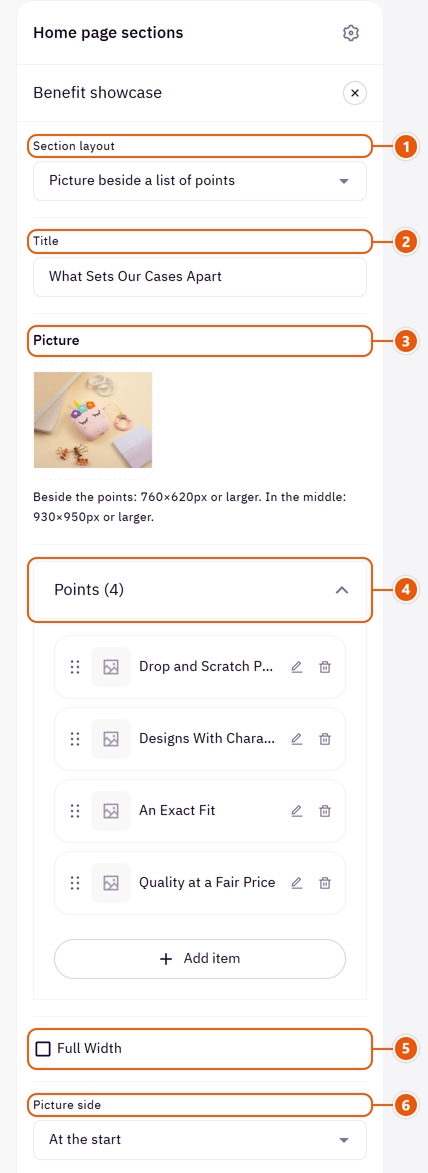
- 1“Section layout”
Your picture and points stay when you switch. - 2“Title”
The section's main heading; leave it empty for none. - 3“Picture”
Without it the points show on their own. - 4“Points”Up to 6 items
- 5“Full width”
The content spans the whole screen instead of the page width. Good for banners and large pictures. - 6“Picture side”
The picture at the start of the section (the right in Arabic) or the end.Shown with “Picture beside a list of points”
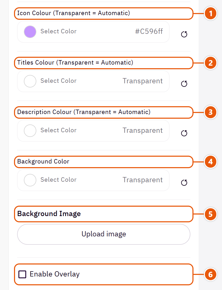
- 1“Icon colour (transparent = automatic)”
The ready-made icons' colour. - 2“Titles colour (transparent = automatic)”
The section title's colour, and in some sections the words around it, as the field's name says. Transparent keeps the theme's colour. - 3“Description colour (transparent = automatic)”
The short line under each point. - 4“Background color”
A colour behind the whole section to set it apart. Transparent takes the page colour. - 5“Background image”
A picture behind the whole section, cropped to fit; choose a calm one about 1920 wide. - 6“Enable overlay”
A see-through colour layer over the background or picture so the words read.
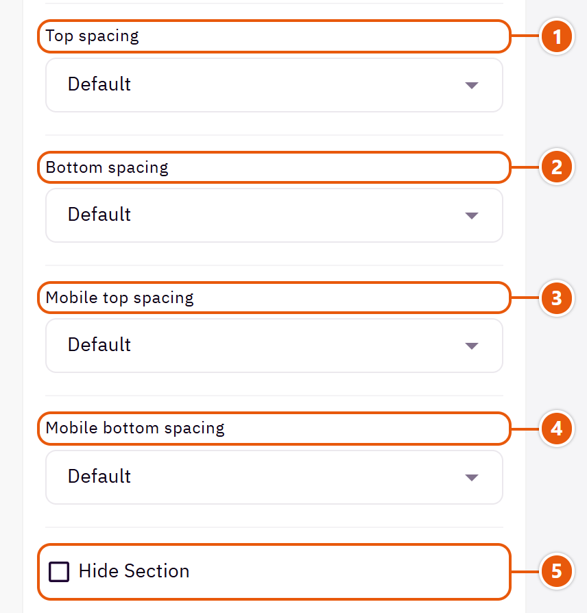
- 1“Top spacing”
“Default” keeps the chosen design's space, “00” removes it, the rest are pixels. - 2“Bottom spacing”
Like “Top spacing”, below the section. - 3“Mobile top spacing”
On “Default” phones use the “Top spacing” number. - 4“Mobile bottom spacing”
On “Default” phones use the “Bottom spacing” number. - 5“Hide section”
Hides the section without deleting it; its content is kept. Handy for a seasonal offer.
Inside each item of “Points” (press the pencil beside it)
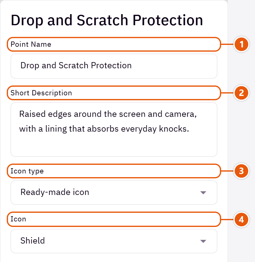
- 1“Point name”
Such as “Guaranteed quality”. - 2“Short description”
A line explaining the point. - 3“Icon type”
“Your own picture” for an icon of your brand. - 4“Icon”
Pick the closest match; each icon's shape is written beside it.Shown when “Icon type” is “Ready-made icon”
The other settings
- Points
- Icon picture (square): Shown small in the icon's place.Shown when “Icon type” is “Your own picture”
Plus the options in "Options every section shares", in the Home page sections chapter, except "Background picture stays still on scroll".
Tips
- A point with neither a name nor a description is skipped, and the section hides when there are none.
Two pictures in one frame; the shopper drags the line in the middle to see the difference: a skincare result, a room before and after the furniture, a repair. The section shows once both pictures are uploaded.

Step by step
- Upload the “Before” and “After” pictures at the same size.
- Write a “Section title” if you want one.
- Type the two tags on the pictures, or leave them empty.
- Publish.
Where to find its settings

- 1“Title”
The section's main heading; leave it empty for none. - 2““Before” picture”
Shows on the left in both languages. - 3““After” picture”
Shows on the right. Shoot it from the same spot and angle so the only difference is the result. - 4““Before” tag on the picture (empty = none)”
A white pill in the picture's corner, such as “Before use”. - 5““After” tag on the picture (empty = none)”
Such as “After two weeks”. - 6“Full width”
The content spans the whole screen instead of the page width. Good for banners and large pictures. - 7“Title colour (transparent = automatic)”
The section title's colour, and in some sections the words around it, as the field's name says. Transparent keeps the theme's colour. - 8“Background color”
A colour behind the whole section to set it apart. Transparent takes the page colour.
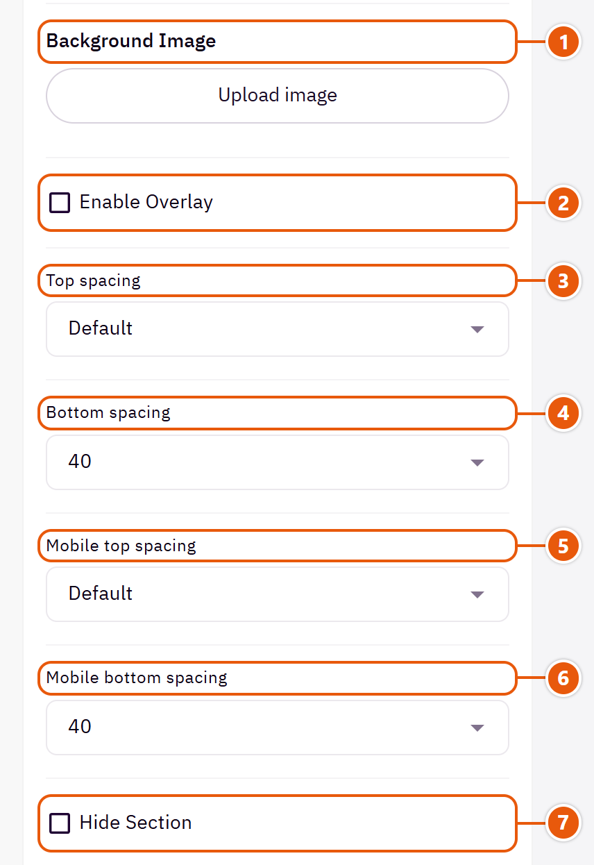
- 1“Background image”
A picture behind the whole section, cropped to fit; choose a calm one about 1920 wide. - 2“Enable overlay”
A see-through colour layer over the background or picture so the words read. - 3“Top spacing”
“Default” keeps the chosen design's space, “00” removes it, the rest are pixels. - 4“Bottom spacing”
Like “Top spacing”, below the section. - 5“Mobile top spacing”
On “Default” phones use the “Top spacing” number. - 6“Mobile bottom spacing”
On “Default” phones use the “Bottom spacing” number. - 7“Hide section”
Hides the section without deleting it; its content is kept. Handy for a seasonal offer.
Plus the options in "Options every section shares", in the Home page sections chapter, except "Background picture stays still on scroll".
Tips
- Phones crop the sides, so keep what is being compared in the middle.
Short portrait videos (like reels) in a slider, each with the product it shows, its picture and price, at its foot. A video plays muted by itself while in view and pauses when it leaves.

Step by step
- In “Videos” press “Add item” and upload the “Video”.
- Upload the “Cover picture” and pick the “Product in the video (optional)”.
- Publish.
Where to find its settings
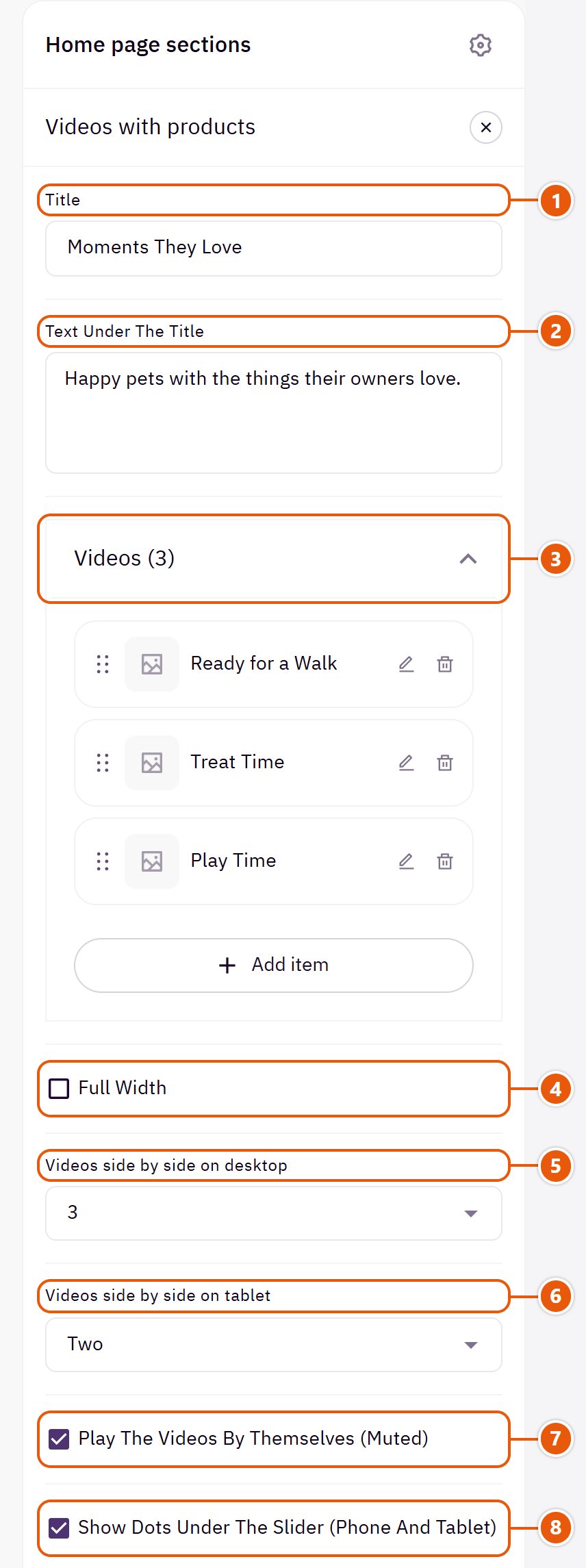
- 1“Title”
The section's main heading; leave it empty for none. - 2“Text under the title”
A short line under the title. - 3“Videos”Up to 8 items
- 4“Full width”
The content spans the whole screen instead of the page width. Good for banners and large pictures. - 5“Videos side by side on desktop”
How many videos show on computers. - 6“Videos side by side on tablet”
“One and a half” shows part of the next video. - 7“Play the videos by themselves (muted)”
Off: a play button on each video. - 8“Show dots under the slider (phone and tablet)”
Phones and tablets only.
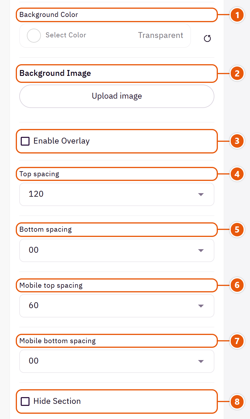
- 1“Background color”
A colour behind the whole section to set it apart. Transparent takes the page colour. - 2“Background image”
A picture behind the whole section, cropped to fit; choose a calm one about 1920 wide. - 3“Enable overlay”
A see-through colour layer over the background or picture so the words read. - 4“Top spacing”
“Default” keeps the chosen design's space, “00” removes it, the rest are pixels. - 5“Bottom spacing”
Like “Top spacing”, below the section. - 6“Mobile top spacing”
On “Default” phones use the “Top spacing” number. - 7“Mobile bottom spacing”
On “Default” phones use the “Bottom spacing” number. - 8“Hide section”
Hides the section without deleting it; its content is kept. Handy for a seasonal offer.
Inside each item of “Videos” (press the pencil beside it)
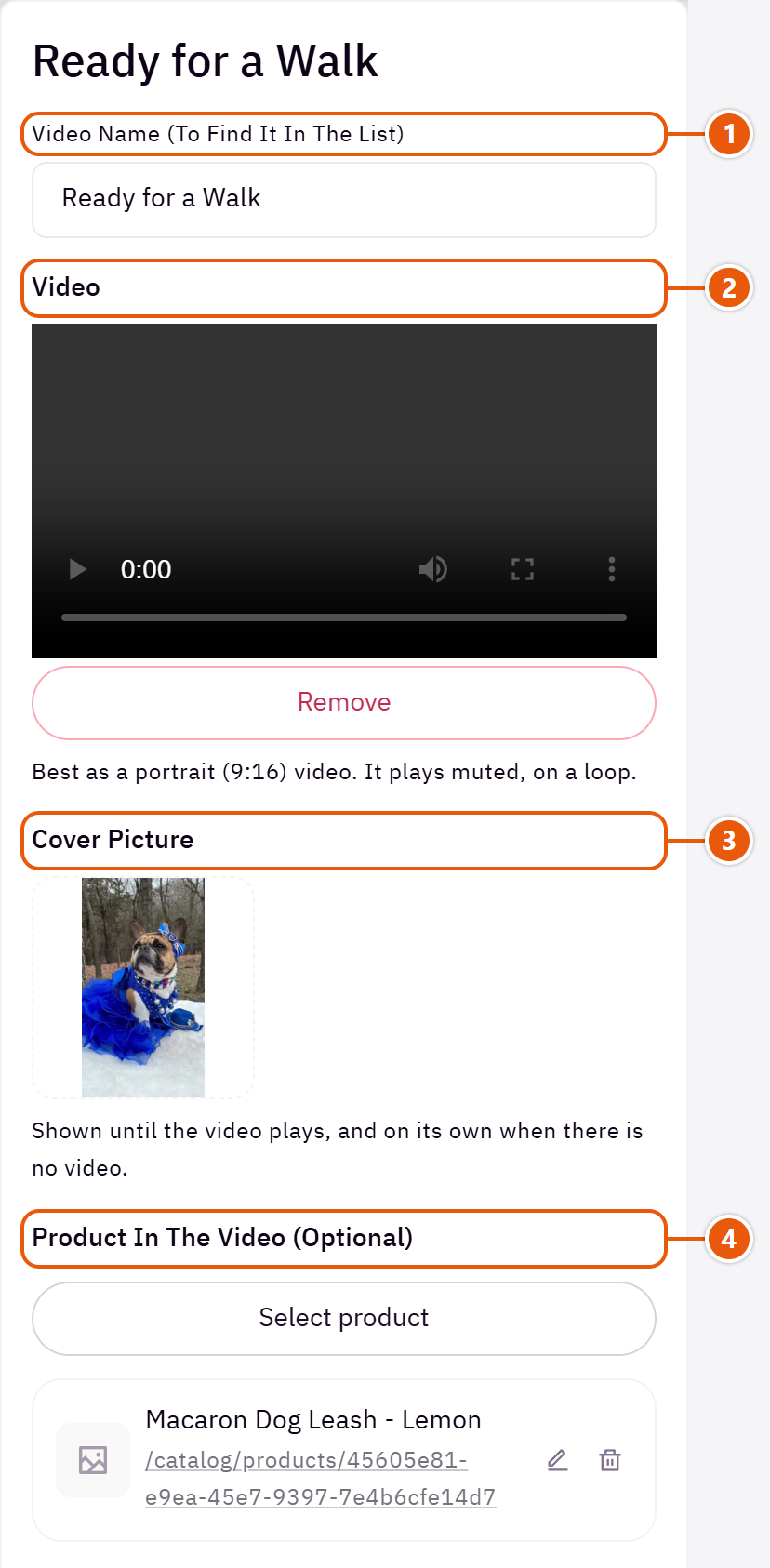
- 1“Video name (to find it in the list)”
A name to find the video in the list; screen readers read it too. - 2“Video”
A short, light video. - 3“Cover picture”
With no video, the picture shows on its own. - 4“Product in the video (optional)”
A small card under the video with the product's picture, name, price and link.
Plus the options in "Options every section shares", in the Home page sections chapter, except "Title colour (transparent = automatic)", "Background picture stays still on scroll".
Tips
- Portrait 9:16 videos under 10 seconds, with a cover picture each so the section shows at once.
Reviews from your customers that you type yourself, with stars, the customer's photo and the product bought (its name, picture and price from your store), or press quotes with their logos. Use real reviews only.

Section look

Review cards side by side, each ending with the product the customer bought.

The customer's photo large beside the review, one at a time. For beauty and fashion.

A short title sums up each review, so visitors catch the key line at once. Suits books.

The row runs on to the screen's edge, hinting at more reviews to swipe. Suits fashion.

A large quote from the press, with the publications' logos under it to switch between them.

One large review at a time, with decorations in two corners. For a strong review you want to stand out.
Step by step
- Choose the “Section look”.
- In “Reviews” press “Add item”.
- Write the “Customer or publication name” and “The review”, and choose the “Star rating”.
- Upload the “Customer photo or press logo” and pick the “Product bought (optional)”, then publish.
Where to find its settings

- 1“Section look”
Your reviews stay when you switch. - 2“Small text above the title”
A short word above the title. - 3“Title”
The section's main heading; leave it empty for none. - 4“Text under the title”
A short line under the title. - 5“Reviews”Up to 12 items
- 6“Icon above the review”
A mark above each review, such as a quote mark. - 7“Icon shape”
“The look's own icon” keeps the original look's mark.Shown when “Icon above the review” is “Icon” - 8“Full width”
The content spans the whole screen instead of the page width. Good for banners and large pictures.

- 1“Title position”
Where the section title sits. - 2“Section background shape”
With a “Background color” or “Background image”: the section shows as a panel in from the screen's edges or with rounded corners. - 3“Title size”
The section title's size. - 4“Customer photo side”
The customer photo before or after the review.Shown with “Customer photo beside the review” - 5“Review alignment”
The review centred or from the start.Shown with “Customer photo beside the review” - 6“Review box width”
“A little narrower” keeps the review box in from the page's edges on large screens.Shown with “Customer photo beside the review” - 7“Card or review box corners (the box when it has a colour)”
“As the store's other cards” follows “Card and panel corners” in “Look”.
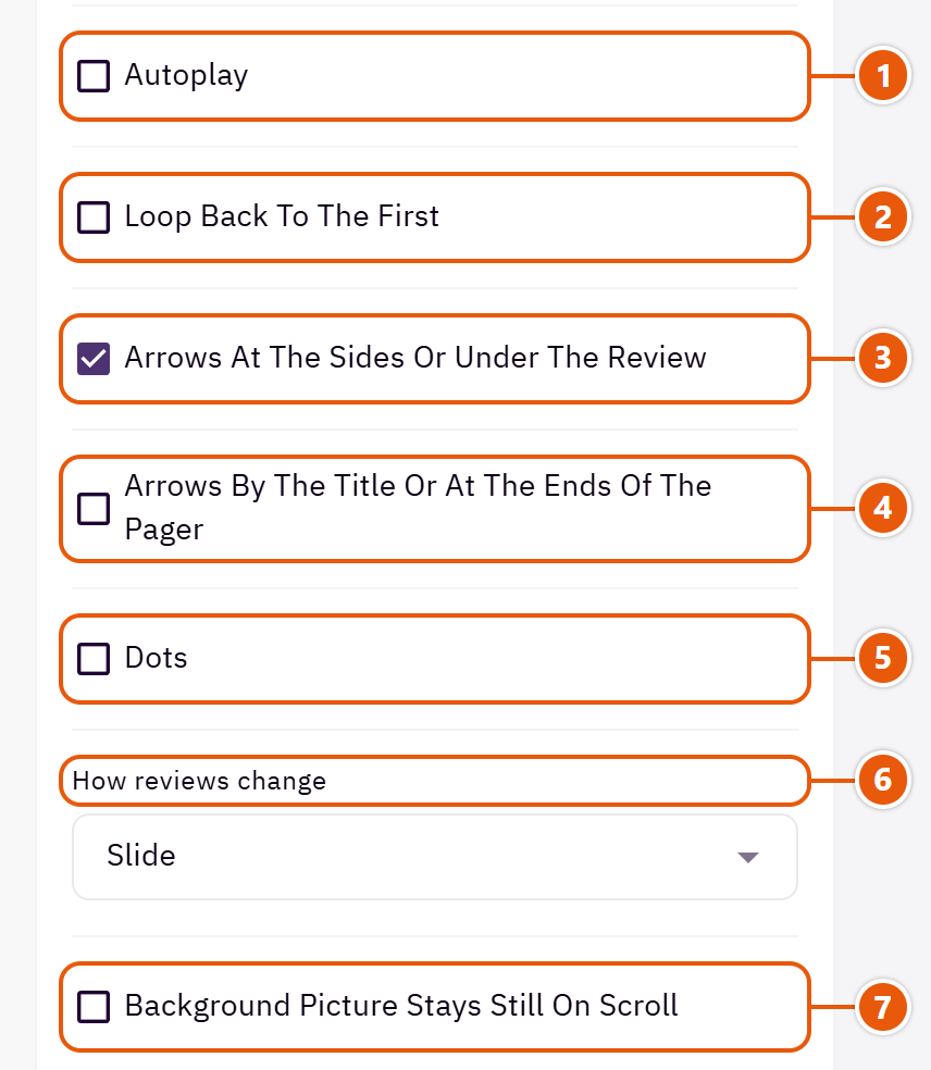
- 1“Autoplay”
The reviews turn by themselves. - 2“Loop back to the first”
Instead of stopping at the last review. - 3“Arrows at the sides or under the review”
Where they sit depends on the look. - 4“Arrows by the title or at the ends of the pager”
Arrows by the title, or at the two ends of the dots in some looks. - 5“Dots”
A dot per review or group. - 6“How reviews change”
How one review gives way to the next.Shown with “Customer photo beside the review” - 7“Background picture stays still on scroll”
In “Testimonials” only: the background picture stays still while the page moves over it.
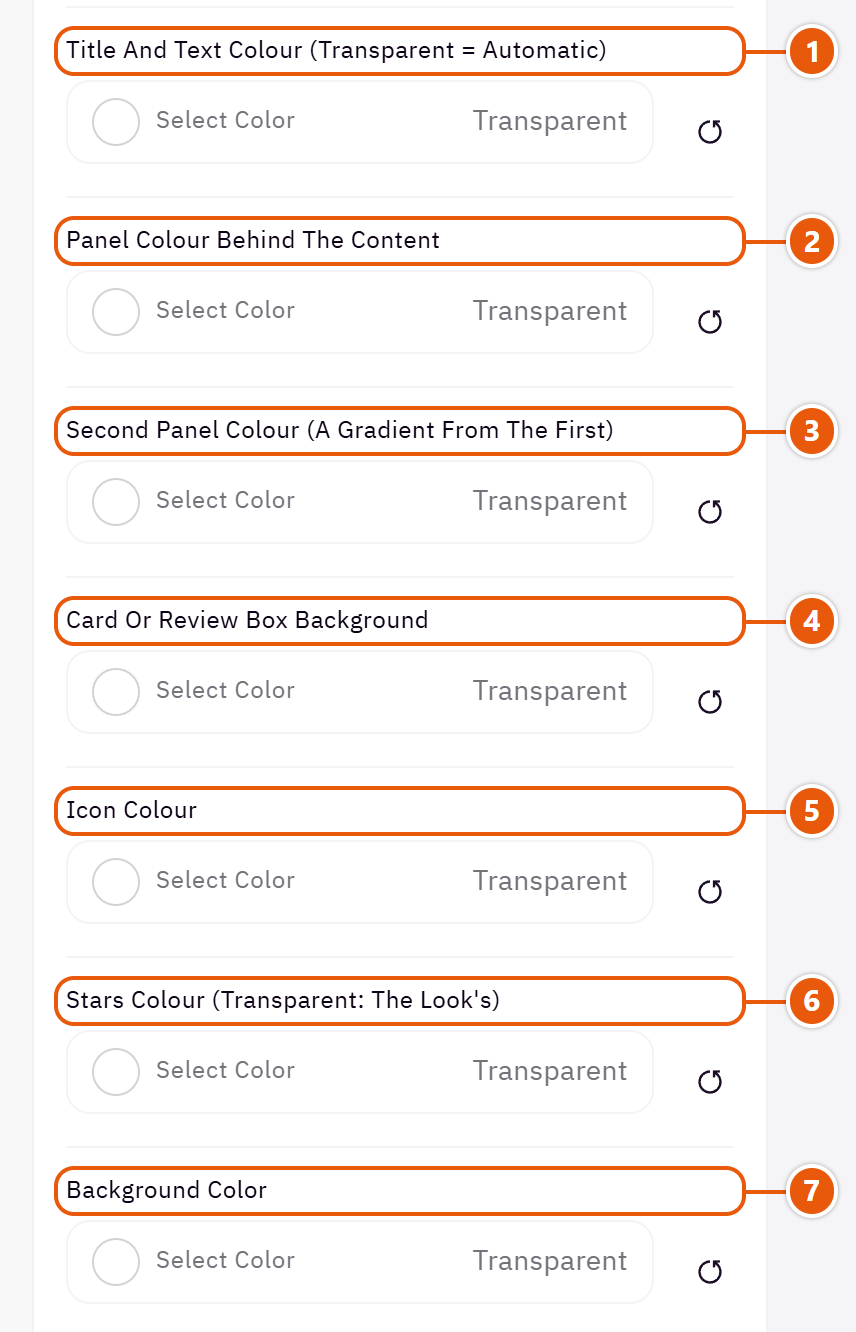
- 1“Title and text colour (transparent = automatic)”
The title and the words around the reviews. - 2“Panel colour behind the content”
A coloured panel behind the whole section; its words adjust to read. - 3“Second panel colour (a gradient from the first)”
With the “Panel colour behind the content” it makes a top-to-bottom gradient; without it, it does nothing. - 4“Card or review box background”
The review cards' colour. - 5“Icon colour”
The quote mark or icon. - 6“Stars colour (transparent: the Look's)”
The rating stars in this section only. - 7“Background color”
A colour behind the whole section to set it apart. Transparent takes the page colour.
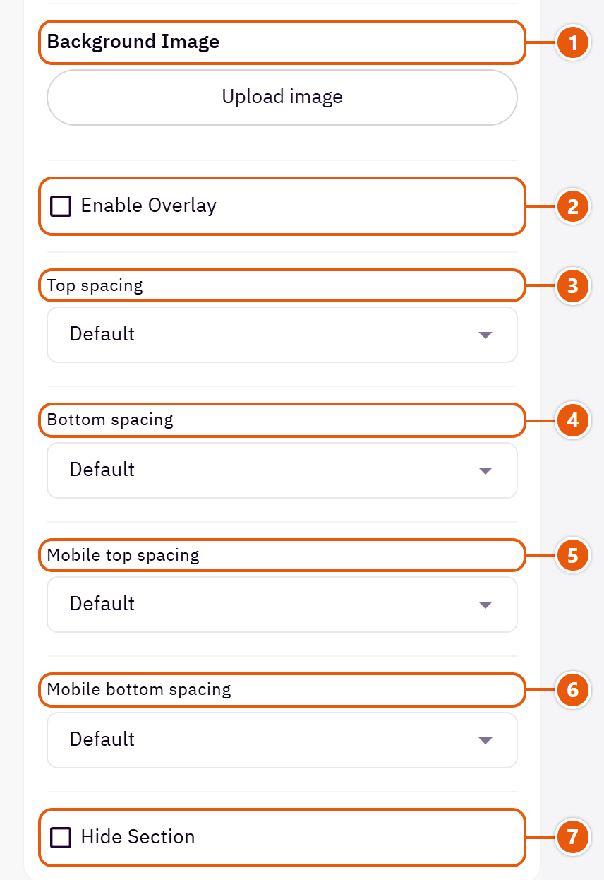
- 1“Background image”
A picture behind the whole section, cropped to fit; choose a calm one about 1920 wide. - 2“Enable overlay”
A see-through colour layer over the background or picture so the words read. - 3“Top spacing”
“Default” keeps the chosen design's space, “00” removes it, the rest are pixels. - 4“Bottom spacing”
Like “Top spacing”, below the section. - 5“Mobile top spacing”
On “Default” phones use the “Top spacing” number. - 6“Mobile bottom spacing”
On “Default” phones use the “Bottom spacing” number. - 7“Hide section”
Hides the section without deleting it; its content is kept. Handy for a seasonal offer.
Inside each item of “Reviews” (press the pencil beside it)

- 1“Review title (optional)”
A short line from the review, such as “Best buy of the year”. - 2“Customer or publication name”
The customer's name, or the publication's in press quotes. - 3“The review”
The customer's words as said. - 4“Star rating”
“No stars” for press quotes. - 5““Verified buyer” badge”
Turn it on only for someone who really bought. - 6“Customer photo or press logo”
The customer's photo or the publication's logo; sizes are under the field. - 7“Product bought (optional)”
Shows the product's name, picture, price and link from your store.
The other settings
- Icon picture: A small picture instead of the icon.Shown when “Icon above the review” is “Picture”
- Decor picture, top corner: A decoration swinging in the panel's corner, such as a leaf.Shown with “One review on a coloured panel”
- Decor picture, bottom corner: A second decoration in the bottom corner.Shown with “One review on a coloured panel”
- Review title size: “Large, in the headings font” suits short review titles.Shown with “Review cards with a title and product row”
- Time per review: 5000 is 5 seconds.Shown when “Autoplay” is on
Plus the options in "Options every section shares", in the Home page sections chapter, except "Title colour (transparent = automatic)".
Tips
- A review with no words, name or photo is left out.
- A square customer photo about 700 x 700 with the face in the middle.
The logos of the brands you sell or your partners, in a strip that moves by itself or in cells that slide. It tells visitors the products are genuine.

Section look

A strip of logos moving without end, faded at both ends.

Each logo in a cell, slid by arrows or swipe. Calmer, and suits many brands.
Step by step
- Choose the “Section look”.
- In “Logos” press “Add item” and upload the “Logo”.
- Pick a “Link (optional)” to the brand's page if you want, then publish.
Where to find its settings
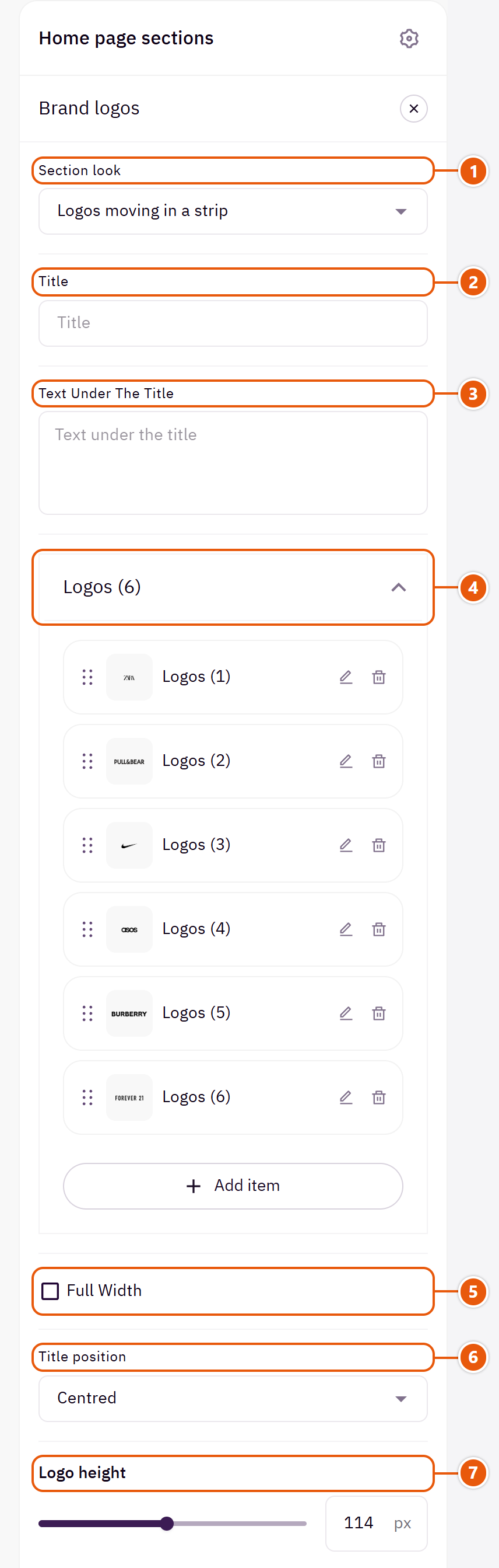
- 1“Section look”
Your logos stay when you switch. - 2“Title”
The section's main heading; leave it empty for none. - 3“Text under the title”
A short line under the title. - 4“Logos”Up to 20 items
- 5“Full width”
The content spans the whole screen instead of the page width. Good for banners and large pictures. - 6“Title position”
Where the section title sits. - 7“Logo height”
Each logo's size in the strip; the width follows.Shown with “Logos moving in a strip”
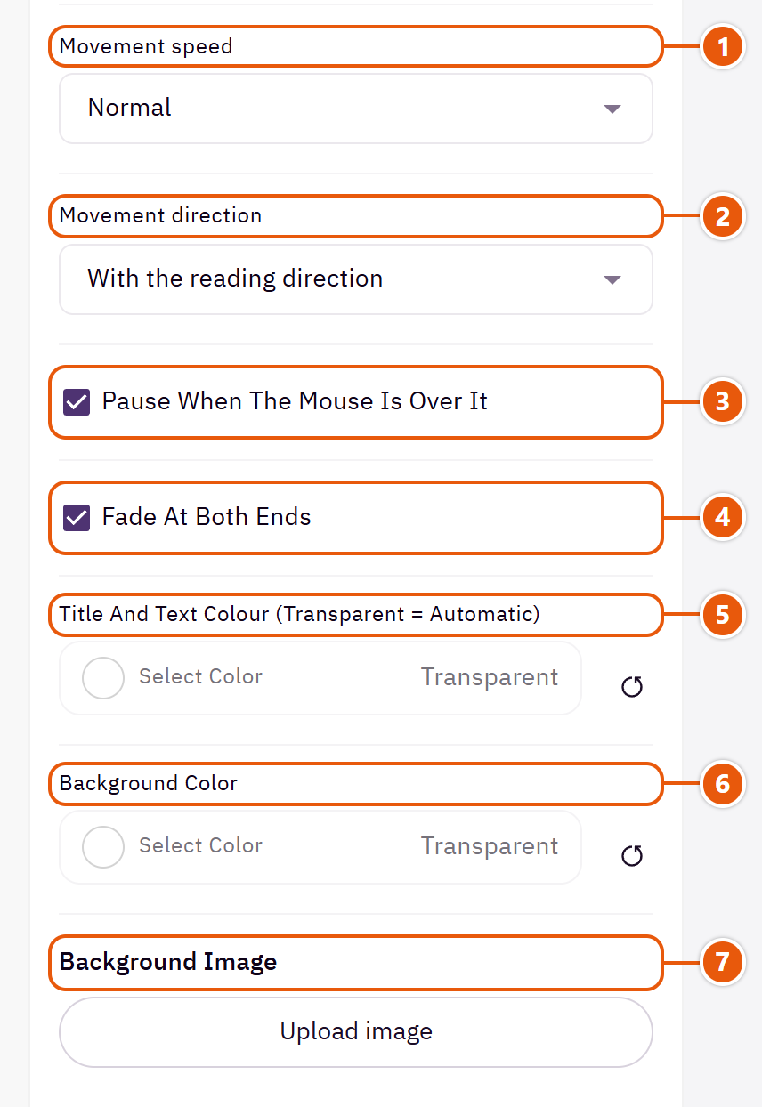
- 1“Movement speed”
How fast the strip moves.Shown with “Logos moving in a strip” - 2“Movement direction”
“Against the reading direction” when two moving strips follow each other and you want them opposite.Shown with “Logos moving in a strip” - 3“Pause when the mouse is over it”
So a visitor can click a logo.Shown with “Logos moving in a strip” - 4“Fade at both ends”
Logos fade out at the ends instead of being cut.Shown with “Logos moving in a strip” - 5“Title and text colour (transparent = automatic)”
The title, the line under it and the brand names. - 6“Background color”
A colour behind the whole section to set it apart. Transparent takes the page colour. - 7“Background image”
A picture behind the whole section, cropped to fit; choose a calm one about 1920 wide.
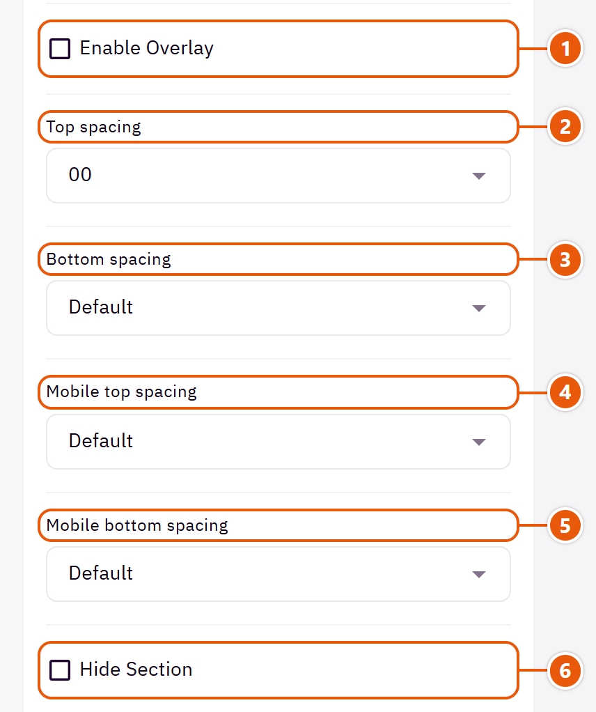
- 1“Enable overlay”
A see-through colour layer over the background or picture so the words read. - 2“Top spacing”
“Default” keeps the chosen design's space, “00” removes it, the rest are pixels. - 3“Bottom spacing”
Like “Top spacing”, below the section. - 4“Mobile top spacing”
On “Default” phones use the “Top spacing” number. - 5“Mobile bottom spacing”
On “Default” phones use the “Bottom spacing” number. - 6“Hide section”
Hides the section without deleting it; its content is kept. Handy for a seasonal offer.
Inside each item of “Logos” (press the pencil beside it)
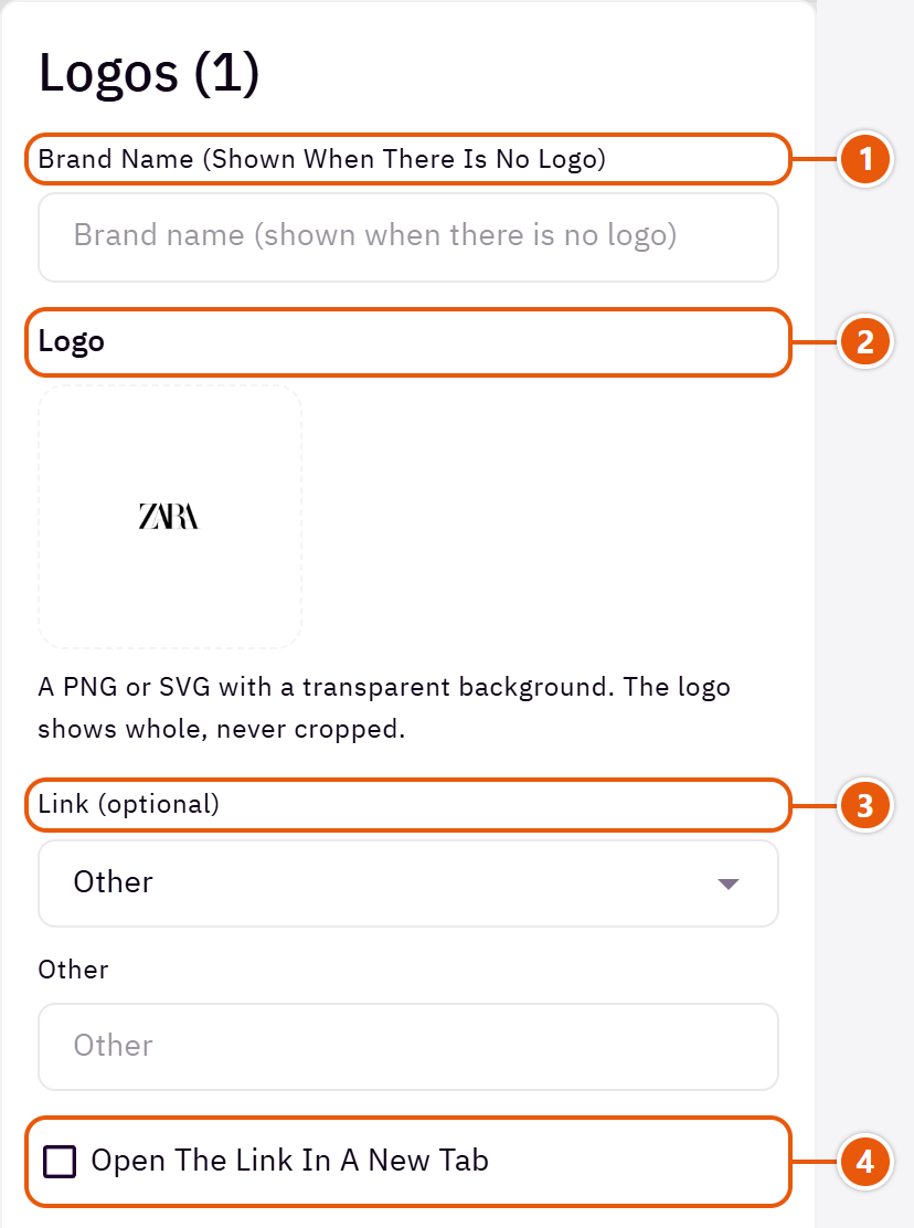
- 1“Brand name (shown when there is no logo)”
With no logo, the brand name shows in its cell. It also describes the logo to Google. - 2“Logo”
Every logo gets the same space, so upload them at about the same proportions. - 3“Link (optional)”
Such as the brand's page or its category in your store. - 4“Open the link in a new tab”
Only for links outside your store.
The other settings
- Cell style: “Joined, a thin line between” is one strip; “Separate boxes with rounded corners” are cards apart.Shown with “Logos in cells, slid by arrows or swipe”
- Autoplay: The cells slide by themselves.Shown with “Logos in cells, slid by arrows or swipe”
- Time per slide: 5000 is 5 seconds.Shown with “Logos in cells, slid by arrows or swipe” and when “Autoplay” is on
- Loop back to the first: Instead of stopping at the last logo.Shown with “Logos in cells, slid by arrows or swipe”
- Arrows beside the title: Two arrows at the end of the title row, on large screens.Shown with “Logos in cells, slid by arrows or swipe”
- Dots: Dots under the cells on screens below 1200px.Shown with “Logos in cells, slid by arrows or swipe”
Plus the options in "Options every section shares", in the Home page sections chapter, except "Title colour (transparent = automatic)", "Background picture stays still on scroll".
Tips
- Use a PNG or SVG logo on a transparent background; it shows whole, never cropped.
A row of your store's promises (free shipping, returns, secure payment...) with an icon, a name and a short line. On computers they sit in one row; on phones they slide.

Section look

The words centred, with no card, a bordered card or a coloured card.

Lighter and shorter. Good under the slider or above the footer.
Step by step
- Choose the “Section look”.
- In “Benefits” press “Add item” and write the “Benefit name”.
- Choose an “Icon” or upload your own picture.
- Drag them into order and publish.
Where to find its settings
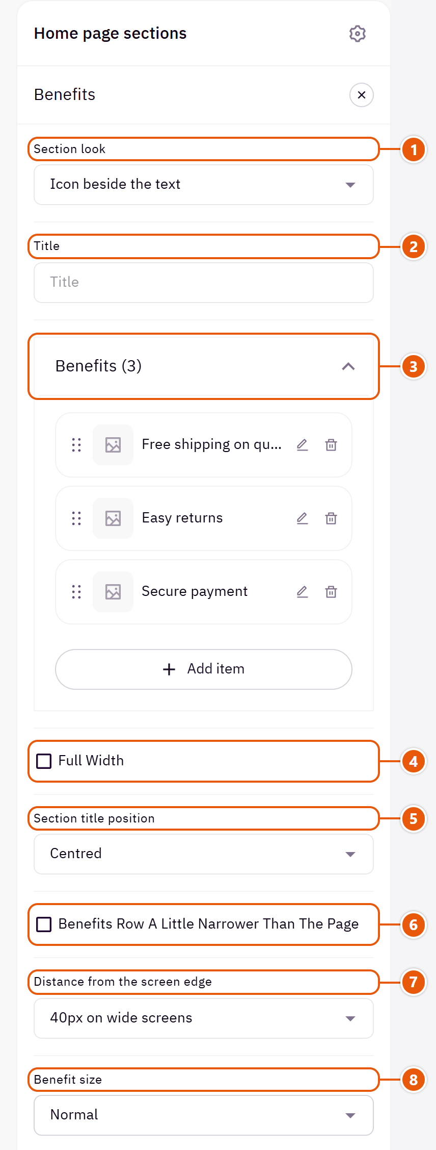
- 1“Section look”
Your benefits stay when you switch. - 2“Title”
The section's main heading; leave it empty for none. - 3“Benefits”Up to 8 items
- 4“Full width”
The content spans the whole screen instead of the page width. Good for banners and large pictures. - 5“Section title position”
Where the section title sits above the benefits. - 6“Benefits row a little narrower than the page”
Off: the row takes the page's full width. - 7“Distance from the screen edge”
“40px on wide screens” stretches the row to 40px from the screen's edge instead of the page's width. - 8“Benefit size”
“Small” for a light one-line row.Shown with “Icon beside the text”

- 1“Icon inside a circle”
Off: a small coloured icon and one line, the lightest look.Shown with “Icon beside the text” - 2“Lines between the benefits on a computer”
Spreads the benefits across the row with lines between them, from 1200px screens. Not used with the frame.Shown with “Icon beside the text” - 3“A frame round them, the title on its line”
A rounded box round the benefits, with the section title set into its top line. - 4“Benefit names in capitals”
Affects English letters only. - 5“Benefit names font”
“The text font” sets the benefit names in the body font instead of the headings font. - 6“Benefit names weight”
“As the Look” follows “Headings weight” in “Look”. - 7“A thin line above the section”
Turn it off when the section sits right under a banner and needs no divider. - 8“A thin line below the section”
A divider between the row and the section below, like the line above the section.
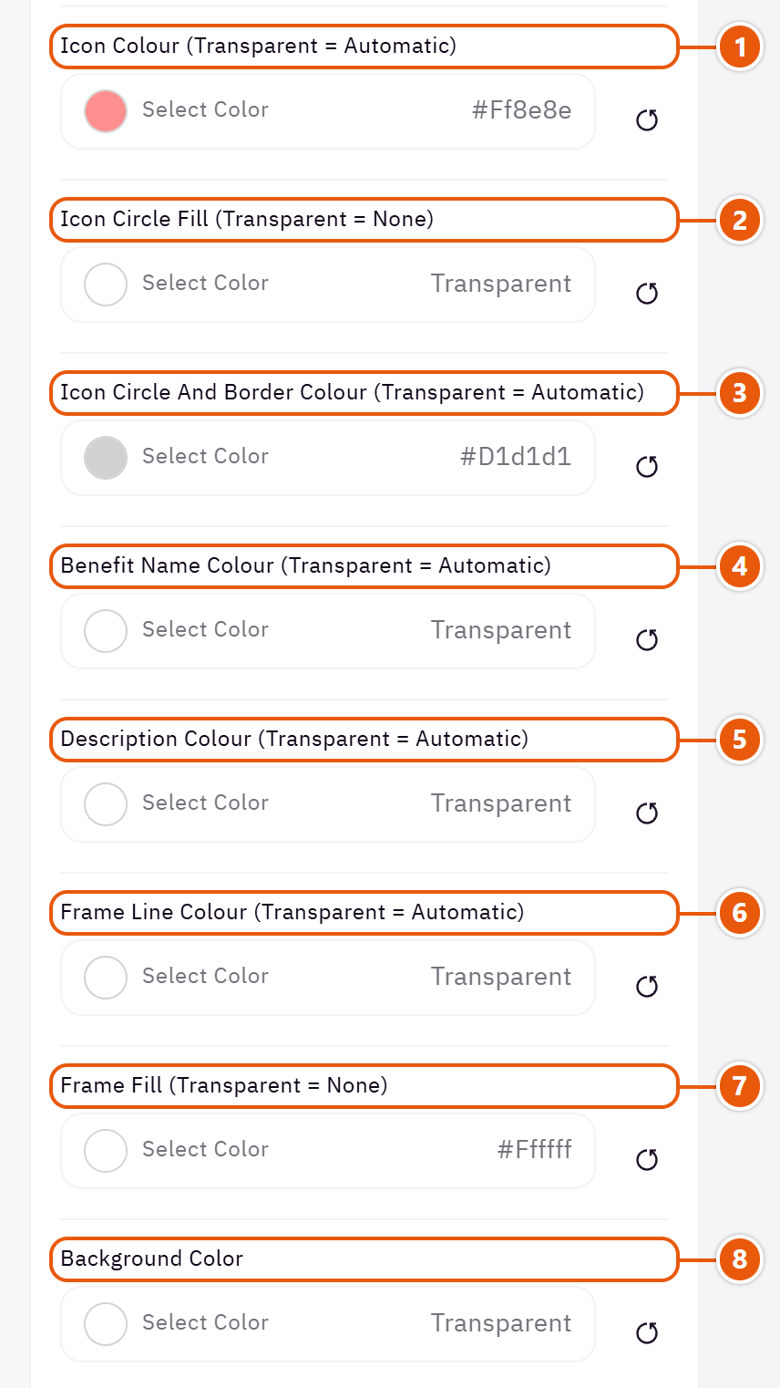
- 1“Icon colour (transparent = automatic)”
The ready-made icons' colour. - 2“Icon circle fill (transparent = none)”
A fill for the circle round the icon. - 3“Icon circle and border colour (transparent = automatic)”
The colour of the icon circles and card borders. - 4“Benefit name colour (transparent = automatic)”
The section title's colour, and in some sections the words around it, as the field's name says. Transparent keeps the theme's colour. - 5“Description colour (transparent = automatic)”
The short line under each benefit. - 6“Frame line colour (transparent = automatic)”
The frame's line. Empty: the circle colour.Shown when “A frame round them, the title on its line” is on - 7“Frame fill (transparent = none)”
A fill inside the frame.Shown when “A frame round them, the title on its line” is on - 8“Background color”
A colour behind the whole section to set it apart. Transparent takes the page colour.
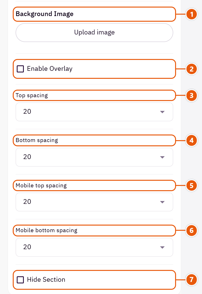
- 1“Background image”
A picture behind the whole section, cropped to fit; choose a calm one about 1920 wide. - 2“Enable overlay”
A see-through colour layer over the background or picture so the words read. - 3“Top spacing”
“Default” keeps the chosen design's space, “00” removes it, the rest are pixels. - 4“Bottom spacing”
Like “Top spacing”, below the section. - 5“Mobile top spacing”
On “Default” phones use the “Top spacing” number. - 6“Mobile bottom spacing”
On “Default” phones use the “Bottom spacing” number. - 7“Hide section”
Hides the section without deleting it; its content is kept. Handy for a seasonal offer.
Inside each item of “Benefits” (press the pencil beside it)
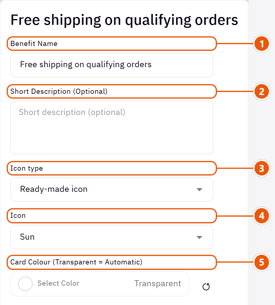
- 1“Benefit name”
Two or three words, such as “Free shipping”. - 2“Short description (optional)”
Such as “On every order over 200 SAR”. - 3“Icon type”
“Your own picture” for your brand's icons. - 4“Icon”
Pick the closest, such as “Shipping box” for delivery and “Shield” for a guarantee.Shown when “Icon type” is “Ready-made icon” - 5“Card colour (transparent = automatic)”
A benefit given a colour becomes a coloured card in any look.
The other settings
- Card style: “Coloured card (each benefit sets its colour)” takes each card's colour from “Card colour (transparent = automatic)” inside the benefit.Shown with “Icon above the text”
- Benefits
- Icon picture (square): Shown in the icon's place.Shown when “Icon type” is “Your own picture”
Plus the options in "Options every section shares", in the Home page sections chapter, except "Background picture stays still on scroll".
Tips
- Three or four benefits fit one row on a computer.
The questions your shoppers ask most, in a list that opens one at a time, beside a title, a description and two buttons. It cuts down repeat questions to your support.

Section design

Words and buttons on one side, the questions on a card on the other; stacked on phones.
Step by step
- In “Questions” press “Add item”.
- Write the “Question” and the “Answer”.
- Write the “Title”, “Description” and buttons if you like, then publish.
Where to find its settings

- 1“Section design”
One look today; your questions are kept. - 2“Title”
The section's main heading; leave it empty for none. - 3“Description”
A line or two under the title, such as “Can't find your answer? Talk to us”. - 4“Questions”Up to 12 items
- 5“First button text (empty: no button)”
Such as “Contact us”. - 6“First button link”
The page the first button opens. - 7“Second button text, white (empty: no button)”
A white button under the first, such as “All questions”. - 8“Second button link”
The page the second button opens.
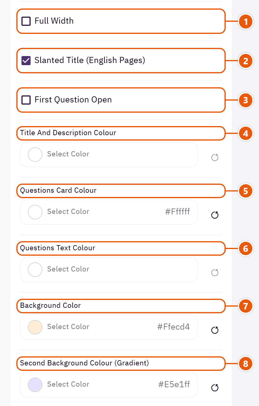
- 1“Full width”
The content spans the whole screen instead of the page width. Good for banners and large pictures. - 2“Slanted title (English pages)”
English only; Arabic has no slanted letters. - 3“First question open”
The first question shows open, so visitors see the questions open. - 4“Title and description colour”
The title and description beside the questions. - 5“Questions card colour”
The card holding the questions. - 6“Questions text colour”
The questions and answers. - 7“Background color”
A colour behind the whole section to set it apart. Transparent takes the page colour. - 8“Second background colour (gradient)”
With “Background color” it makes a gradient from one to the other.
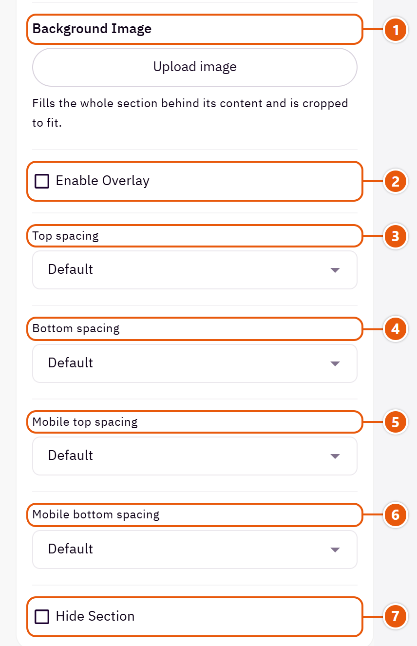
- 1“Background image”
A picture behind the whole section, cropped to fit; choose a calm one about 1920 wide. - 2“Enable overlay”
A see-through colour layer over the background or picture so the words read. - 3“Top spacing”
“Default” keeps the chosen design's space, “00” removes it, the rest are pixels. - 4“Bottom spacing”
Like “Top spacing”, below the section. - 5“Mobile top spacing”
On “Default” phones use the “Top spacing” number. - 6“Mobile bottom spacing”
On “Default” phones use the “Bottom spacing” number. - 7“Hide section”
Hides the section without deleting it; its content is kept. Handy for a seasonal offer.
Inside each item of “Questions” (press the pencil beside it)
- 1“Question”
Write it the way a shopper asks it. - 2“Answer”
A short, clear answer. A question with no answer is not shown.
Plus the options in "Options every section shares", in the Home page sections chapter, except "Title colour (transparent = automatic)", "Background picture stays still on scroll".
Tips
- Five to eight questions are enough: shipping, returns, payment, sizes.
Your latest blog posts in sliding cards: the picture, the post's category, its date, title, a summary and “Read more”. It fetches the posts from your Zid store blog by itself, or shows posts you write here.

Section design

A centred title over the post cards: 3 at a time on computers, 2 on tablets, one on phones.
Step by step
- Switch the blog on in your Zid dashboard and publish posts with pictures.
- In the section keep “Posts source” on “Automatic, from the store blog” and choose the “Number of posts”.
- Write the “Title” and the “All posts” button text.
- Publish.
Where to find its settings
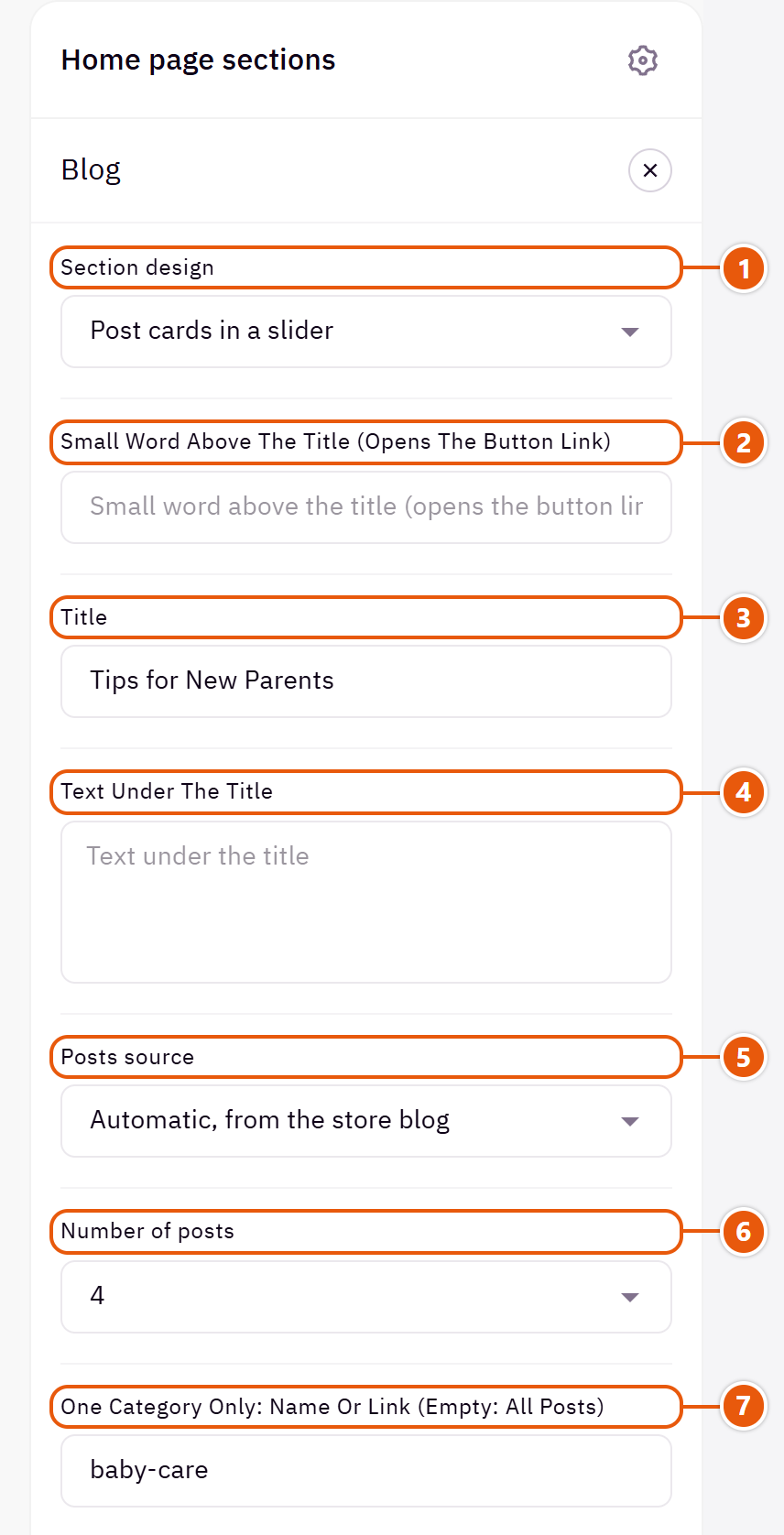
- 1“Section design”
One look today; your posts and settings are kept. - 2“Small word above the title (opens the button link)”
A small button above the title, such as “Blog”, opening the same link as the button. - 3“Title”
The section's main heading; leave it empty for none. - 4“Text under the title”
A line telling visitors what the blog offers. - 5“Posts source”
“Automatic, from the store blog” shows your latest published posts and updates itself; it needs the blog switched on in Zid. With the blog off, it shows the posts you wrote here. - 6“Number of posts”
How many posts to fetch from the blog.Shown when “Posts source” is “Automatic, from the store blog” - 7“One category only: name or link (empty: all posts)”
Easiest is to paste the category's link from your store blog (after clicking it). Empty: all posts.Shown when “Posts source” is “Automatic, from the store blog”
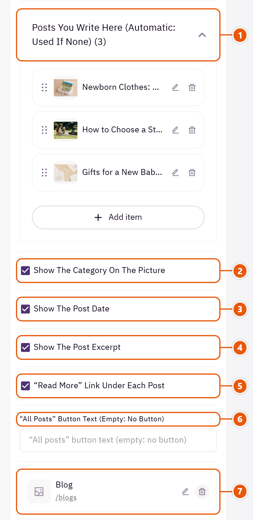
- 1“Posts you write here (automatic: used if none)”Up to 12 items
- 2“Show the category on the picture”
Turn it off if your posts have no categories. - 3“Show the post date”
The date above the post title. - 4“Show the post excerpt”
Two lines of the post under its title. - 5““Read more” link under each post”
A small link opening the post. - 6““All posts” button text (empty: no button)”
A button under the cards, such as “All posts”. - 7“Link of the button and the small word”
Starts on the blog page; with one category chosen and this left as is, it opens that category.
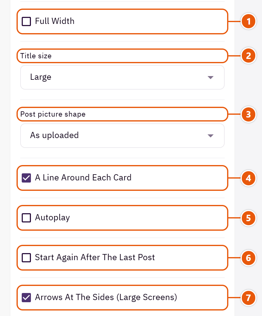
- 1“Full width”
The content spans the whole screen instead of the page width. Good for banners and large pictures. - 2“Title size”
The section title's size. - 3“Post picture shape”
A fixed shape crops every picture alike so the cards line up. - 4“A line around each card”
Turn it off for borderless cards on a coloured ground. - 5“Autoplay”
Pauses under the mouse. - 6“Start again after the last post”
Instead of stopping at the last post. - 7“Arrows at the sides (large screens)”
On screens 1200px and wider; phones swipe.
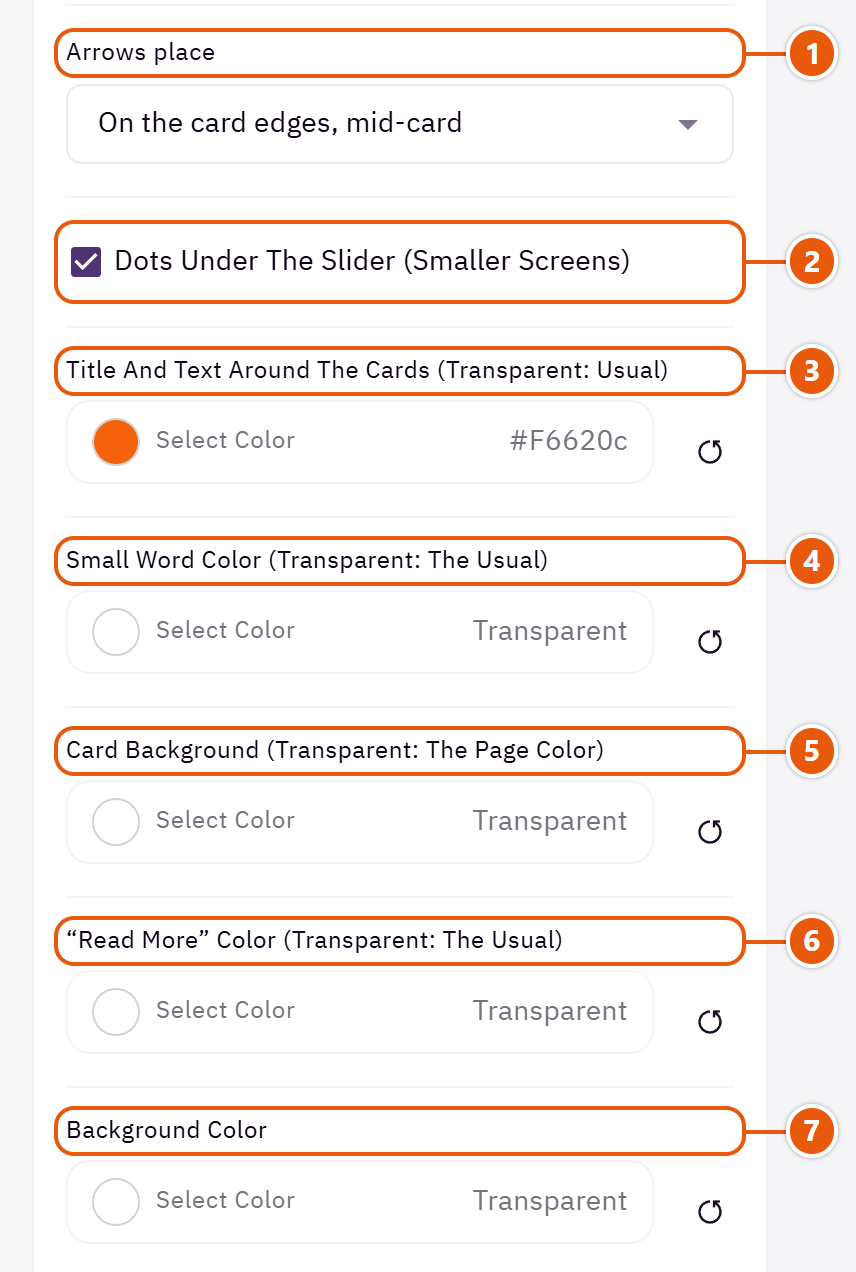
- 1“Arrows place”
“Inside the cards, on hover” is the quietest.Shown when “Arrows at the sides (large screens)” is on - 2“Dots under the slider (smaller screens)”
Below 1200px only, and hidden when every post is in view. - 3“Title and text around the cards (transparent: usual)”
The section title's colour, and in some sections the words around it, as the field's name says. Transparent keeps the theme's colour. - 4“Small word color (transparent: the usual)”
The small button above the title. - 5“Card background (transparent: the page color)”
Each card's background. - 6““Read more” color (transparent: the usual)”
The “Read more” link's colour. - 7“Background color”
A colour behind the whole section to set it apart. Transparent takes the page colour.
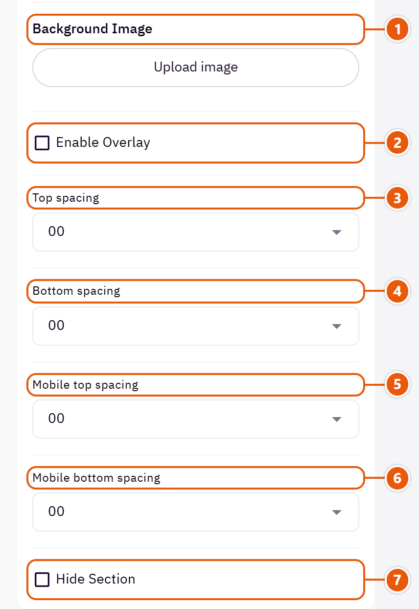
- 1“Background image”
A picture behind the whole section, cropped to fit; choose a calm one about 1920 wide. - 2“Enable overlay”
A see-through colour layer over the background or picture so the words read. - 3“Top spacing”
“Default” keeps the chosen design's space, “00” removes it, the rest are pixels. - 4“Bottom spacing”
Like “Top spacing”, below the section. - 5“Mobile top spacing”
On “Default” phones use the “Top spacing” number. - 6“Mobile bottom spacing”
On “Default” phones use the “Bottom spacing” number. - 7“Hide section”
Hides the section without deleting it; its content is kept. Handy for a seasonal offer.
Inside each item of “Posts you write here (automatic: used if none)” (press the pencil beside it)
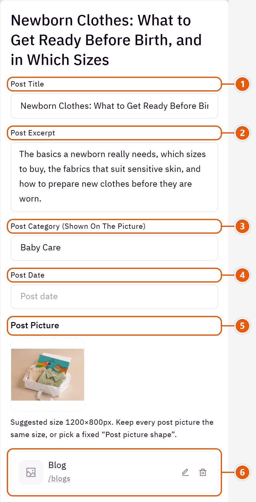
- 1“Post title”
Needed for the post to show. - 2“Post excerpt”
A sentence or two inviting a read. - 3“Post category (shown on the picture)”
A word on the picture's corner, such as “Tips”. - 4“Post date”
Shown as you type it, such as “12 September 2026”. - 5“Post picture”
Without one the card keeps a tidy picture space. - 6“Post link (empty: the blog page)”
The post's page on your blog.
The other settings
- Time per slide (1000 = 1 second): 5000 is 5 seconds.Shown when “Autoplay” is on
Plus the options in "Options every section shares", in the Home page sections chapter, except "Background picture stays still on scroll".
Tips
- A post on your Zid blog shows here with its picture, category, date and summary by itself.
- With no published posts and none written here, the section hides.
A strip of square photos in the Instagram style; each can open the product or category it shows, and a round button in the middle can lead to your social account.

Step by step
- In “Photos” press “Add item” and upload the “Photo”.
- Write the “Photo name (for search and screen readers)” and pick the “Link (a product or category, optional)”.
- Put your account link in “Your account link (a round button over the photos)”, then publish.
Where to find its settings
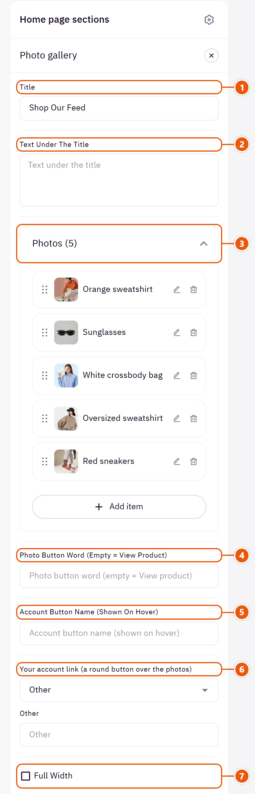
- 1“Title”
The section's main heading; leave it empty for none. - 2“Text under the title”
Such as “Follow us on Instagram”. - 3“Photos”Up to 20 items
- 4“Photo button word (empty = View product)”
The word shown when the mouse is on a photo's button. - 5“Account button name (shown on hover)”
Such as “@yourstore”. - 6“Your account link (a round button over the photos)”
Empty: no button. - 7“Full width”
The content spans the whole screen instead of the page width. Good for banners and large pictures.
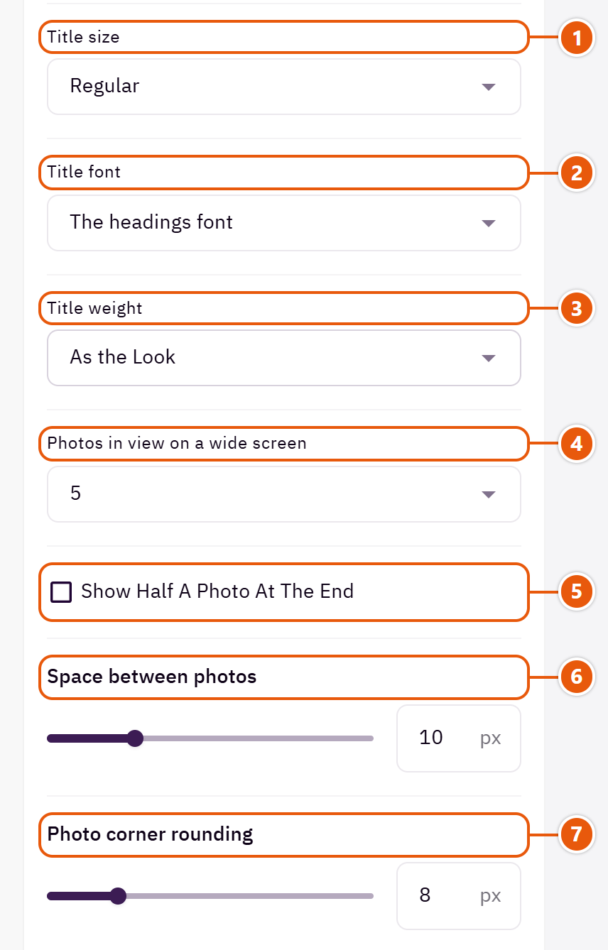
- 1“Title size”
The section title's size. - 2“Title font”
“The text font” sets the section title in the body font instead of the headings font. - 3“Title weight”
“As the Look” follows “Headings weight” in “Look”. - 4“Photos in view on a wide screen”
On wide screens; phones show two. - 5“Show half a photo at the end”
Shows half a photo at the end, hinting there are more. - 6“Space between photos”
Zero: the photos touch. - 7“Photo corner rounding”
Zero: square corners.

- 1“Autoplay”
The photos slide by themselves. - 2“Loop back to the first”
Instead of stopping at the last photo. - 3“Arrows at the sides”
Two arrows beside the strip. - 4“Dots (under 1200px)”
On screens below 1200px. - 5“Title and text colour (transparent = automatic)”
The title and the line under it. - 6“Background color”
A colour behind the whole section to set it apart. Transparent takes the page colour. - 7“Background image”
A picture behind the whole section, cropped to fit; choose a calm one about 1920 wide.
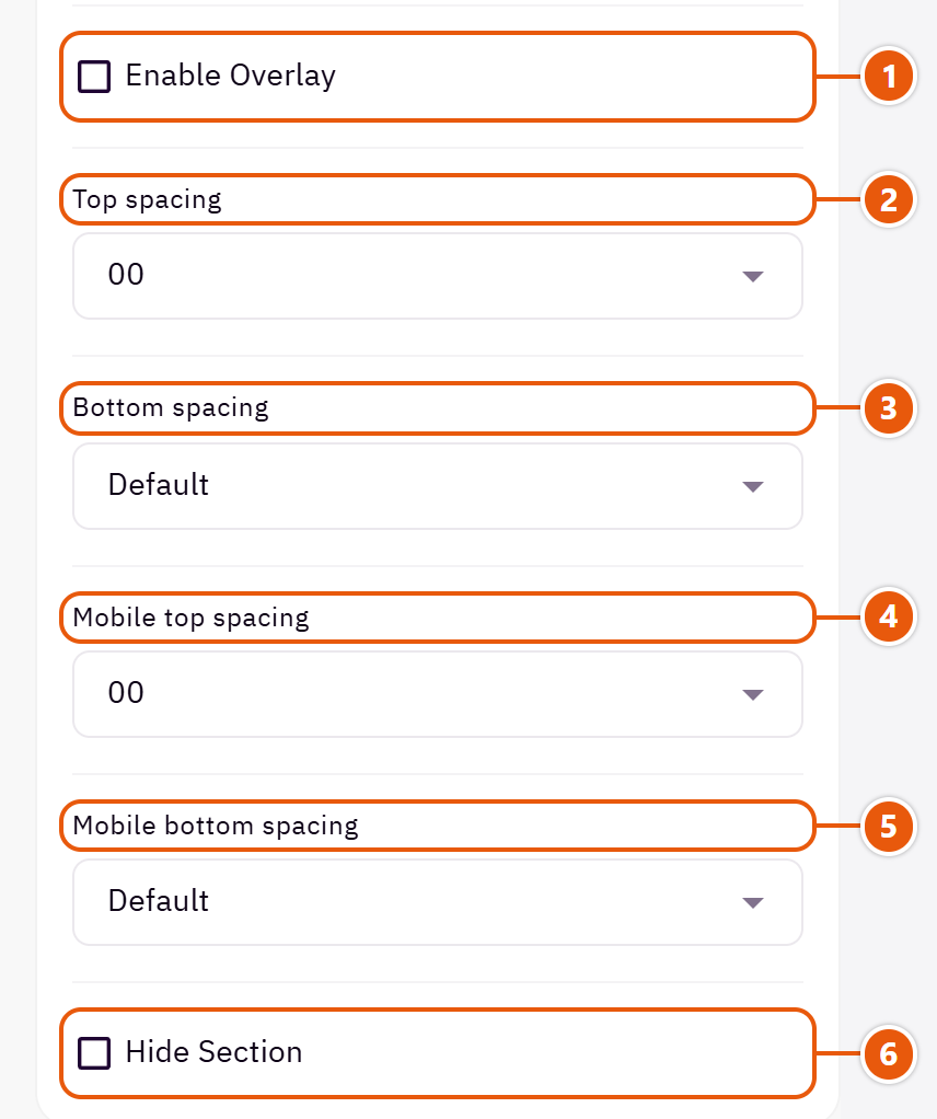
- 1“Enable overlay”
A see-through colour layer over the background or picture so the words read. - 2“Top spacing”
“Default” keeps the chosen design's space, “00” removes it, the rest are pixels. - 3“Bottom spacing”
Like “Top spacing”, below the section. - 4“Mobile top spacing”
On “Default” phones use the “Top spacing” number. - 5“Mobile bottom spacing”
On “Default” phones use the “Bottom spacing” number. - 6“Hide section”
Hides the section without deleting it; its content is kept. Handy for a seasonal offer.
Inside each item of “Photos” (press the pencil beside it)
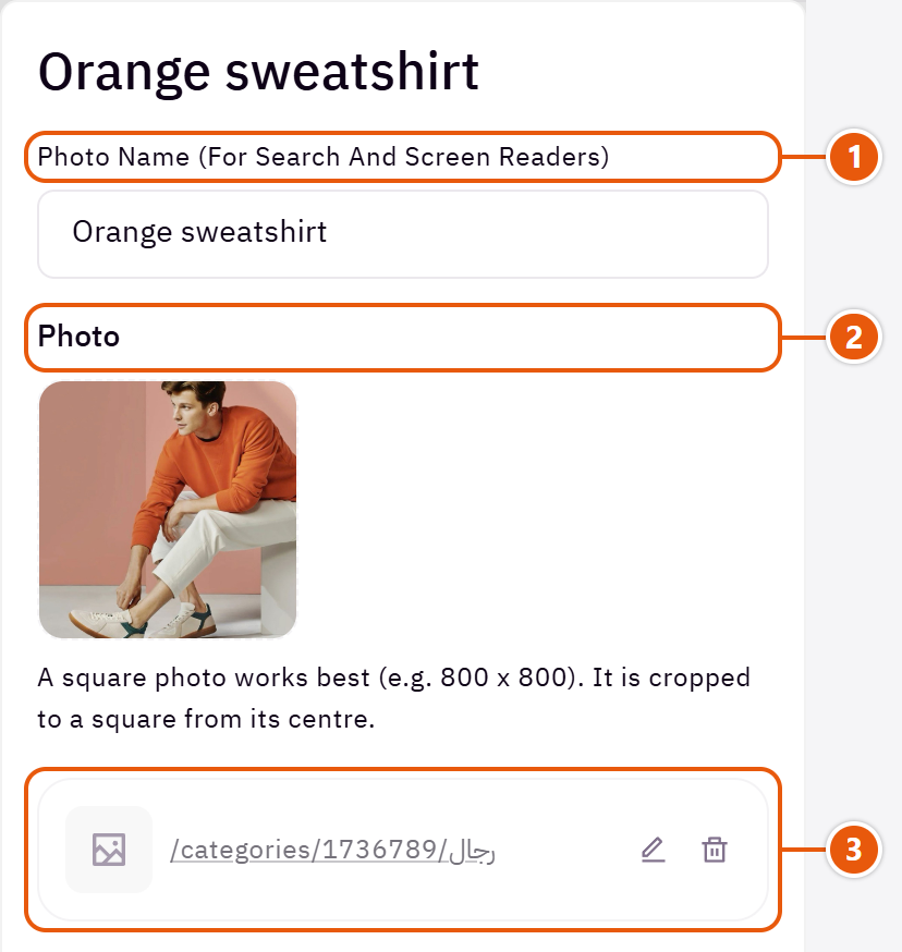
- 1“Photo name (for search and screen readers)”
A few words describing the photo. Not shown on the page. - 2“Photo”
A row with no photo is left out. - 3“Link (a product or category, optional)”
A photo with a link gets a small shop button; one without is just a picture.
The other settings
- Time per slide: 5000 is 5 seconds.Shown when “Autoplay” is on
Plus the options in "Options every section shares", in the Home page sections chapter, except "Title colour (transparent = automatic)", "Background picture stays still on scroll".
Tips
- Square photos about 800 x 800; any other shape is cropped to a square from its centre.
Your store's contact details: address, phone, email and opening hours, over a map or beside a picture, with a directions button. Any empty field takes your store's details from Zid.

Design

A section-wide Google map with the details card on it. For a shop people visit.

A coloured card with the details and a button, beside a picture. When you need no map.
Step by step
- Choose the “Design”.
- Leave address, phone and email empty to take your Zid store details, or type them.
- Write the “Opening hours (one line each)”.
- Write the “Button text”, then publish.
Where to find its settings
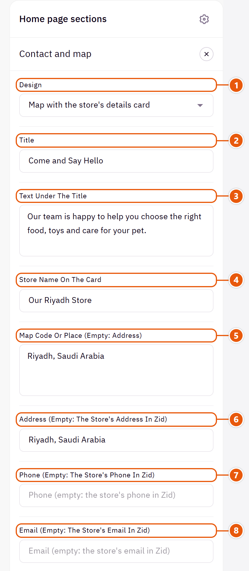
- 1“Design”
Your details stay when you switch. - 2“Title”
The section's main heading; leave it empty for none. - 3“Text under the title”
A line under the title, above the map.Shown with “Map with the store's details card” - 4“Store name on the card”
The card's first line, such as the branch name.Shown with “Map with the store's details card” - 5“Map code or place (empty: address)”
In Google Maps: “Share”, then “Embed a map”, and copy the code. Or type the place's name. A short share link does not work in the map.Shown with “Map with the store's details card” - 6“Address (empty: the store's address in Zid)”
Type it for an address other than the one in Zid. - 7“Phone (empty: the store's phone in Zid)”
It becomes a link the shopper taps to call. - 8“Email (empty: the store's email in Zid)”
It becomes a link that opens a new email.
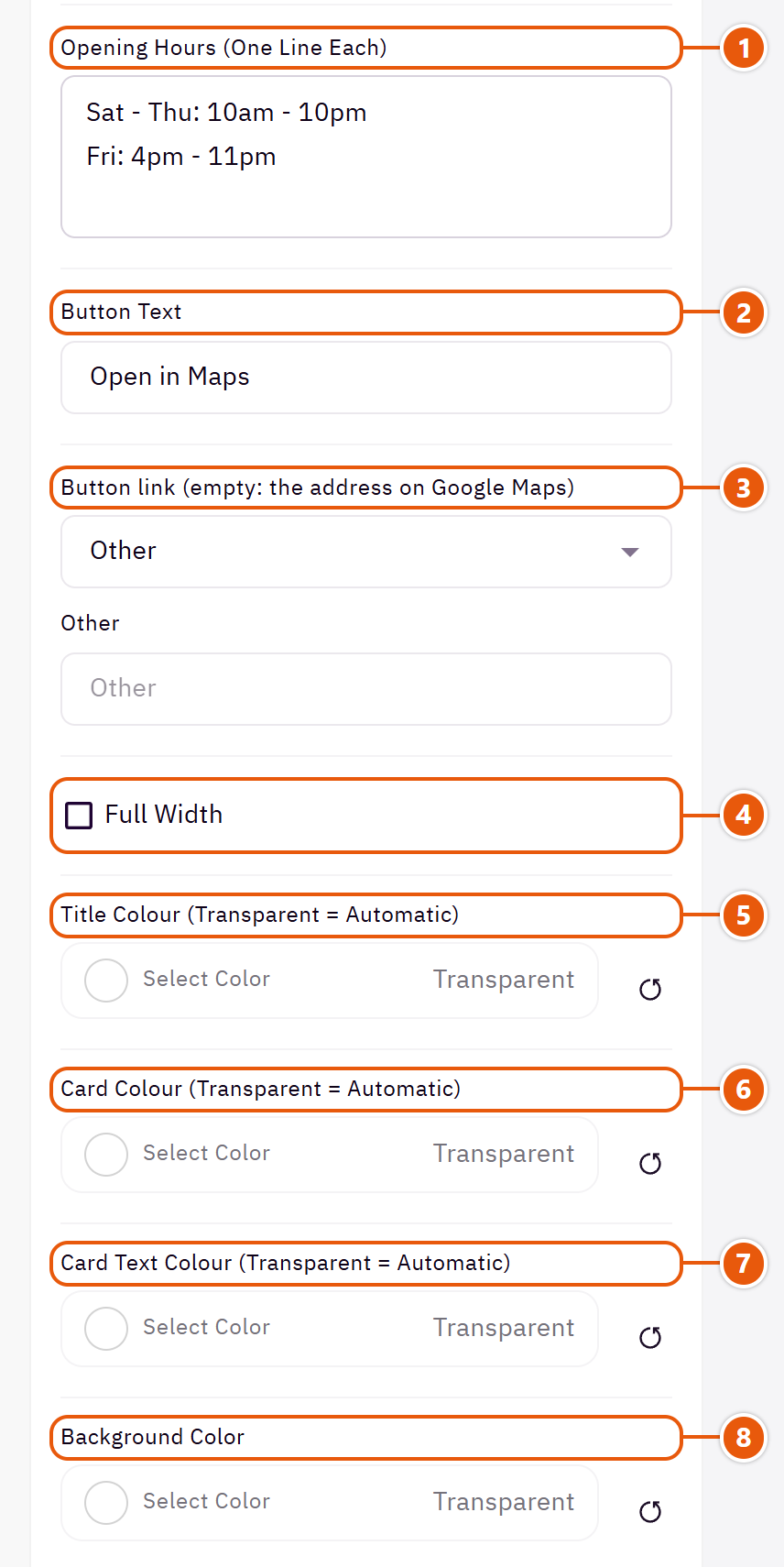
- 1“Opening hours (one line each)”
Such as “Sat - Thu: 9am - 10pm”. - 2“Button text”
Such as “Get directions”. Empty: no button. - 3“Button link (empty: the address on Google Maps)”
Empty: the button opens the address on Google Maps. - 4“Full width”
The content spans the whole screen instead of the page width. Good for banners and large pictures. - 5“Title colour (transparent = automatic)”
The section title's colour, and in some sections the words around it, as the field's name says. Transparent keeps the theme's colour. - 6“Card colour (transparent = automatic)”
The details card's colour. - 7“Card text colour (transparent = automatic)”
Transparent: white on a dark card, otherwise the design's own. - 8“Background color”
A colour behind the whole section to set it apart. Transparent takes the page colour.
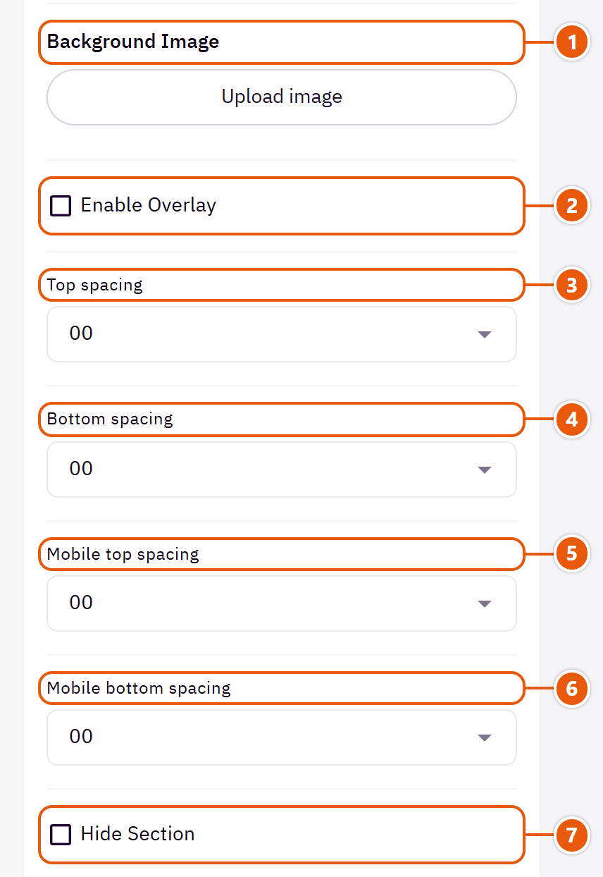
- 1“Background image”
A picture behind the whole section, cropped to fit; choose a calm one about 1920 wide. - 2“Enable overlay”
A see-through colour layer over the background or picture so the words read. - 3“Top spacing”
“Default” keeps the chosen design's space, “00” removes it, the rest are pixels. - 4“Bottom spacing”
Like “Top spacing”, below the section. - 5“Mobile top spacing”
On “Default” phones use the “Top spacing” number. - 6“Mobile bottom spacing”
On “Default” phones use the “Bottom spacing” number. - 7“Hide section”
Hides the section without deleting it; its content is kept. Handy for a seasonal offer.
The other settings
- Text on the card under the title: A line or two on the card above the details.Shown with “Details card beside a picture”
- Picture: A photo of your shop or team.Shown with “Details card beside a picture”
Plus the options in "Options every section shares", in the Home page sections chapter, except "Background picture stays still on scroll".
Tips
- Update your store details once in Zid and the section follows.
A title and plain lines of text, with no pictures. For a welcome, your store's story, or an important note between two sections.

Step by step
- Write the “Title”.
- In “Messages” press “Add item” and write the “Text”, with a heading for the line if you like.
- Publish.
Settings
- Messages
- Line heading (optional): Bold words at the start of the line, such as “Free shipping:”.
- Text: The words themselves; a line shows when it has a heading or text.
Plus the options in "Options every section shares", in the Home page sections chapter, except "Title colour (transparent = automatic)", "Background picture stays still on scroll".
Product page and cart
The product page, the cart page and the cart drawer: photo layout and zoom, colour and size pickers, the size guide, the fixed add-to-cart bar, the free-shipping bar and the discount code. All in “Page settings”, for every product at once.
Every product's page: the photo layout and zoom, how colour and size are picked, the description and tabs, the fixed add-to-cart bar, the size guide, shipping and returns rows, and related products. These settings apply to every product.

- 1“Product images layout”
In “One column, product info stays beside it” the photos stack and the info stays beside them as you scroll. - 2“Show the brand above the product name”
Shows only for a product with a brand, linking to its page. Turn it off if every product is your own brand. - 3“Variant picker style”
The picture styles use each choice's image from Zid, the circles show the real colour, and “Dropdown” is the simplest. - 4“Show the “Size guide” button”
A button by the sizes that opens a window with the chart. - 5“Show the SKU and categories”
The SKU and categories under the button. - 6“Info rows under the button (shipping, returns)”Up to 6 items
Step by step
- Open “Page settings”, then “Product page”.
- Choose the “Product images layout” and “Image zoom”.
- Choose the “Variant picker style”.
- Add “Info rows under the button (shipping, returns)”, then publish.
Where to find its settings
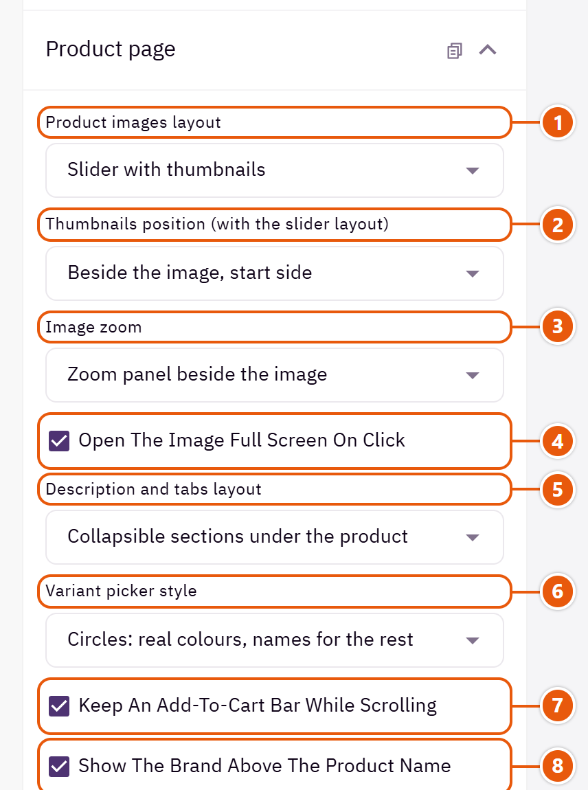
- 1“Product images layout”
- 2“Thumbnails position (with the slider layout)”
On phones the thumbnails always sit below.Shown when “Product images layout” is “Slider with thumbnails” - 3“Image zoom”
On computers, when the mouse is on the photo. - 4“Open the image full screen on click”
A tap opens the photo large, and the shopper can flip through them. - 5“Description and tabs layout”
How the description, reviews, questions and extra tabs are shown. - 6“Variant picker style”
- 7“Keep an add-to-cart bar while scrolling”
Once the shopper scrolls past the add button, a small bar with the price and button stays at the bottom. - 8“Show the brand above the product name”
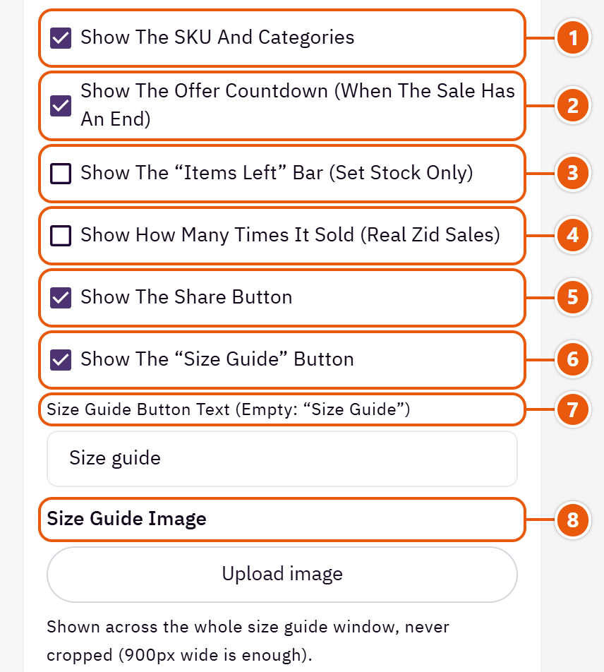
- 1“Show the SKU and categories”
- 2“Show the offer countdown (when the sale has an end)”
Counts to the sale end set on the product in Zid. - 3“Show the “items left” bar (set stock only)”
A bar with the quantity left, for products with a set stock in Zid. - 4“Show how many times it sold (real Zid sales)”
Shows the real sales count from Zid, never a made-up number. - 5“Show the share button”
A button opening social sharing and copy link. - 6“Show the “Size guide” button”
- 7“Size guide button text (empty: “Size guide”)”
The words on the size guide button.Shown when “Show the “Size guide” button” is on - 8“Size guide image”
A picture of your size chart.Shown when “Show the “Size guide” button” is on
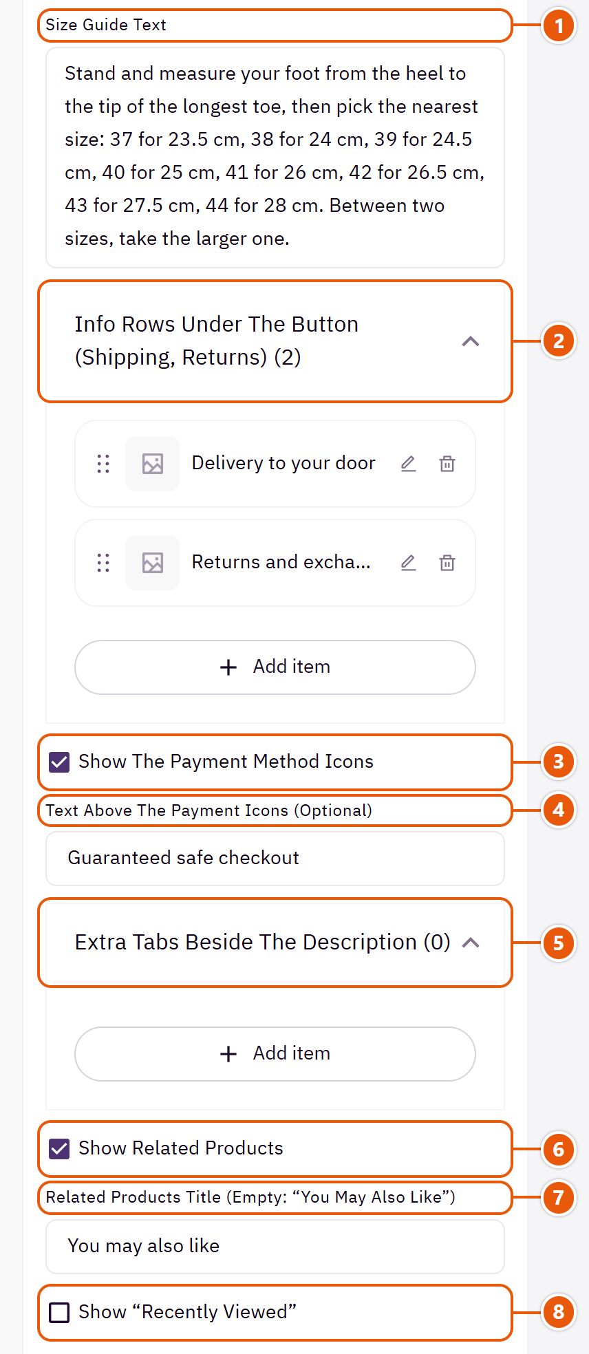
- 1“Size guide text”
Text under the picture, such as how to measure.Shown when “Show the “Size guide” button” is on - 2“Info rows under the button (shipping, returns)”
- 3“Show the payment method icons”
The icons of the payment methods on in your store. - 4“Text above the payment icons (optional)”
A line above the icons.Shown when “Show the payment method icons” is on - 5“Extra tabs beside the description”Up to 6 items
- 6“Show related products”
A “You may also like” row under the product, from the related products Zid picks. - 7“Related products title (empty: “You may also like”)”
The related products row's title.Shown when “Show related products” is on - 8“Show “Recently viewed””
Products the shopper opened before on the same device.
The other settings
- Info rows under the button (shipping, returns)
- Row text: Such as “Free shipping over 200 SAR”.
- Icon: Pick the closest to the row.
- Extra tabs beside the description
- Tab name: Such as “How to use”.
- Tab content: The same text shows on every product.
Tips
- Each choice's picture (such as each colour) is uploaded on the product in Zid; the theme shows it by itself.
The cart page: the free-shipping bar, the discount code field, payment icons, and customer quotes beside the total to reassure the shopper before paying.

Where to find its settings
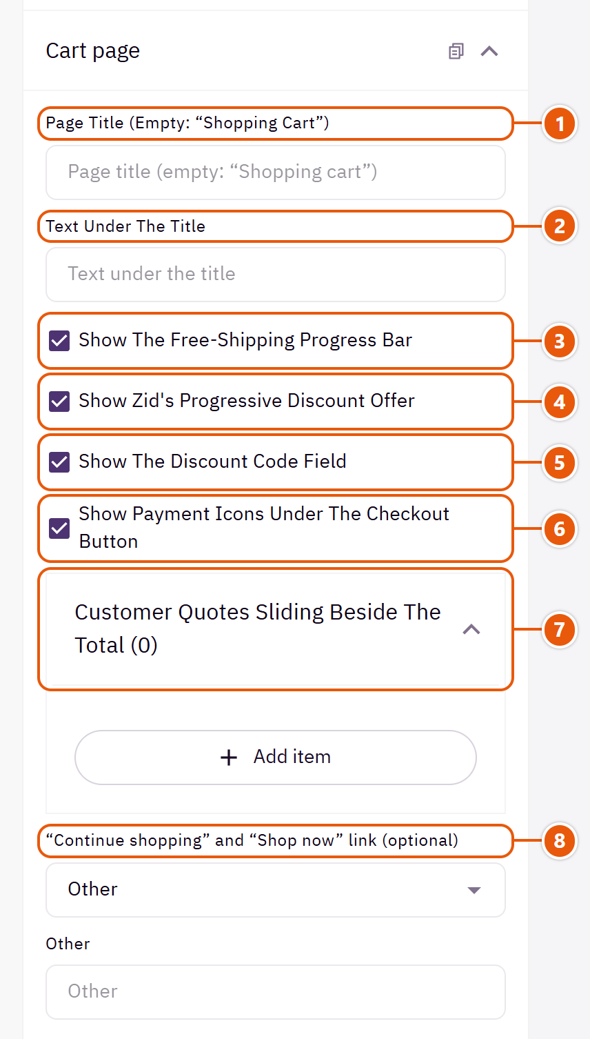
- 1“Page title (empty: “Shopping cart”)”
The cart page title. - 2“Text under the title”
Such as “Check your order before paying”. Empty: no line. - 3“Show the free-shipping progress bar”
Tells the shopper how much is left for free shipping; needs a free-shipping rule in Zid. - 4“Show Zid's progressive discount offer”
Shows when Zid's progressive discount is on. - 5“Show the discount code field”
A field for the shopper's coupon. - 6“Show payment icons under the checkout button”
The payment methods on in your store. - 7“Customer quotes sliding beside the total”Up to 6 items
- 8““Continue shopping” and “Shop now” link (optional)”
Empty: “Or continue shopping” goes home, and the empty cart's “Shop now” goes to the products.
The other settings
- Customer quotes sliding beside the total
- Customer name: Who said it.
- Customer picture (optional): A small round picture by the name.
- What the customer said: A short line from a real review.
- Rating: From 1 to 5 stars.
The cart that slides in from the side once a product is added: the items and their quantities, the free-shipping bar, a discount code, gifting, the totals, the checkout button and “You may also like”. Shoppers keep browsing without leaving the page.

Where to find its settings
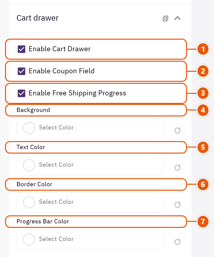
- 1“Enable cart drawer”
Off: the cart icon goes straight to the cart page. - 2“Enable coupon field”
Shoppers enter a coupon in the drawer without going to the cart page. - 3“Enable free shipping progress”
Shows how much is left for free shipping and fills as items are added; needs a free-shipping rule in Zid. - 4“Background”
Empty takes the page background. - 5“Text color”
Names, prices and headings. - 6“Border color”
The lines between items and parts. - 7“Progress bar color”
The filled part of the free-shipping bar.
Footer
The bottom of every page, under “Footer” in the editor: “Footer” (3 designs), “About the store”, “Contact details”, “Social media”, the three link columns and “Newsletter”. It also shows your store's numbers (Business platform, VAT and commercial register), payment methods and store app links.
The footer under every page: the logo, link columns, contact, social, the newsletter, and a last row with the copyright and payment methods. Above it, a row of your store's numbers, each with its mark and name: “Business platform:”, “VAT number:” and “Commercial register:”, beside your store app links.

- 1“Business platform number (if not in your Zid store details)”
When your number is in your Zid store details, Zid's number shows and opens your certificate on the Business platform; one typed here shows without a link.Shown when “Show the VAT number, commercial register and Saudi Business Center” is on - 2“VAT number (if it isn't in your Zid store details)”
Type it if Zid does not show it.Shown when “Show the VAT number, commercial register and Saudi Business Center” is on - 3“Commercial register number (if not in your Zid store details)”
Zid does not send the register number to the store, so type it here to show it.Shown when “Show the VAT number, commercial register and Saudi Business Center” is on - 4“Show your store app links”
The App Store and Google Play badges. - 5“Show the payment method icons”
The icons of the payment methods on in your store. - 6“Copyright line (empty: “© Your store. All rights reserved.”)”
The copyright line at the bottom.
Footer design

A top row with the logo and social, then columns with lines between them. Can take a cloud edge on top.

Tidy and calm; suits beauty and jewellery.

Set in from the screen's edges. A modern, playful look, as for accessory shops.
Step by step
- Open “Footer”, then the “Footer” group, and choose the “Footer design”.
- Fill the links of “First column”, “Second column” and “Third column”.
- Check “Newsletter” and “Contact details”, then publish.
Where to find its settings
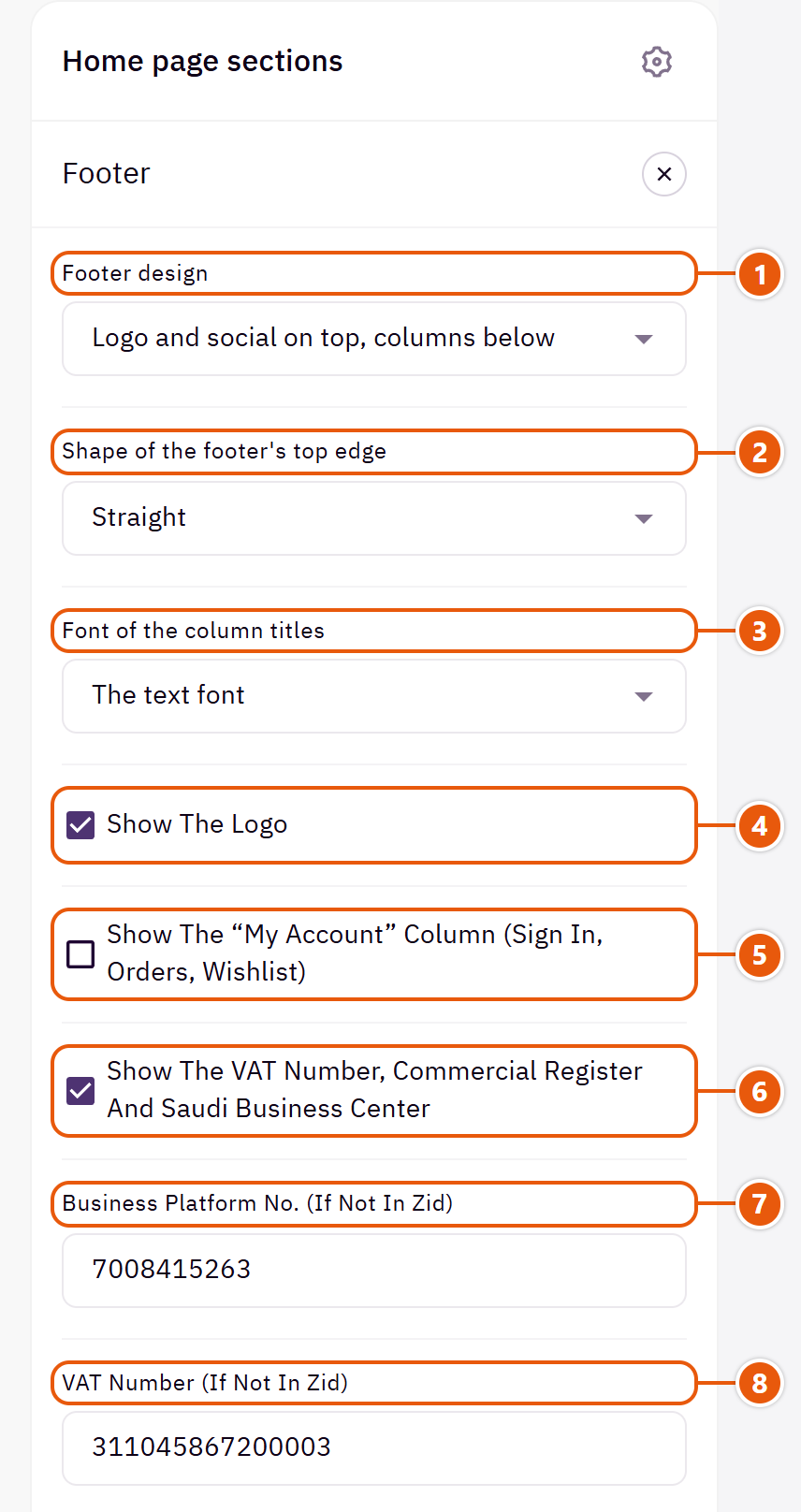
- 1“Footer design”
On phones the columns fold and open by tapping their titles. - 2“Shape of the footer's top edge”
“Clouds” draws clouds in the footer's colour above it. Suits baby stores.Shown with “Logo and social on top, columns below” - 3“Font of the column titles”
“The headings font” matches the page's headings; “The text font” is quieter; the slanted one shows on English pages only. - 4“Show the logo”
The header's logo in the footer; on a dark footer the light logo shows. - 5“Show the “My account” column (sign in, orders, wishlist)”
A column with sign in, orders and wishlist links. - 6“Show the VAT number, commercial register and Saudi Business Center”
Each number shows with its mark and name when it is in your Zid store details, or typed in the fields below. - 7“Business platform no. (if not in Zid)”
- 8“VAT number (if not in Zid)”
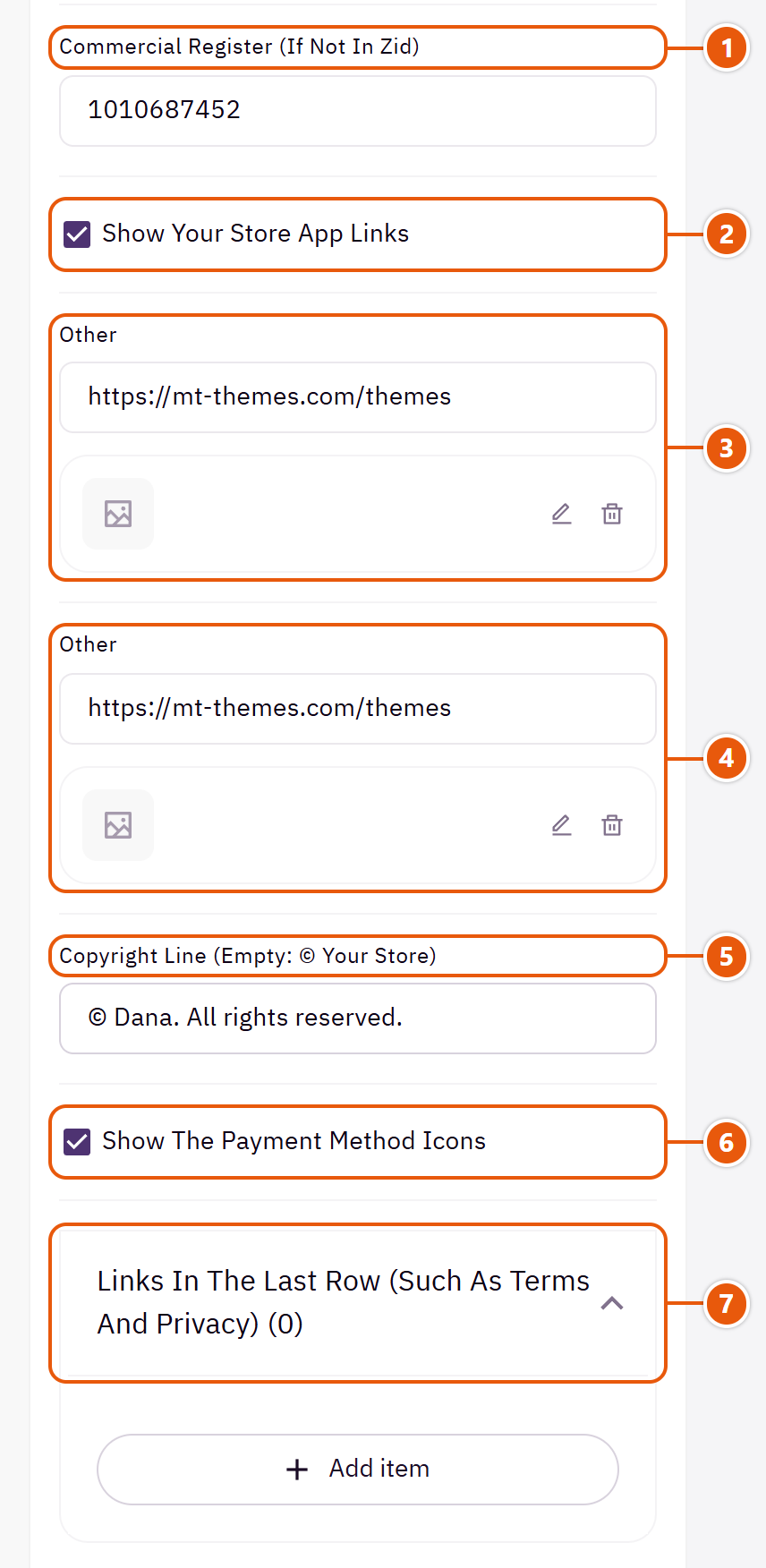
- 1“Commercial register (if not in Zid)”
- 2“Show your store app links”
- 3“Your App Store link (a Zid app's own link is used by itself)”
Put your app's link, or switch off “Show your store app links” if you have no app.Shown when “Show your store app links” is on - 4“Your Google Play link (a Zid app's own link is used by itself)”
Put your app's link, or switch off “Show your store app links” if you have no app.Shown when “Show your store app links” is on - 5“Copyright line (empty: © Your store)”
- 6“Show the payment method icons”
- 7“Links in the last row (such as terms and privacy)”Up to 4 items
The other settings
- Links in the last row (such as terms and privacy)
- Link text: Such as “Terms and conditions”.
- Link: The page the link opens.
- Show the country and currency button in the last row: Turn it off if you sell to one country in one currency.Shown with “The whole footer as a rounded card”
Tips
- The app links start on mt-themes.com so the badges show; change them to your app's links or switch them off.
- The designs put no numbers in the footer: your store's own from Zid, or the ones you type here, are the ones shown.
Beside the logo in the footer: a line about your store and a link under it.

Where to find its settings

- 1“Name if no logo (empty: store name)”
Shows only when “Show the logo” is off. - 2“A short line about the store (optional)”
A sentence or two about your store. - 3“Text of a link under that line (e.g. See our stores)”
Such as “See our stores”. - 4“Where that link goes”
The page the link opens.
The footer's contact column: address, phone and email from your Zid store details, with a “Get directions” link to the map.

Where to find its settings
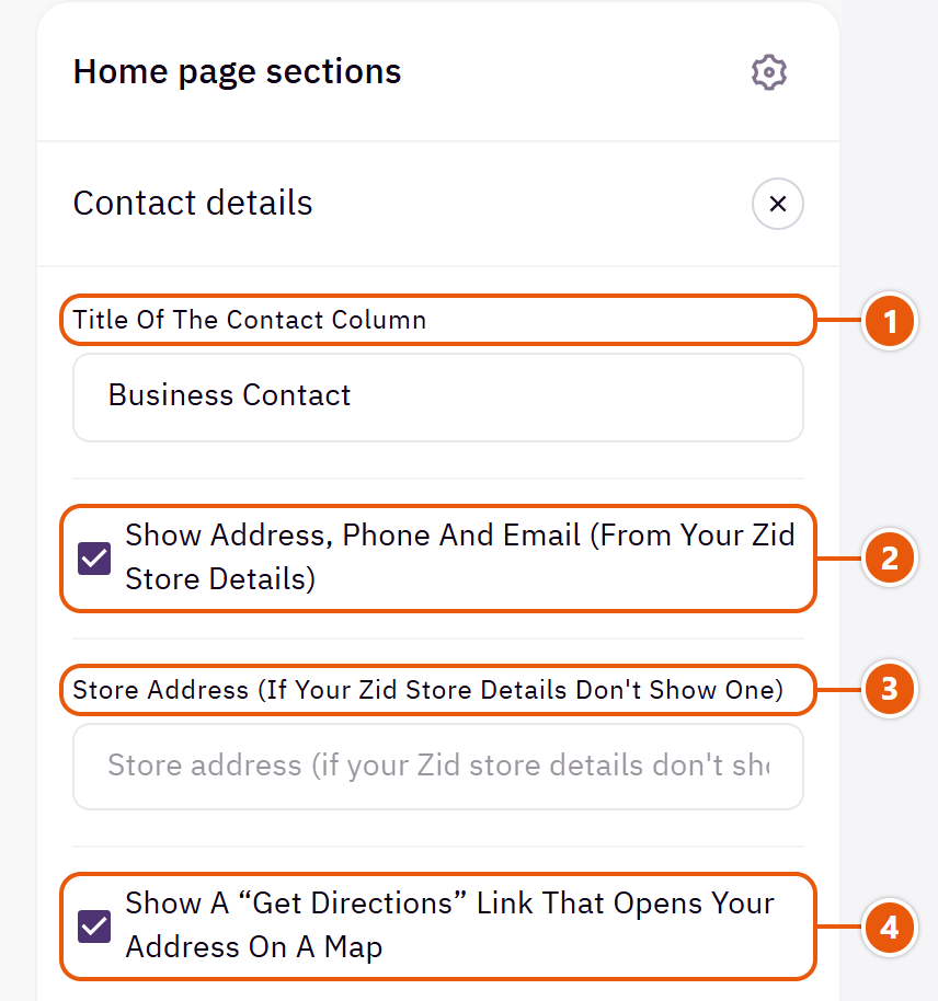
- 1“Title of the contact column”
Such as “Contact us” or “Visit us”. - 2“Show address, phone and email (from your Zid store details)”
Edit the details themselves in your Zid store details. - 3“Store address (if your Zid store details don't show one)”
Type it if Zid shows no address for your store.Shown when “Show address, phone and email (from your Zid store details)” is on - 4“Show a “Get directions” link that opens your address on a map”
Opens your address on Google Maps.Shown when “Show address, phone and email (from your Zid store details)” is on
Your social account icons in the footer, from your Zid store details. Add or change the accounts there.

Where to find its settings
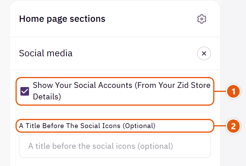
- 1“Show your social accounts (from your Zid store details)”
Off: no icons. - 2“A title before the social icons (optional)”
Such as “Follow us”.Shown when “Show your social accounts (from your Zid store details)” is on
The footer's first link column, such as “Shop” with your main categories. A column with no links does not show.

Where to find its settings
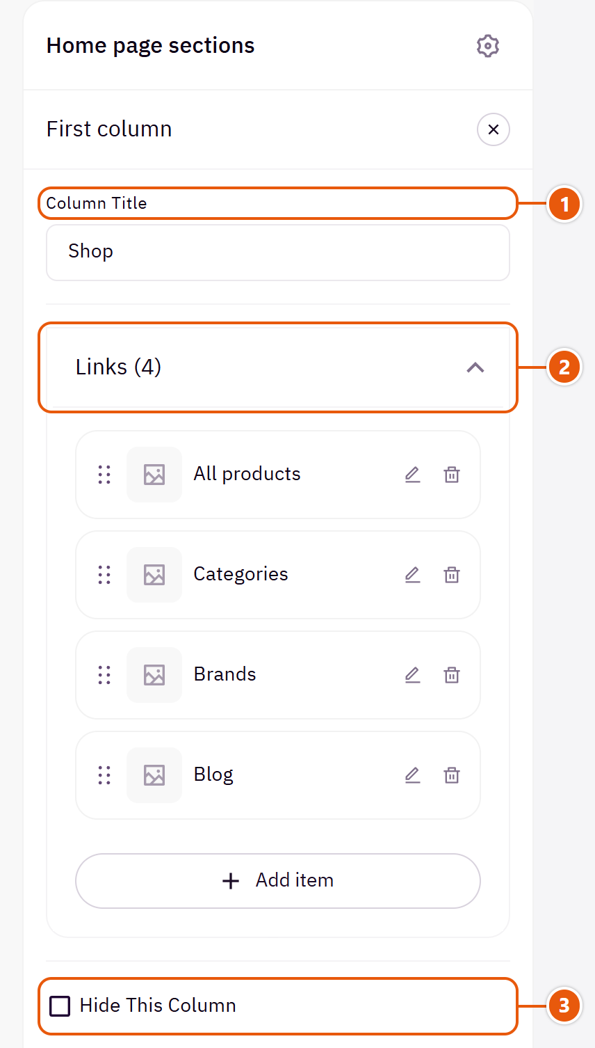
- 1“Column title”
On phones the column opens by tapping its title.Shown when “Hide this column” is off - 2“Links”Shown when “Hide this column” is offUp to 8 items
- 3“Hide this column”
Hides the column without deleting its links.
The other settings
- Links
- Link text: The words shown.
- Link: The page the link opens.
The second link column, such as “Help”: shipping, returns and FAQs.

Where to find its settings

- 1“Column title”
On phones the column opens by tapping its title.Shown when “Hide this column” is off - 2“Links”Shown when “Hide this column” is offUp to 8 items
- 3“Hide this column”
Hides the column without deleting its links.
The other settings
- Links
- Link text: The words shown.
- Link: The page the link opens.
The third link column, such as “Links”: about us, the blog and contact.

Where to find its settings

- 1“Column title”
On phones the column opens by tapping its title.Shown when “Hide this column” is off - 2“Links”Shown when “Hide this column” is offUp to 8 items
- 3“Hide this column”
Hides the column without deleting its links.
The other settings
- Links
- Link text: The words shown.
- Link: The page the link opens.
The newsletter sign-up in the footer. With no mail service, it opens sign-up in your store, and Zid's sign-up form carries the newsletter consent. With a form link from a service such as Mailchimp, the email goes to that service.

Where to find its settings
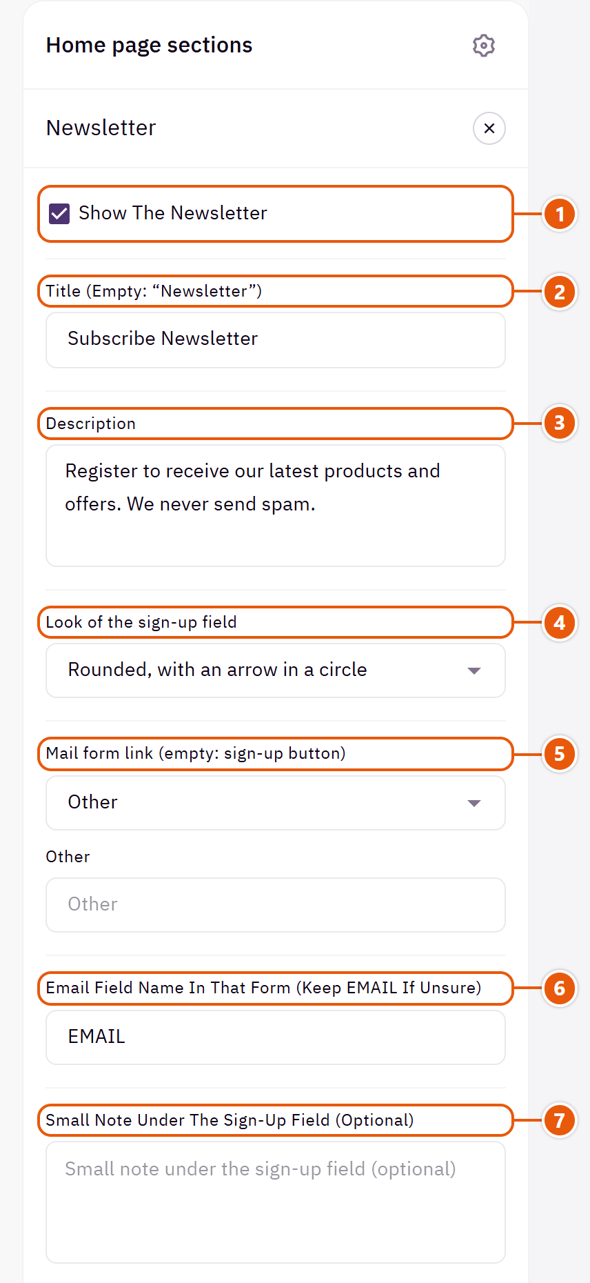
- 1“Show the newsletter”
Off: no newsletter. - 2“Title (empty: “Newsletter”)”
The newsletter's title.Shown when “Show the newsletter” is on - 3“Description”
A line on what subscribers will receive.Shown when “Show the newsletter” is on - 4“Look of the sign-up field”
The field and button look.Shown when “Show the newsletter” is on - 5“Mail form link (empty: sign-up button)”
Copy it from the service's form code (the part after action=).Shown when “Show the newsletter” is on - 6“Email field name in that form (keep EMAIL if unsure)”
The email field's name in the service's form; in Mailchimp it is EMAIL.Shown when “Show the newsletter” is on - 7“Small note under the sign-up field (optional)”
Such as “You can unsubscribe at any time”.Shown when “Show the newsletter” is on
Page designs
Dana has 30 ready designs for different businesses, each with its own home page, colours, fonts and text. All share one theme and the settings explained here; only the look differs. How to apply one is in “Start here”.
Fashion, Family Fashion, Women's Fashion, Footwear, Eyewear, Print on Demand, Skincare, Glow, Jewelry, Gold, Watches, Tech Accessories, Electronics, Electronics Market, Phone Cases, Office Furniture, Furniture, Furnishings, Handmade, Plants, Baby, Grocery, Bicycles, Pickleball, Sportswear, Supplements, Books, Flowers, Pets and Travel.
Every design uses the theme's same sections in its own order, looks, colours and fonts, so a section you like in one design can be added to yours with “Add section”.
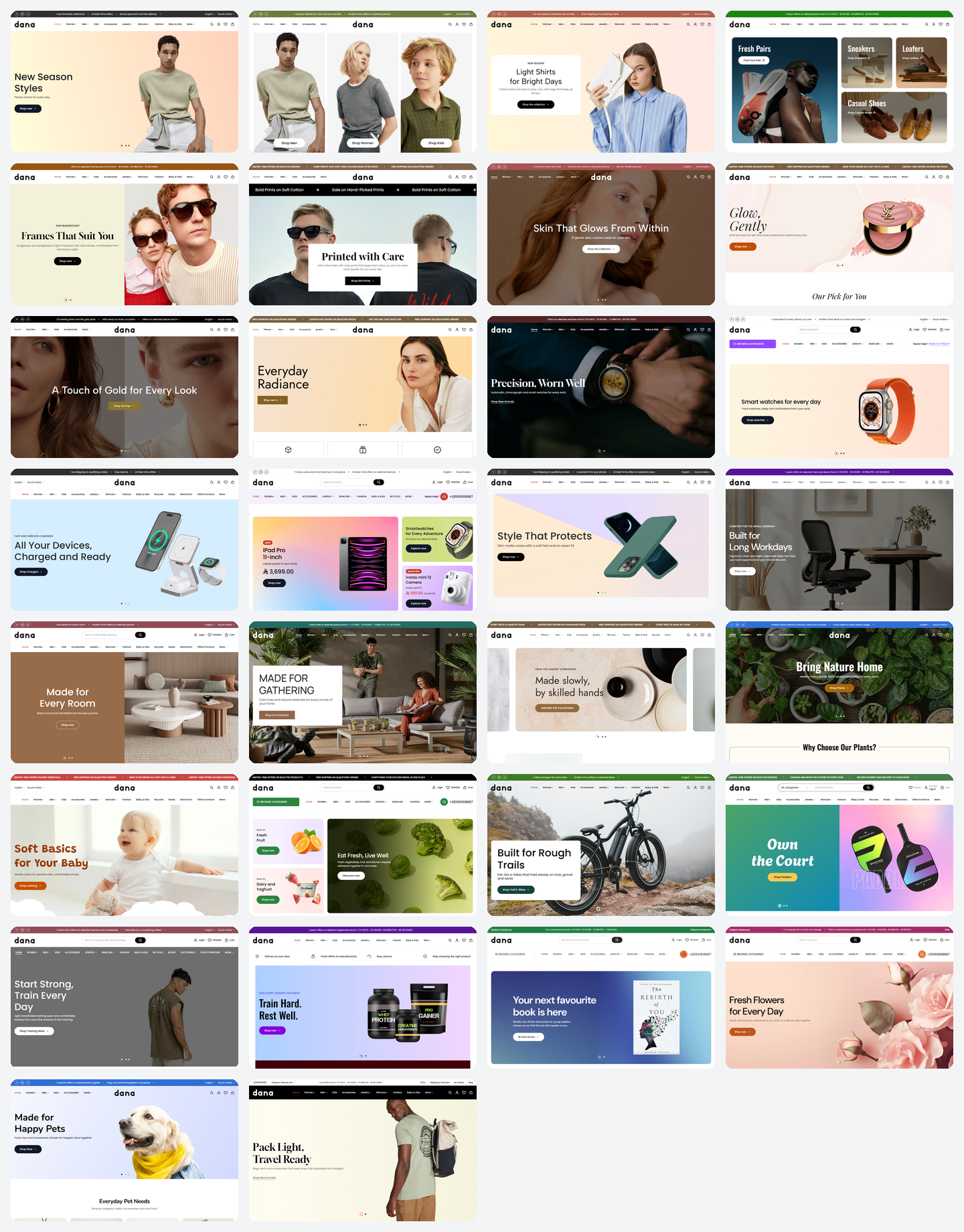
Every design has a working copy on the demo store with real products, to browse and try the cart and search before you choose. The floating “Designs” button on the demo store is for the demo only and does not come with the theme; to try a design on your store, use “Preview presets” as in “Applying one of the 30 designs”.
Questions and fixes
The questions merchants ask most, each with a short fix. Not here? Reach us on +201551618967 or at [email protected].
Check these reasons in order.
Step by step
- You have not pressed “Publish”: changes stay a draft only you see.
- The section is hidden: untick “Hide section” inside it.
- Its main content is empty: e.g. “Before and after” without both pictures, “FAQs” without answers, or a banner with no picture or words.
- Its product source is empty: e.g. “Category products” of a category with no products, or “On sale products” when nothing is discounted.
- You are on the other language: English has its own sections; see the next question.
In Zid each language has its own home sections, header, footer and “Page settings”, so edits made with the editor in Arabic change Arabic pages only.
Step by step
- Switch the editor to English and repeat the change.
- To carry a home section over: “Copy section to English language” from the menu beside its name, then translate its text.
- Check English before “Publish”; an empty English home page shows empty to shoppers.
Posts are written in Zid's blog, and the theme shows them in two places: the “Blog” home section fetches your latest posts by itself, and the blog page and each post's page take the theme's look.

Step by step
- In your Zid dashboard switch the blog on and create categories matching your store's departments.
- Write posts in Arabic and English, each with a cover picture and a summary, and publish them.
- In the editor add the “Blog” section and keep “Posts source” on “Automatic, from the store blog”.
- Choose the blog page's look in “Page settings”, then “Blog page”, and publish.
Tips
- A post every week or two about your field brings visits from Google.
A category page shows its sub-categories with pictures above the products. When the category has no sub-categories in Zid, the theme takes them from the items under it in the header menu, with their names and order, and the pictures from the category pictures.

Step by step
- Put the sub-categories under the category in Zid, or under it in the header menu.
- Upload a picture for each sub-category on its page in Zid.
- In “Page settings”, then “Category and products page”, keep “Show the sub-categories strip” on and choose the “Sub-categories look”.
- Publish.
Tips
- A sub-category with no picture shows the first letter of its name, never an empty box.
When a shopper opens search, before typing, the window shows popular searches and featured products in a slider, so there is something to buy from the first moment. As they type, your products appear under the field at once.

Step by step
- Open “Header”, then “Search window”.
- In “Products under the search (latest or a category; empty: none)” choose “Recent products”, “On sale products” or “Category products”.
- Write the “Title above the products under the search” and add popular searches if you like, then publish.
The bar reads the free-shipping rule from your Zid shipping settings and tells shoppers how much is left. With no free-shipping rule there is no bar.
Step by step
- In your Zid dashboard set free shipping above an amount.
- In the editor: “Page settings”, then “Cart drawer”, and keep “Enable free shipping progress” on.
- In “Cart page” keep “Show the free-shipping progress bar” on, then publish.
An applied design or imported file replaces your customization; how to go back depends on whether you published.
Step by step
- Not published: “Undo all changes” returns to the published version, also dropping every other unpublished change.
- Published: in “History” press “Restore” on the newest entry (“Current version”) to bring back the version live before your last publish. Check it, then press “Publish”.
- Have an exported file? “Import” it and your customization returns exactly, in both languages; then “Publish”.
Tips
- “History” keeps nothing unpublished, so press “Export” before applying a design to keep a copy.
Related themes
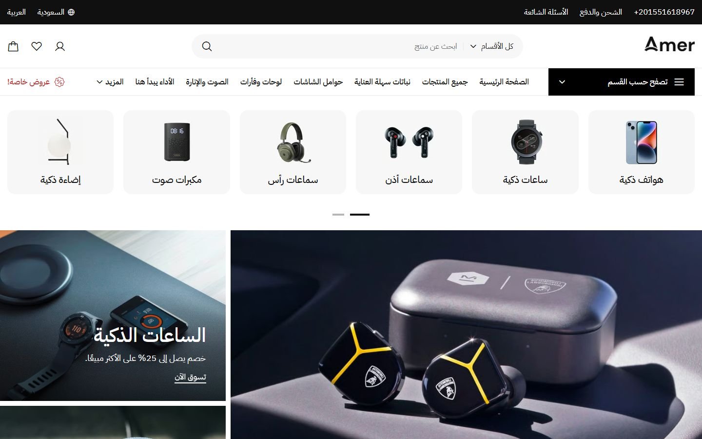
Amer
A Zid theme with 22 ready designs for different kinds of stores, in Arabic and English.
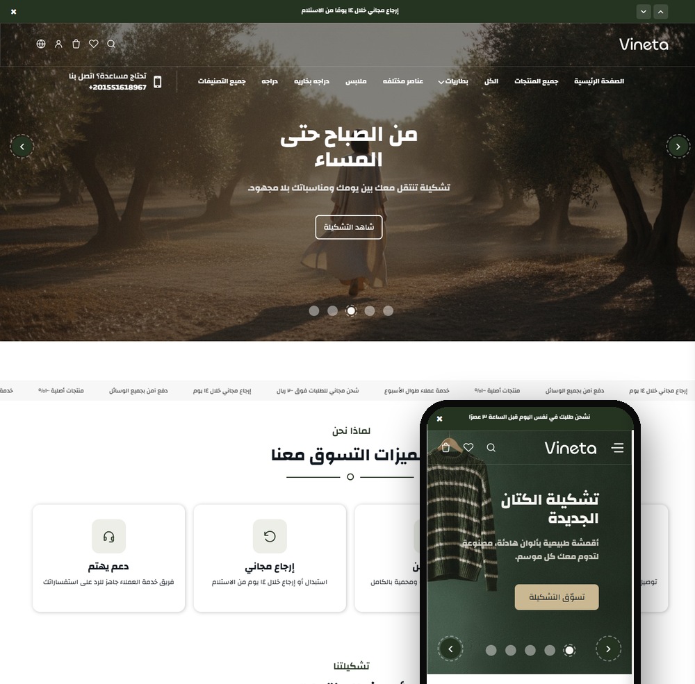
Vineta
A modern Zid theme with 22 sections and two product page designs, a true Arabic/English mirror.
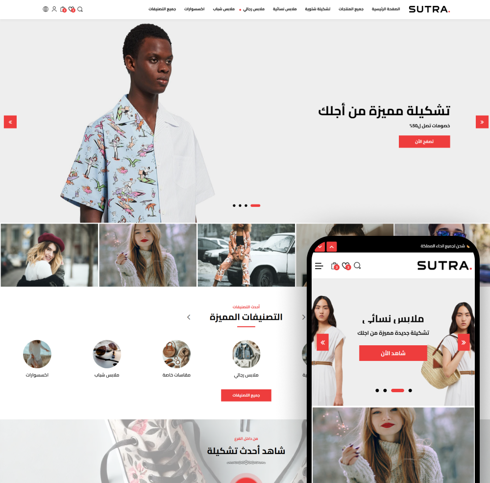
Sutra
Sutra - the best Zid store theme to grow your sales. Modern, mobile-friendly, and easy to customize.
Not sure which theme to pick?
Our team helps you pick the theme and customize it for your store.
Contact us