The e-commerce world in the Arab region, specifically in the Kingdom of Saudi Arabia, is witnessing rapid development and fierce competition among stores to achieve the highest sales rates and attract the largest possible segment of customers. In light of this intense competition, having a good product and a competitive price is no longer enough to guarantee success. Instead, the way this product is presented and the experience the customer goes through—from the moment they enter the store until the checkout process is completed—has become the real differentiator between a successful store and one that suffers from poor sales. This is where the concept of store design and user experience emerges as a fundamental pillar that cannot be overlooked in any way.
When we talk about leading and distinguished platforms like Salla and Zid, we are talking about integrated work environments that provide merchants with a robust technical infrastructure, multiple design options, and customizable ready-made templates. However, making the most of these capabilities requires a deep understanding of digital consumer behavior and how to guide them smoothly through the virtual store's aisles. Store design is not limited to choosing attractive colors or a beautiful logo; rather, it is an art and a science aimed at removing all obstacles a customer might face, making the shopping journey enjoyable, intuitive, and fast, which directly and immediately reflects on increased revenues.
In this comprehensive and detailed guide, we will delve into the secrets and strategies of improving user experience (UX) and user interface (UI) in Salla and Zid stores. Together, we will explore practical steps and applied tips based on accurate market analysis, covering all aspects of the store—starting from the homepage, moving through product categories and the search mechanism, down to optimizing performance speed and mobile compatibility, and concluding with designing the perfect checkout page that guarantees converting passing visitors into loyal, long-term customers for your brand.
The Importance of User Experience in E-commerce Stores and Its Direct Impact on Sales
User experience in e-commerce is defined as the overall impression and feeling generated by the customer while interacting with all elements of your online store. This impression is formed based on how easy it is to navigate the site, the clarity of the information provided, the responsiveness of the pages, and the smoothness of transitioning from one step to another. When a customer faces a complex user experience, such as having difficulty finding the desired product or encountering long and confusing checkout steps, the likelihood of them leaving the store without completing the purchase increases significantly. This is known as the bounce rate, which is the primary enemy of any merchant seeking to increase their profits.
On the other hand, investing in improving the user experience is considered one of the highest-return investments in the digital commerce world. An intuitive design that anticipates the customer's needs and provides solutions before they even search for them acts as a professional sales representative available around the clock. On platforms like Salla and Zid, merchants have analytical tools that clearly show how simple UI improvements, such as changing the placement of the "Add to Cart" button or clarifying the return policy, can lead to noticeable leaps in the store's daily and monthly sales figures.
Furthermore, user experience plays a crucial role in reducing the store's operational costs in the long run. A carefully designed store that provides clear and comprehensive information about products, shipping, and frequently asked questions significantly reduces the pressure on customer service. Shoppers can easily find answers to all their inquiries without needing to contact technical support. This organization saves the merchant's time and effort, allowing them to focus on more important tasks such as product development, expanding into new markets, and planning innovative marketing campaigns.
How Good Design Reflects on Customer Trust and Store Loyalty
First impressions in the digital world are extremely crucial, as a visitor decides within mere seconds whether to stay in the store or leave for good. A professional and clean design gives an immediate sense of the store's reliability and professionalism; the customer subconsciously links the quality of the website's design to the quality of the products and services offered. When a customer sees an organized store that relies on high-quality images, harmonious colors, and clear fonts, they feel reassured to share their personal and banking information, which is of paramount importance to the success of any online sale.
Trust is not built solely through aesthetic appearance; it extends to include transparency and clarity in presenting information. Successful stores on Zid and Salla always make sure to highlight contact methods, exchange and return policies, and social media links in prominent, easily accessible places, often at the bottom of the homepage. Additionally, transparently displaying previous customer reviews and opinions enhances the store's credibility and encourages new visitors to make a purchasing decision with greater confidence, based on the real positive experiences of others.
As for loyalty, a customer who enjoys a smooth, pleasant, and complication-free shopping experience is highly likely to return to purchase again, and will even recommend the store to their friends and family. This type of word-of-mouth marketing is considered the most powerful, impactful, and cost-effective of all. A store design that respects the customer's time and offers them a personalized experience and comfortable browsing contributes to building a long-term relationship that goes beyond a mere one-time sale, transforming into genuine and deep brand loyalty.
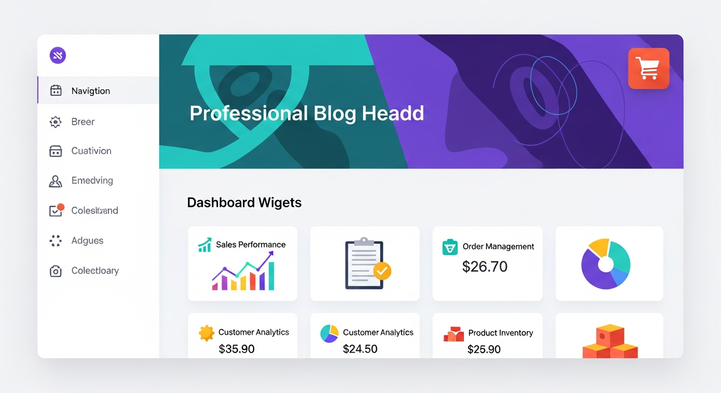
The Golden Rules for Designing a Professional User Interface on Salla and Zid
The first and most important rule in UI design is simplicity and avoiding annoying visual clutter. The homepage design should be clean and direct the customer's focus straight to the most important products and offers. Many merchants fall into the trap of cramming the homepage with a massive number of advertising banners, images, and moving text, which distracts the visitor and makes them feel lost. Instead, use white space smartly to rest the visitor's eyes, and rely on one or two main advertising banners that highlight the best offers or latest collections in an attractive and direct manner.
Visual hierarchy is the second golden rule that must be strictly applied. This means guiding the user's eye toward the most important elements using size, color, and contrast. For example, the call-to-action button, such as "Add to Cart" or "Buy Now," should be the most prominent element on the product page, using a contrasting color that aligns with your brand identity. You can check out our comprehensive guide on improving the conversion rate for Salla and Zid stores with simple steps to learn more about how to employ colors and design buttons in a scientific and deliberate way to significantly increase sales.
Consistency and uniformity in design represent the third rule to ensure a flawless user experience. Your store must maintain the same visual style across all pages, from the homepage to the thank-you page after checkout. Using the same fonts, the same color palette, and the same icon style creates a strong and cohesive visual identity that sticks in the customer's mind. The Salla and Zid platforms provide advanced dashboards for customizing templates, making it easier for the merchant to unify the store's overall appearance without needing complex programming expertise. This reflects a high level of professionalism and attention to the finest details.
Organizing Categories and Facilitating the Product Search Journey Professionally
The main navigation bar or top menu serves as the map that guides the customer inside your store. This menu should be logically organized and based on customer needs, not just the internal layout of your warehouse. Use clear and direct names for main categories, and avoid complex technical terms or vague names. If your store contains a wide range of products, use drop-down menus that branch into precise subcategories, allowing the customer to reach their desired section with the fewest possible clicks and in the fastest time.
The search bar is an indispensable tool in any successful online store and should be clearly visible at the top of all website pages. Many shoppers enter the store knowing exactly what they are looking for and do not want to browse through menus. Make sure to enable the smart search feature that suggests results as the customer types and accounts for synonymous keywords. To ensure the correct products appear during a search, you must pay attention to organizing products from the dashboard. You can benefit from our article on Inventory Management: Secrets to Organizing Your Products on Salla and Zid to learn how to link keywords to products effectively and professionally.
Alongside categories and search, filtering and sorting tools play a pivotal role in improving the user experience, especially in large stores like fashion or electronics outlets. You should allow the customer to filter results based on price, size, color, brand, or even ratings. These options narrow down the search scope and reduce customer confusion, which speeds up the purchasing decision process. Platforms like Zid and Salla provide excellent capabilities for setting up precise and customized filters, and the merchant should fully utilize them to offer a seamless shopping experience that closely resembles the assistance of an expert salesperson in a traditional store.
Optimizing Store Speed and Mobile Compatibility to Ensure a Seamless Experience
Speed is the most valuable currency in today's internet world, as statistics indicate that a one-second delay in page load time can lead to a drop in conversion rates by up to seven percent. Digital customers lack patience, and if your store takes too long to display products, they will simply move on to a competitor's store. To improve your store's speed on Salla or Zid, you should primarily focus on optimizing image sizes. Use modern formats like WebP, compress images without sacrificing quality, and avoid using auto-playing videos or heavy plugins that consume browser resources and hinder initial loading speeds.
Mobile compatibility is no longer just an added feature; it is an absolute and obvious necessity, as more than eighty percent of e-commerce purchases in the Arab region are made via mobile devices. You must design your store with a mobile-first mindset, ensuring that texts are readable without zooming in, and that buttons and links are large enough to be easily tapped with a thumb. Regularly test your store on various screen sizes and operating systems to ensure there is no overlapping of elements or design distortion that could hinder the shopping process and cause user frustration.
Seamless mobile navigation also requires attention to simplifying forms and reducing the fields required for registration or checkout, as typing on mobile screens is considered harder and more annoying than on traditional keyboards. A slow or non-mobile-friendly store is the main reason for losing customers at the last minute. If you suffer from this recurring problem, we recommend reading our detailed guide on Abandoned Carts: Customer Recovery Strategies on Zid and Salla, to discover how improving technical performance and mobile UX acts as the first line of defense to reduce cart abandonment rates and increase confirmed sales.
Strategies for Displaying Products and Checking Out in a Way That Increases Sales
The product page is where the customer makes their final purchasing decision, so it must be designed with extreme care to be persuasive and comprehensive. Always start by using high-resolution, professional images that show the product from multiple angles and in real-use contexts if possible. Since the customer cannot physically touch or try the product, images and short videos are what compensate for this limitation. Add an image zoom feature to enable the visitor to examine fine details, and ensure that the colors displayed in the images match reality to avoid costly and annoying returns later.
The written product description should focus on the benefits and value the customer will receive, rather than just listing dry technical specifications. Use short paragraphs and bulleted lists to highlight key features, and speak in a language that addresses the customer's needs and solves their problems. On this interactive page, you can smartly display complementary or similar products to increase the shopping cart value. To learn the best ways to apply this effective strategy, you can review our article on Cross-Selling: Double Your Store's Sales on Salla and Zid, which offers innovative ideas for linking products together naturally and enticingly for the buyer.
Finally, the checkout and payment process is the bottleneck in any online store, and it must be completely free of friction and complexity. Provide a guest checkout option without forcing the customer to create a long and detailed account, and clearly display the total cost, including taxes and shipping, right from the start to avoid last-minute surprises that drive the customer away. The Salla and Zid platforms support excellent integration with local payment gateways like Mada, Apple Pay, and STC Pay. Make sure to enable these fast options and highlight their logos to reassure the customer and speed up the payment process with a single, secure click.
Conclusion: A Comprehensive Summary of the Steps to Successfully Design Your E-commerce Store
In conclusion, we can confidently say that store design and UX optimization are not merely cosmetic luxuries; rather, they are the primary engine for sales growth and building a strong, sustainable brand. In this comprehensive guide, we have explored the importance of focusing on design simplicity, clear navigation, and fast responsiveness, and how these factors combined create a safe and comfortable shopping environment that motivates the customer to buy and visit again. Paying attention to the finest details in the user interface reflects your respect for your customers and your dedication to providing them with the best possible service.
The Salla and Zid platforms offer Arab stores top-tier technical infrastructure and highly flexible customization tools, but the real challenge lies in how the merchant utilizes these tools to build an integrated and well-thought-out customer journey. By applying the golden rules we mentioned—starting from organizing categories and facilitating search, moving through paying close attention to the mobile browsing experience, and down to optimizing product pages and simplifying checkout steps—you will undoubtedly be able to transform your store into a professional sales platform that operates highly efficiently around the clock and outperforms your competitors.
Finally, we must remember that improving the user experience is an ongoing process that does not stop at the store's launch. We always recommend monitoring your store visitors' behavior using analytical tools, listening attentively to customer feedback and complaints, and conducting regular tests on various design elements. Always be ready to adjust your strategy and update your store's interface to keep pace with your audience's expectations and the rapid developments in the e-commerce world. Continuous development is your golden key to achieving increasing profits and long-term success in this promising market full of opportunities.