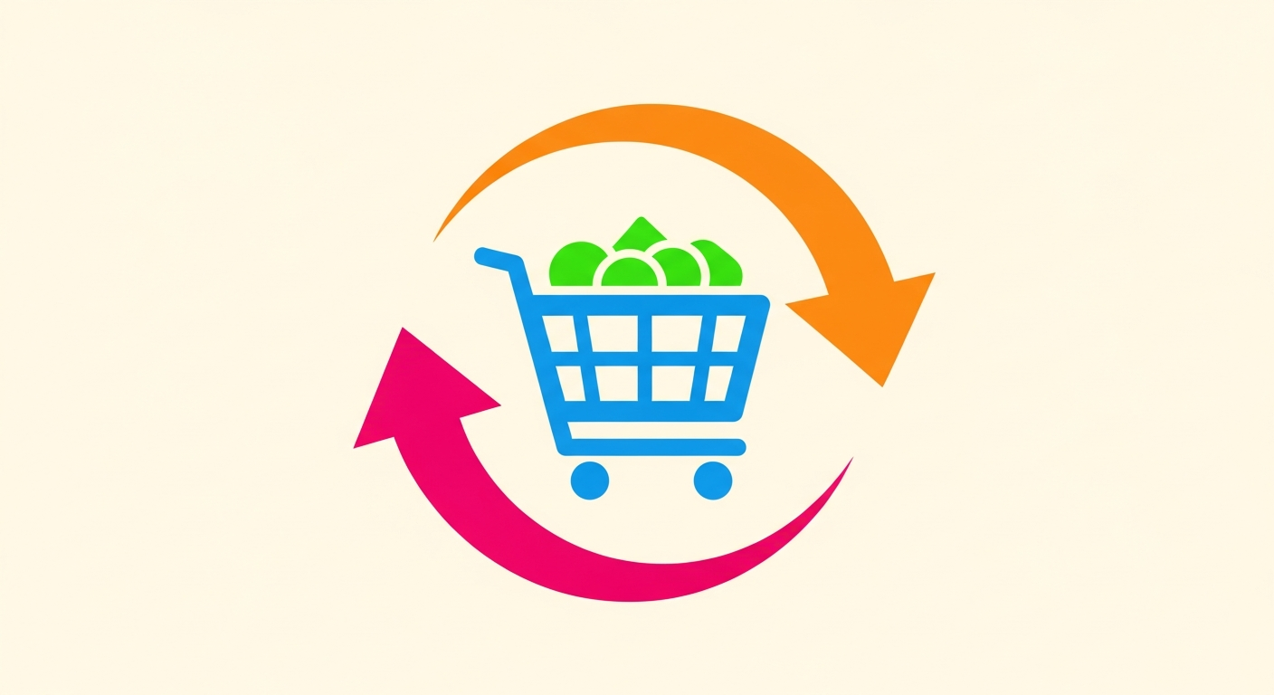
In the fast-paced world of e-commerce, store owners face a constant challenge: rising advertising costs coupled with fluctuating returns on investment (ROI). Often, a merchant is left puzzled when their ad campaigns drive thousands of visits to their store, yet the actual number of sales doesn't even cover the cost of the ad itself. Here lies the missing link that many overlook—it's not just about product quality or ad creativity, but rather the "destination" where the customer lands after clicking the link. Directing a potential customer to the store's homepage is like throwing them into a vast ocean of choices without a compass, leading to distraction and them leaving without making a purchase. This is the primary reason behind wasted marketing budgets.
Landing pages are the secret weapon used by professional marketers to dramatically multiply conversion rates. They are pages designed for one single purpose: persuading the visitor to take a specific action, whether that's buying a product, subscribing to a mailing list, or downloading a file. In this comprehensive article, we will dive deep into landing pages and explore how you, as a merchant using the "Zid" or "Salla" platform, can build professional landing pages that turn visitors into loyal customers. We will review the psychological and design strategies that leave the customer with no choice but to click the buy button.
What is a Landing Page and Why is it Radically Different from Your Traditional Store?
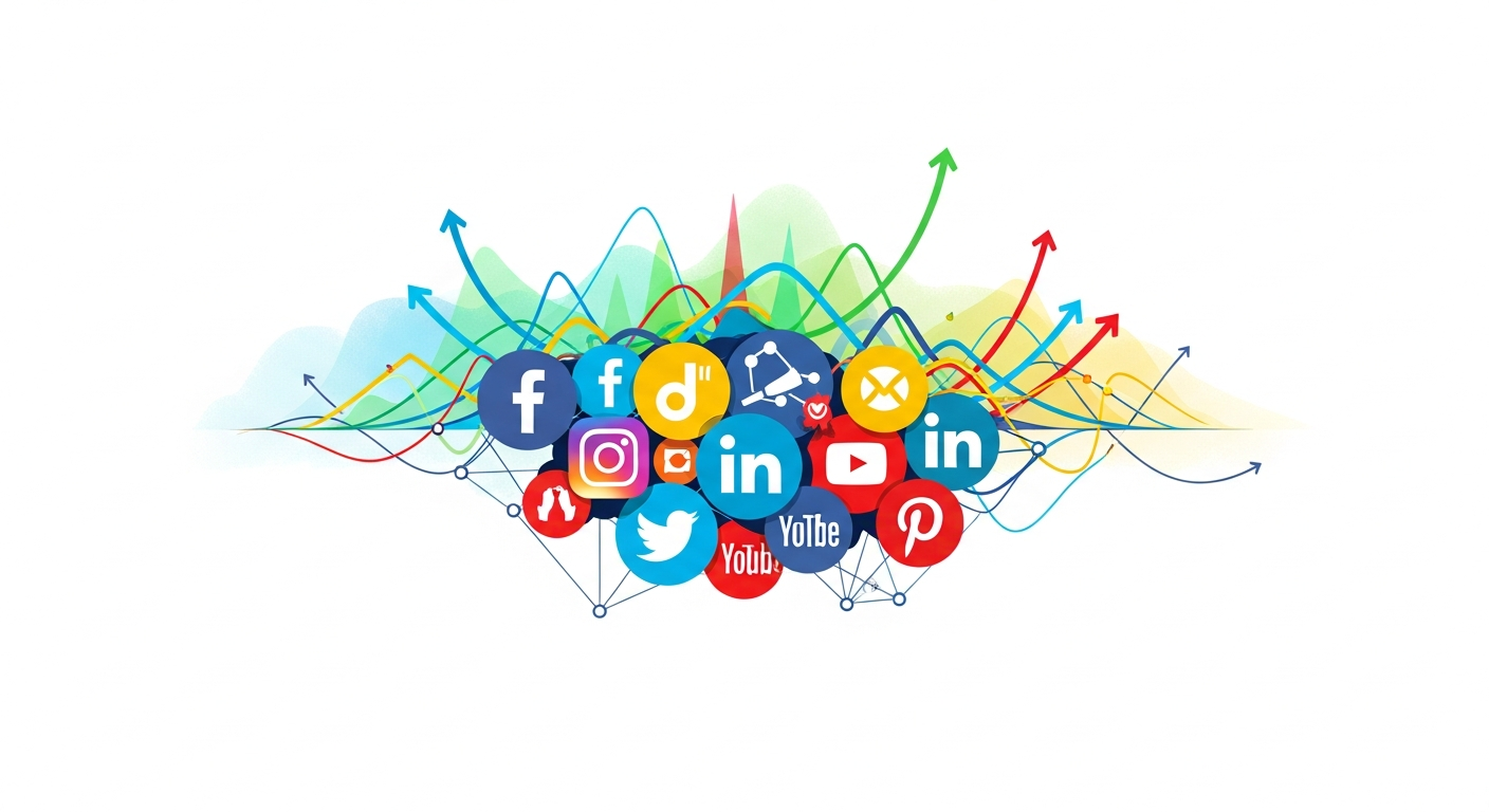
A landing page is a standalone web page created specifically for a particular marketing or advertising campaign. It is where a visitor "lands" after clicking on an ad on Google, Facebook, Instagram, TikTok, or others. The fundamental difference between a landing page and your main store page on Zid or Salla lies in "focus." A store's homepage is designed to be a comprehensive portal, featuring top navigation menus, links to multiple categories, social media links, and general brand information. This multitude of options, while necessary for a general store, is the arch-enemy of paid ad campaigns. Studies show that an abundance of links and choices increases the likelihood of customer distraction and site abandonment without purchasing (known as the paradox of choice).
In contrast, a landing page features what is known as a "1:1 attention ratio." This means the ratio of things the visitor can do (click the buy button) to the number of things available on the page should be equal. In a successful landing page, the top navigation bar is removed, side links are hidden, and the focus is solely on showcasing the promotional offer for the product or service and its features, with a single, clear, and repeated Call to Action (CTA) button. This targeted design eliminates any distractions that might divert the customer's attention from the main goal, psychologically and visually guiding them toward completing the purchase. This explains why landing pages achieve conversion rates that can be 5 to 10 times higher than regular pages.
Furthermore, landing pages allow you to tailor the marketing message to perfectly match the ad's audience. If you are running an ad targeting mothers to sell a baby product, the landing page must speak the language of mothers, highlight the benefits they care about, and use images that reflect their emotions, rather than sending them to a generic product page with a dry technical description. This alignment between the "ad message" and the "page content" is the crucial factor in building immediate trust, as the visitor feels they have arrived at the right place that meets the need they clicked the ad for. You can reinforce this concept by checking out Snapchat Ads: Smart Strategies to Double Your Store's Sales to understand how to unify the message between the advertising platform and the landing page.
The Anatomical Elements of Building a High-Converting Landing Page
To build a successful landing page on the Zid or Salla platforms, simply placing a product image and a buy button is not enough. The page must include a well-thought-out structure that appeals to both the customer's mind and emotions. The first and most important element is a "catchy headline," which is the first thing the visitor's eye catches. It must be clear, direct, and promise a significant benefit or a solution to a painful problem the customer faces. The headline is not the place for being overly clever or vague; it must tell the visitor in less than three seconds: What is this product? And what will I get out of it? This is immediately followed by a subheadline that explains the details and supports the promise made in the main headline, reinforced by a high-quality image or video showing the product in actual use rather than just a white background image, because the customer wants to imagine themselves using and benefiting from the product.
The second element is "persuasive copywriting" that focuses on benefits rather than features. Instead of saying "20W charger" (a feature), say "Charge your phone to 50% in just 15 minutes" (a benefit). The content should flow logically to answer potential customer objections before they even think of them, such as: Is the product authentic? Is there a warranty? What if I don't like it? This is where "Social Proof" comes into play. It is an indispensable, vital element that involves displaying previous customer reviews, real product photos taken by customers, or logos of companies or entities that trust your store. The presence of these elements builds a wall of trust that makes it easier for a new customer to jump over the hurdle of hesitation and pull out their credit card.
The third and final element in the structure is the "Irresistible Offer" and the Call to Action (CTA) button. The offer must be so enticing that the customer feels foolish if they miss it. This could include a special limited-time discount, free shipping, or additional gifts. Here, you can leverage product bundling strategies to increase the order value. For more details on crafting these offers, we recommend reading our article on Product Bundles: How to Smartly Increase Average Order Value?. The CTA button should be in a contrasting color to the rest of the page and feature action-oriented text like "Order Now and Get the Discount" instead of just "Submit" or "Buy." This button should be repeated in several places on the page (at the beginning, middle, and end) so it is available to the customer the moment they decide to purchase.
Technical Strategies for Designing Pages on Zid and Salla
When working on platforms like Zid and Salla, some might think that design options are limited by the store's templates. However, the truth is that both platforms offer advanced tools and apps in their respective app stores that allow for building custom landing pages (Landing Page Builders). The first strategy here is to use these apps to create "hidden" pages that do not appear in the main store menu but are only accessible via the ad link. When designing these pages, "loading speed" must be considered a top priority; every second of delay in page load can cost you 7% in sales. Make sure to compress images and use short, autoplaying videos without sound to ensure the user is not annoyed, while ensuring the page is 100% mobile-responsive, as the vast majority of traffic in the Arab region comes from smartphones.
The second strategy involves simplifying the checkout process within the landing page. In Zid and Salla, you can enable options like "Quick Buy" or Apple Pay to be directly available, reducing the steps the customer needs to complete the order. Complexity at this stage is the silent killer of sales; every additional field the customer is asked to fill out increases the likelihood of cart abandonment. If you suffer from the problem of customers reaching checkout and then leaving, it is essential to review strategies for recovering these customers. You can learn more about this in the article Abandoned Carts: Recovery Strategies in Zid and Salla, as integrating a landing page strategy with a cart recovery strategy forms a comprehensive system for maximizing profits.
The third strategy is technically implementing the principles of "Scarcity and Urgency" within the design. Many Zid and Salla plugins offer countdown timers that can be placed next to the buy button to show that the offer ends shortly, or display a bar indicating "Low stock remaining." These psychological tools are not just decorative; they are powerful triggers that push a hesitant customer to make an immediate decision out of Fear Of Missing Out (FOMO). However, these tools must be used honestly and credibly. Do not set a timer that resets every time the customer visits the page, as this will cost you your credibility in the long run and destroy your brand's reputation.
Fatal Mistakes That Destroy Your Campaign Results on Landing Pages
One of the most common mistakes merchants make is a lack of alignment between the ad and the landing page (Ad Scent). Imagine a customer clicking on an ad promising a "50% discount on sports shoes," only to land on a page showcasing a "summer clothing collection" or displaying the shoes at full price without mentioning the discount! This disconnect in the message causes immediate confusion and a feeling of being deceived, prompting the visitor to leave in seconds. You must use the same headlines, the same colors, and the same image style found in the ad on the landing page. If the ad is a video of a specific influencer praising the product, it is smart to place that exact video at the top of the landing page to reinforce continuity and assure the customer they are in the right place.
The second mistake is "stuffing the page" with unnecessary information or a cluttered design. Today's visitor doesn't read every word; instead, they "scan" the page. Overly long texts, undivided paragraphs, and small fonts make the page look like a boring newspaper. Instead, use bullet points, clear subheadings, and visual icons to convey information quickly. Remember, the goal is not to flex your linguistic muscles, but to deliver value in the shortest way possible. Poor design lacking white space strains the eye and makes the customer feel uncomfortable, which negatively impacts their purchasing decision.
The third and most dangerous mistake is neglecting performance measurement and relying on guesswork. Many merchants launch a landing page and let it run without closely monitoring the numbers. The page might look beautiful to you, but it doesn't sell. This is where Key Performance Indicators (KPIs) step in to tell you the truth. Is the bounce rate high? This means the top of the page is unappealing or slow. Are they clicking the button but not buying? The problem lies in the checkout page or the price. To understand how to track and accurately analyze these numbers to ensure your store's success, we recommend referring to Key Performance Indicators (KPIs): 5 Numbers That Determine Your E-commerce Store's Success, where you will find a guide to understanding the language of numbers.
A/B Testing: The Scientific Path to Doubling Profits
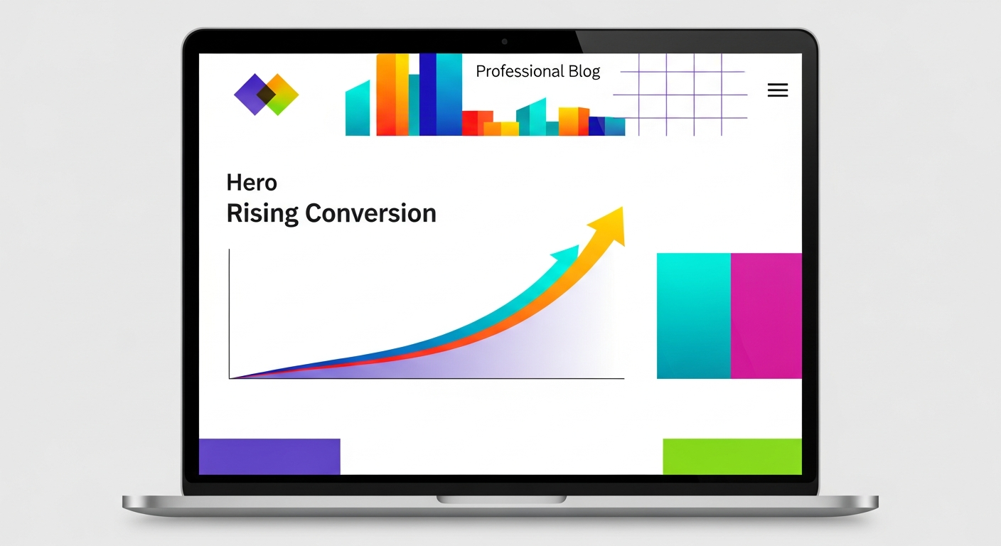
Achieving the perfect landing page on the first try is almost impossible, even for top experts. The secret lies in continuous optimization through what is known as A/B testing. This process involves creating two versions of a landing page, Version (A) and Version (B), which are completely identical except for one single element you want to test. This element could be the main headline, the color of the buy button, the hero image, or even the price. 50% of visitors are directed to Version (A) and 50% to Version (B). After a specific timeframe or a certain number of visits, the results are analyzed to see which version generated more sales.
For example, you might test a headline focusing on "fear of loss" (Don't miss the offer of the season) against a headline focusing on "gain" (Get the best look this season). You might be surprised that changing a single word in the headline or changing the button color from red to green can increase the conversion rate by 20% or more. On platforms like Zid and Salla, you can conduct these tests manually by duplicating the page and changing the link in the ads, or by using advanced third-party tools that integrate with your store. The important thing is not to test more than one element at the same time, so you know exactly what influenced the result.
Continuing this process is what separates successful stores from struggling ones. The market changes, consumer behavior evolves, and what worked last month might not work today. Make the culture of "experimentation and measurement" a core part of your marketing strategy. Don't rely on your personal taste or your friends' opinions; let actual data and results drive your decisions. Every minor improvement in the conversion rate means a decrease in Customer Acquisition Cost (CAC) and a direct increase in net profit, which is the ultimate goal of any business.
In conclusion, landing pages are not just an add-on tool or a technical luxury; they are the fundamental pillar upon which successful advertising campaigns in modern e-commerce are built. The difference between a store that burns its money on ads to no avail and another that achieves massive ROI often lies in the quality of the landing page that welcomes visitors. By understanding the nature of these pages, focusing on a single element, adopting the customer's language, and avoiding distractions, you set foot on the first path to success.
Always remember that building on robust platforms like Zid and Salla makes the task easier for you, but tools alone are not enough without a clear strategy and continuous experimentation. Start today by reviewing your current campaigns: Are you sending visitors to the homepage? If the answer is yes, stop immediately and start building your first custom landing page. Apply the elements we discussed, from the catchy headline to persuasive content and high credibility, and do not forget the importance of mobile responsiveness and loading speed.
E-commerce is a game of numbers and continuous optimization, and the landing page is your playground where you control every detail to guide the visitor toward the goal. Do not be afraid of making mistakes at the beginning; every mistake is a lesson, and every A/B test is a step toward improving results. Invest your time and effort in optimizing your landing pages, and you will find that your advertising budget starts working with unprecedented efficiency, turning passing visitors into loyal customers for your brand.