




Introduction: The Gateway to E-commerce Success
The checkout page is more than just the final step in the purchasing journey; it's the critical juncture that determines whether a visitor converts into an actual customer or abandons their cart. In the rapidly evolving world of e-commerce, where competition is fierce and customer attention is limited, no online store, whether built on platforms like Salla, Zid, or Shopify, can afford to overlook the importance of optimizing this page. It is the moment when a customer decides to either complete a purchase they've invested time and effort into, or to backtrack due to simple, easily avoidable obstacles.
According to numerous studies, the average shopping cart abandonment rate ranges between 70% and 80%, a staggering figure that reveals the magnitude of lost opportunities faced by e-commerce stores daily. A significant portion of this abandonment occurs specifically at the checkout page. This means that the store successfully attracted the customer, showcased the right product, and persuaded them to add it to the cart, but failed at the very last step. Therefore, optimizing the checkout page is not a luxury, but an absolute necessity to boost conversion rates and maximize the impact of marketing and sales efforts.

In this comprehensive article, we will delve into strategies for optimizing the checkout page for Salla, Zid, and Shopify stores, focusing on best practices that ensure a smooth, trustworthy, and encouraging checkout experience. We will cover every aspect, from simplifying steps to building trust, and offering flexible payment and shipping options. We will also explore how to effectively implement these strategies for your own store, ensuring you convert more visitors into loyal customers and significantly increase your revenue.
Understanding the Checkout Journey: Why Do Customers Abandon Their Carts?
Before embarking on checkout page optimization, it is crucial to understand the underlying reasons why customers abandon their carts. Knowing these pain points helps store owners pinpoint issues accurately and provide effective solutions. Often, these reasons are linked to a poor user experience, lack of transparency, insufficient options, or even concerns related to trust and security. Identifying these factors is the first step towards building a successful checkout page. Ignoring these reasons means you might invest efforts in improvements that do not address the core problem, leading to wasted time and resources without achieving desired results.
Statistics show that the most common reasons for shopping cart abandonment include unexpected extra costs (such as shipping fees or taxes), the requirement to create a new account, a long and complicated checkout process, the absence of preferred payment options, security concerns, and a poor mobile user experience. Each of these points represents a potential barrier between the customer and the purchase process. Store owners should analyze their own data to understand their customers' behavior and determine which of these reasons are most impactful for their specific store, as reasons may vary slightly across different market segments or product types.
It is very important to view the checkout page from the customer's perspective, not just the store owner's. Store owners often perceive their page as logical and clear, but a new customer might find it confusing or demanding too much effort. Utilize analytical tools, such as heatmaps and session recordings, to understand how customers interact with your page. These tools can reveal hidden weaknesses, such as where customers pause or go back, or fields they find difficult to complete. This qualitative data is invaluable in directing optimization efforts towards the most critical areas that impact conversion rates.
Streamlining the Checkout Process and Reducing Steps
One of the most crucial principles for optimizing the checkout page is simplification. Every extra step, every unnecessary field, represents an opportunity for the customer to abandon their purchase. The checkout process should be as smooth as possible, like a direct highway to completing the purchase. This doesn't necessarily mean reducing the number of pages, but rather minimizing the number of fields and information required on each page, while being careful not to overwhelm the customer with irrelevant details or repetitive requests. The goal is to minimize friction as much as possible to ensure the customer does not feel overwhelmed or bored before reaching the finish line.
To achieve this simplification, start by removing all unnecessary fields. Do you really need a fax number? Can first name and last name fields be combined into one? Can the second address line be omitted if not essential? Platforms like Salla, Zid, and Shopify offer flexibility in customizing checkout fields, allowing you to hide or make certain fields optional. Use this feature wisely to provide a customized and efficient checkout experience. You can also leverage auto-fill features for addresses or information to speed up the process, reducing the effort required from the customer and increasing the likelihood of completing the purchase effortlessly.
Guest checkout options allow customers to complete their purchase without needing to create a new account, a vital feature for reducing cart abandonment rates. Many customers do not wish to commit to creating an account for every store they purchase from, especially if it's their first time. If account creation is necessary to provide a better future experience, make this option available *after* the purchase is complete, or make it entirely optional. Most major e-commerce platforms like Salla, Zid, and Shopify offer this feature by default or through easy settings, making it a simple step with a significant impact on user experience and customer satisfaction, and consequently on increasing conversions.
Building Trust and Security on the Checkout Page
Trust is the cornerstone of any online transaction, and on the checkout page, this trust becomes even more critical. Customers hesitate to provide their financial and personal information if they do not feel completely secure. Building trust is not limited to data security; it also includes transparency and reliability in every aspect of the process. The customer must feel assured that their information is safe and that the store is legitimate and trustworthy, otherwise, they will not hesitate to abandon their cart and seek an alternative that offers a greater sense of comfort and security. This trust requires continuous building, starting from the storefront all the way to the final payment step.
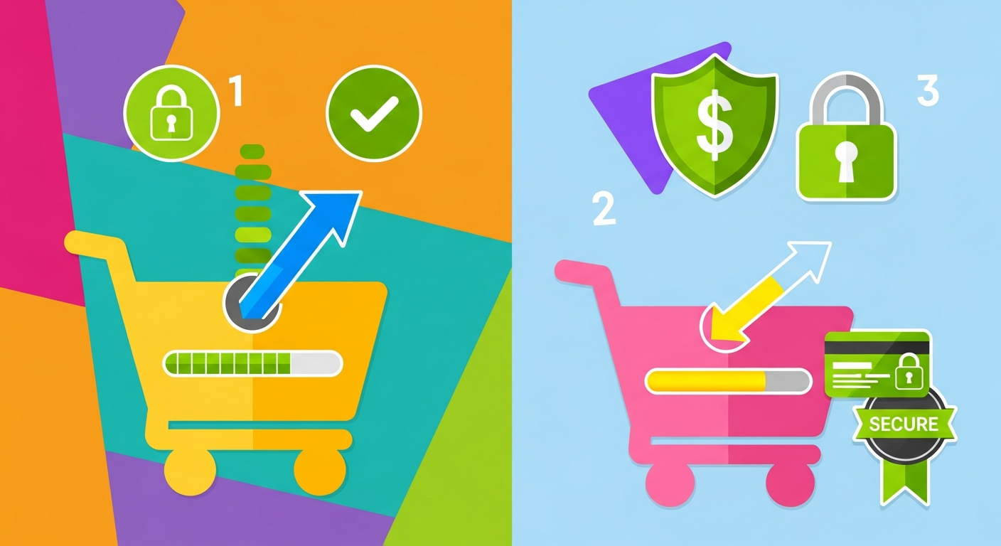
Ensure your store uses an SSL (Secure Sockets Layer) certificate, indicated by a green padlock in the browser's address bar and an 'https://' prefix. This clearly signals to customers that their connection is secure and their information is encrypted. Additionally, display logos of trusted payment methods (e.g., Visa, MasterCard, Mada, Apple Pay, PayPal, etc.) and well-known payment gateways (e.g., Stripe, PayTabs, HyperPay). Third-party security badges (e.g., Norton Secured, McAfee Secure) can further enhance this sense of security. Platforms like Salla, Zid, and Shopify natively support these features and provide tools to easily embed these logos, adding an extra layer of credibility and reassuring customers about their data protection.
Transparency is another key to building trust. All costs, including product prices, shipping fees, and taxes, should be clear and itemized before the customer reaches the final checkout page. Avoid unpleasant surprises at the last minute, as they are one of the biggest reasons for cart abandonment. Clearly displaying your return and exchange policy, terms of service, and privacy policy (even if through small links in the footer) enhances your store's credibility and shows the customer that you are committed to transparency and professionalism. Positive customer reviews and testimonials can also contribute to building trust, as new customers tend to trust the opinions of others. For more on handling abandoned shopping carts, you can read our article on Abandoned Carts: Strategies for Recovery in Salla and Zid which offers practical solutions to this problem.
Optimizing Payment and Shipping Options
Flexible and diverse payment and shipping options are crucial factors in enhancing the checkout page experience. What might be suitable for one customer may not be for another. Providing a wide range of choices caters to a broader customer base and increases the likelihood of completing a purchase. In the Arab market, for instance, many prefer cash on delivery, while others opt for electronic payments via credit cards or digital wallets. Not offering a customer's preferred option can lead to cart abandonment, even if the customer has reached this stage fully convinced of the product.
Offer multiple payment options that suit your target audience. This includes credit cards (Visa, MasterCard), Mada, Apple Pay, Google Pay, PayPal, in addition to popular local payment options in the region you serve. In the Gulf region, installment payment services like Tabby and Tamara have become extremely popular and significantly contribute to increasing conversion rates, especially for high-value products. Always remember that every additional and reliable payment option you enable is an extra opportunity to complete a sale. You can check out our article on Tabby and Tamara: How to Boost Your Sales in Salla and Zid to learn more about effectively integrating these solutions. Platforms like Salla, Zid, and Shopify offer easy integrations with most popular payment gateways, making it simple for store owners to activate these options quickly.
For shipping, offer multiple options ranging from economy to express shipping, with clear costs displayed upfront. Avoid surprising the customer with high shipping fees on the checkout page. If you can offer free shipping, make it very prominent as an additional incentive. Delivery information should be clear, specifying the estimated delivery time. Unclear shipping policies or high costs can deter customers. E-commerce platforms provide tools to manage various shipping carriers, such as linking your accounts with multiple shipping companies to offer diverse options to customers, and setting prices based on region or product weight, giving you great flexibility in managing this vital process.
Optimizing the Mobile User Experience
In our current era, the number of online shoppers using their smartphones and tablets is steadily increasing. Therefore, the checkout page must be fully optimized to provide a seamless experience on mobile devices, just as it is on desktop computers. Any friction or difficulty in interacting with the checkout page on a mobile phone can lead to customer frustration and immediate purchase abandonment, especially since mobile users are often less patient and expect a fast, intuitive experience. Neglecting to optimize the mobile checkout experience means losing a significant and growing portion of potential sales.
Ensure your checkout page design is responsive, meaning it automatically adapts to the screen size of the device being used. Buttons should be large enough for easy finger tapping, and input fields should be clear and easy to fill, with automatic numeric keypads for number fields (like card numbers). Avoid intrusive pop-ups or elements that might hinder interaction on smaller screens. The layout should be simple and uncluttered, focusing on the essential information required to complete the transaction. This reduces the customer's need to zoom in or out or scroll horizontally, making the process smoother.
Platforms like Salla, Zid, and Shopify offer responsive templates and designs by default, but you should always test your store's checkout page on a variety of mobile devices to ensure there are no issues. Use tools like Google Mobile-Friendly Test to assess your page's mobile readiness. You can also leverage features like one-touch payment via Apple Pay or Google Pay to significantly speed up the checkout process on mobile devices, reducing the number of required steps and increasing transaction completion speed. Optimizing overall store speed, including the checkout page, has a direct impact on conversions. You can learn more in our article on Optimizing Store Speed: Increasing Conversion in Salla and Zid.
Using Visual Cues and Clear Error Messages
Visual cues help guide the customer through the checkout process and give them a sense of control and progress, reducing the likelihood of cart abandonment due to uncertainty or feeling lost. When customers know where they are in the journey and how many steps remain, they become more willing to complete the process. These visual cues act as a roadmap, dispelling any potential confusion and providing a sense of clarity and transparency. They inform the customer that they are moving in the right direction and that the end is near, encouraging them to proceed.
Progress bars are an excellent example of visual cues. They clearly show the number of steps in the checkout process and the current step the customer has reached. For example, the bar could be divided into “Cart → Shipping Info → Payment → Confirmation.” The current step should be visually highlighted. This not only reduces anxiety but also gives the customer a sense of accomplishment with each step completed. Most e-commerce platforms, such as Salla, Zid, and Shopify, offer built-in progress bars on their checkout pages, or they can be easily added via apps or simple customizations. The bar should be clear and simple, not distracting, focusing on its primary function of guiding the user.
Additionally, error messages should be clear and helpful. Instead of simply displaying “Error,” explain to the customer what the error is and how to fix it. For example, if the card number is incorrect, state that clearly. If the shipping address is incomplete, specify the missing field. Error messages should appear near the field that needs correction and be distinctly colored (e.g., red) to draw attention. Messages should be friendly and not accusatory, aiming to help the customer complete the process rather than frustrating them. Real-time validation can also be used to alert the customer to errors immediately, before they click the submit button, saving them time and reducing frustration from having to re-fill the form. Providing access to customer support during this crucial phase can also prevent abandonment; our article on Customer Service: Best Tools to Improve It in Salla and Zid offers relevant insights.
Conclusion: The Key to E-commerce Success
In the world of e-commerce, the checkout page is the final bridge a customer crosses before completing a purchase. Optimizing it is not just a cosmetic addition; it is a crucial investment that determines the effectiveness of your marketing and sales efforts. Ignoring this page means missing a golden opportunity to convert interested visitors into loyal customers and incurring significant revenue losses. We have seen how small details, such as simplifying fields or providing flexible payment options, can make a huge difference in conversion rates, underscoring that every aspect of this page deserves continuous attention and improvement.
In this article, we have reviewed a comprehensive set of strategies that store owners on Salla, Zid, and Shopify platforms can implement to optimize their checkout pages. Starting from understanding the root causes of cart abandonment, moving through streamlining steps and reducing friction, building trust and security, offering diverse payment and shipping options, all the way to enhancing the mobile experience and using clear visual cues and error messages, and finally, emphasizing the importance of continuous testing and analysis. All these elements work together to create a smooth and efficient checkout experience, encouraging the customer to complete the purchase with confidence and peace of mind.
Investing in checkout page optimization benefits the store by increasing conversion rates, reducing abandoned shopping carts, and enhancing customer satisfaction. Always remember that customers are looking for an easy, secure, and transparent experience. By applying these tips and best practices, you will be able to transform your store's checkout page from a potential weakness into a powerful engine for growth and success in the ever-changing world of e-commerce. Start today by evaluating your checkout page, identifying areas that need improvement, and begin implementing these strategies to achieve tangible and sustainable results for your store.