In the fast-paced e-commerce world, the main interface of your online store is considered like the glass display window in traditional stores exactly. If this interface is organized and displays the best products attractively and professionally, it will push visitors to stop and enter to explore more displays. This concept closely applies to online stores built on Zid and Salla platforms, where the first impression formed in the visitor's mind during the first few seconds of entering the site decisively determines whether they will continue browsing and complete the purchase, or leave the site to look for other alternatives with competitors in the market.
Online store design isn't limited only to choosing beautiful colors or attractive images — it goes beyond that to be an integrated blend of art, consumer psychology, and technical user experience. When you choose to launch your project via Salla or Zid, you get strong and excellent technical infrastructure, but the real challenge lies in how to adapt these tools and ready templates to uniquely reflect your brand identity. Successful design is one that takes the customer by the hand on a smooth and enjoyable journey, starting from the moment they enter the home page, through browsing products, all the way to completing the payment process without any complications or obstacles that may disturb this experience.
Through this comprehensive and detailed guide, we'll dive into the depths of strategies to improve your online store interface on Zid and Salla platforms, and review together the most important basic principles that major merchants rely on to achieve million-level sales. We'll learn how simple modifications in design and element distribution can make a fundamental difference in store performance. Whether you're a beginner taking your first steps in the e-commerce world, or an experienced merchant seeking to develop your current store, applying these practical tips will ensure converting your store from just a product display platform into a professional selling machine working around the clock with high efficiency.
The Importance of User Interface Design in Online Stores
The supreme importance of user interface design lies in its superior ability to build instant trust with new customers visiting your store for the first time. In the digital world, the customer doesn't have the ability to touch products or speak with the seller face to face, so visual design becomes the only communication language between you and them. The store featuring modern and professional design, with harmonious colors and clear fonts, sends a hidden message to the consumer that this brand is trustworthy and cares about the finest details, reducing their concerns related to buying online and pushing them to make the purchase decision with complete reassurance and high confidence in the quality of what you offer.
Alongside building trust, interface design plays a pivotal role in directing consumer behavior inside the store and significantly facilitating their purchase journey. Smart design is one that reduces the mental effort the visitor exerts to search for what they want, through providing clear navigation menus, prominent call-to-action buttons, and logical product categories. When the customer finds what they're looking for easily and quickly in your Salla or Zid store, the likelihood of adding the product to cart increases significantly, while random and crowded design leads to distracting visitor attention and making them feel frustrated, pushing them to leave the site immediately and look for a smoother shopping experience.
The direct impact of store design clearly reflects on the language of numbers, specifically on conversion rates and overall sales. Every element on your page, from the size and color of the purchase button, to the way images and videos are displayed, affects the final purchase decision. So it's very essential to continuously follow up and analyze visitor behavior to ensure design works in your favor. You can review our comprehensive guide on Improving Conversion Rate for Your Store to understand how precise visual modifications can double your profits and reduce customer acquisition cost effectively and sustainably.
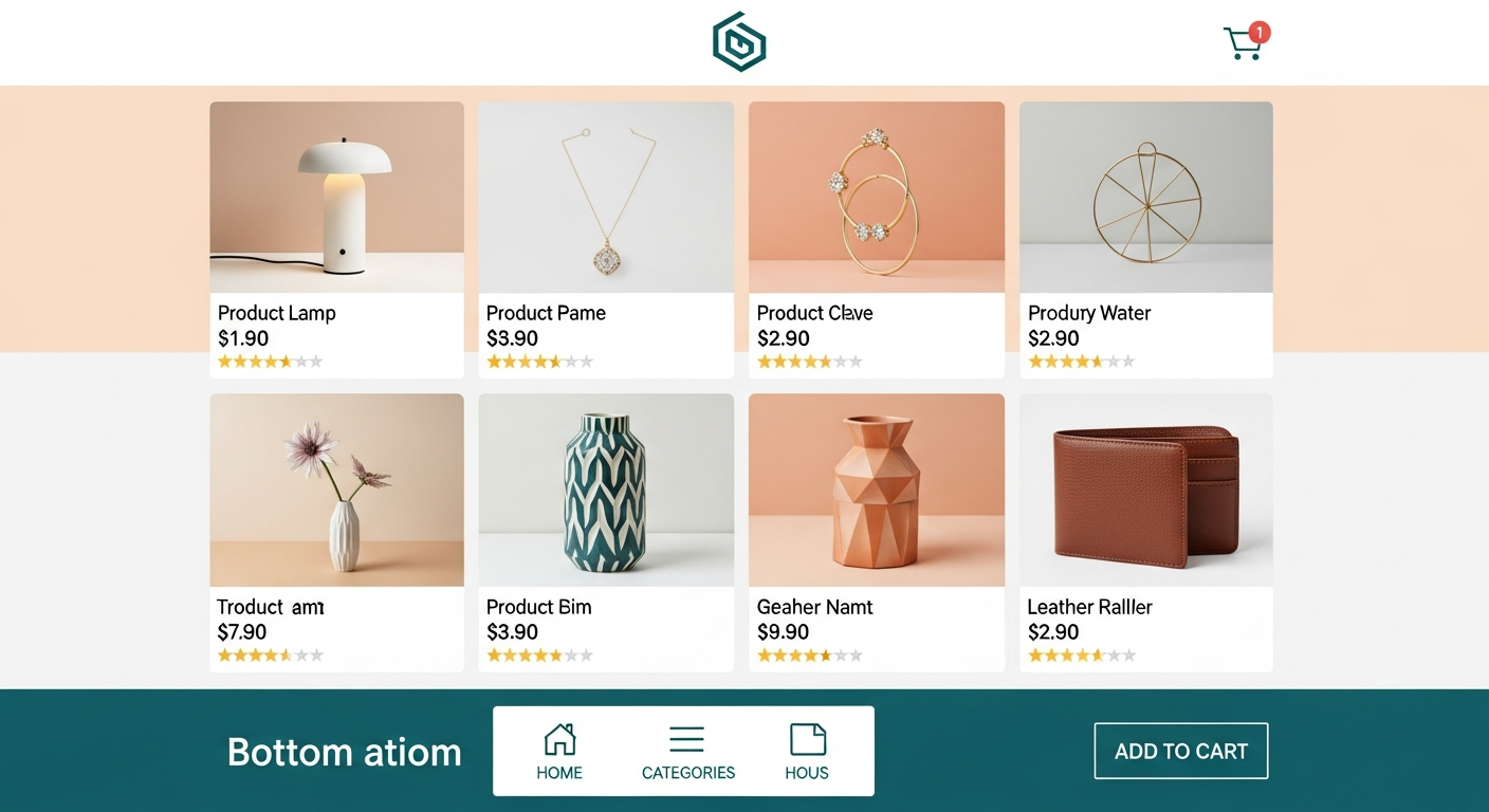
The Basic Principles for Designing an Attractive Store on Zid and Salla
The first and most important principle in designing successful online stores is adopting the simplicity and clarity philosophy in every interface detail. Many merchants fall into the trap of stuffing the home page with many animated banners, long texts, and screaming colors, thinking that this attracts attention. But the truth is that white spaces or empty spaces in design are considered an aesthetic and functional element of great importance — they give the visitor's eye a chance to rest, highlight products better, and make purchase buttons and call-to-action more visible and prominent. On Zid and Salla platforms, you can choose templates supporting this simplicity and allowing your products to be the real hero in the interface.
The second principle relates to visual hierarchy, the art of directing the visitor's eye toward the most important elements in the order you wish. This hierarchy is achieved through skillful manipulation of font sizes, color contrast, and image positions. For example, the title of the largest promotional offer should be the largest size and most attention-grabbing, followed by a brief description in smaller font, then the purchase button in a color clearly standing out from the rest of the page colors. Applying this principle in your store ensures the customer will receive the basic marketing message upon entry, and will know exactly the next step they should take without any confusion or hesitation.
The third principle, which is never negotiable in our current era, is full compatibility with mobile devices. Statistics in the Saudi and Arab market indicate that the vast majority of online purchases happen via smartphones. So you must ensure that your store on Salla or Zid appears ideally on small screens, that texts are readable without needing to zoom, and that purchase buttons are large enough to be easily clicked with the thumb finger. Mobile-dedicated design isn't just an aesthetic addition — it's the lifeline for the success of your e-commerce business and its continuity amid fierce competition.
Improving the Browsing and Product Search Experience
Main navigation menus are like the map guiding visitors inside your online store aisles, and this map should be clear and direct as much as possible. A common mistake is using vague or unfamiliar names for store sections in an attempt to differentiate, leading to confusing the customer. Instead, use clear and direct terms accurately reflecting what the section contains. Additionally, avoid creating very long and complex dropdown menus — divide products into logical main categories and sub-categories facilitating for the customer reaching the required product with the fewest possible clicks and at extreme speed.
The advanced search bar is the magic tool customers who know in advance what they want to buy rely on, and they have very high purchase intent. The search bar in your store should be prominent and in a strategic location at the top of the page, preferably supporting the autocomplete feature suggesting products as soon as the first letters are typed. Moreover, providing an advanced filter system (like filtering by price, color, size, or brand) is extremely important, especially if your store contains hundreds or thousands of products, this narrows search options and speeds up the decision-making process.
The ideal browsing experience isn't complete without paying great attention to the visual side of products and accompanying texts. High-quality images showing product details from multiple angles compensate the customer for their inability to inspect the product in reality. Images should be unified in background and dimensions to give the entire store a professional character. Equally important, accompanying texts should be accurate and attractive. We recommend reading our detailed article on Writing Attractive and Convincing Product Descriptions to learn how to highlight your product benefits and convert passing visitors into actual buyers through words only.
Customizing the Home Page and Product Pages for Maximum Sales
The home page is your store's digital interface, playing a decisive role in convincing the visitor to stay. This page should contain an attractive Hero Banner displaying your strongest offer or newest product collection with professional images and resonant marketing phrases. Below this banner, it's essential to customize dynamic sections like a best-selling products section, exclusive offers section, and newly added products section. These changing sections give the visitor the impression that the store is active and continuously updated, encouraging them to discover more options that may meet their needs and push them to immediate purchase.
As for the product page, it's the real battleground where the customer makes their final decision either to buy or leave. This page should be free of any distractions, and fully focus on highlighting product value. Ensure price clarity in an undisputed way, and if there's a discount, display the old price crossed out to highlight savings. The Add to Cart button should be the most prominent element on the entire page, in a contrasting color that immediately catches the eye. The page should also include detailed information about shipping and return policies to reassure the customer and remove any psychological obstacles preventing them from clicking the purchase button.
Adding Social Proof elements in product pages is considered a golden strategy to increase sales and reduce hesitation rates. These elements include previous customer ratings, their images of the product in real life, secure payment badges, and quality certifications if any. When the potential customer sees that other people have bought the product and were satisfied with it, that breaks their fear barrier. The absence of these elements may lead to a common and annoying phenomenon for merchants. You can learn more about how to address it via the Abandoned Cart Recovery Strategies guide, where we clarify how good design builds trust preventing the customer from retreating at the last moments.
Common Store Design Mistakes to Avoid
Among the most fatal mistakes online store owners make is ignoring site load speed in favor of adding heavy and exaggerated design elements. Uploading very large images, using unoptimized video clips on the home page, or adding complex programming scripts, are all factors leading to severe slowness in store response. In the age of speed, the customer doesn't have the patience to wait more than three seconds for the page to load — if the store exceeds this duration, the visitor will immediately close the page and move to competitors. So always ensure compressing images and optimizing your store performance on Salla or Zid using available tools.
The second common mistake is glaring inconsistency in visual identity and using random colors and fonts not expressing the brand. Some merchants change button and font colors on every page, or use more than five different types of fonts in the same interface, creating a visual chaos lacking professionalism. You should choose a specific color palette consisting of a main color and two secondary colors, and commit to it on all store pages and your social media platforms. This consistency builds a strong mental image of your brand and makes it easier for customers to remember and recognize you in the future.
The third pivotal mistake relates to the complexity of the checkout process due to poor design of this sensitive stage. Requesting unnecessary information from the customer, or forcing them to create an account before purchasing, or placing many complex steps to complete the order, are all practices destroying user experience and leading to losing confirmed sales. The checkout page design in your store on Salla or Zid should be extremely simple, while providing fast and secure payment options, and showing the order summary clearly with total cost including shipping and taxes, to ensure the highest possible conversion rates.
Conclusion: Your Investment in Design is an Investment in Your Success
In closing this comprehensive guide, we must strongly emphasize that online store design isn't just an aesthetic process or luxury that can be postponed, but the basic pillar on which the success of your business project in digital space is built. The carefully designed interface is like your best sales representative, working around the clock tirelessly, welcoming visitors, smartly guiding them, answering their questions through information arrangement, and finally convincing them to make the purchase decision. Every minute you invest in thinking about user experience, color coordination, and element arrangement, will return to you multiplied in the form of sales and customer loyalty.
Zid and Salla platforms stand out by providing a fertile environment and advanced tools enabling you to apply all the principles we mentioned with great ease. You don't need to be a professional programmer or expert designer to own a wonderful store — through ready customizable templates and flexible modification options, you can build an interface reflecting your brand professionalism. However, you must remember that design isn't a task you do once and leave — it's a continuous process requiring permanent monitoring, testing new modifications, and analyzing user reactions via various analytics tools to ensure keeping up with your target audience aspirations.
Finally, we invite you to put yourself in the customer's place and take a comprehensive tour in your online store today. Browse the site from your mobile, try searching for a certain product, and test the purchase process until the end. Document any obstacles or difficulties you face, and immediately start addressing them using the tips and guidance we presented in this article. Always remember that small details in design are what make the big difference in the e-commerce world, and they are what will distinguish your store from thousands of other stores and push your profit engine toward the top with steady and confident steps.