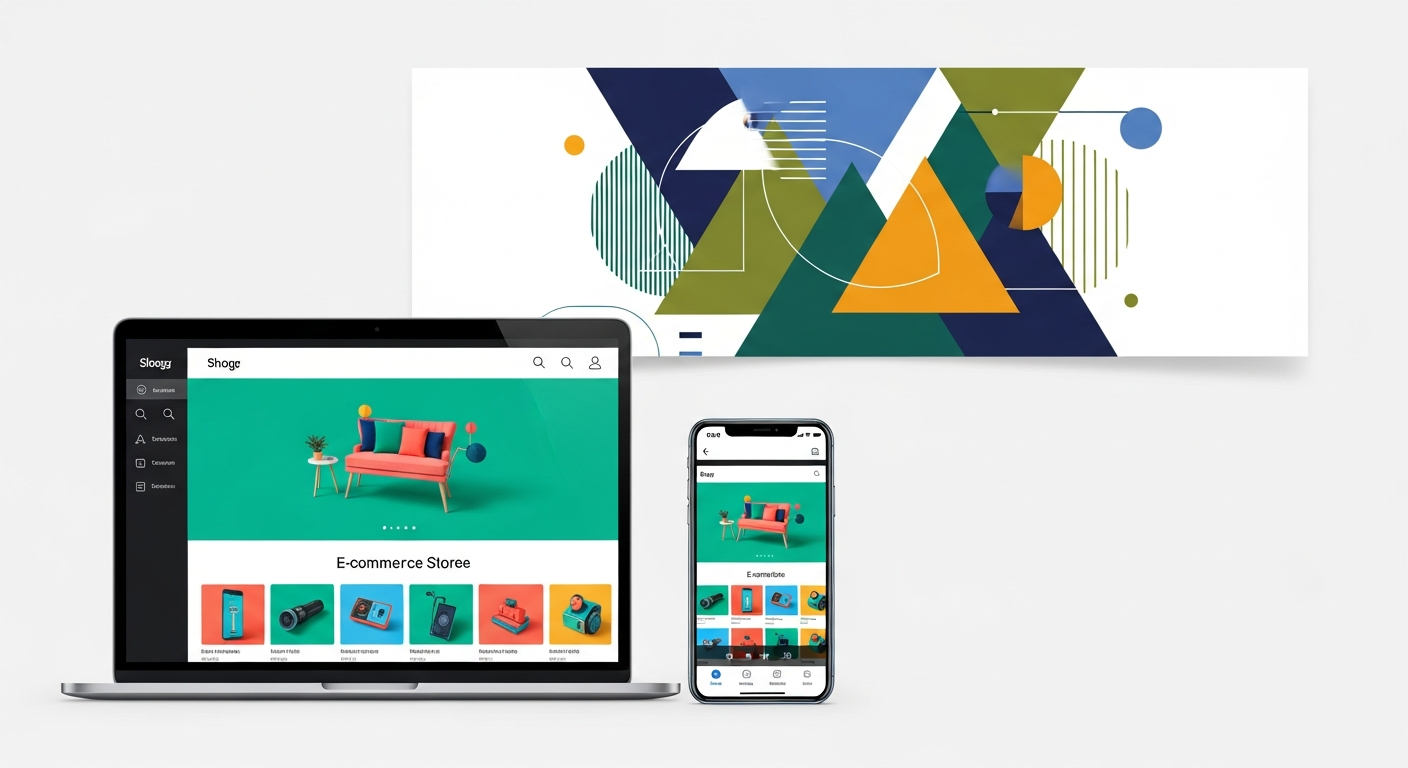
In the fast-paced e-commerce world, owning an excellent product alone is no longer enough to ensure achieving the desired sales — the online store interface has become the glass display window attracting passersby and inviting them to enter and discover what you offer. When the Arab merchant decides to start their online selling journey, they often turn to leading and trusted platforms like Zid and Salla, given the technical facilities and integrated solutions they offer. But the real challenge starts after creating the account and adding products, namely how to design this interface to be professional, attractive, and able to convert the passing visitor into a permanent customer with continuous loyalty to the brand.
Online store design transcends just choosing beautiful colors or placing an attractive logo at the top of the page — it's a strategic process relying on understanding user behavior and facilitating their journey from the moment they enter the site until successfully completing the payment process. On platforms like Salla and Zid, many tools and ready templates are available giving you high flexibility, but wrong use of these tools or stacking elements on the home page may lead to customer distraction and high bounce rates. So investing in improving user experience and designing an interactive interface is considered one of the most important steps ensuring you outperform competitors in a market getting more crowded day by day.
In this comprehensive and detailed guide, we'll dive into the depths of online store design strategies and improving interfaces, with particular focus on how to effectively apply these strategies inside Zid and Salla platforms. We'll review together the most important principles to consider, starting from the first impression and choosing colors, through structuring sections and designing product pages, all the way to improving the final checkout experience. Our goal is to provide you with a clear and practical roadmap enabling you to build an online store that not only looks wonderful, but works as an unstoppable selling machine, supported by best practices in the modern e-commerce world.
The Importance of the First Impression in Online Store Design
When potential customers visit your online store for the first time, they make an unconscious decision to stay or leave within just the first three seconds. This first impression forms based on the design's professionalism, page load speed, and color and font harmony. If your store interface on Salla or Zid platform looks chaotic or not responsive with mobile phone screens, the visitor will feel insecure and lose trust in your brand, pushing them to look for another alternative immediately. So the home page must be carefully designed to reflect your brand identity and value immediately and clearly.
Visual identity plays a decisive role in building trust and credibility with new customers. Your color choice shouldn't be random, but based on psychological connotations suiting the nature of products you sell. For example, bright and joyful colors suit children's toy stores, while dark and golden colors reflect luxury in perfume and jewelry stores. On platforms like Zid and Salla, you can easily customize these colors through appearance settings, and you must ensure unifying these colors in buttons, titles, and backgrounds to provide a comfortable visual experience for the eye and avoid visual fatigue that may turn the visitor away.
Alongside colors, good distribution of white or empty spaces is one of the most important secrets of successful design. Empty spaces give elements space to breathe and direct user's eye toward important buttons, like the purchase button or special offers. Comfortable and reliable design directly reflects on your profits. You can review Conversion Rate: Secrets to Increasing Orders on Salla and Zid to understand how simple interface modifications can double your sales and noticeably and effectively reduce customer acquisition cost.
The Basic Principles for Designing a Professional User Interface on Salla and Zid
To achieve an exceptional user experience, your store design must rest on the simplicity and clarity principle or what's known as smooth user experience. This means every element on the page must serve a specific purpose and help the customer reach their goal with the least possible effort. On Salla and Zid platforms, multiple options are available to customize advertising banners, menus, and top announcement bars. These elements must be used wisely to spotlight current offers or best-selling products without annoying the user with repeated popup windows or long complex texts distracting them from the basic purchase process.
One of the most important principles in Arab e-commerce today is mobile-first design. Statistics indicate that more than eighty percent of purchases through online stores in the Arab region happen via mobile phones. So when designing your Zid or Salla store, you should preview the interface via the phone screen before the computer screen. Ensure buttons are large enough to click with the thumb, texts are clearly readable without needing zoom, and images load fast and don't exceed screen limits to avoid annoying horizontal scrolling.
Choosing the appropriate template or theme is the cornerstone in this process. Platforms provide free and paid templates suiting different sectors. The good template is one that provides balance between aesthetics, speed, and modification flexibility. For deeper details on this strategic topic, we recommend reading Store Design: Your Guide to Choosing the Right Theme on Zid and Salla, where this guide will help you make the right decision saving you a lot of time and effort in the future and ensuring you a strong and professional launch from day one.
Simplifying Browsing and Smartly Structuring Sections
Your store's main menu is the roadmap guiding the visitor inside your site corridors. If this map is complex or illogical, the visitor will get lost and leave quickly. Products should be organized in clear and defined main categories, and avoid creating a huge number of categories in the top menu. It's always preferable to rely on organized dropdown menus branching into precise sub-categories. On Salla and Zid platforms, you can drag and drop sections to arrange them by importance or by seasons, making it easier for the customer to find what they're looking for in seconds.
The smart search bar is an indispensable tool in any successful online store, especially if the store contains hundreds or thousands of products. Customers who use the search bar have much higher purchase intent than just regular browsers. So the search bar should be prominent at the top of the page, preferably supporting autocomplete and spelling correction features. Ensure linking common keywords with your products inside the Salla or Zid dashboard to ensure accurate results appear for customers even if they use different synonyms for the product name.
To ensure an ideal browsing experience free of complications, there's a set of golden rules user experience experts recommend, which must be accurately applied in your store. These rules help reduce cognitive load on the visitor and make them focus only on discovering products and making the purchase decision with confidence. These effective practices are summarized in the following points you can apply immediately:
- Applying the three-click rule: where the customer should be able to reach any product in your store at maximum three clicks from the home page.
- Using clear and direct names for sections instead of creative or vague names that the average visitor may not quickly understand.
- Activating the navigation path or breadcrumbs at the top of product pages so the visitor can return to the main section with one easy click.
- Dedicating a special section for discounted products or offers under an attractive and clear name to be a quick destination for those looking for winning deals.
Applying these tips in organizing sections will noticeably reduce customer service inquiries related to searching for products, and raise the average visitor stay duration inside the store, giving positive signals to search engines that your site provides excellent user experience, and consequently contributing to improving your store's ranking in organic search results in the long term.
Optimizing Product Pages to Increase Sales
The product page is your digital sales representative — it's the decisive stage where the customer makes their decision to put the product in cart or close the page. The first thing that grabs the customer's attention here is images. Each product should contain high-quality images with white or neutral background, plus images showing the product during use in real life. On Zid and Salla platforms, it's preferred to upload multiple images from different angles and activate the zoom feature so the customer can examine fine details and materials, compensating them for inability to touch the product with their hand.
Product description is the second most important element after images. Avoid copy-pasting from supplier sites — write a unique description addressing the feelings and needs of the target customer. Use short paragraphs, and avoid huge text blocks. Focus on benefits the customer will get and not just technical features. For example, instead of writing "5000mAh battery," write "a battery lasting two full days of continuous work to keep you always connected." This style touches the customer's direct need and convinces them of the actual product value.
One of the smart strategies on product pages is displaying related or complementary products to encourage the customer to increase shopping cart size. This technique effectively increases average order value without additional marketing costs. To dive deeper into how to professionally apply this strategy, you can visit our article on Cross-Selling: Your Guide to Increasing Average Order on Salla and Zid, which explains in detail how to choose suggested products and place them in the most suitable location inside the product page to achieve the highest possible conversion rate.
- Use bold and clear headings to divide product description into easy-to-read parts like: Features, Specifications, Usage Method.
- Highlight the Add to Cart button in a contrasting color different from the rest of the page colors to be the most clear and attention-grabbing element.
- Add a section for previous customer ratings and reviews — social proof is considered the strongest purchase motivator and builds instant trust in the new visitor.
- Clarify return and exchange policy briefly next to the purchase button to dispel any concerns that may prevent the customer from completing the process.
Paying attention to every small detail on the product page, from image quality to store policy transparency, creates a safe and comfortable purchase environment. Always remember that the customer doesn't only buy the product itself, but buys the trust and solution this product provides to their problem or desire, and the product page's function is conveying this message completely clearly.
Improving the Checkout Experience to Reduce the Cart Abandonment Rate
The payment and order completion stage is considered the bottleneck in any online store. After all the effort exerted in design, marketing, and convincing the customer of the product, you may lose them at the last moment if the checkout page is complex or requires many boring steps. Platforms like Salla and Zid offer a naturally simplified payment experience, but your role as a merchant is improving this experience to the maximum by activating fast payment options and reducing fields required in the registration form to the absolute minimum, like name, mobile number, and delivery address.
Providing multiple and local payment options is considered decisive in the Arab market, especially in Saudi Arabia and the Gulf. You must ensure activating payment via Mada, credit cards, and fast payment services like Apple Pay and STC Pay. The presence of these trusted payment method logos at the bottom of the store and on the cart page gives reassurance to the customer that their financial data is safe. Shipping costs should also be displayed transparently and clearly before the customer reaches the final payment step, because surprise fees are the number one reason globally for abandoned carts.
Despite all improvements, there will still be a percentage of customers who leave their carts for various reasons like preoccupation or hesitation. Here comes the role of smart targeting tools available on the platforms to send automatic reminders via email or SMS. To learn advanced strategies in this aspect and successfully apply them, we invite you to review the guide Abandoned Carts: Recovery Strategies on Zid and Salla, so you can recover a large segment of lost sales and convert the hesitant into actual buyers with simple and thoughtful steps.
Conclusion and Final Recommendations for Your Store Success
In closing this comprehensive guide, we must emphasize that online store design on Salla and Zid platforms isn't a task accomplished once and forgotten, but a continuous process of improvement and development. We've reviewed how the first impression builds trust, and how smart structuring of sections and menus facilitates the customer journey and prevents them from distraction. We've also addressed the importance of converting product pages into strong and convincing selling pages through descriptive images and attractive texts, and finally simplifying the payment process to ensure no sales opportunity is lost at the last moments.
The best investment you can make as an online merchant is continuously monitoring your store visitor behavior. Use integrated analytics tools on Zid and Salla, or link your store with external tools like Google Analytics to understand pages visitors leave from, and products most attracting interest. Conduct continuous tests on button colors, title formats, and banner distribution. What works with another store may not be optimal for your target audience, so data and numbers are the real compass that should direct your design and marketing decisions.
Finally, remember that technology evolves and consumer behavior continuously changes, but the basic principle remains constant: the customer always looks for the easiest, fastest, and safest experience. By applying the professional practices we discussed in this article, and maximally benefiting from Salla and Zid platform capabilities, you'll be able to build an online store interface that not only reflects your product quality, but builds a strong and sustainable relationship with your customers, ensuring you stable growth and brilliant success in the vast e-commerce world full of opportunities.