In the fast-paced world of e-commerce, owning an online store is no longer a luxury or an optional extra; it has become an absolute necessity for the success and sustainability of any business in the market. With the tremendous development witnessed by leading Arab platforms like Zid and Salla, launching a store is easier than ever. However, the real challenge is no longer how to technically create the store, but rather how to make it stand out among thousands of competitors using the same platforms. This is where the role of "store design" emerges as a crucial factor separating a store with modest sales from one that builds a strong brand and achieves sustainable customer loyalty. Design is the digital storefront that reflects your professionalism and the quality of your products.
The front end of your online store is exactly equivalent to the storefront in traditional markets. If the storefront is cluttered, its colors are off-putting, or its shelves are hard to navigate, the customer will leave immediately and never return, regardless of the quality of the products displayed inside. Choosing the right theme on Salla or Zid is not just an aesthetic decision regarding colors and fonts; it is a strategic decision that directly impacts user experience, page load speed, conversion rates, and ultimately, your net profits. In this comprehensive guide, we will take you on a detailed and deep journey to explore the secrets of e-commerce store design and how to choose the perfect theme that aligns with your brand identity and significantly multiplies your sales.
The Importance of Choosing the Right Theme for Your Store on Salla and Zid
First impressions in the digital world are formed in fractions of a second, and this impression determines whether a visitor will continue browsing your store or leave immediately to find an alternative. When a customer enters your store built on the Salla or Zid platform, the first thing their eyes fall upon is the theme used, the color harmony, and the way products are displayed on the homepage. A professional, carefully designed theme sends an immediate message to the customer that this store is trustworthy and invests in providing a premium experience. This breaks the barrier of fear associated with online shopping and increases the likelihood of completing an order with complete peace of mind and confidence.
User Experience (UX) plays a pivotal role in the success of any online store, and the theme is the template that encompasses this entire experience. An excellent theme smoothly guides the customer from the moment they land on the homepage, through browsing categories and searching for products, all the way to adding a product to the cart and completing the checkout process without any complications. On the Zid and Salla platforms, there are themes specifically designed to minimize the number of clicks required to reach a product and to facilitate navigation through top and side menus, ensuring the customer never feels lost or distracted during their shopping journey in your store.
The ultimate goal of any online store is to increase sales and conversion rates, and design plays the role of a silent salesperson persuading the customer to buy. Advanced themes provide dedicated spaces to showcase special offers, best-selling products, and customer reviews in an attractive and compelling manner. Furthermore, the design of Call to Action (CTA) buttons, such as "Add to Cart" or "Buy Now," significantly influences visitors' decisions. To learn how your page design can impact purchasing decisions when launching marketing campaigns, check out our guide on Landing Pages: How to Multiply Your Ad Campaign Results?, as a well-designed theme complements the effectiveness of landing pages in converting visitors into actual buyers.
Essential Criteria for Choosing the Perfect Theme for Your Online Store
The first and most important criterion in today's era is the theme's complete and flawless compatibility with smartphones. Recent statistics in Arab e-commerce indicate that over eighty percent of online store purchases are made via mobile devices. Therefore, when browsing the theme store on Salla or Zid, you must ensure that the theme adopts a "Mobile-First Design" approach. This means menus should be easy to open and close with one finger, product images must adapt to screen sizes without losing quality, and purchase buttons should be easily accessible at the bottom of the screen to facilitate quick clicking.
The second criterion is the page load speed and the technical performance of the chosen theme. No matter how beautiful a theme is or how full of animations it may be, if it causes the store to take more than three seconds to load, it will lead to the loss of a large percentage of potential customers who lack patience in the digital world. The Salla and Zid platforms provide robust infrastructure and extremely fast servers, but choosing a theme bloated with complex code or unnecessary plugins can hinder this speed. Always look for lightweight themes with clean code that focus on displaying content quickly and directly without frustrating delays for the shopper.
The third criterion is how well the theme aligns with your brand's visual identity and the nature of the products you sell. Every business sector has a distinct character that requires a design reflecting its spirit and message. For example, if you sell luxury cosmetics and perfumes, you will need a theme characterized by ample whitespace, elegant thin fonts, and a strong focus on large images to highlight product details. Conversely, if you run a store selling auto parts or electronics on Zid or Salla, you will need a practical theme focused on detailed menus, advanced filters, and the ability to clearly display technical specification tables to make searching and comparing easier for the customer.
How to Evaluate the User Interface Before Purchasing a Theme
Before making a purchasing decision and adopting a specific theme for your store on Salla or Zid, it is absolutely essential to conduct a comprehensive evaluation of the demo provided by the theme developer. Do not just look at the homepage and be dazzled by its beauty; instead, interact with the demo as if you were a real customer wanting to make a purchase. Click on dropdown menus, browse subcategories, and try using the search bar to ensure results are clear and appear quickly. This live experience will reveal many subtle details that might not be apparent in the theme's promotional images.
While browsing the demo, pay special attention to the design of the individual product page, as this is where the customer makes their final purchasing decision. Ensure that the product image display area is large and clear, and that there is an option to zoom in on images to see details accurately. Also, check how the price and any discounts are displayed, as well as how sizes or colors are selected. These elements must be clear and intuitive, requiring no mental effort from the customer to understand how to use them and successfully add the product to the shopping cart.
Finally, test the checkout process within the demo theme as much as possible. Notice how the side or pop-up shopping cart appears when a new product is added—is it intrusive and covering the entire screen, or is it elegant and allows the customer to continue shopping? Ensure that trust badges, such as secure payment methods and return guarantees, are prominently displayed at the bottom of the page or near the purchase button. These small details in the user interface play a major psychological role in reassuring the customer and removing any hesitation that might prevent them from completing the final payment process.
Comparing Design Options on the Salla and Zid Platforms
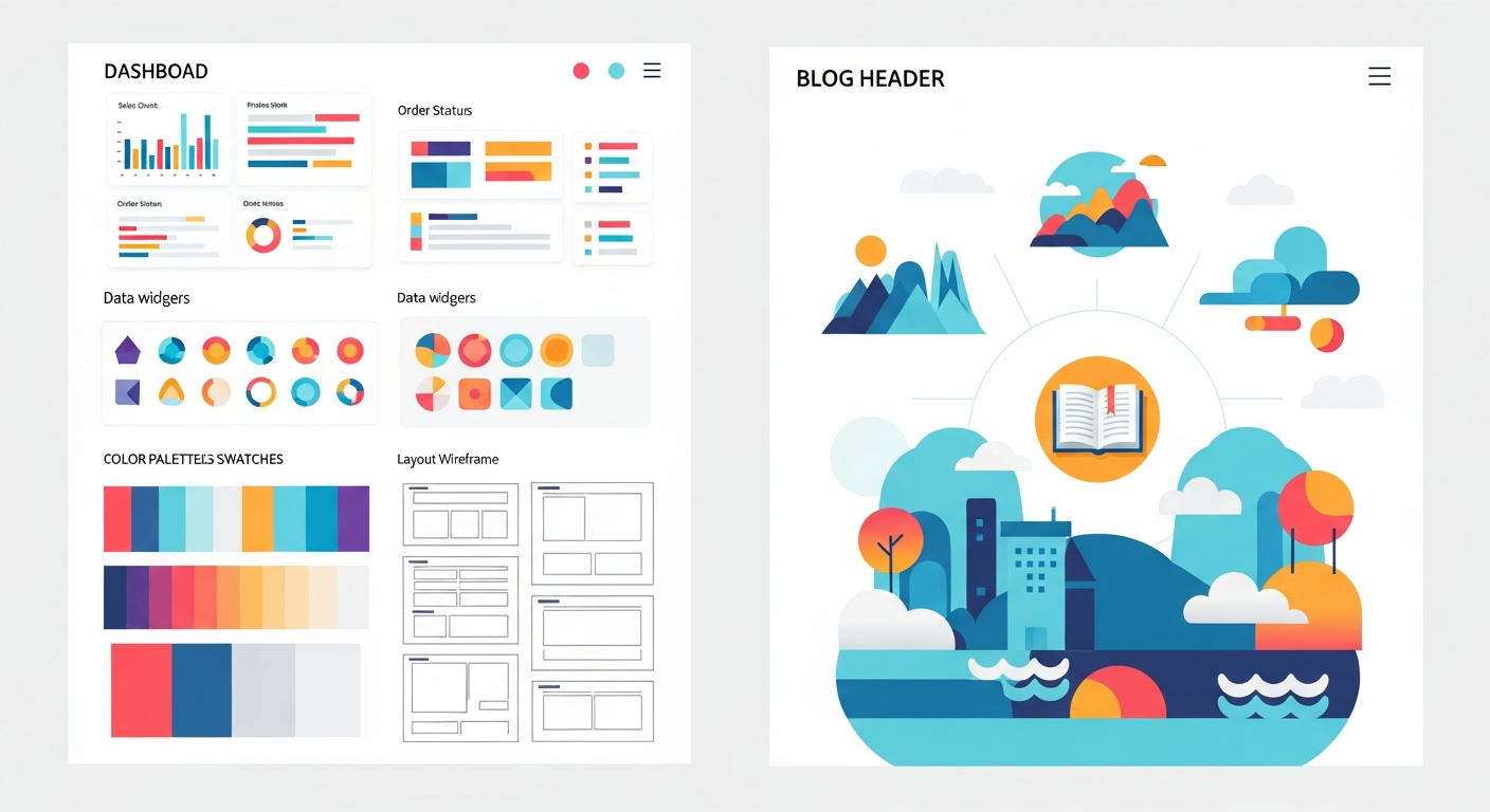
When talking about the Salla platform, we find that it has come a long way in providing flexible and diverse design options suitable for stores of all sizes. The Salla theme store features a wide range of ready-made themes specifically developed to suit the Saudi and Gulf markets. One of Salla's standout features is the "Theme Builder" tool, which allows merchants to easily modify store colors, font types, and the arrangement of elements on the homepage through a simple drag-and-drop interface that requires no coding experience. Additionally, Salla offers advanced customization via CSS for stores that wish to uniquely and exclusively tailor their identity to stand out from the rest.
On the other hand, the Zid platform offers a robust design experience that heavily focuses on professionalism and integration with marketing tools. The Zid Themes store includes a suite of meticulously designed templates aimed at boosting conversion rates and enhancing the customer experience. Zid themes are highly flexible in customizing display areas, adding advertising banners, and arranging product grids in innovative ways. Zid also focuses its designs on clearly highlighting the merchant's brand and providing advanced tools for organizing complex menus, making it an excellent choice for stores with thousands of products and multi-level categories.
Regardless of the platform you choose, you must realize that a theme is merely a framework or structure that requires high-quality content to look its best. Even the most expensive and advanced themes will look dull and boring if the text content for the products is weak or unappealing. An excellent theme provides you with great spaces to display text, and you must utilize them smartly. We recommend reading our detailed article on Product Descriptions: Secrets to Writing Copy That Multiplies Your Sales, to learn how to integrate persuasive copy with your theme's design to convince the customer to buy and clearly communicate the true value of your products in a professional manner.
Common Mistakes to Avoid When Customizing Your Store Design
One of the most common mistakes made by beginner e-commerce store owners on Salla and Zid is overstuffing the homepage with visual elements and animated banners. Some believe that displaying all products, offers, and categories on the first page will attract the customer, but the truth is that this visual clutter causes mental distraction and overwhelms the shopper, driving them to leave the store immediately. You should adopt a "Less is More" philosophy and use whitespace smartly to rest the browser's eyes and direct their focus solely toward essential products and the most important offers.
The second fatal mistake is using low-quality product images or images with inconsistent dimensions and backgrounds. As mentioned earlier, the theme is a frame, and the images are the artwork within it. If you purchase a professional theme and populate it with blurry, dark, or randomly sized images, the overall appearance of the store will look cheap and untrustworthy. You must standardize image dimensions (for example, making them all square or rectangular with a specific ratio) and use good lighting. To achieve this without exorbitant costs, you can benefit from the valuable tips in the article Mobile Product Photography to Increase Zid and Salla Sales, to learn how to take professional photos that match the elegance of the theme you have chosen.
The third mistake that many overlook is neglecting the customization and design of policy pages, FAQs, and the "About Us" page. Many merchants pour all their focus into the homepage and product pages, leaving informational pages with a primitive design or unformatted text. These pages are the cornerstone of building trust with new customers visiting your store for the first time. The design of these pages must align with the overall identity of the theme, and the text within them should be divided into clear paragraphs, using subheadings and bulleted lists to make reading easier and to transparently convey return and shipping policies.
Conclusion: A Comprehensive Summary of Your Online Store Design Journey
In conclusion to this comprehensive guide, we must emphasize that the process of designing a store and choosing the right theme on the Salla and Zid platforms is not merely a passing technical step; it is a true investment in the future of your brand. The theme you choose today will represent the interface that thousands or perhaps millions of visitors will interact with in the future. We have explored the importance of first impressions and how design plays a crucial role in building trust and facilitating the user experience, which directly and positively reflects on conversion rates, ultimately increasing sales and profits.
We also reviewed the golden standards you should never compromise on when browsing theme stores, starting with full compatibility with smart devices, which represent the backbone of modern e-commerce, through load speed that keeps the customer in your store, down to the necessity of aligning the design with your visual identity and the nature of the products you offer. The Zid and Salla platforms provide a fertile environment full of fantastic options and advanced tools that enable you to customize your store to look its absolute best, provided you avoid common mistakes like visual clutter and neglecting image quality.
Finally, remember that store design is not a one-and-done process to be forgotten; rather, it is a continuous process of improvement and development based on visitor behavior and the analytical data you collect. Do not hesitate to make adjustments, change button colors, or even change the theme entirely if you notice the store's performance is not meeting your ambitions. Invest your time in browsing demos, experience the store as a real customer, and always ensure that your store is a comfortable, fast, and attractive place that meets your customers' needs and exceeds their expectations every time they decide to shop from your brand.