In today's era, mobile phones have become the primary medium consumers use for online shopping. Therefore, designing a mobile-friendly online store is no longer just an option, but an absolute necessity for the success of any store on platforms like Zid and Salla. Stores that are not mobile-friendly lose a massive number of potential customers and negatively impact user experience and your sales.
In this article, we will cover the fundamental principles of designing a mobile-friendly online store, in addition to common mistakes to avoid to ensure the best shopping experience for your customers.
Why Must Your Store Be Mobile-Friendly?
The importance of your store's mobile compatibility lies in several key points:
- Increased Sales: The majority of shoppers use mobile phones, and a mobile-friendly store design increases the likelihood of purchase.
- Improved User Experience (UX): It provides a seamless and enjoyable experience for customers, encouraging them to return.
- Search Engine Optimization (SEO): Search engines like Google give preference to mobile-friendly websites.
- Reduced Bounce Rate: When a customer finds the store difficult to use on mobile, they leave quickly.
- Building Brand Trust: A professional, mobile-compatible store boosts customer trust.
Fundamental Principles for Designing a Mobile-Friendly Online Store
1. Responsive Design
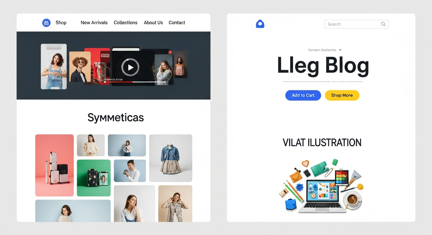
Responsive design is the foundation. This means your store's design automatically adapts to the screen size the user is browsing from, whether it's a mobile phone, tablet, or desktop computer. This ensures your store looks perfect on all devices.
2. Loading Speed
Mobile users are impatient. Your store must load at maximum speed. The main reasons for slow loading include large unoptimized images, excessive code, and too many plugins. Platforms like Zid and Salla provide tools to help optimize store speed, but you must also pay attention to the quality of your product images.
Loading speed on mobile is not a luxury; it is a necessity. Every second of delay could cost you a customer.
3. Easy Navigation and Clear Menus
Menus should be simple, clear, and easily accessible on mobile. Use the popular Hamburger Menu, and ensure the main sections of the store are clearly visible.
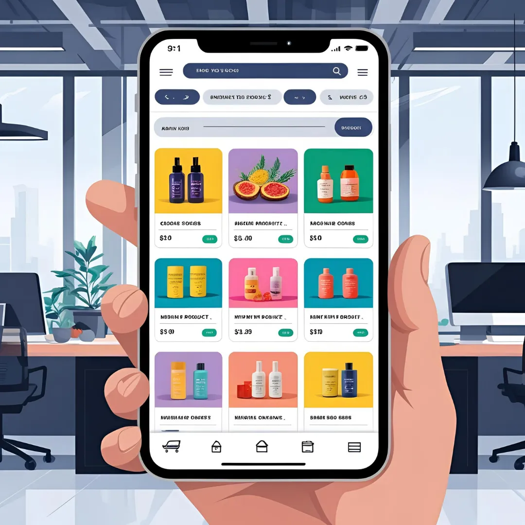
4. Large Buttons and Clickable Elements
A user's fingers are larger than a mouse cursor. Therefore, buttons and clickable elements (like links) must be large enough to be easily tapped without errors. Make sure there is enough space around buttons to avoid accidental clicks.
5. Seamless Checkout Process
The payment process should be as smooth and simple as possible on mobile:
- Reduce the Number of Steps: The fewer steps to complete a purchase, the better.
- Simplified Data Forms: Use short and clear form fields.
- Guest Checkout Option: Do not force customers to create an account.
- Support Multiple Payment Methods: Provide diverse and convenient payment options for mobile users (such as Apple Pay, Google Pay).
6. High-Quality and Optimized Visual Content
Images and videos are the foundation of online stores. Ensure they are high quality, but also optimized for mobile performance. Use modern image formats (like WebP) and compress images to reduce their size without affecting their quality.
7. Use Readable Fonts
Choose clear and easy-to-read fonts for small screens. Avoid complex or very small fonts that might be difficult to read.
Common Mistakes to Avoid
- Text That Is Too Small or Too Large: Which requires constant zooming in and out.
- Buttons Placed Too Close Together: Which lead to accidental clicks.
- Annoying Pop-ups: That cover the entire screen and are difficult to close.
- Unoptimized Images: Leading to slow loading times and high mobile data consumption.
- Not Testing the Store on Different Devices: What looks good on one device may not look good on another.
- Relying Solely on Flash or Outdated Technologies: Which do not work on mobile devices.
- Lack of a Quick Call or WhatsApp Button: Customers prefer quick communication.
Conclusion
Designing a mobile-friendly online store is not just a trend; it is an integral part of a successful e-commerce strategy. By focusing on user experience, loading speed, and easy navigation, you can build a store that maximizes the potential of the growing segment of mobile users. Remember that continuous optimization and testing your store on different devices are the keys to maintaining an excellent user experience.